Journey With Color: So Many Colors!

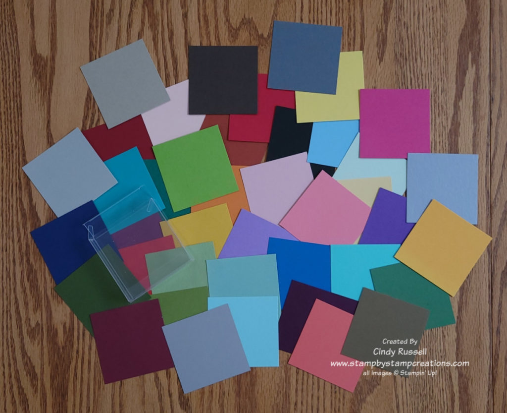
With so many colors and so many shades of colors sometimes it’s hard to know where to begin.  Most of the time you have an idea of the basic color(s) you want to use on a card but how do you choose a shade of that color? 

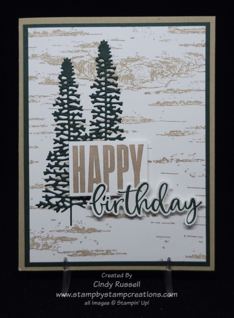
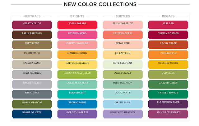
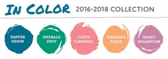
Currently, Stampin’ Up! has 11 different greens for us to choose from!  Green wins the prize for the most shades.  Check out the chart I made.  You can see how the greens go from a very soft and light Soft Seafoam to the deep and rich Evening Evergreen.  We all have our favorites.  The greens that I probably use most often are Pear Pizzazz and Old Olive, although it depends on the project.  If I was going to pick a favorite green it would have to be Evening Evergreen.  A chart like this make it easy to see all of the greens together so you could maybe try a new shade.

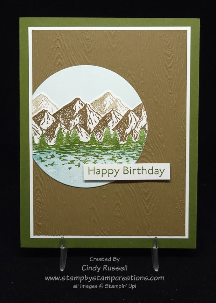
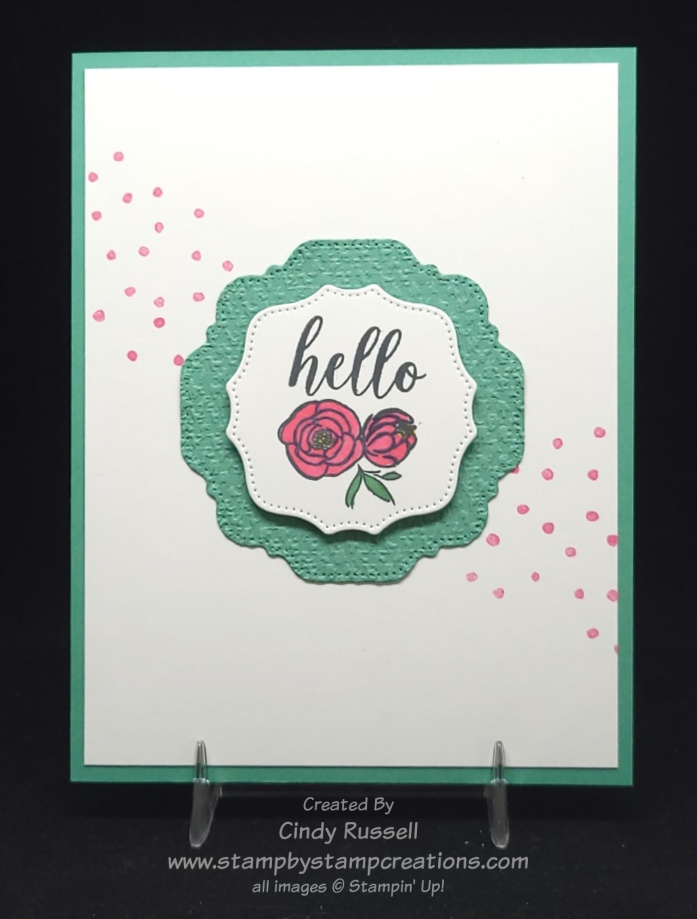
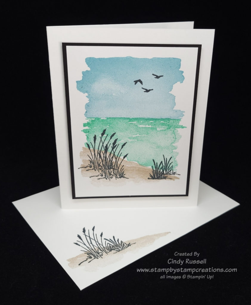
Check out the lovely card that my friend Janet made.  She used Soft Sea Foam along with Balmy Blue.  Personally, I don’t care for Soft Seafoam, but it really works on this card.  I get a nice, relaxed feeling when I look at it which is probably what Janet was going for when she chose these two colors to go with her stamped images.  If I recreated this card and went with my go-to green of Pear Pizzazz it wouldn’t have worked nearly as well.  You just wouldn’t have that same relaxed feeling.

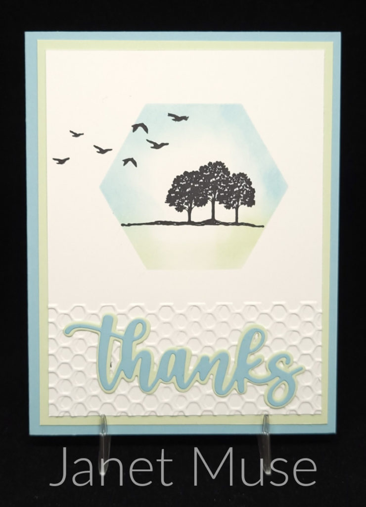
Different colors and different shades of colors are going to give you different feelings.  As I mentioned, the soft colors of Janet’s card make me feel relaxed and peaceful.  If I tried making this card with Granny Apple Green which is a fun, bright, in-your-face color it definitely wouldn’t make you feel relaxed.  Bright colors give you more of a happy and excited feeling.  They would be better suited for a birthday card or something like that.

When you’re choosing a color or shade of color you also want to think about how it’s being used on your project.  Are you using a certain ink color to stamp an image or are you using a blending brush to apply the ink color on cardstock?  Are you just using the colored cardstock for layers?  These questions are important to think about when choosing the right color/shade for your project. 

In a previous paragraph I mentioned that my go-to light green, Pear Pizzazz, probably wouldn’t have worked on Janet’s card.  I’d like to change that thought up a bit.  If I recreated Janet’s card as is, Pear Pizzaz wouldn’t have worked.  If I changed up the card so that I didn’t use any Pear Pizzazz cardstock on the card and just used it on the focal point it might work.  I’d be able to blend the Pear Pizzazz lightly enough with my Blending Brush to get that same soft look. Sometimes you have to experiment and see what’s actually going to work for your project.

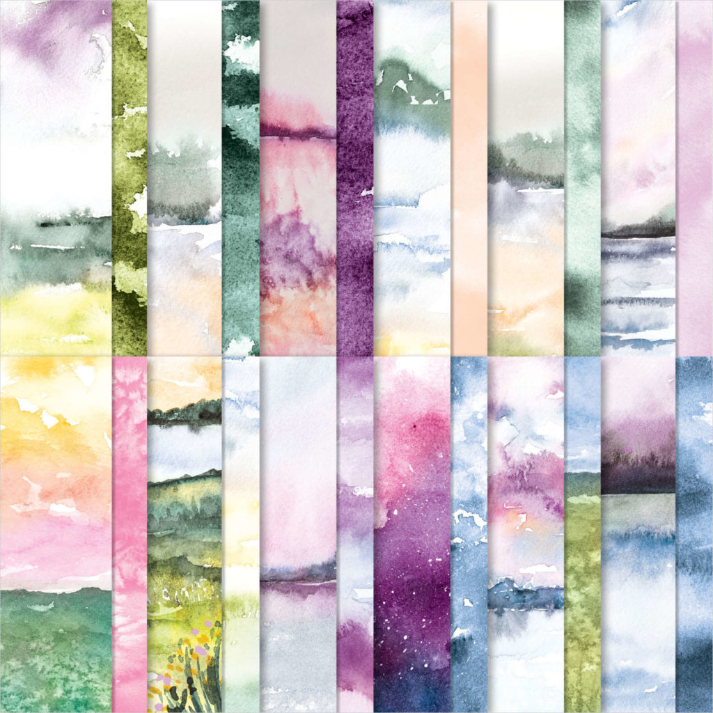
Stampin’ Up! has so many choices of greens for our projects.  Don’t always head for your favorites.  You may even see me using Soft Seafoam on one of my upcoming projects!  Give those other shades a try.  Think about the feeling you’re trying to project.  Stampin’ Up! already does this for us with their Designer Papers.  Check out some of the papers and see what kind of feelings you get. 

Color and combinations of color are powerful.  Think about the feeling you want your card to project before choosing your colors.

Have a great day! Take care and Happy Stamping!

A Masculine Card for Make It Mine Monday!

While I was scrolling through Pinterest looking for cards to make for my 40 Projects In 40 Days (find them on my Facebook page), This card caught my eye and knew I had to Make It Mine!  It seems that I have a thing for trees.  I seem to purchase any stamp set that has some type of tree in it.  😊

I love how Rose used the Birch background stamp on her card with the die-cut trees. I also love how she stamped and cut out the “happy birthday” from the Biggest Wish stamp set.

As you can see, I flipped the card and added a layer. It looks like Rose used grays on her card but I used Crumb Cake. The die-cut trees are from the Majestic Mountain dies. My card only has two tree on it to keep it a little more simple.

There’s a tip that I want to remind you of. I shared it with you last fall in my newsletter. What? You don’t get my newsletter? You may want to go to the sign-up box at the top of this page and get on that list today so you don’t miss anything!

Anyway, the tip that I want to remind you of is that when you are cutting around a stamped word like “birthday” here on my card you should lightly sketch around the word so that your scissors have a line to follow. It really makes a difference. The image here on my card was my second attempt. I forgot to trace around the word the first time and really messed it up. Another tip would be to remember to use Adhesive Sheets when die cutting the trees or other intricate images. It makes life a whole lot easier!

This turned out to be a perfect card for a guy. I’m going to have to make a few more of them to keep in my stash! Have a great day! Take care and Happy Stamping!

Easy & Elegant Pocket Fun Fold Card

Easy Pocket Fun Fold Card

Today’s card is a Pocket Fun Fold and it’s easy!  The base of the card is one piece of 5 ½” x 8 ½” card stock scored at 2 ½” and 6 ½”.  That’s it!  Fold along both score lines to the center of the card.  The smaller 2” section will form the pocket of the card.  You will need to use a strong, narrow adhesive like Stampin’ Up!’s Tear & Tape close to the edges of the cardstock so that you have room for the card insert.  Once you have the card base formed you will notice that closed card is only 5 ½” x 4” instead of the usual 5 ½” x 4 ¼”.  This is because the larger flap overlaps the pocket portion of the card.

Easy Pocket Fun Fold Card

To decorate the card you need to pieces of coordinating designer paper.  The larger piece is 5 ¼” x 2 ¼”.  The smaller piece is 5 ¼” x 1 ¾”.  I used the Abstract Beauty Designer Series Paper on my card.  I love the black and gold together.  The flowers on my focal point were punched using the Strawberry Builder Punch.  The centers were punched with a ¼” Circle Punch (retired).

The gold foil portion of the card insert is 4 ¾” x 3 ¾”.  The Basic White portion of the insert is 4 ½”x 3 ½”.  Both sentiments that I used on my card are from the Peaceful Moments stamp set.

Fun and simple.  My kind of fun fold!  I hope you’ve enjoyed today’s card!  Have a great day.  Take care and Happy Stamping!

A Colorado Card Sketch

This card definitely reminds me of my home state of Colorado. Gotta love those mountains!

I’ve had the Mountain Air stamp set and the Majestic Mountain Dies for a while and haven’t used them much. My 40 Projects In 40 Days challenge has got me looking at, and trying to use, all of those unloved stamp sets on my shelves.

It may be hard to tell from the photo but I used the dies on my card. I stamped each row of mountains separately, die cut them and layered them on a piece of Basic White cardstock that I had added a little color to with a Blending Brush and Balmy Blue ink.

The water is stamped on a separate piece of Basic White cardstock with Balmy Blue ink and the “water” stamp from the Oceanfront set. The trees are stamped over the water with Mossy Meadow ink. I then used a circle die from the Layering Circles die set to die cut the area of lake and trees that I wanted to use on the card. I did this because I knew that my die wouldn’t go through more than a few pieces of cardstock.

Once the I had my die-cut lake and trees I adhered them to the mountains. I lined up the same circle die around the edge of the water/trees and ran the cardstock and die through my Stampin’ Cut & Emboss Machine. Most of the circle was die cut but I did have to use paper snips on a few areas that had more than a couple layers.

Here is the card sketch that inspired me today. I stayed pretty true to the sketch. The only changes I made were flipping the design and adding one more layer. Not bad for me! Ha!

Have you tried using sketches yet? I hope so! They are a great way to get those creative juices flowing!

Have a great day! Take care and Happy stamping!

Journey With Color: The Next Step

It’s time for a new step in our Journey of Color.  We’ve talked about the history of Stampin’ Up! colors but now we need to figure out how best to use the colors that we have.  Stampin’ Up! has 40 colors in their color palette not including the 10 current In Colors, Basic Black, Basic White and Very Vanilla.

Here’s the breakdown:

Reds:  4

Yellows:  4

Pinks:  4

Greens:  8

Purples:  4

Oranges:  2

Blues:  6

Grays:  3

Browns:  5

If you include the current In Colors you add 1 Yellow, 2 Pink, 3 Green, 1 Purple, 1 Orange, 1 Blue and 1 Brown.  Green is definitely the most popular color in Stampin’ Up!’s color palette.

Now what?  We need to figure out how to use the colors together.  We all have our favorite color palettes and our go-to colors.  How do we get out of that rut?  How do we come up with fresh color combinations? 

In their catalogs, Stampin’ Up! provides us with a quick and easy tool for combining colors:  their designer paper!  In their designer papers they come up with color combinations I would never think of and they’re gorgeous!  Check out pages 130 through 134 in the Annual Catalog.  This is where you can view all the papers and below each picture Stampin’ Up! lists the colors included in that package of paper!  You can also see the colors included on the package of paper itself.  I like creating cards with Stampin’ Up!’s designer papers because most of them coordinate with a stamp set or bundle.  You know me, I love coordination!

Maybe you don’t like to use designer paper.  Maybe you are more of a paper, ink and stamps type of person.  You can still get your color combinations from designer paper but how can you come up with your own combinations?

When I am creating, I use color swatches a lot.  If I’m using designer paper on my project, I will check out the list of colors used on the papers and pull out a full sheet or scrap of those colors of cardstock.  This way I can put the different colors together and see what combinations I like best.  If I’m starting from scratch, I look at the stamp set or dies/punches that I’m working with.  Let’s say I want to create a card with a pink flower on it.  I would pull out some pink and green swatches of cardstock to see which combinations I like the best.  Then, if I want to add a third or fourth color to my project I would pull out additional swatches.

Starting with designer paper and color swatches are the easiest methods of determining color combinations.  When you use color swatches you will probably still start with your favorite combinations but if you have other colors to look at you may try something new. Give one of these methods a try next time you’re creating!

Have a great day! Take care and Happy Stamping!

Make It Mine With A Hello

A simple hello for you on Make It Mine Monday. Once again, the simplicity of a card caught my eye. I have trouble recreating simplicity, but I like it. As the banner above the photo says, this card was created using Stampin’ Up!’s Dressed To Impress stamp set. This fun stamp set is quite “girly”. The coordinating All Dressed Up dies die cut some of the images and also has dies that you can create a 3D purse with.

I love the white on white that Kim did on this card with her layers with just the subtle pink dots to set them apart. That is what made me want to recreate her card.

Of course when I started my creative process things didn’t turn out quite as simple as I wanted.

Stampin’ Up!’s All Dressed Up!

To start with, I didn’t want to use the “fabulous” portion of the “hello fabulous” stamp so I masked that portion of the stamp before inking it up. I also wanted to use a die that fit around my images a little closer so as not to leave quite as much white space. The Hippo & Friends dies fit worked perfectly and I was able to layer my stamped images.

The flowers on my card are colored with the Polished Pink and Just Jade Stampin’ Blend Markers so those are the colors I used on the rest of the card. The larger label is embossed with the Tasteful Texture 3D Embossing Folder. To really change up my card from Kim’s I used a Just Jade card base instead of Basic White.

Even though I changed quite a bit about Kim’s card, I do love hers. One of these days I will figure out simple stamping. How do you do with simple stamping? If you’ve got the hang of it I’d love to see some of your projects.

Have a great day! Take care and Happy Stamping!

Best Wishes Swing Arm Fun Fold Card

Swing Arm Fun Fold Card – front

I love fun fold cards.  This fun fold card is called the Swing Arm Fun Fold and is quite easy to make.  The base of the card is the basic 5 ½” x 8 ½” piece of cardstock folded in half at 4 ¼”.  To make it a fun fold you just need to add a label (or focal piece) and the swing arm.

On my card I used Stampin’ Up!’s beautiful Symbols of Fortune Specialty Designer Series Paper from the January – June Mini Catalog. One side of each sheet of this paper has a gold foil design on it. So pretty!

Both the “best wishes” on the front of the card and the “happy birthday” on the inside of the card are from the Artistically Inked stamp set in the Annual Catalog.

The circles are die cut using the Layering Circles dies and the decorative label is die cut using the Hippo & Friends dies. I have to admit that I purchased this die set because of all the layering dies in it. One of these days I may purchase the coordinating Hippo Happiness stamp set. 🙂

Swing Arm Fun Fold Card – inside

The swing arm on my card measures 1″ x 4 3/4″. It’s scored at 3″. The smaller section is adhered to the inside of the back section of the card. The long section is what folds over to the front of the card. When attach the swing arm to the label you want to make sure that you adhere the swing arm to the top of the label. The arm will be sandwiched between two layers so that you can’t see the end of it.

Swing Arm Fun Fold. So easy. So fun! Have a great day! Take care and Happy Stamping!

Cocktails & Card Sketches

Cocktails and Card Sketches! How can you go wrong? The Nothing’s Better Than stamp set is so fun! It’s definitely going on my keeper shelf. The great thing about this stamp set is that it encompasses four different favorite items (well, only three of mine as I don’t care for coffee…). Cocktails, Chocolate, Cookies and Coffee! Such a fun stamp set and it has coordinating dies too! The Love You More Than dies. The sentiments in this stamp set are fun too.

When I saw this card sketch I thought it would be a fun one to work with. I didn’t realize how difficult it would be to find just the right image for the focal point. I could have used a butterfly just like in the sketch but I wanted to be a little original! 🙂

When I saw the Nothing’s Better Than stamp set on my shelf and knew it had coordinating dies I knew I had the winner. I changed up the sketch a little bit since I wanted to use the die for the work “cocktails”. I also added a few layers (naturally!).

It was a fun sketch to work with and I was able to use a bright and cheerful color palette with Polished Pink, Bermuda Bay and Basic Black.

Have a great day! Take care and Happy Stamping!

(Don’t forget to decorate the inside of your cards!)

Journey With Color: Most Recent Color Change

Today in our Journey With Color we finish up Stampin’ Up!’s history of color. Hasn’t it been fun seeing where the color collections began and how they got to where they are today?

The last and most recent color change that Stampin’ Up! had was in their 2018-2019 Annual Catalog.  If you know your Stampin’ Up! colors, you can see in the photo Stampin’ Up!’s current colors.  The only thing that this photo doesn’t show is that Stampin’ Up! added a new group called Basics.  This group consists of Whisper White (now Basic White), Very Vanilla and Basic Black.

Stampin’ Up!’s 2018-2019 Color Change

I’ve summarized the changes to each of the four color groups below.  You can compare it to the previous color groups here.

Neutrals:  Whisper White, Very Vanilla and Basic Black moved to Basics Group.  Chocolate Chip was retired.  Night of Navy was moved from the Regals group.  Merry Merlot and Mossy Meadow were added. 

Brights:  Real Red, Pumpkin Pie, Rich Razzleberry and Old Olive were moved to the Regals group.  Tangerine Tango and Tempting Turquoise were retired, and Poppy Parade, Flirty Flamingo, Mango Melody, Granny Apple Green, Coastal Cabana and Gorgeous Grape were added.

Regals:  Rose Red, Always Artichoke, Island Indigo, Elegant Eggplant and Perfect Plum were retired.  Night of Navy moved to the Neutrals group.  Real Red, Pumpkin Pie, Rich Razzleberry and Old Olive were added from the Brights Group.  Shade Spruce and Blackberry Bliss were added.

Subtles:  Pink Pirouette, Wild Wasabi, Soft Sky, Marina Mist and Wisteria Wonder were retired.  Petal Pink, Soft Seafoam, Mint Macaron, Balmy Blue and Highland Heather were added.

If you’ve been following this Journey With Color since the beginning, you will notice that many of the new colors that were added to Stampin’ Up!’s color collection were former In Colors.  It’s nice when some of your favorites make the cut!  😊

Color changes can be fun even though some of us don’t always do well with it.  I wonder when the next one will be?

Have a great day! Take care and Happy Stamping!

A Beachy Make It Mine Card

Oceanfront Seaside Card

This beachy card is so easy and so fun to make with the Oceanfront stamp set.  This was one of those stamp sets that I didn’t think I needed.  I live in land-locked Colorado so I don’t get to the ocean much. I’m more of a lake girl (my Minnesota roots). Ha!

But I fell in love with the New Horizons designer paper and saw all sort of cards online that used both this gorgeous paper and the Oceanfront stamp set.  It was time to make the purchase. 

The Oceanfront stamp set makes it so easy to create a beach scene.  There is one stamp for the sky, one stamp for the ocean and one stamp for the sand.  On my card I stamped the “sand” three times to give it a little more texture and depth.  I used Balmy Blue for the sky, Coastal Cabana for the water and Crumb Cake for the sand.  Easy Peasy!

This stamp set is one of Stampin’ Up!’s DistINKtive stamp sets which is why there is so much texture and shading in the water and the sky. Stampin’ Up! sure does make it easy for us to create a lovely scene like this.

Thank you Tracy for the inspiration. The simpleness of this card is what first caught my attention and I knew I wanted to recreate it.

When you compare the two cards you can see that I added a some more of the grasses and left off the sentiment. I also added the birds from the On The Horizon stamp set as I felt the upper portion of the card needed some type of black element on it. I also made my layers slightly smaller. You know me, I don’t handle white space very well. 🙂

Of course looking at this card while writing this in frigid Minnesota (although the weather is actually very mild right now) makes me want to head to the ocean. How about you?

Have a great day! Take care and happy stamping!

Black & White Half Front Fun Fold Card

It’s a Fun Fold Card that highlights the fun All Together Designer Series Paper! This Half-Front Fun Fold is easy peasy!

I cut my cardstock 4 1/4″ x 11″ and scored it at 5 1/2″. Then I trimmed 3″ off of one of the sections which left the “front” of the card 2 1/2″. The large piece of designer paper is 2 1/4″ x 4″. I added a strip of 4″ x 1/4″ designer paper to the bottom of the inside piece (5 1/4″ x 4″) to add a little interest.

The sentiment focal point piece of Basic White cardstock is 2 3/4″ x 3 1/2″. The sentiment is from the Happiest of Birthdays stamp set. I love that it is so large and can be used as a focal point on a card.

This black & white birthday card would be perfect any guy in your life. Guy cards are so hard to design but you can’t go wrong with black & white!

It’s been a fun week playing with black & white cards but next week I think we’ll move back to some color!

Have a great day! Take care and Happy Stamping!

A Black & White Card Sketch

It’s black and white week here on my blog.  All of the projects I’m sharing with you this week are black and white.  As I mentioned on Monday, there is something about a black and white card that always catches my eye.  They’re so striking.

Once again I was able to stick pretty close to the card sketch. I only added one layer around the focal point. The designer paper I used was the fun All Together 6″ x 6″ Designer Series Paper. As I mentioned in my newsletter earlier this week, all of the designs are black and white. So fun!

The die I used as the focal point is from the Meadow Dies which coordinates with the Quiet Meadow stamp set. This set of dies is filled with silhouette dies. So many different ones to choose from for any type of card.

What would you use as your focal point on this card sketch? Would you use a die like I did or would you prefer to stamp an image. Maybe a combination of the two! There are really so many options when you use a card sketch.

Have a great day! Take care and Happy Stamping!

Journey With Color: Lots of In Colors

This week in our Journey With Color, we’re going to finish up with the history of Stampin’ Up! In Colors.  Next week I’ll share the most recent change to Stampin’ Up!’s line of colors and then we’ll move on.

When In Colors were first introduced, they only had a life span of 1 year.  Starting with the major color overhaul in the 2010-2011 catalog In Colors now have a life span of 2 years.

Below you can see photos of the In Colors from 2014-2016 to the current ones.

In Colors 2021-2023

Wow! So many colors! Which group is your favorite? Which is your least favorite?

Of these groups, I have to admit that I didn’t care for the 2015-2017 collection. The only color I really liked in this group was Watermelon Wonder.

When talking favorites the current 2021-2023 In Colors and the 2017-2019 colors are pretty darn close with the win going to 2021-2023.

Now, if you want to get into individual favorites, I can’t narrow it down to just a few so I’ll give you a list: Berry Burst, Tranquil Tide, Pretty Peacock, Evening Evergreen and Polished Pink!

I do love that Stampin’ Up! gives us fresh new colors each year and that they stick around for two years so that we can have time to play with them. What is your opinion of In Colors?

Make It Mine In Black & White

This week’s Make-It-Mine card is black and white with a little bit of gray on it.  Monochromatic is the technical term.  Monochromatic means: “of, relating to, or having tones of one color in addition to the ground hue”.

There’s something about a black and white card that always catches my eye.  Black and white together is simple and it’s stunning.  I like these types of cards so much that I’m sharing them all week on my blog, Facebook and even in my newsletter.  Be sure to check them all out!  (If you don’t get my newsletter yet, just fill out the info in the box to the right.)

I used Stampin’ Up!’s Artfully Layered stamp set on today’s card.  I was inspired by Tess Rollin’s card.  As you can see, I stuck pretty close to Tess’s card and only added a few extra leaves. 

This card is quite simple.  All stamping except the sentiment is done directly on the card base.  The two leaves on the upper portion of the card were stamped first.  Then I used a piece of scrap paper to cover them so I could stamp just a portion of the leaves on the lower section of the card.  The sentiment is layered on black cardstock and adhered to the card front with Stampin’ Dimensionals. Easy Peasy!

I tried using embellishments of some sort on my card like Tess did but they seemed to distract from the simplicity of the card.  I like Tess’s use of embellishments but I just couldn’t make them work.  Sometimes simple is better.

Somewhere Over the Rainbow Bridge Fun Fold Card

Bridge Fun Fold Card

How can you not sing Somewhere Over the Rainbow while looking at this fun fold card?  So many rainbows!  I’m going to be sad when Sale-a-bration is over on February 28th and I won’t be able to get any more of the fun Sunshine & Rainbows Designer Series Paper. The paper coordinates perfectly with the Rainbow of Happiness Bundle of products from Stampin’ Up!’s January – June Mini Catalog. I’ve used the Rainbow of Happiness stamp set, the Brilliant Rainbow dies and the Cloud Punch on my card.

Bridge Fun Fold Card

This second picture gives you a top view so you can see all of the panels a little better.

This fun fold is pretty easy. Start with a card base that is 4 1/4″ x 8″. Make sure the length is 8″, not 8-1/2″. I made that error the first time around and couldn’t figure out why my “bridge” piece wouldn’t fit! Sheesh!

With the long edge of the card base at the top of your Simply Scored scoring board score the cardstock at 1 1/4″, 2 1/2″, 5 1/2″ and 6 3/4″. Fold the two outside score lines into mountain folds and the two inside score lines into valley folds. The “bridge” piece of cardstock is 5 1/2″ x 1″. The width of the “bridge” piece of cardstock can be any dimension that works for your design. The key is to make sure the length is 5 1/2″.

The four designer paper panels measure 4″ x 1″. The designer paper piece on the “bridge” measures 5 1/4″ x 3/4″. The Basic White piece of cardstock in the center of the card measures 4″ x 2 3/4″.

To adhere the “bridge” to the card you want to fold the card like in this picture. The sections on one side of the center piece of the card base should be “open” and the sections on the other side should be folded closed.

Make sure to put adhesive only on the areas of the “bridge” that will be adhered to the two outside panels.

The way the card is folded in this last photo is also the way you will fold it to slide it into an envelope.

Let me know if you have any questions on this fun fold. Have a great day! Take care and Happy Stamping!