Pink. I love the color pink. When I first heard the names of the new In-Colors the name Pretty In Pink sounded quite familiar. Since I’ve been a demonstrator for 20 years it should. Pretty in Pink used to be a regular Stampin’ Up! color! No wonder it sounded familiar. I believe this is the first time that Stampin’ Up! has brought back a retired color (other than In-Colors).
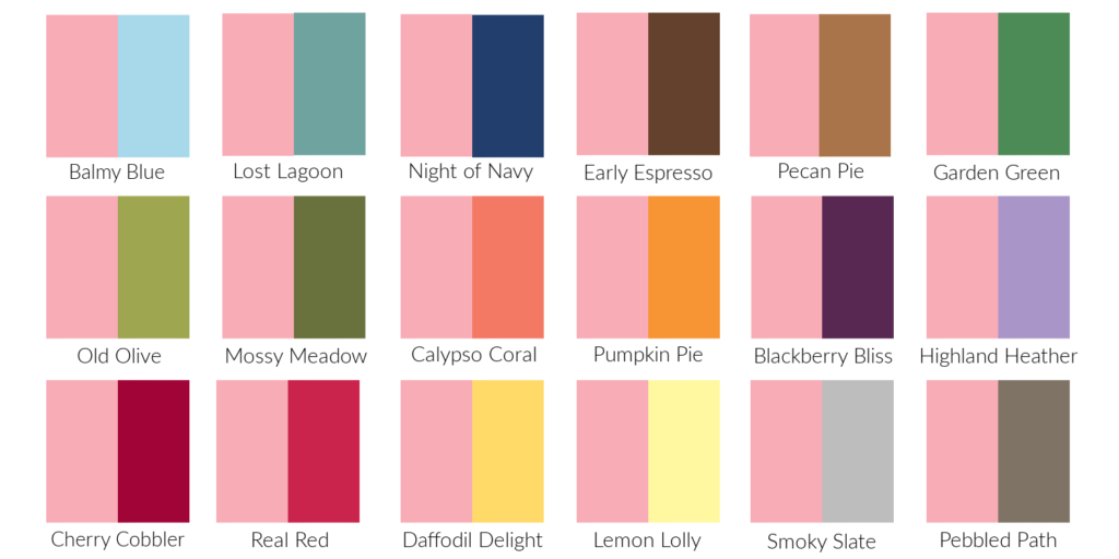
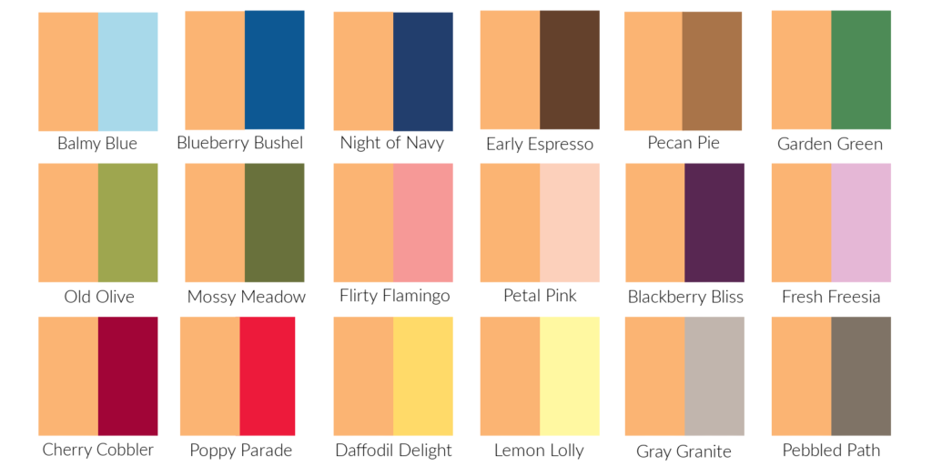
Pretty In Pink is the exact same color now as it was way back when. It’s a lovely soft pink. In this first photo you can see how it compares to some of the other Stampin’ Up! pinks.
In this second photo it’s compared with some of the other Stampin’ Up! colors. I like it with most of the other colors except Calypso Coral and Pumpkin Pie. What do you think?
The last photo shows the color combinations from Stampin’ Up!’s Color Coach. My least favorite combination is the middle one with Lemon Lolly and Petal Pink. My favorite combination is the last one with Coastal Cabana and Lost Lagoon.
Are you excited that Stampin’ Up! has brought back Pretty in Pink? I am! It’s the perfect addition to their color family…and it’s PINK! Have a great day. Take care and Happy Stamping!
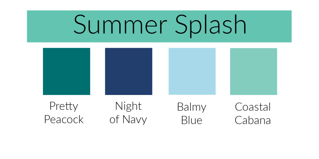
This week in our Journey With Color I will be talking about Summer Splash. The name says it all. When I look at this color, or even just say the name, I can picture myself sitting by a pool or on the beach in the tropics with an umbrella drink. (Why would I be in the tropics without an umbrella drink! Ha!) There’s also a soft warm breeze and plenty of shade. What do you imagine when you see this color or say the name?
Summer Splash is a beautiful soft blue green just a little deeper than Stampin’ Up!’s current Coastal Cabana. In the photo above you can see how it compares with some of the other blues in Stampin’ Up!’s color collection. I like it best with the blues that have a little green in them.
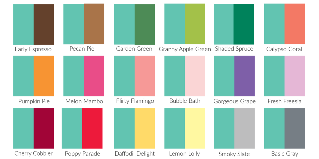
This second photo compares Summer Splash with other Stampin’ Up! colors. It looks pretty good with most of them. I’m not sure which colors I like it with best. How about you?
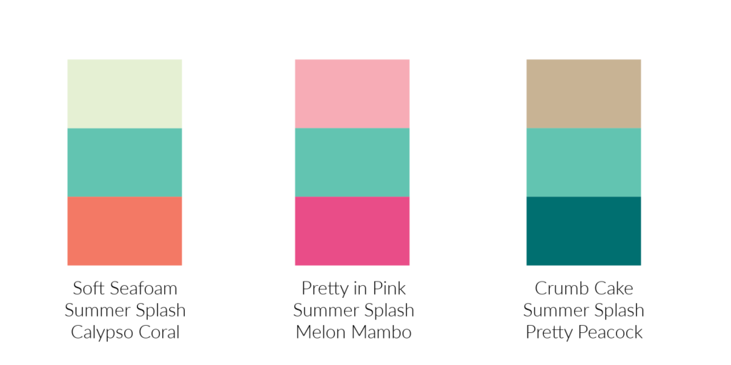
This last photo is the color combinations that Stampin’ Up! artists came up with. What do you think of them? The middle combination caught my eye first but that’s probably because it has my favorite color, Melon Mambo, in it. When I took another look, I really liked the last combination with Crumb Cake and Pretty Peacock. It’s so striking! Which combination is your favorite?
I hope you’re enjoying our Journey With Color. Have a great day. Take care and Happy Stamping!
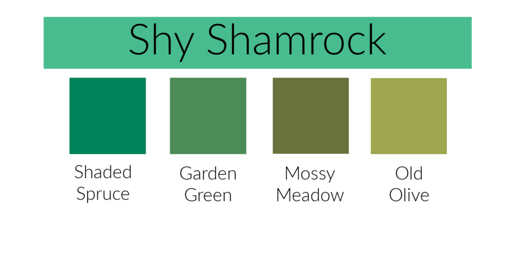
Shy Shamrock is a beautiful, soft green. It reminds me a little of the past In-Color Just Jade. Here in the first photo, you can see how Shy Shamrock compares to a few of Stampin’ Up!’s other greens. It works best with greens that have a bit more blue in them like Shaded Spruce.
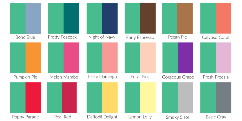
In this second photo you can see how Shy Shamrock works with other Stampin’ Up! colors. I know it works perfectly with the other 2024-2026 In-Colors which are more on the pastel side but when looking at this chart I think I like it best with the darker, brighter colors like Pretty Peacock, Night of Navy and Melon Mambo.
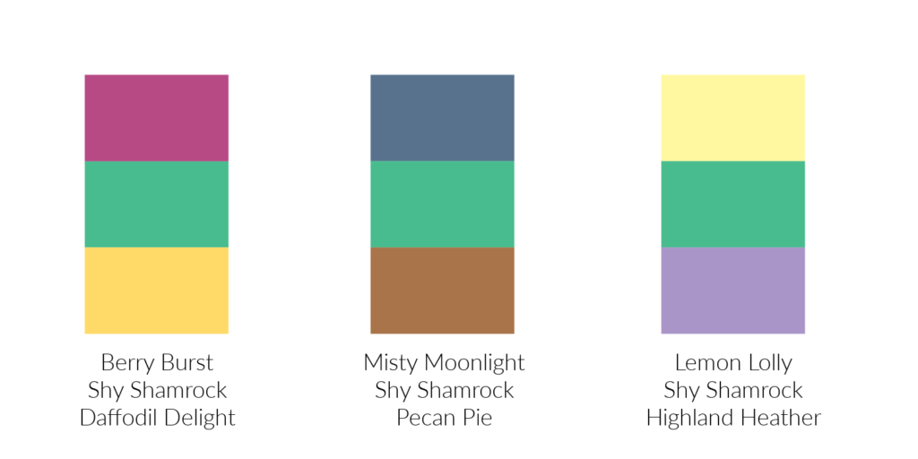
This last picture shows that color combinations that Stampin’ Up! has shared in their Color Coach. I can see myself using any of these combinations. The first one is probably my favorite because of the brighter colors (and Melon Mambo is one of my favorite colors!). Which of the combinations is your favorite?
Last year in my Journey With Color when I shared new colors with you I included color combinations from Stampin’ Up!’s Color Coach. I completely missed those color combinations with the new In-Colors Peach Fuzz and Petunia Pop that I shared with you the past two weeks. Now I need to catch up!
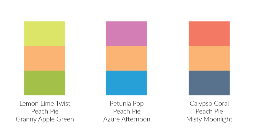
Check out these fun combinations with Peach Fuzz. I can’t decide which one is my favorite. The first combination with the two bright greens catches my eye, but if I were designing a project, I think I would go for the third combination with Calypso Coral and Misty Moonlight. I would call it the “safe” combination for people like me who are a bit “color shy”.
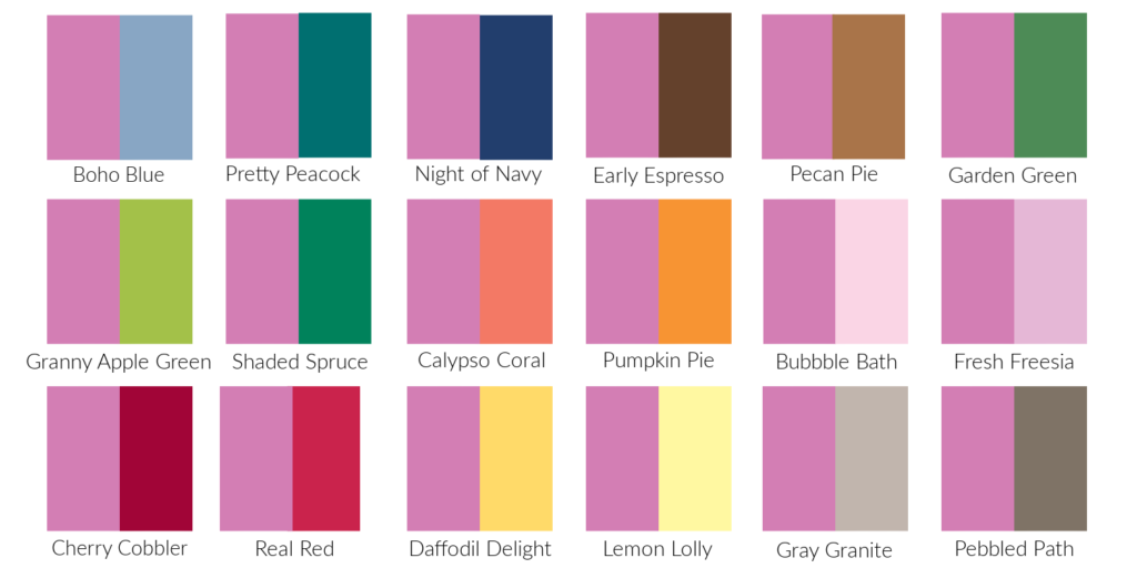
What do you think about these combinations for Petunia Pop? Once again I am going to go with choice #3. Not only does the combination catch my eye but it’s the one I’d most likely use on a card. Although, option #1 is nice too. The more I look at them though, the middle one says “flowers” to me. You have the pink petals, the yellow center and the green leaves. I guess with these combinations it all comes down to what you are stamping with the colors.
I love seeing the different color combinations that Stampin’ Up! comes up with. They definitely help me see “outside the box”.
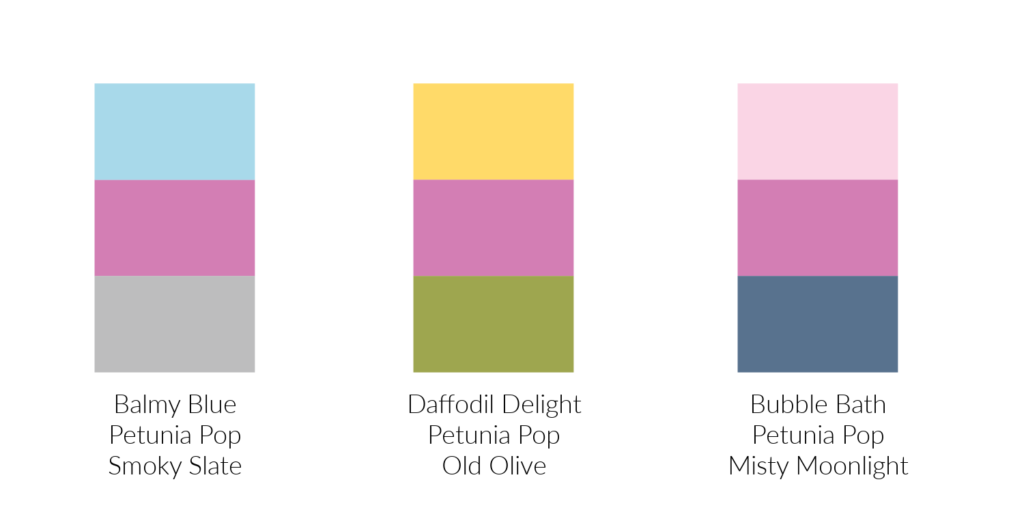
Yesterday in my newsletter, I shared a card with you, and I used this new color, Petunia Pop. All the new 2024-2026 In-Colors are pretty, but Petunia Pop is definitely my favorite. Is it pink? Is it purple? I had a hard time deciding so I compared it to both color families here in this first photo.
I store my ink pads and cardstock by color group (pinks, reds, blues, etc.). It was a difficult decision, but I finally decided that Petunia Pop belonged in the purple family. Do you agree?
In the photo below you can see how Petunia Pop looks with some of Stampin’ Up!’s other colors. Of the combinations I’ve shared, I think my favorites are when Petunia Pop is paired with Pretty Peacock, Navy Blue, Bubble Bath and Fresh Freesia. From this comparison chart you can see that it has a lot of blue in it as it works well with other colors with a lot of blue.
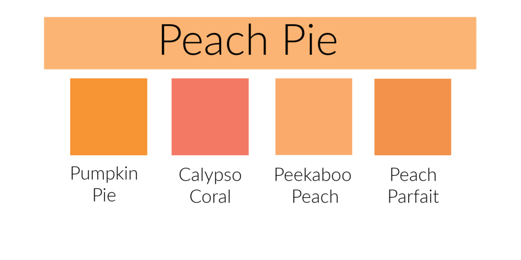
When Stampin’ Up! comes up with their new In-Colors each year they not only look for colors that will coordinate with current Stampin’ Up! colors, they also try to choose relevant colors that will be popular in today’s world. Did you know that the 2024 Pantone Color of the Year is called Peach Fuzz? Stampin’ Up! got it right when they added Peach Pie to this year’s In-Colors.
Stampin’ Up! has had a number of peach colors in past line-ups include Peach Parfait and Peekaboo Peach, as well as similar colors like Grapefruit Grove and Crisp Canteloupe. As you can see from the attached color comparison, Peach Pie is very similar to Peekaboo Peach, just a bit lighter. It works really well with the current Stampin’ Up! colors. A lighter orange color was definitely needed. Peach Pie will be fun to work with.
In the photo below you can see how Peach Pie works with other Stampin’ Up! colors. I think it will go well with most any of the blues and greens, although I like it best with the darker shades. Personally, I don’t like it with any of the yellows or reds but I sure someone else with use it with some of those colors and it will be gorgeous. Which colors do you like Peach Pie best with?
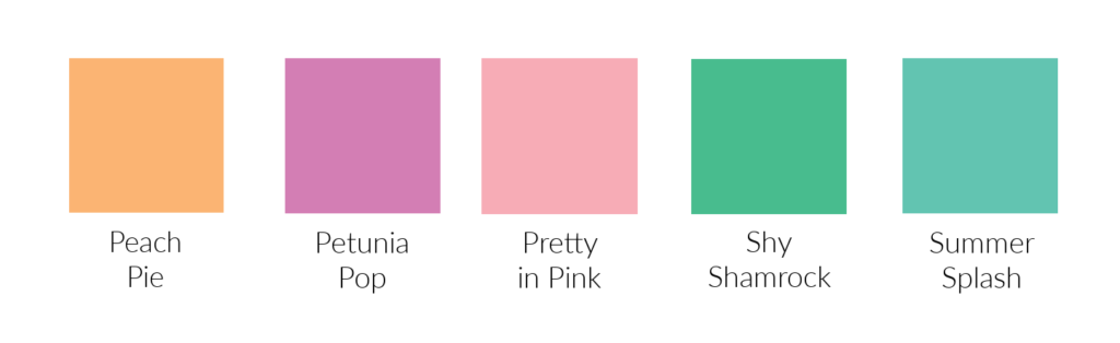
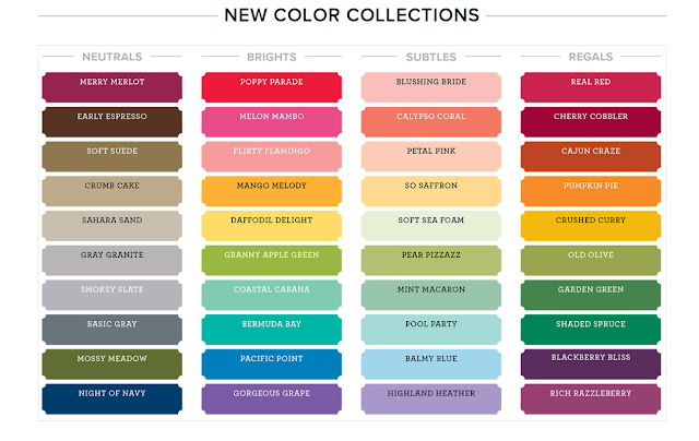
I’m so excited to get back to our Journey With Color. This week I want to introduce you to Stampin’ Up!’s new 2024-2026 In-Colors! These five colors are all soft and pastel-like. They would fit perfectly in Stampin’ Up!’s Subtle family of colors. They are beautiful!
Below you will find a brief description of each color. I will go into more details about these colors in the upcoming weeks.
Peach Pie is a nice soft orange/peach color.
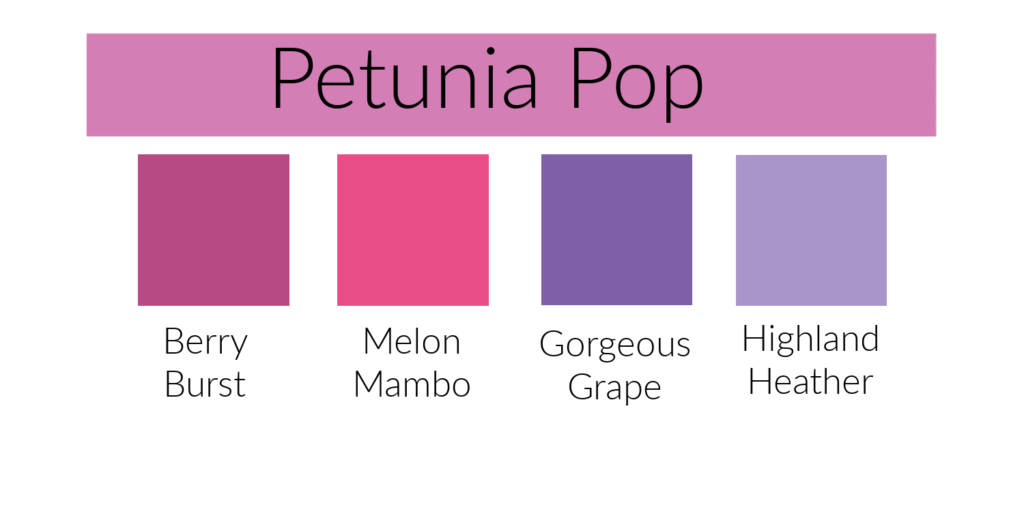
Petunia Pop is a beautiful pinkish purple.
Pretty in Pink is a lovely “baby pink” color.
Shy Shamrock is a soft, lighter green.
Summer Splash is a light blue in the turquoise family.
These are all great additions to Stampin’ Up!’s color spectrum. I can’t wait to play with them!
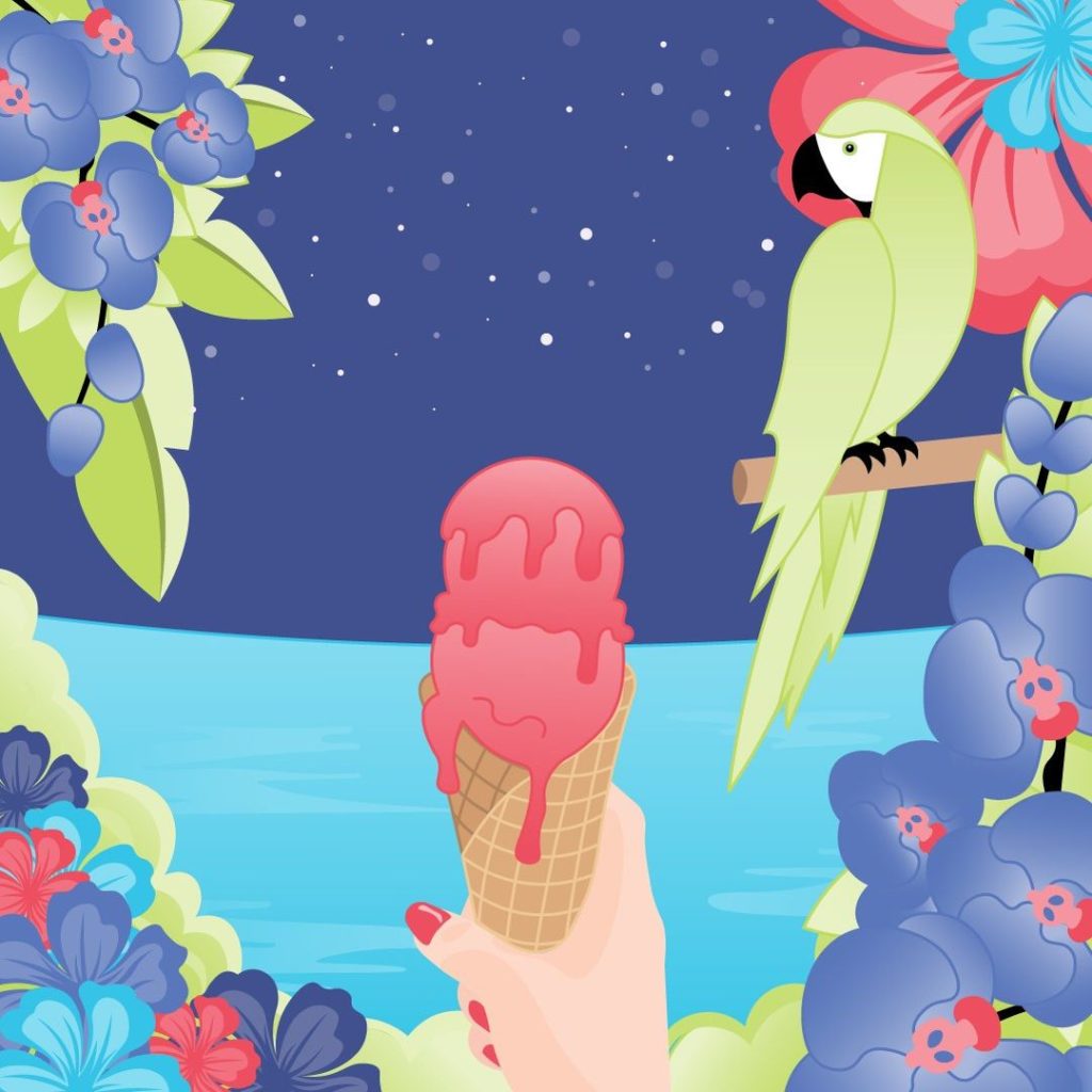
Stampin’ Up!’s new 2022-2024 In Colors are perfect for creating a Tropical Oasis! They are gorgeous and I love them all!
A little over a week ago, Stampin’ Up! created riddles for us to guess the names and the colors. Each morning for five days they posted a riddle and a photo in gray tones in our Demonstrator Planning Place on Facebook. In the evening of each day they then colored the picture like you see below and told us the name. It was fun to try to guess what color it was going to be as well as the name. I enjoyed seeing all the different guesses people came up with. Some of them were pretty funny.
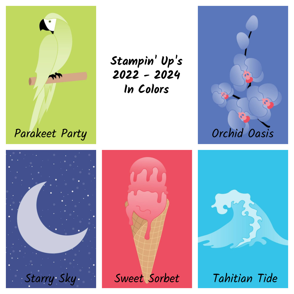
Stampin’ Up!’s 2022-2024 In Colors
Parakeet Party “Don’t let my feathers fool you—I’m a social butterfly! Bright, bold, and beautiful is my motto. This is one bird who doesn’t have time for siestas, but that’s because me gusta la fiesta! Who am I?”
Isn’t this a pretty green?
Sweet Sorbet
“I’m a delicious treat on the tip of your tongue. Creamy yet dairy-free is the life for me. Strawberries, watermelon, raspberries, oh my! Just blend a little fruit juice, water, and sugar for a frozen surprise. What’s my name?”
Pink! Woo Hoo! I love my pinks!
Tahitian Tide
“I rise and fall with the sun and the moon. I’m a fun splash mid-afternoon. If you’re looking for a slice of paradise and that tropical aura, then I recommend a sweet escape to Bora Bora! Can you guess my name?”
Stampin’ Up! hasn’t had a turquoise color in a long time!
Starry Sky
“Like billions of fireflies shining so bright we work together to light up the night. Connect us together and we make up dazzling constellations. Shared with someone you love we’re quite the romantic destination. Who am I?”
Such a pretty blue!
Orchid Oasis
“I bloom in perfect symmetry. Elegant, fragrant, vibrant—I’m a flower fit for royalty. Together we can celebrate friendships, new beginnings, and affection. Think of me as your wellspring of tranquility and personal connection. What’s my name?”
This is almost a Periwinkle Blue. If you follow the Pantone colors of the year, this is spot on! This year’s color is called Very Peri and it’s pretty darn close to this!
So what do you think of Stampin’ Up!’s newest colors? I love the way these colors all coordinate together. Do you like them as much as I do? I can’t wait to get my hands on them! Then the fun will begin!
With so many colors and so many shades of colors sometimes it’s hard to know where to begin. Most of the time you have an idea of the basic color(s) you want to use on a card but how do you choose a shade of that color?
Currently, Stampin’ Up! has 11 different greens for us to choose from! Green wins the prize for the most shades. Check out the chart I made. You can see how the greens go from a very soft and light Soft Seafoam to the deep and rich Evening Evergreen. We all have our favorites. The greens that I probably use most often are Pear Pizzazz and Old Olive, although it depends on the project. If I was going to pick a favorite green it would have to be Evening Evergreen. A chart like this make it easy to see all of the greens together so you could maybe try a new shade.
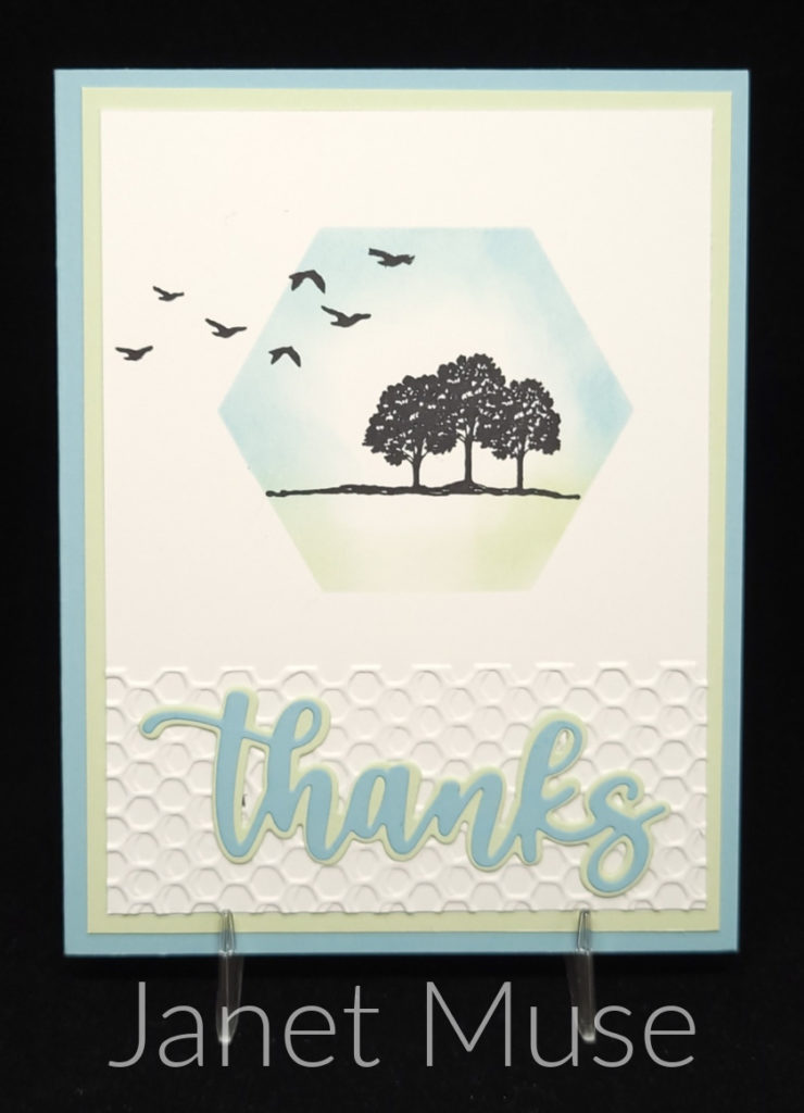
Check out the lovely card that my friend Janet made. She used Soft Sea Foam along with Balmy Blue. Personally, I don’t care for Soft Seafoam, but it really works on this card. I get a nice, relaxed feeling when I look at it which is probably what Janet was going for when she chose these two colors to go with her stamped images. If I recreated this card and went with my go-to green of Pear Pizzazz it wouldn’t have worked nearly as well. You just wouldn’t have that same relaxed feeling.
Different colors and different shades of colors are going to give you different feelings. As I mentioned, the soft colors of Janet’s card make me feel relaxed and peaceful. If I tried making this card with Granny Apple Green which is a fun, bright, in-your-face color it definitely wouldn’t make you feel relaxed. Bright colors give you more of a happy and excited feeling. They would be better suited for a birthday card or something like that.
When you’re choosing a color or shade of color you also want to think about how it’s being used on your project. Are you using a certain ink color to stamp an image or are you using a blending brush to apply the ink color on cardstock? Are you just using the colored cardstock for layers? These questions are important to think about when choosing the right color/shade for your project.
In a previous paragraph I mentioned that my go-to light green, Pear Pizzazz, probably wouldn’t have worked on Janet’s card. I’d like to change that thought up a bit. If I recreated Janet’s card as is, Pear Pizzaz wouldn’t have worked. If I changed up the card so that I didn’t use any Pear Pizzazz cardstock on the card and just used it on the focal point it might work. I’d be able to blend the Pear Pizzazz lightly enough with my Blending Brush to get that same soft look. Sometimes you have to experiment and see what’s actually going to work for your project.
Stampin’ Up! has so many choices of greens for our projects. Don’t always head for your favorites. You may even see me using Soft Seafoam on one of my upcoming projects! Give those other shades a try. Think about the feeling you’re trying to project. Stampin’ Up! already does this for us with their Designer Papers. Check out some of the papers and see what kind of feelings you get.
Color and combinations of color are powerful. Think about the feeling you want your card to project before choosing your colors.
Today in our Journey With Color we finish up Stampin’ Up!’s history of color. Hasn’t it been fun seeing where the color collections began and how they got to where they are today?
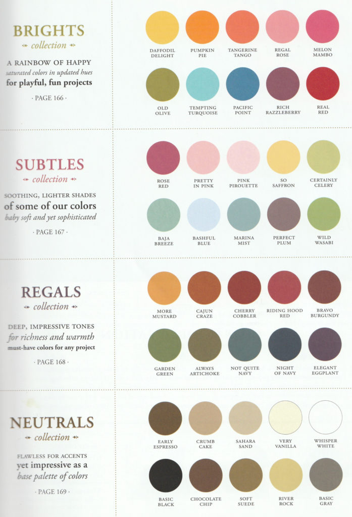
The last and most recent color change that Stampin’ Up! had was in their 2018-2019 Annual Catalog. If you know your Stampin’ Up! colors, you can see in the photo Stampin’ Up!’s current colors. The only thing that this photo doesn’t show is that Stampin’ Up! added a new group called Basics. This group consists of Whisper White (now Basic White), Very Vanilla and Basic Black.
Stampin’ Up!’s 2018-2019 Color Change
I’ve summarized the changes to each of the four color groups below. You can compare it to the previous color groups here.
Neutrals: Whisper White, Very Vanilla and Basic Black moved to Basics Group. Chocolate Chip was retired. Night of Navy was moved from the Regals group. Merry Merlot and Mossy Meadow were added.
Brights: Real Red, Pumpkin Pie, Rich Razzleberry and Old Olive were moved to the Regals group. Tangerine Tango and Tempting Turquoise were retired, and Poppy Parade, Flirty Flamingo, Mango Melody, Granny Apple Green, Coastal Cabana and Gorgeous Grape were added.
Regals: Rose Red, Always Artichoke, Island Indigo, Elegant Eggplant and Perfect Plum were retired. Night of Navy moved to the Neutrals group. Real Red, Pumpkin Pie, Rich Razzleberry and Old Olive were added from the Brights Group. Shade Spruce and Blackberry Bliss were added.
Subtles: Pink Pirouette, Wild Wasabi, Soft Sky, Marina Mist and Wisteria Wonder were retired. Petal Pink, Soft Seafoam, Mint Macaron, Balmy Blue and Highland Heather were added.
If you’ve been following this Journey With Color since the beginning, you will notice that many of the new colors that were added to Stampin’ Up!’s color collection were former In Colors. It’s nice when some of your favorites make the cut! 😊
Color changes can be fun even though some of us don’t always do well with it. I wonder when the next one will be?
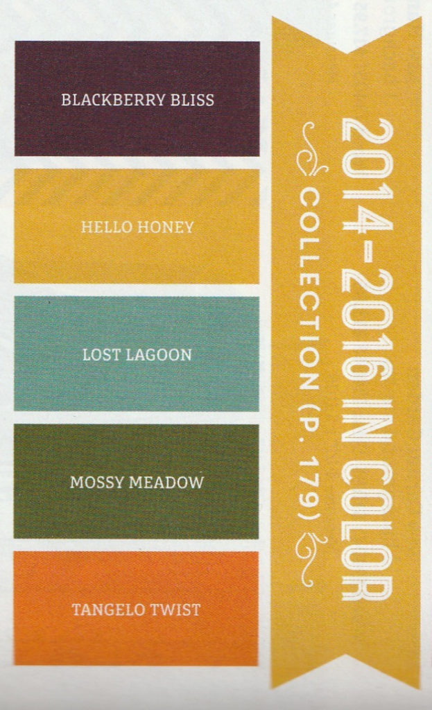
This week in our Journey With Color, we’re going to finish up with the history of Stampin’ Up! In Colors. Next week I’ll share the most recent change to Stampin’ Up!’s line of colors and then we’ll move on.
When In Colors were first introduced, they only had a life span of 1 year. Starting with the major color overhaul in the 2010-2011 catalog In Colors now have a life span of 2 years.
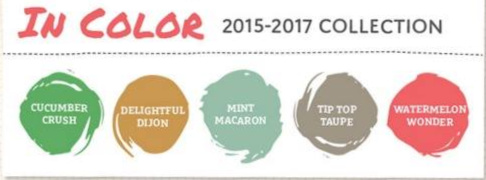
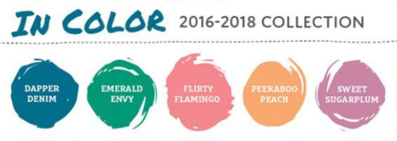
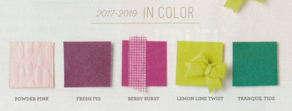
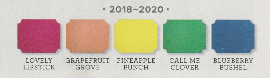
Below you can see photos of the In Colors from 2014-2016 to the current ones.
In Colors 2021-2023
Wow! So many colors! Which group is your favorite? Which is your least favorite?
Of these groups, I have to admit that I didn’t care for the 2015-2017 collection. The only color I really liked in this group was Watermelon Wonder.
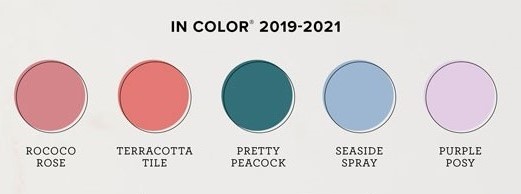
When talking favorites the current 2021-2023 In Colors and the 2017-2019 colors are pretty darn close with the win going to 2021-2023.
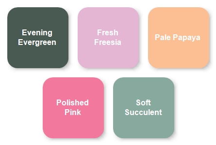
Now, if you want to get into individual favorites, I can’t narrow it down to just a few so I’ll give you a list: Berry Burst, Tranquil Tide, Pretty Peacock, Evening Evergreen and Polished Pink!
I do love that Stampin’ Up! gives us fresh new colors each year and that they stick around for two years so that we can have time to play with them. What is your opinion of In Colors?
After the major overhaul to Stampin’ Up!’s colors that I shared with you last week, there were a few years that only included changes to In Colors. Starting during the major overhaul, In Colors would now have a lifespan of 2 years and only 5 would be introduced each year.
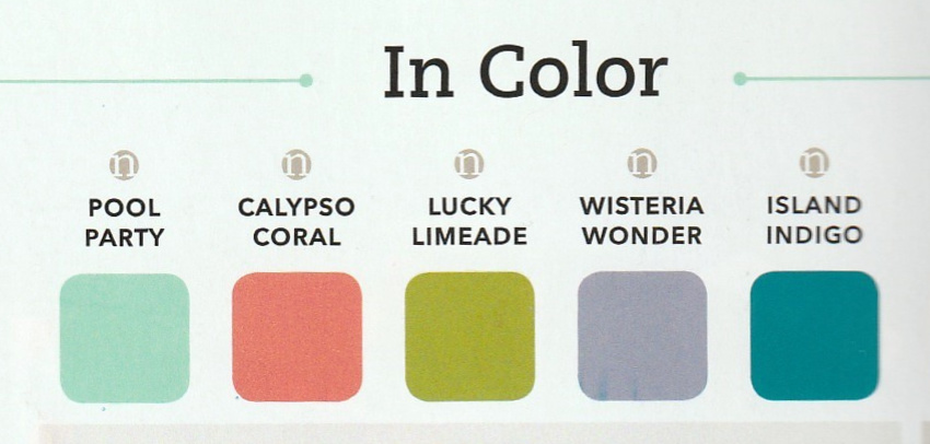
The 2011-2012 catalog introduced the 2011-2013 In Colors which were Pool Party, Calypso Coral, Lucky Limeade, Wisteria Wonder and Island Indigo. By adding these five colors and including the five In Colors that were introduced the previous year, there were now a total of 10 In Colors in the 2011-2012 Catalog bring the total number of Stampin’ Up! colors to 50. My favorites in this group of In colors were Pool Party and Island Indigo.
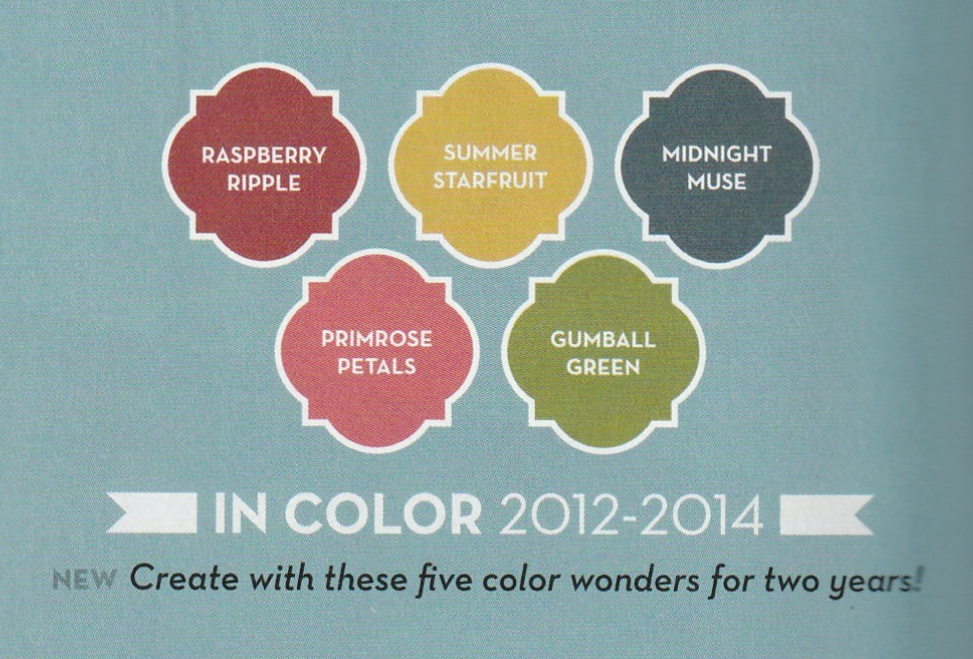
In the 2012-2013 Annual Catalog the 2010-2012 In Colors were retired and the 2012-2014 In Colors were introduced. They were Gumball Green, Midnight Muse, Primrose Petals, Raspberry Ripple and Summer Starfruit. My favorite colors in this group of In Colors were Midnight Muse and Raspberry Ripple.
Stampin’ Up! Colors 2013-2014
It was time for a small color change with the 2013-2014 Annual Catalog. Some colors switched color families, some colors were added and some were retired. Many of the names of the new colors may sound familiar as they were former In Colors. Below you can find the changes by color family.
Neutrals: River Rock was retired and Smoky Slate was added
Brights: Regal Rose was retired and Bermuda Bay was added.
Regals: More Mustard, Bravo Burgundy, Riding Hood Red and Not Quite Navy left. Perfect Plum and Rose Red moved over from the Subtles color family.
Subtles: Pretty in Pink, Certainly Celery, Baja Breeze and Bashful Blue were retired. Perfect Plum and Rose Red moved to the Regals family. Pear Pizzazz, Soft Sky, Pool Party, Wisteria Wonder, Calypso Coral and Blushing Bride were added.
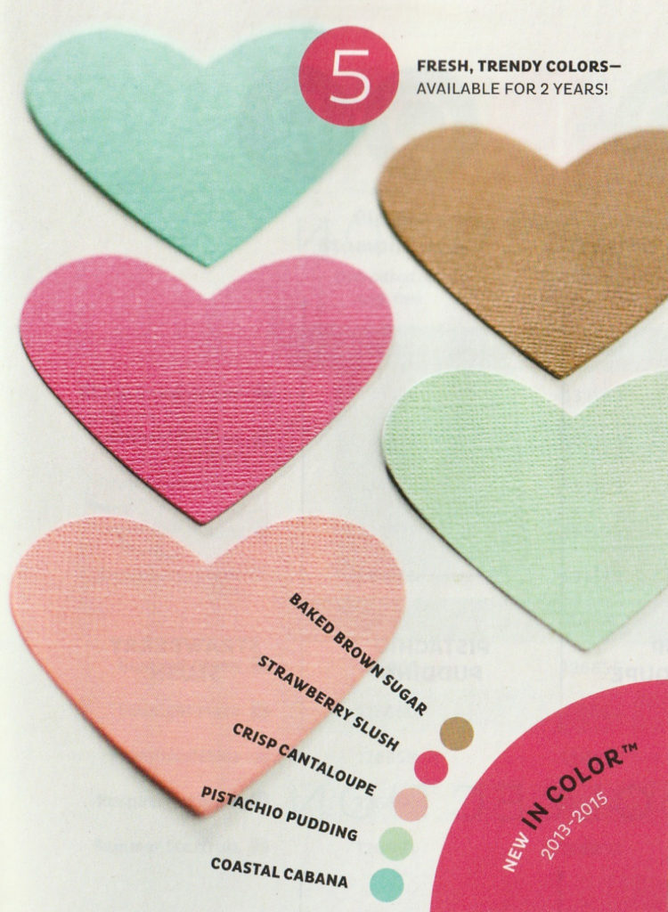
The new In Colors for 2013-2015 were Baked Brown Sugar, Coastal Cabana, Crisp Cantaloupe, Pistachio Pudding, Strawberry Slush. You’ve probably already guess that one of my favorite In Colors of this bunch was Strawberry Slush since it was PINK! The other color I liked best of this group was Coastal Cabana.
I hope you’re enjoying this history of Stampin’ Up! color. It’s kind of fun to see how the colors and the color families have evolved.
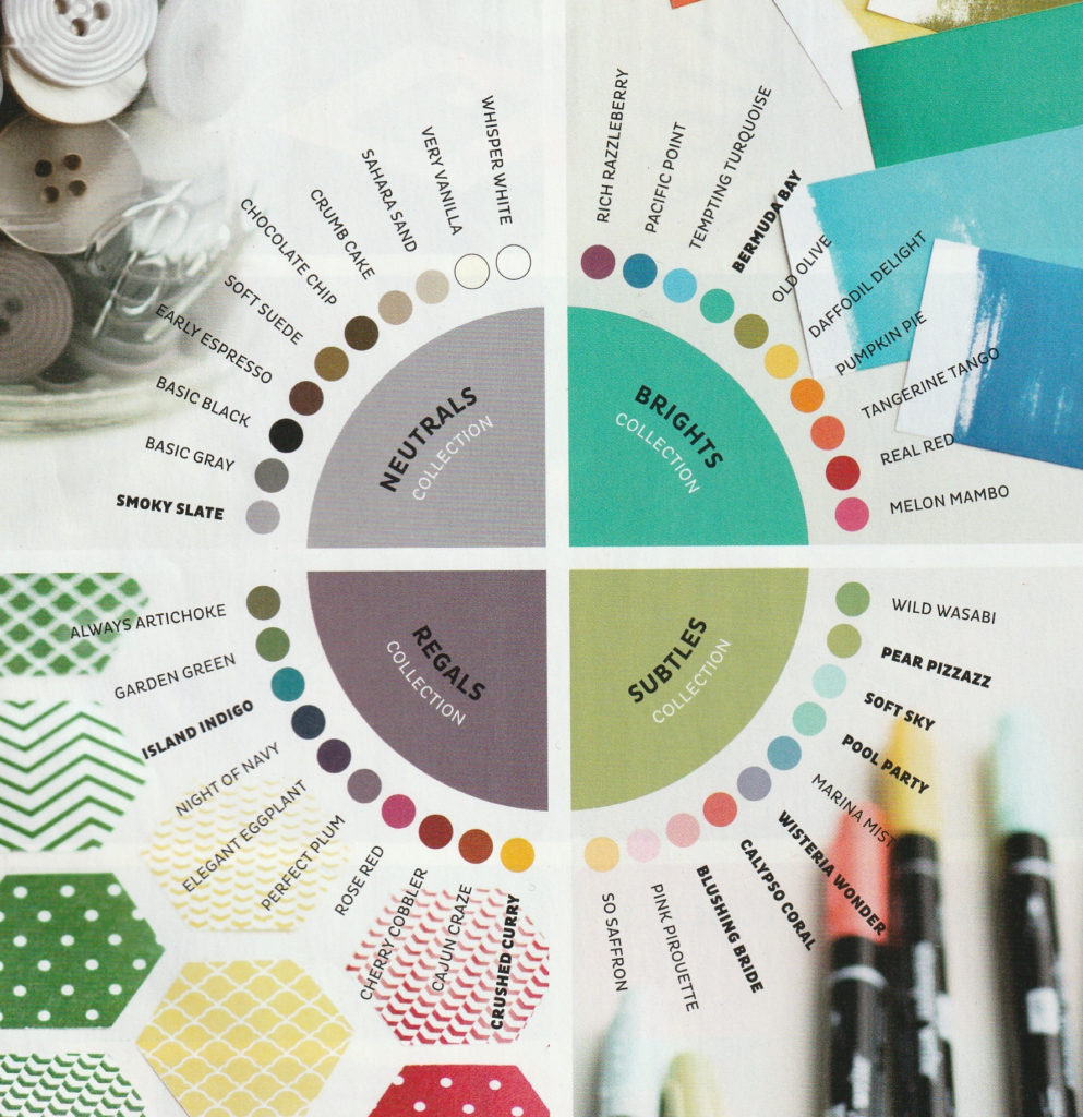
Wow! This week in our Journey With Color we’ll be talking about a major overhaul to Stampin’ Up! colors. With their 2010 – 2011 Catalog, Stampin’ Up! not only changed up the colors but they also changed the names of the color groups as well as the number of colors in each group.
The last big change to Stampin’ Up! colors was back in the 2005-2006 Catalog. This change is even bigger. It starts with the color groups themselves. The names were change and the number of colors in each group went from 12 down to 10. Bold Brights became Brights. Rich Regals became Regals. Soft Subtles became Subtles and Earth Elements was combined with Neutrals to become the Neutrals group.
Stampin’ Up! Colors 2010-2011
In this chart you can see the four new color families and the colors included in them. I like Stampin’ Up!’s short description of the new color families that includes what type of projects they’d be good for.
Overall, Stampin’ Up! moved 8 colors from one color family to another, got rid of 31 colors and added 16 new colors. Of the 16 new colors 10 of them were former In Colors so only 6 of the colors were ones we’ve never seen. The brand new colors (not former In Colors) were Daffodil Delight, Marina Mist, Cajun Craze, Cherry Cobbler, Early Espresso and Crumb Cake.
There was also a change to In colors with this catalog. The first change was that they only introduced five In Colors instead of six. The second change to In Colors was that they would now have a life span of two years instead of just one. This will bring the total number of colors available in any given year to 50. Forty core colors and ten In Colors, except for this 2010-2011 catalog which only has five In Colors.
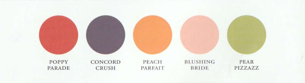
In Colors 2010-1012
The first five In Colors with a two year span were Poppy Parade, Concord Crush, Peach Parfait, Blushing Bride and Pear Pizzazz. Of these colors, my favorite was probably Concord Crush. It was a gorgeous deep purple. Which one of these five colors is/was your favorite?
Last week, our introduction to Journey With Color was about the beginning of Stampin’ Up! colors which didn’t happen until their 1997-1998 catalog. This week’s step of the journey will be about the first changes that Stampin’ Up! made to their color collection.
There were two small changes made Stampin’ Up!’s color collection in their 2000-2001 catalog. The first one was replacing Rocket Red for Real Red (which is still with us today!). I don’t remember Rocket Red but from the old catalogs I’ve looked at it was a bit brighter and not as deep of a color. The second change in this catalog was removing Lucious Lime for Creamy Caramel. They were pretty short on shades of brown in their catalogs back then and had quite a few greens.
The Neutrals grouping of colors first showed up in a Stampin’ Up! catalog in the 2004-2005 edition. It included White, Vanilla and the new Basic Brown.
To keep current in the world of color Stampin’ Up! made a big color change in their 2005-2006 Catalog. Stampin’ Up! is all about stamps, ink and paper and color is a big part of these items. It was important for them to keep the colors fresh. The 2005-2006 catalog saw 9 colors retired and 12 colors added as well as some switching of colors from one grouping to another. Below is a little summary of these changes.
Brights
There was only one little change made in this color group. Positively Pink was exchanged for Pixie Pink, a slightly bolder and brighter shade.
Earth Elements
Going Gray and Basic Black were moved from this group to the newer Neutrals group. Not Quite Navy moved from the Rich Regals group to this group and the new color Pumpkin Pie was added.
Rich Regals
The most changes happened to this group. I’ve already mentioned that Not Quite Navy left this group for the Earth Elements. The colors that were retired from this group were Eggplant Envy, Forest Foliage, Baroque Burgundy, Rose Romance and Marvelous Magenta. This left room for the new colors Handsome Hunter, Always Artichoke, So Saffron, Regal Rose, Bravo Burgundy and Elegant Eggplant.
Soft Subtles
Here three colors retired and three colors were added. Mauve Mist, Mint Melody and Bliss Blue left and Apricot Appeal, Certainly Celery and Bashful Blue were added.
Neutrals
This new group is where Going Gray and Basic Black were moved to. White and Vanilla got their new names of Whisper White and Very Vanilla. (You don’t want to lose that alliteration!). The new color Sahara Sand was added to the group.
I wanted to share a form with you that had all of these new colors on it but thought I might be easier just to send you to an electronic form of the catalog. This way the pages of the catalog have only been scanned once and you might get a better idea of what the colors actually looked like. So click here and then scroll down to pages 8 & 9 to view Stampin’ Up!’s colors with this change.
Which of these new colors is your favorite? Which color were you sad to see go? I’ll say that Pixie Pink was probably my favorite addition as I do love PINK! Forest Foliage was probably the color I most hated to see go. How about you?