
It’s time for a new step in our Journey of Color. We’ve talked about the history of Stampin’ Up! colors but now we need to figure out how best to use the colors that we have. Stampin’ Up! has 40 colors in their color palette not including the 10 current In Colors, Basic Black, Basic White and Very Vanilla.
Here’s the breakdown:
Reds: 4
Yellows: 4
Pinks: 4
Greens: 8
Purples: 4
Oranges: 2
Blues: 6
Grays: 3
Browns: 5
If you include the current In Colors you add 1 Yellow, 2 Pink, 3 Green, 1 Purple, 1 Orange, 1 Blue and 1 Brown. Green is definitely the most popular color in Stampin’ Up!’s color palette.
Now what? We need to figure out how to use the colors together. We all have our favorite color palettes and our go-to colors. How do we get out of that rut? How do we come up with fresh color combinations?
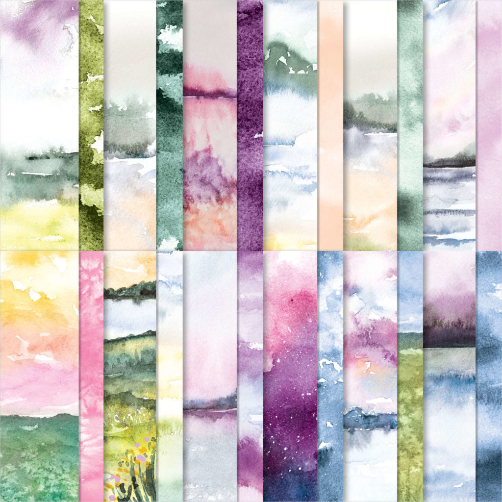
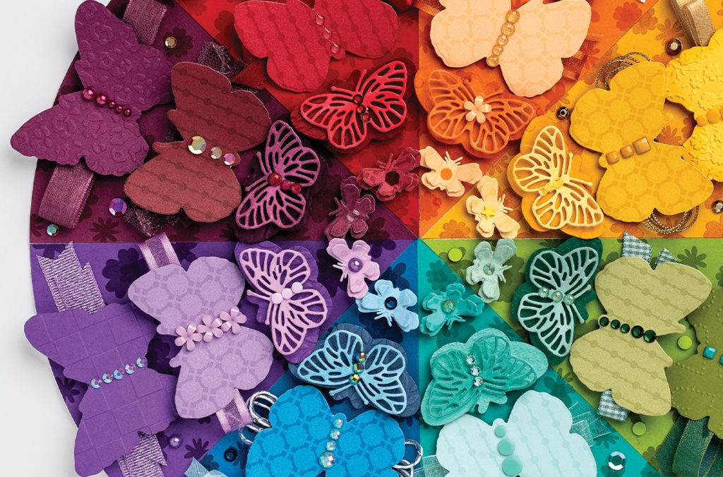
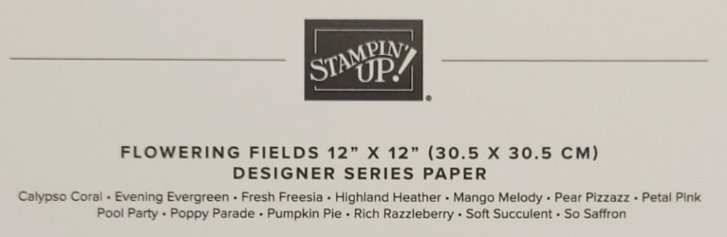
In their catalogs, Stampin’ Up! provides us with a quick and easy tool for combining colors: their designer paper! In their designer papers they come up with color combinations I would never think of and they’re gorgeous! Check out pages 130 through 134 in the Annual Catalog. This is where you can view all the papers and below each picture Stampin’ Up! lists the colors included in that package of paper! You can also see the colors included on the package of paper itself. I like creating cards with Stampin’ Up!’s designer papers because most of them coordinate with a stamp set or bundle. You know me, I love coordination!
Maybe you don’t like to use designer paper. Maybe you are more of a paper, ink and stamps type of person. You can still get your color combinations from designer paper but how can you come up with your own combinations?
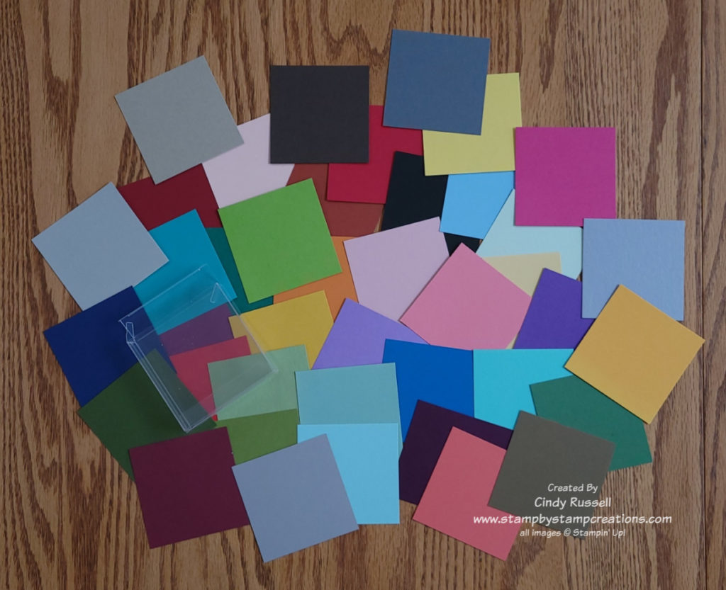
When I am creating, I use color swatches a lot. If I’m using designer paper on my project, I will check out the list of colors used on the papers and pull out a full sheet or scrap of those colors of cardstock. This way I can put the different colors together and see what combinations I like best. If I’m starting from scratch, I look at the stamp set or dies/punches that I’m working with. Let’s say I want to create a card with a pink flower on it. I would pull out some pink and green swatches of cardstock to see which combinations I like the best. Then, if I want to add a third or fourth color to my project I would pull out additional swatches.
Starting with designer paper and color swatches are the easiest methods of determining color combinations. When you use color swatches you will probably still start with your favorite combinations but if you have other colors to look at you may try something new. Give one of these methods a try next time you’re creating!
Have a great day! Take care and Happy Stamping!