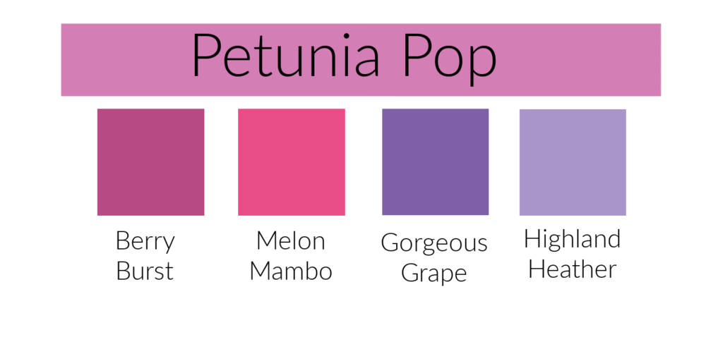
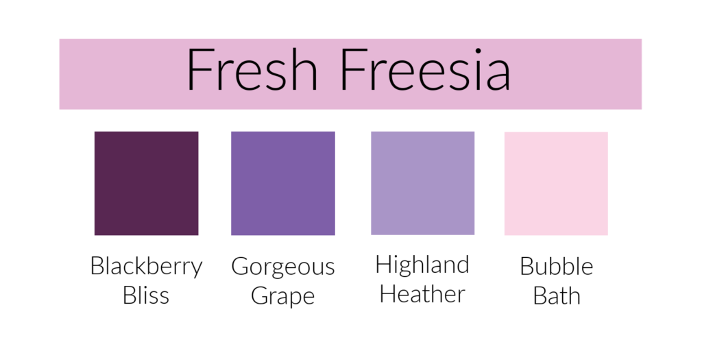
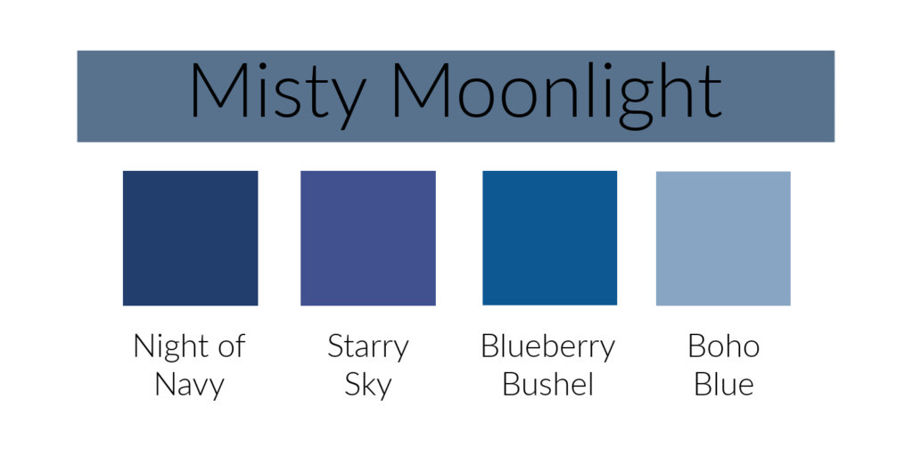
Pink. I love the color pink. When I first heard the names of the new In-Colors the name Pretty In Pink sounded quite familiar. Since I’ve been a demonstrator for 20 years it should. Pretty in Pink used to be a regular Stampin’ Up! color! No wonder it sounded familiar. I believe this is the first time that Stampin’ Up! has brought back a retired color (other than In-Colors).
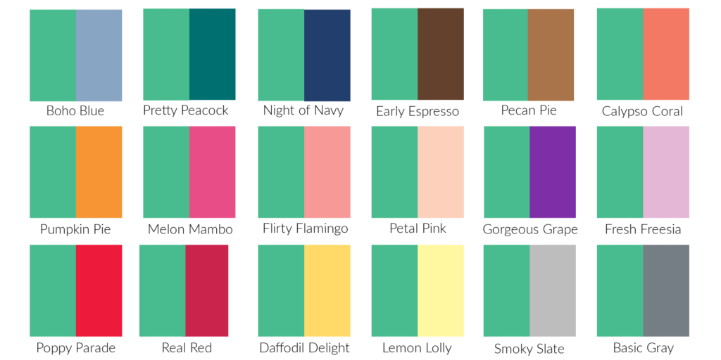
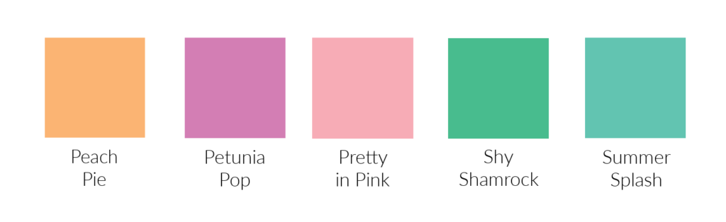
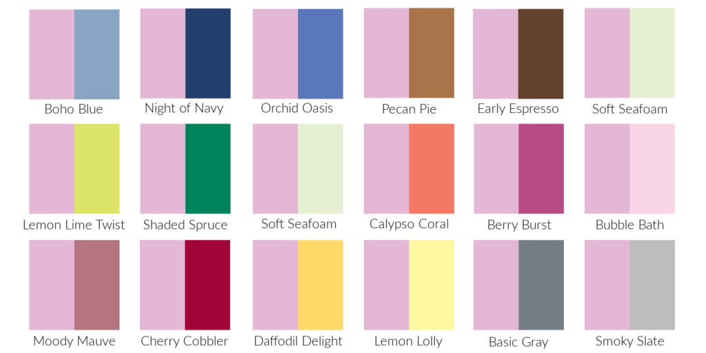
Pretty In Pink is the exact same color now as it was way back when. It’s a lovely soft pink. In this first photo you can see how it compares to some of the other Stampin’ Up! pinks.
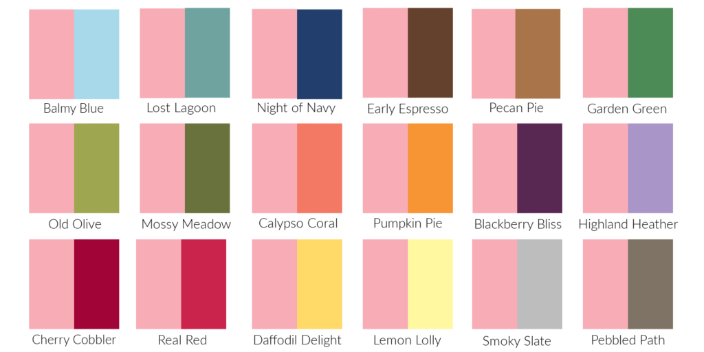
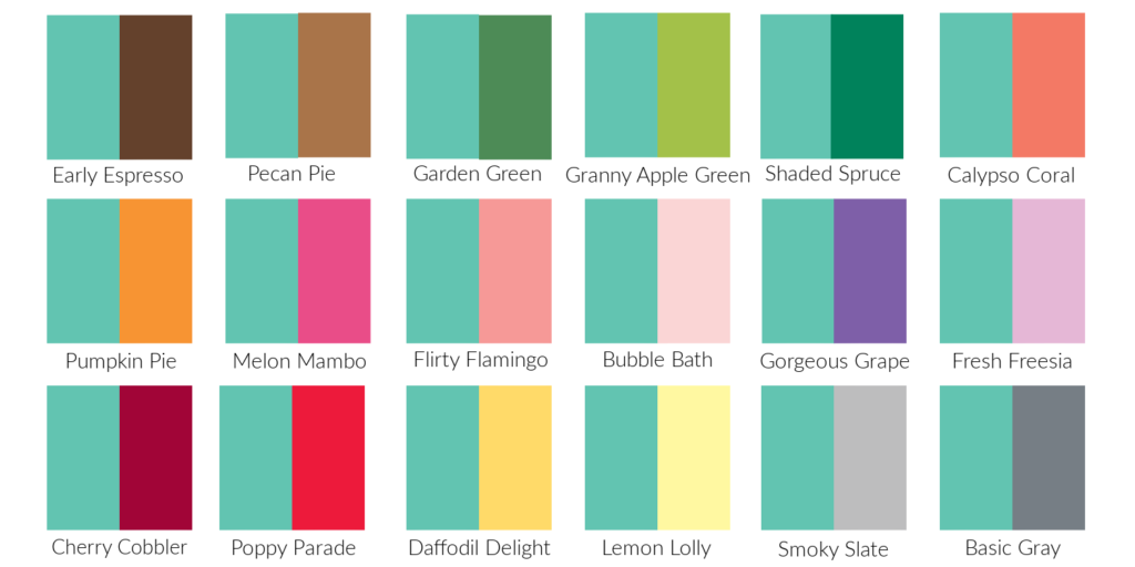
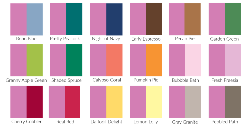
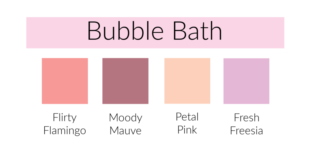
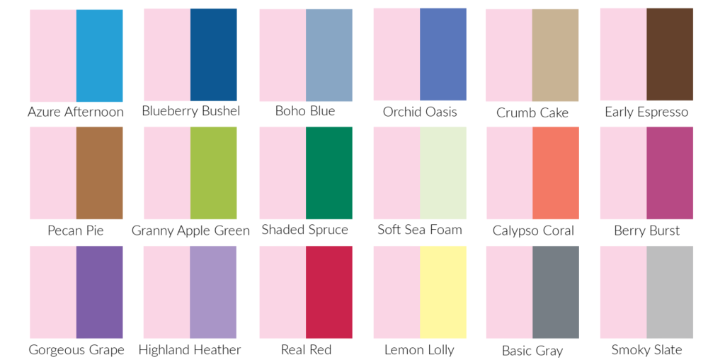
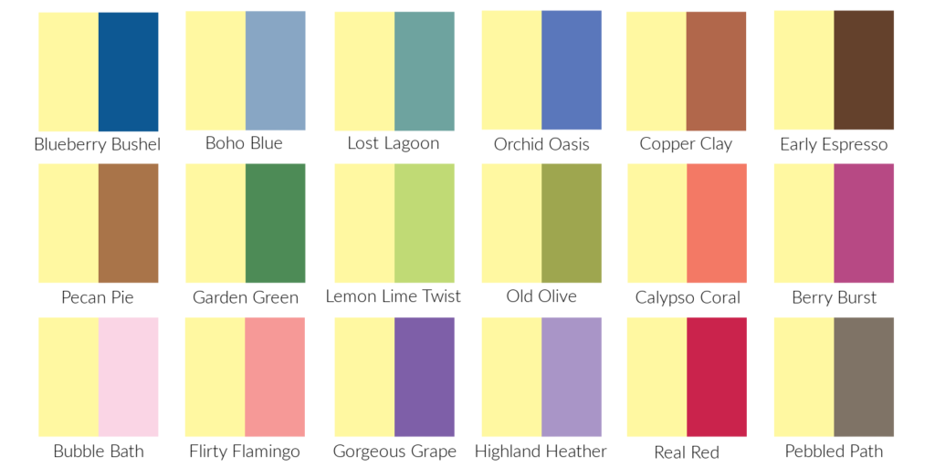
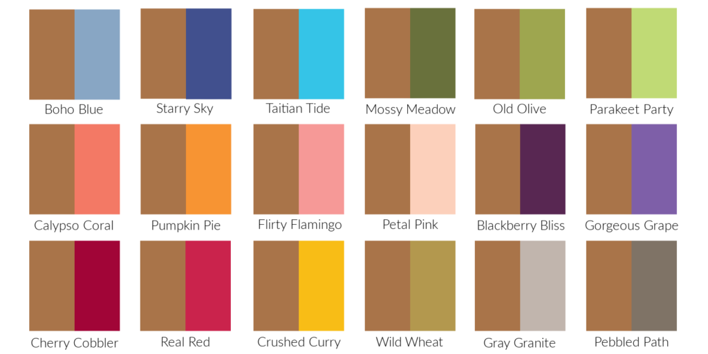
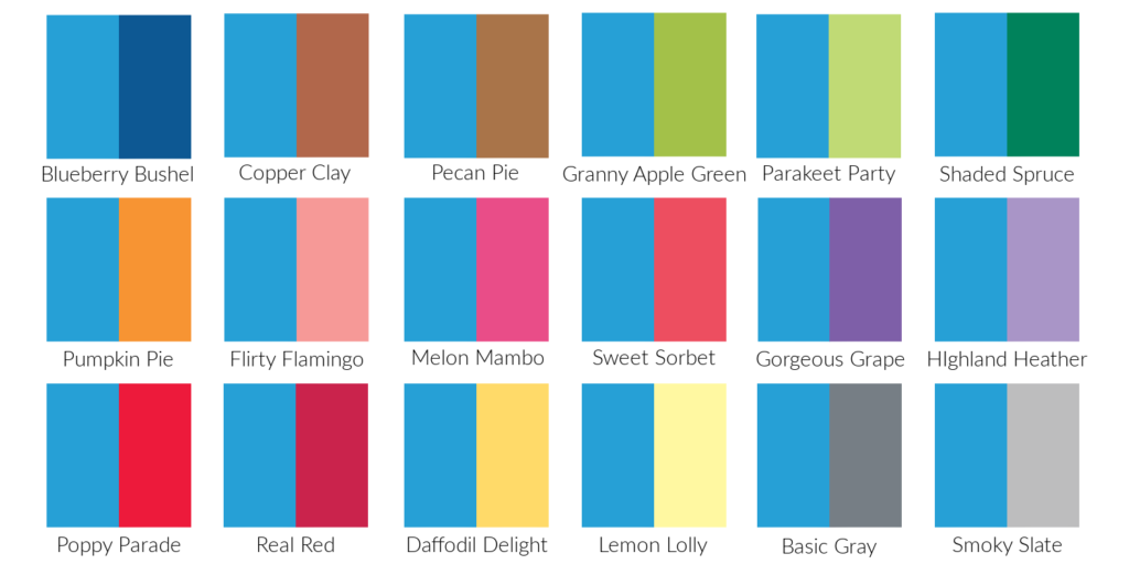
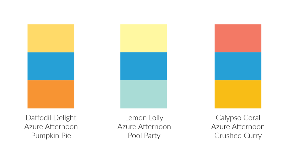
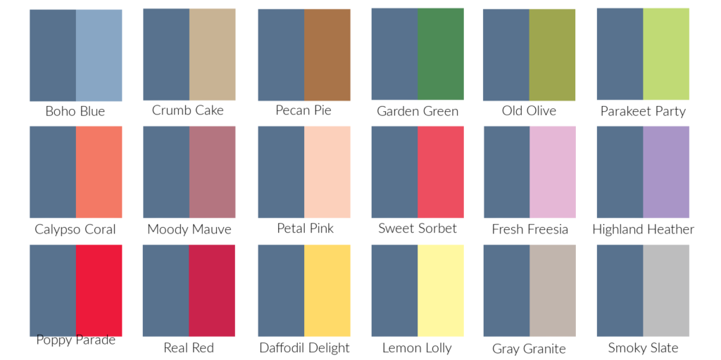
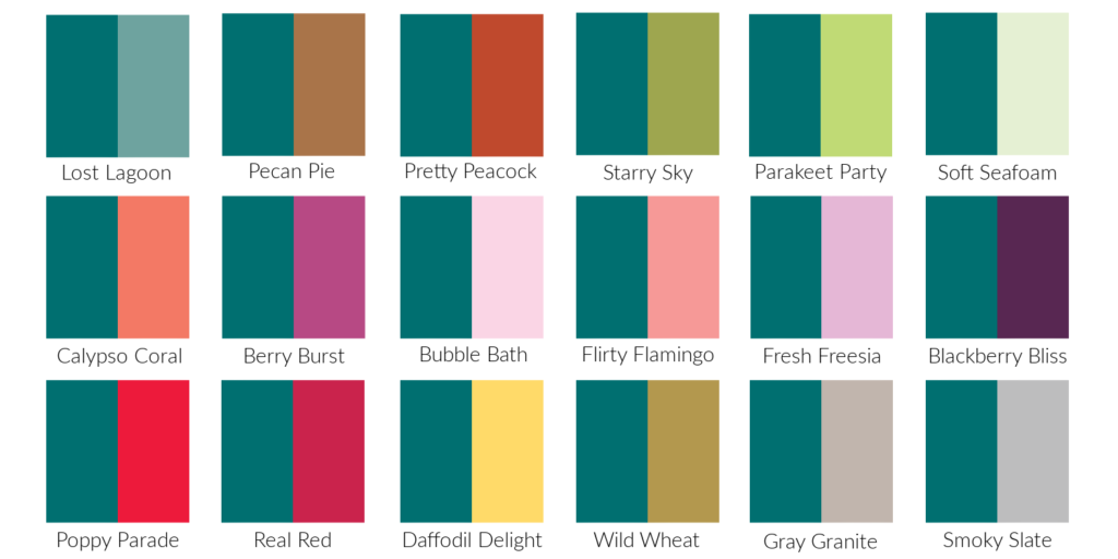
In this second photo it’s compared with some of the other Stampin’ Up! colors. I like it with most of the other colors except Calypso Coral and Pumpkin Pie. What do you think?

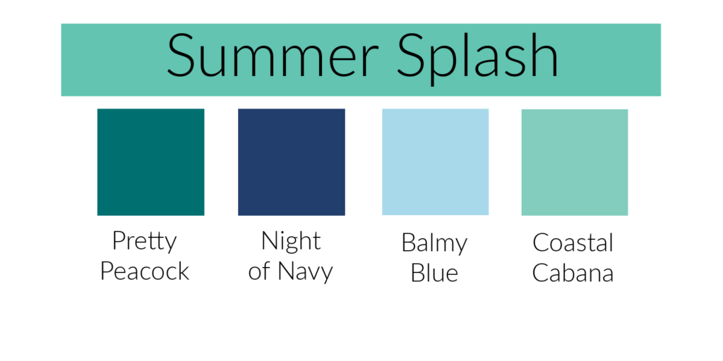
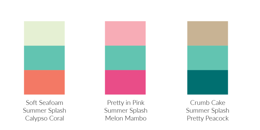
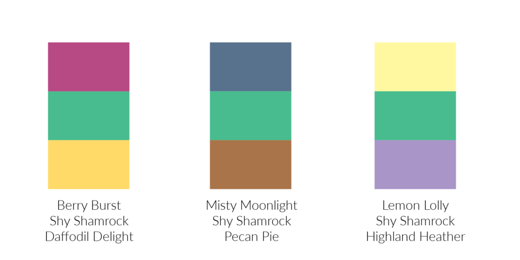
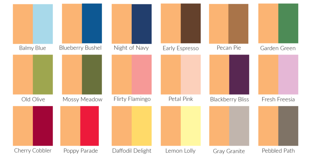
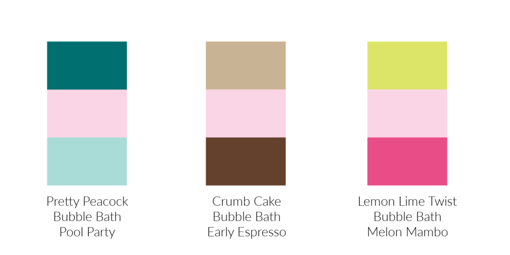
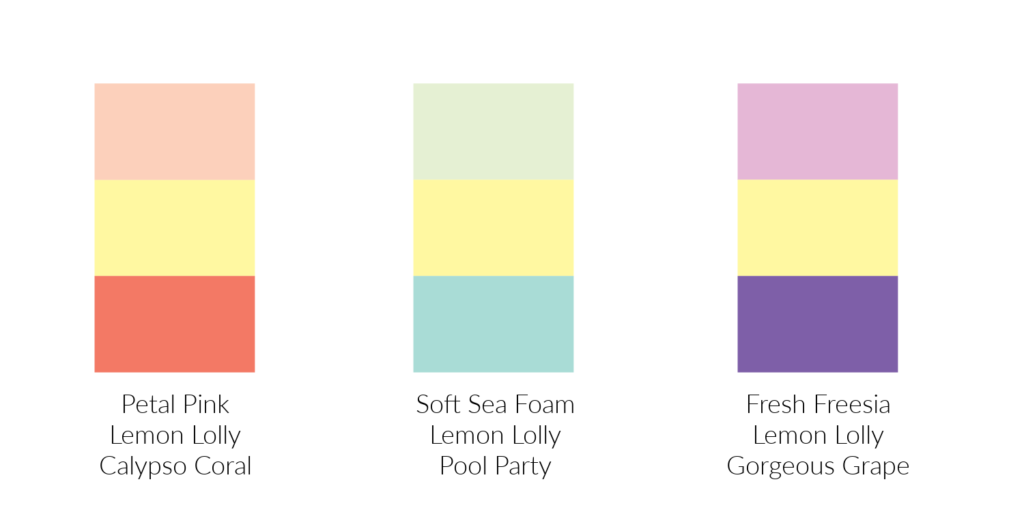
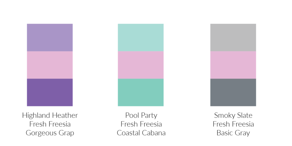
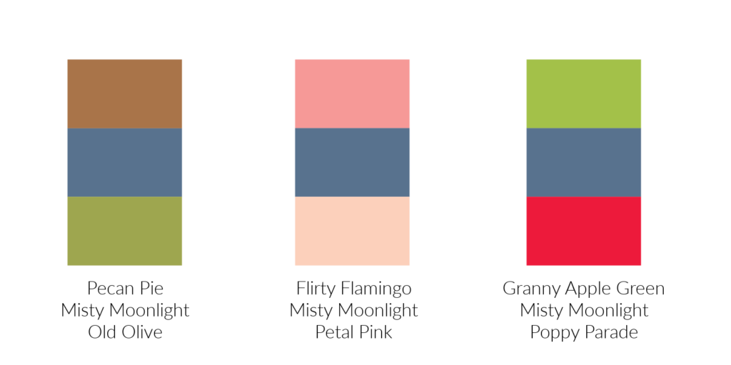
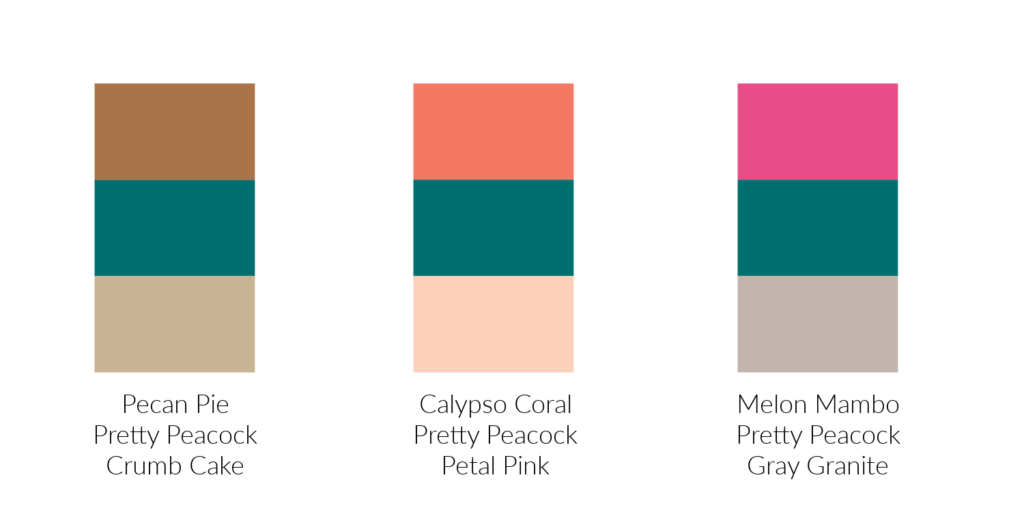
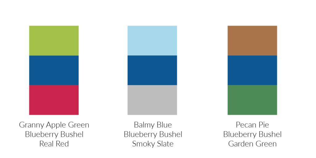
The last photo shows the color combinations from Stampin’ Up!’s Color Coach. My least favorite combination is the middle one with Lemon Lolly and Petal Pink. My favorite combination is the last one with Coastal Cabana and Lost Lagoon.
Are you excited that Stampin’ Up! has brought back Pretty in Pink? I am! It’s the perfect addition to their color family…and it’s PINK! Have a great day. Take care and Happy Stamping!