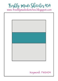
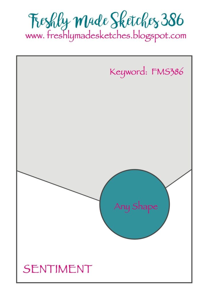
Here is today’s card sketch. I think I did pretty good on this one. Just a few additions, right? Naturally I had to add another layer….
I used Stampin’ Up!’s gorgeous Expressions in Ink Specialty Designer Series paper as the focal point for my card. This paper is so beautiful! The sentiment is from the Artistically Inked stamp set which also is part of the Expressions in Ink Suite of products that can be found on pages 96-97 of Stampin’ Up!’s Annual Catalog. “thanks” is heated embossed with Gold Embossing Powder .
Did you notice how I used the “Rule of 3” with the gold? There is gold in the designer paper, the sentiment is embossed in gold and my added layer is gold. If you don’t remember what the Rule of 3 is it is this: when things are used in threes they are more pleasing to the eye. You may use this when creating your projects and not even realize that you’re using the “Rule of 3”.
Once again, I’m going to encourage you to try creating with card sketches. Whether you get your sketches from Freshly Made Sketches where I’ve been finding mine or some other source, card sketches are a great way to start the creative process.
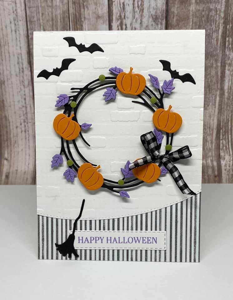
Nontraditional Halloween Card with Sparkle of the Season
Today I really changed things up with Make It Mine Monday! Both cards are made using the fun and versatile Sparkle of the Season Bundle but after that…..well, you decide! Ha!
There were two things on the original card that caught my eye and made me want to make it mine. The first was my favorite checked ribbon and the second was the little bats on the card. I love stamped, punched or die-cut bats but I’m pretty sure I’d be totally freaked out if I encountered a real bat. After including the those two items on my card all bets were off and the card was my own. I guess I did use the same pattern of the Cute Halloween designer paper.
The bundle used to create both the original card and my card is the Sparkle of the Season Bundle (page 58 in Stampin’ Up!’s Mini Catalog). In the Seasonal Swirls dies that coordinate with the Sparkle of the Season stamp set there are three different swirled wreath dies. One has Christmas greenery, one has leaves and the last one has stars. On the card that inspired me the creator used the wreath with leaves and added pumpkins. For a Halloween card I wanted to use the wreath with the stars and I wanted my stars to be yellow which is why my Halloween card is black and yellow instead of black and orange. Now that I’m writing this I guess I could have used the traditional Halloween colors but…I didn’t.
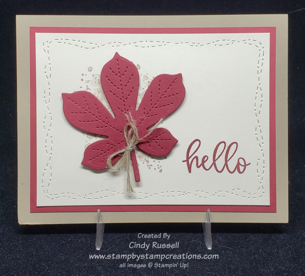
In my newsletter early this week I shared a card that was similar to this with a single leaf and the same color combination. I liked it so much that I wanted to use it again with a fun fold.
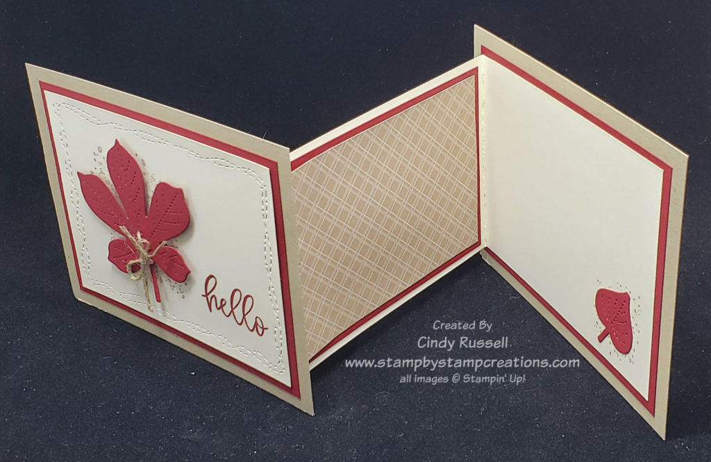
Today’s card is a modified Z-Fold. I’m actually calling it a Modified Z-Fold 2.0 because I’ve already shared one type of modified Z-Fold card with you. You really can do a lot with a Z-Fold.
Modified Z-Fold Fun Fold Card
As you can see in the photos above, the front and back of the card aren’t connected to each other at all. The inside Z-fold section connects the front and the back of the card. It’s a fun little modification to change things up a little.
Each of the outside panels are 5 1/2″ x 4 1/4″. The inside Z-fold is a piece of cardstock that is 11″ long and 3 1/2″ wide. It is scored on the long side at 1 1/2″ and 6 1/4″. Fold the 1/2″ score mark into a mountain fold and the 6 1/4″ score mark into a valley fold.
The large outside section of the Z-Fold is adhered to a 5″ x 3 3/4″ piece of Cherry Cobbler cardstock which is then adhered to the back section of the card. To adhere the front piece of the card to the small section of the Z-fold first close up the Z-fold and place adhesive on the small section. Now line up the front of the card with the back of the card and press down so the adhesive adheres. The card base should be complete and ready to decorate.
I love the way the Stitched With Whimsy die perfectly frames the leaf and sentiment on the card front. It also brings out the stitching on the Stitched Leaf die. The “hello” is from the Biggest Wish stamp set and the speckles behind the leaf are from the Gorgeous Leaves stamp set.
Below you will find a quick video on how I made the base of the card.
I hope you agree with me that I hit the nail on the head with this card sketch. I didn’t add anything and I didn’t change anything. Can you believe it? With recreating projects I have a hard time leaving well enough alone.
How about you? When you are inspired by a project do you copy it verbatim or do you switch things up to follow your own personal style more? Even with step-by-step instructions right in front of me I change things up….mostly because I didn’t read the directions correctly or I wasn’t paying close enough attention to the video/instructor.
Whether you do follow something step-by-step or completely change things up, the important thing is that you are happy with the results. You need to enjoy what you do and that includes enjoying the finished product!
Go create and enjoy! Have a great day! Take care and Happy Stamping!
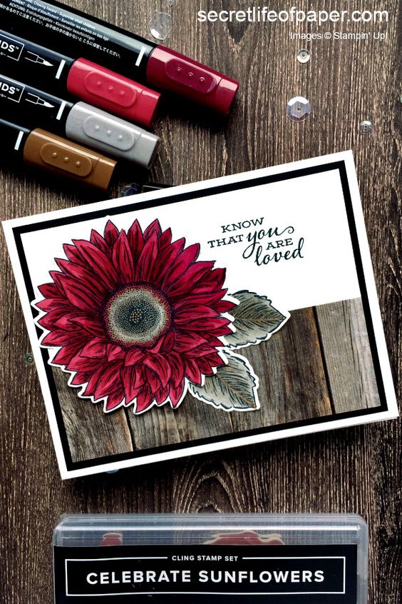
This lovely card made with Stampin’ Up!’s Celebrate Sunflowers stamp set really caught my eye. My first thought was “nice card but sunflowers are yellow!”. Well, I had to look it up but apparently you can find sunflowers in colors other than yellow if they are crossbred. Who knew? I admire the creator of this card for stepping outside the box. I also admire them for doing such a nice job of coloring with their Stampin’ Blends Markers!
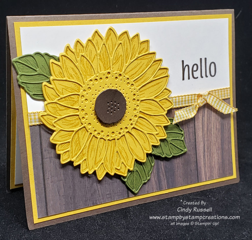
How do you switch up such a nice card? Well, you first make the sunflower yellow! Ha! I guess I’m a purist. Of course then I had to decide which of Stampin’ Up!’s yellows to use. As with many of the color decisions I make when creating a project I let my ribbon make the decision for me. After seeing the lovely original I knew that I wanted to add ribbon and thought that the Bumblebee Gingham Ribbon would work perfectly with a sunflower.
Celebrate Sunflowers
Lately, I’ve really been into using dies on my projects so that is what I chose to do with my sunflower. I’m not very good at coloring either.
I stamped both the flower image and the leaves before die-cutting the solid portions and then I die cut the intricate pieces after adding a piece of Adhesive Sheet to the back of the cardstock.
The more I thought about it, I guess I did change up quite a bit on the card. The only things that I didn’t change were the basic layout of the card and the stamp set I used. That’s the whole idea of Make It Mine Monday. Get inspired! Take a card that catches your eye and start from there.
Have a great day. Take care. Happy stamping. Be inspired!
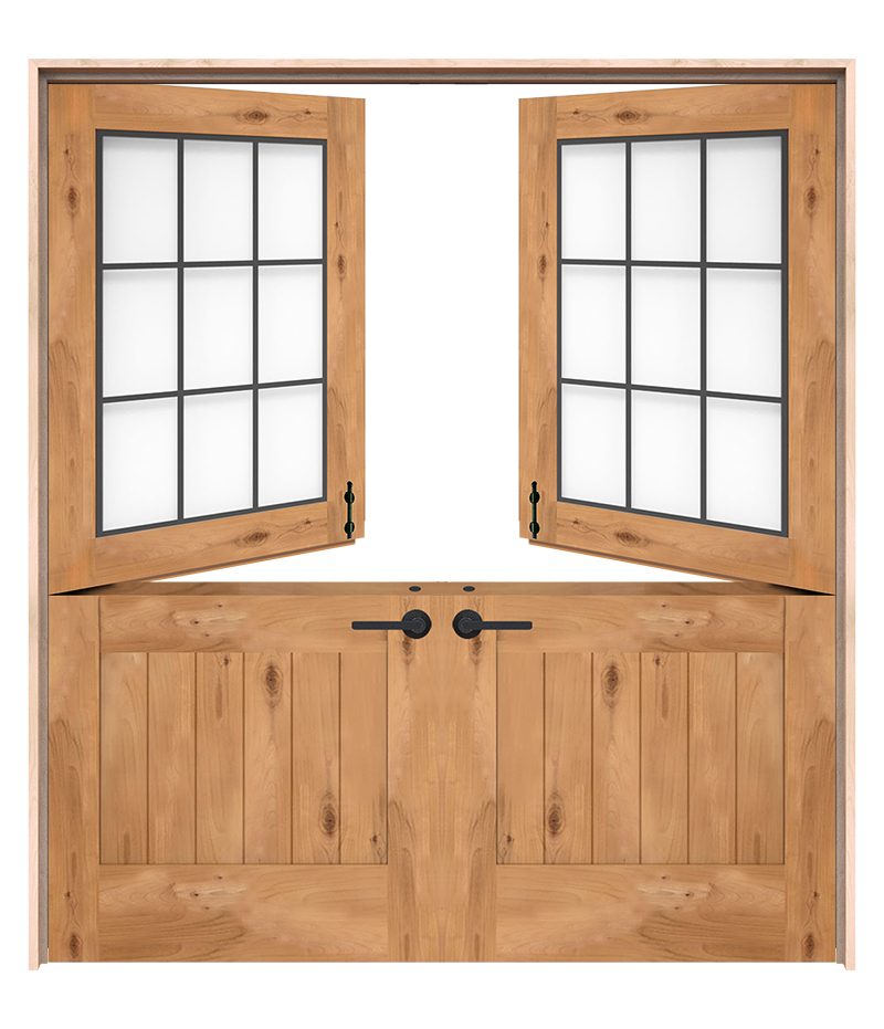
Guess what? There is an actual Double Dutch Door! Just like the name suggests, it’s double! Both the top and bottom parts have two doors each! Who knew?!
Last week I shared the Dutch Door Fun Fold with you and today you get the Double Dutch Door Fun Fold. These folds are similar, yet different. The Dutch Door Fun Fold only had one piece that opened on the card and the Double Dutch Door Fun Fold actually has three! OK…maybe it should be called the Triple Dutch Door Fun Fold but that name doesn’t have quite the same ring. Ha!
Double Dutch Door Fun Fold
In these two photos you can see the three different flaps on the card. The top flap will fold down and the two smaller flaps at the bottom will fold in. So fun!
Here is the closed card. You can easily see the three flaps. The circular focal point helps hold the flaps down.
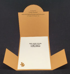
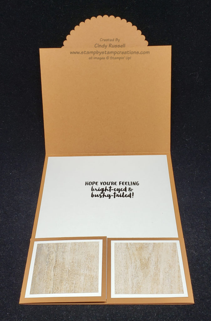
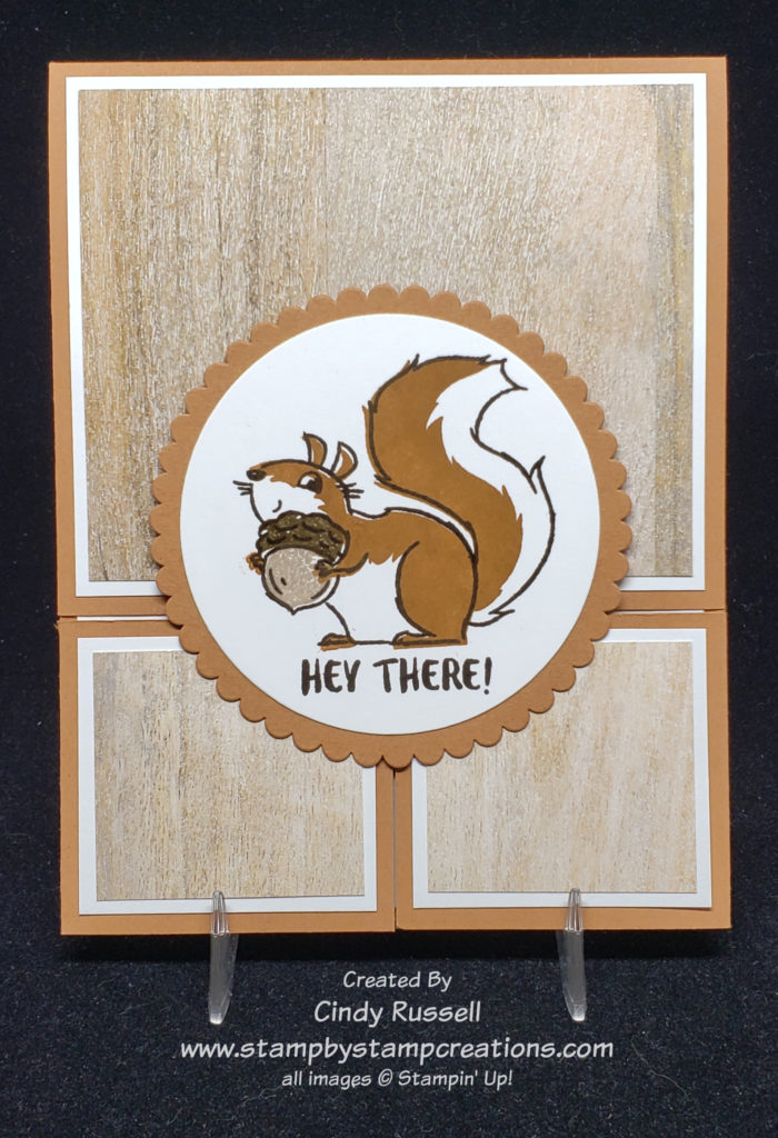
When I saw the Nuts About Squirrels stamp set on page 49 of the new Mini Catalog I thought “here we go again…another cutesy stamp set and I don’t do cutesy”. Hmmm…as you can see, I changed my mind. These little squirrels are too stinkin’ cute and I really like the sentiments. There’s your basic “happy birthday” but the “hope you’re feeling bright-eyed & bushy-tailed” was the clincher for me.
As you can see, this stamp set makes a very cute card! Cinnamon Cider was just the right color for my squirrel and the In Good Taste Designer Series Paper completed my card perfectly!
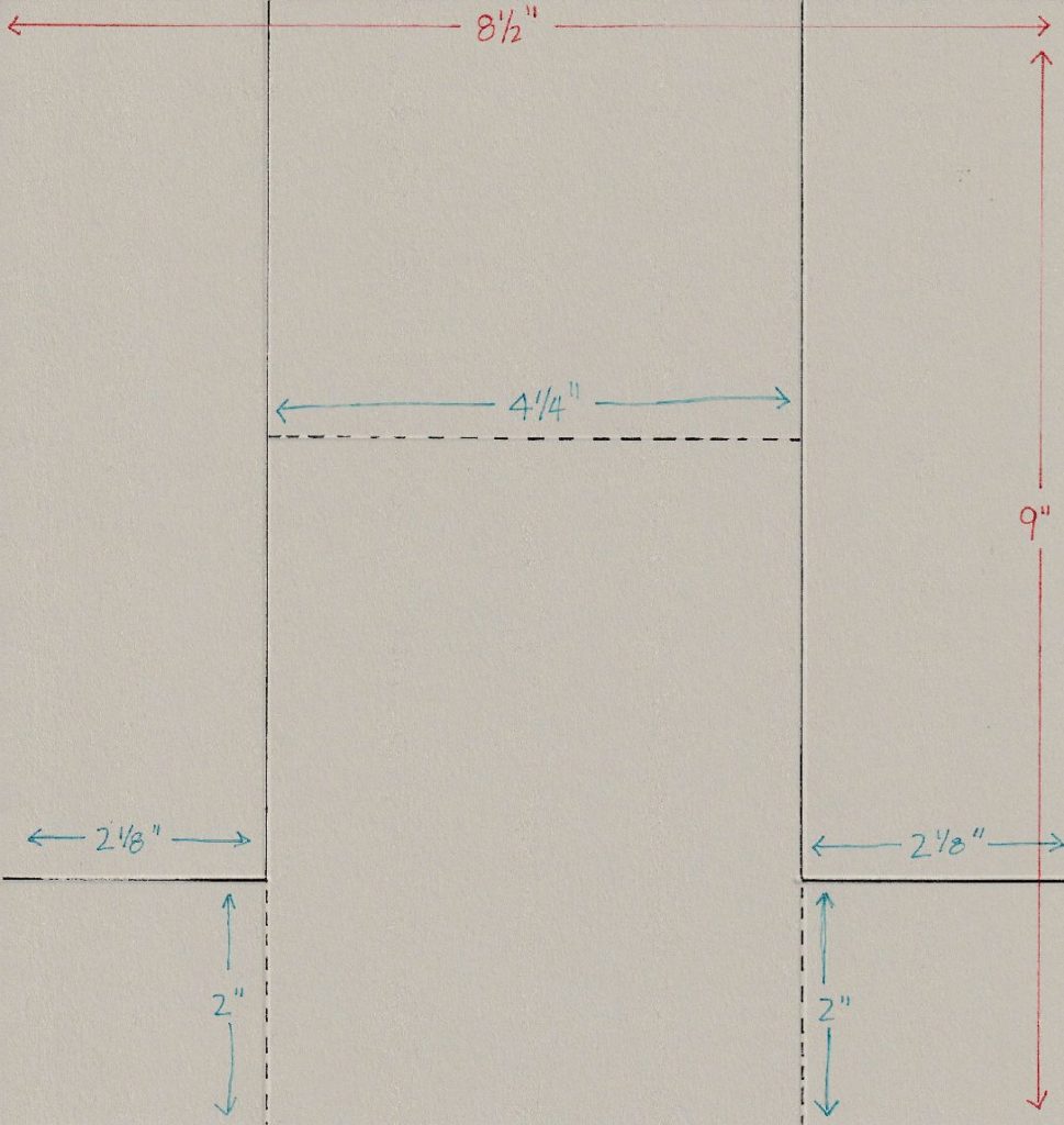
Here is a template to help you make the card base. You need to start with a piece of cardstock that is 8 1/2″ wide by 9″ high. Then cut and score according to the template.
Have fun with this fold. I think you’ll like it! I’d love to see what your Double Dutch Door Card looks like! Leave a comment and share!
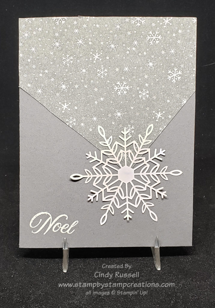
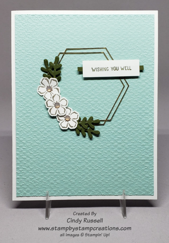
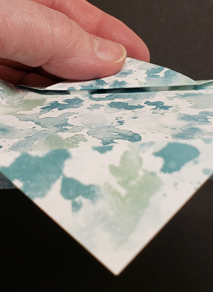
I’m going to start today’s post with a definition of “ephemera”. At first I looked it up in the dictionary and the definition didn’t make any sense at all. Then I “googgled” it and had better luck. I typed in “ephemera in crafting” and got a more useful definition. “Ephemera is generally defined as collectible memorabilia that is was for a short term purpose. … Ephemera is almost always paper-based and is often written or printed items that were expected to have short term popularity or usefulness.” When I look in Stampin’ Up!’s catalog at the Expressions in Ink Ephemera Pack on page 141 of the Annual Catalog I would call it “pretty stuff to put on my latest project”. I wouldn’t call this the best description but it works for me. Ha!
The reason I went into all this detail for today’s card sketch is because the gold wreath on my card is part of the Expressions in Ink Ephemera Pack. Since I was using it I thought I should figure out what the word “ephemera” meant.
My take on today’s card sketch is pretty close. That is if you discount the extras I added. Ha! In my opinion the sketch needed another layer and I added the sentiment to finish it off.
Are you wondering how I got the gold ephemera wreath to adhere to the card front? I didn’t. I placed the wreath where I wanted and when I adhered the flowers and the sentiment they held the wreath in place. There was no way I would have been able to get glue on the back of that skinny wreath!
That would be my tip of the day….when trying to adhere something really thin and narrow to your project use another piece to actually anchor your thin item.
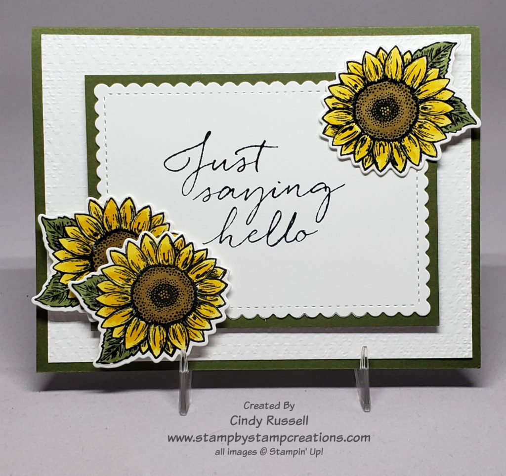
How about some sweet sunflowers for today’s Card Sketch? I saw this card sketch and had to try and figure out what type of image to put in the two circles. After scouring my stamp shelf I decided on these small sunflowers. As you can tell though, I couldn’t stick to just two. You know….that rule of three….things are more eye catching/pleasing in three or odd numbers.
Once I decided on the images to use this sketch came together quite easily. Of course I had to add a few extra layers but that seems to be par for the course! The sunflowers are from the Celebrate Sunflowers stamp set. I colored them with my Stampin’ Blends markers. Coloring isn’t my favorite thing to do but it’s SO easy with Stampin’ Up!’s Stampin’ Blends markers. The sentiment is from the Tasteful Touches stamp set. I needed something large to fill the space.
I heat embossed all of the stamped images on my card. I like to do this when I used the Stampin’ Blend Markers. It makes it easier to stay in the lines (Ha!) and is especially nice when using the lighter colors. Just my preference but give it a try sometime.
If you haven’t tried playing with card sketches be sure to give it a try. It’s fun! Have a great day! Take care and Happy Stamping!
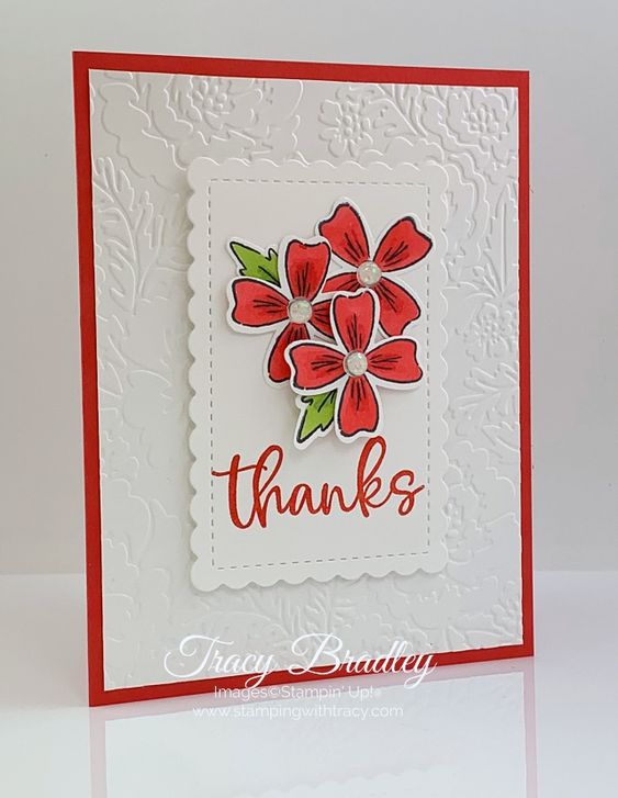
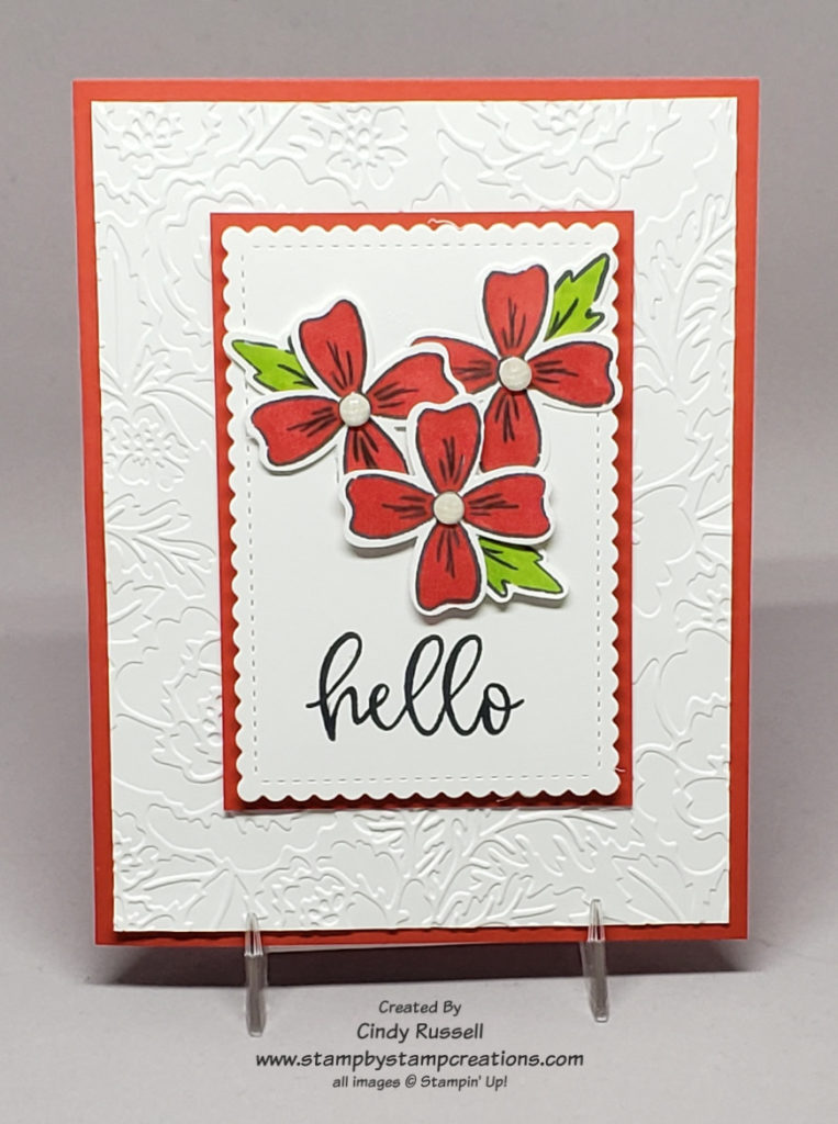
The Flowers of Friendship stamp set can be found in Stampin’ Up!’s current Annual Catalog. I wasn’t going to purchase this set but finally gave in. Once I saw this card by Tracy Bradley I was glad I did. Tracy’s card is clean and fresh. I like the red and white with just that little pop of green. The sentiment is from one of my new favorite stamp sets, Biggest Wish, which I first shared with you last week. Tracy also used the new Pretty Flowers Embossing Folder.
When you like an original card so much how do you change it up to make it your own? I actually started with the embossing folder and used the side that Tracy didn’t use. I love the fact that you can get two different looks when using an embossing folder.
The next thing I changed on Tracy’s card was to add a layer behind the scalloped rectangle. Now the focal point really pops. Did you notice that instead of adhering the scallop rectangle to the red rectangle and popping that up I adhered the red rectangle directly to the card front and popped up the scallop rectangle. When I di it this way I feel it really makes that focal point pop.
I only made two other small changes. I added another leaf so that there would be an odd number and I stamped the sentiment in black instead of red. I was going back and forth between black and red for the sentiment but black finally won out.
How would you have changed Tracy’s card? Leave a comment and let me know or better yet share a picture of your Make It Mine!
This week’s Card Sketch features designer paper again. I wanted to get one last plug in for Stampin’ Up!’s Designer Series Paper Sale before it ends next Monday. So here’s my plug: don’t forget about the sale! Ha! If you’re interested in getting 15% off of 9 of Stampin’ Up!’s fabulous designer series papers be sure to click here and check it out.
Now that that’s out of the way let’s get back to today’s card sketch! I thought about trying this sketch with one of the papers that’s on sale but decided to try it with one of the brand new papers that you will be able to find in the Sale-a-bration Brochure next week. This package of paper is called Peaceful Prints and is 12” X 12”. There are lots of fun patterns in the package and it coordinates with the Peaceful Deer Bundle from the upcoming (Holiday) Mini Catalog! Love that coordination! 😊
I did pretty well with this week’s sketch. I only added one teeny tiny layer behind the designer paper to make it pop as well as adding the sentiment (from the Banner Year stamp set) to the small strip of paper.
When I work with papers that butt up against each other and need to be straight like on this sketch I like to start with a piece of cardstock the same size as my finished designer paper design will be. On this card I started with a piece of Basic Black cardstock that was 3” x 4 ¼”. I then cut two strips of designer paper that were 4 ¼” x 1 ½”. I cut 1 ¼” off of each strip for the small section. Then I adhered my papers to the Basic Black card stock piece.
The layer of Basic White cardstock that I added is 4 3/8” x 3 1/8”. Just enough of a border to make the designer paper pop. The strip of Basic Black cardstock is 3 5/8” x 3/8”. I heat embossed the sentiment with White Embossing Powder since it was on the black cardstock. The sentiment strip is popped up with Mini Stampin’ Dimensionals.
This Card Sketch is a great design to highlight those gorgeous papers you have in your craft room. You’ll just want to remember to stick with smaller patterns. Have a great day! Take care and Happy Stamping!
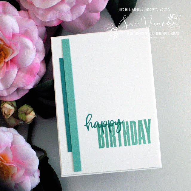
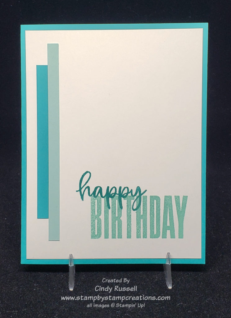
Those of you who have followed me for a while know that simple and Cindy don’t usually go together. I’m all about layers with ribbon. Despite the fact that I don’t do simple there was something about this card by Sue Vine that caught my attention. I loved it and knew I wanted to share it with you. What better way to share it than change it up, right?
Well, if you look close at the two cards you will see that I didn’t change a whole lot about Sue’s card. I did change the color of the card base as well as the color of one of the inks. Sue used a white card base and I used a Bermuda Bay card base. The only other thing I changed was the color of the lighter ink. The original card has Coastal Cabana as the light ink and I used Pool Party. The only reason I switched this color up was that my Coastal Cabana was stamping too dark and if I stamped it off first it stamped too light. Pool Party to the rescue! 😊
Biggest Wish
Sue and I both used the Biggest Wish stamp set. It’s really a fun set to use. There are only five different words in the set but they all come in both a block font and a script font. It makes it fun to combine them as you can see on our cards.
I do have to admit that I was itching to emboss the front of card but I resisted. Keep it simple! Simple stamping is difficult for me but I do need to try it more. The results can be stunning.
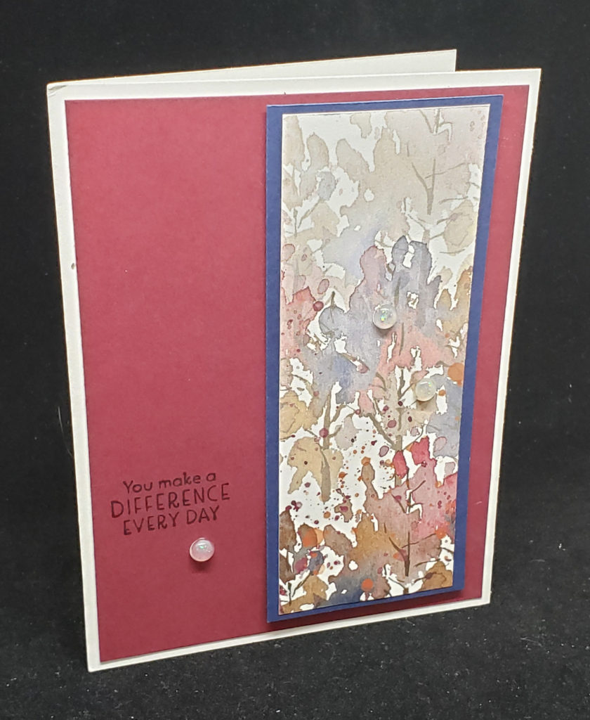
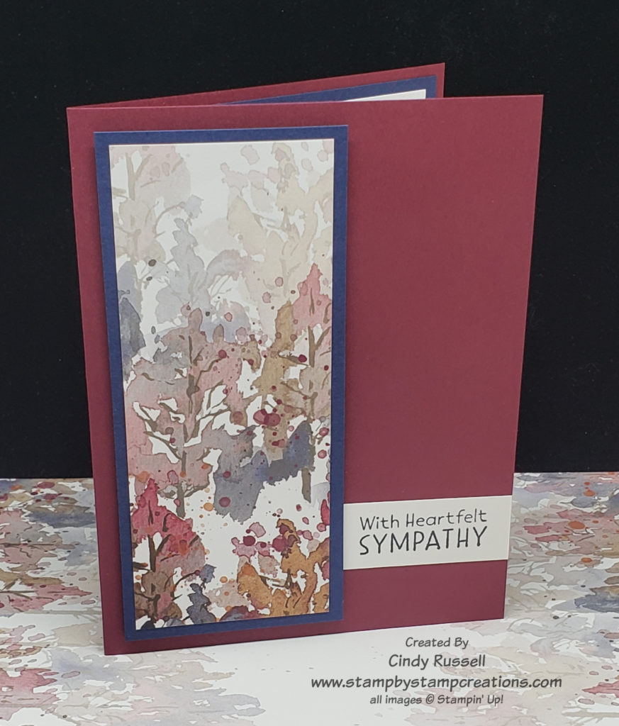
Stampin’ Up! makes such beautiful paper that sometimes you just need to make it the focal point of your card. The first card that I’m sharing here is the card that inspired me. Simple, yet elegant. I received this card in a swap and unfortunately there was no name on it so I don’t know who to credit.
The piece of designer paper used on this card is from the Beauty of the Earth package. It is beautiful and layering it on Night of Navy cardstock makes it pop. Those of you who have been around me for a while know that I have a hard time with “simple”. I usually have to add layers and embellishments to my cards. However it was the simplicity of this card that caught my eye and I knew I had to give it a try.
Beauty of the Earth Sympathy Card
If you look closely at my version of the card you will notice that this time I actually used one less layer! What? I know, it’s pretty different for me. I tried layering my version like the original but I felt that by just layering the designer paper and popping it up on the card base with Stampin’ Dimensionals kept the focus on the designer paper better.
On the original card the sentiment is stamped directly on to the Merry Merlot cardstock with Night of Navy ink. I felt this was a little hard to read. I didn’t want to stamp my sentiment on a label because I thought that that would fight with my designer paper focal point. I thought I’d just try a strip of Basic White cardstock and tuck it under the focal point. Guess what? I LOVE it! What do you think? I am definitely going to have to try this little trick again. It’s just enough to add a little something-something to the front of the card but not enough to detract from the focal point.
Do you love designer paper as much as I do? Don’t forget that Stampin’ Up! has 9 different packages of designer paper on sale this month. Don’t miss out! Check out what’s on sale right here!
This card sketch couldn’t have been any easier. Four pieces of designer paper that are 1 3/8” wide by 4 ¼” tall. That’s it! The hardest part of using this sketch was finding just the right combination of designer paper!
The sketch didn’t call for a sentiment but I thought my card needed a little something more on the front. This sentiment is from the Lovely You stamp set and the label that my sentiment is on was punched with the Lovely Labels Pick A Punch. So easy! I did have to color the pearls with my Flirty Flamingo Stampin’ Blend Marker so they would match the paper. That’s just me being picky though. 😊
I used Stampin’ Up!’s Sweet Symmetry package of Designer Series Paper on my card. Such fun patterns! And yes, this package of paper is one of the one’s that is on sale this month for 15% off! Be sure to check out the pdf of all of the patterns on sale here or view them directly in my online store here.
I’d love to see what you do with this sketch! Leave a comment with your card or send me a photo! Have a great day! Take care and Happy Stamping!
July is birthday month! Yep, I’m having another birthday and we’re going to celebrate. I’m going to share a birthday card with you that I made my own but first I want to share something I’m going to do for you!
Send me a handmade birthday card this month and your name will be entered in a drawing. The first person’s name that I draw will get to choose a current Stampin’ Up! stamp set (valued at $30 or less). The second person’s name that I draw will get to choose a kit from Stampin’ Up!’s new Kit Collection! How fun! Birthday cards can be mailed to me at:
Cindy Russell 1640 Mountain Maple Ave. Highlands Ranch, CO 80129
Let’s get to our cards today!
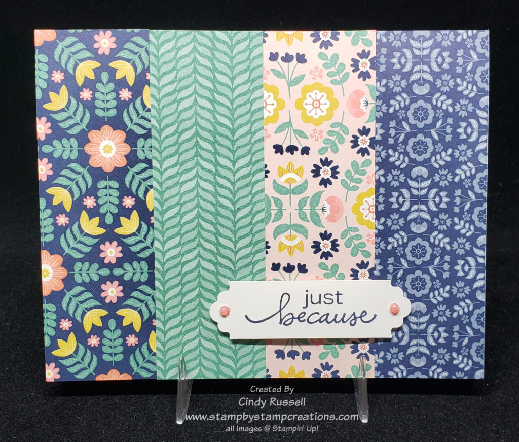
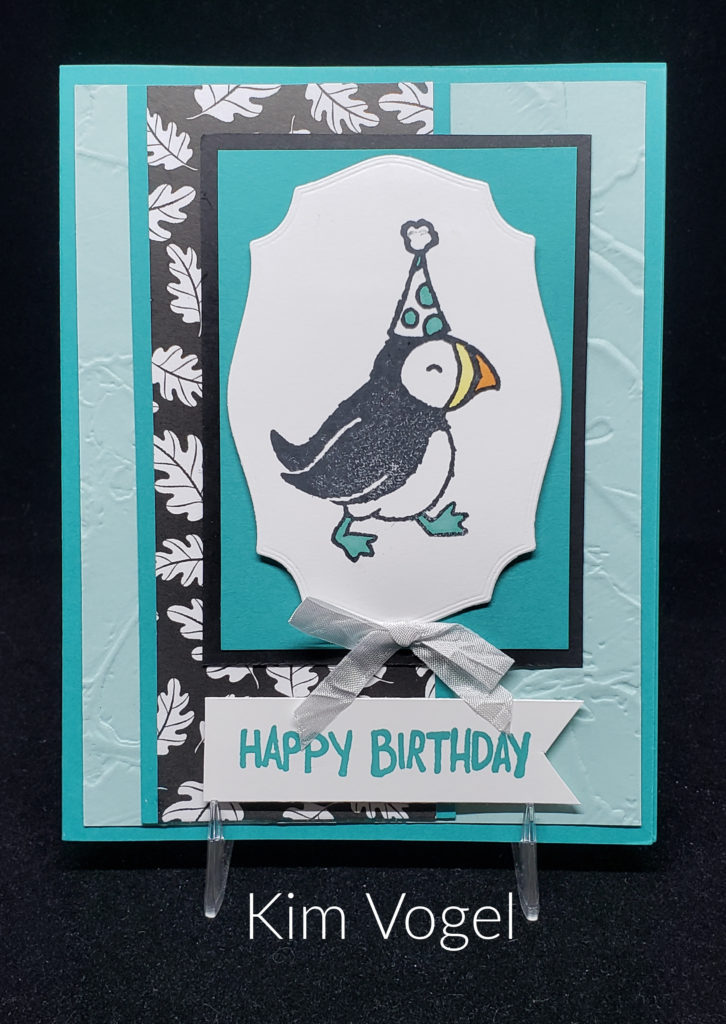
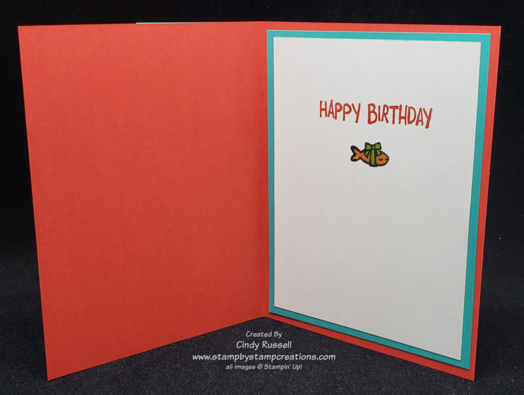
Here’s a birthday card that I received in a swap. These Party Puffins are SO cute! This stamp set makes the best birthday cards! Thank you Kim for the inspiration with your card. I stayed pretty true to Kim’s card design just changing up the color scheme and the arrangement of the layers. I also left off the ribbon and moved the sentiment to the inside of the card.
Kim and I both used the Pattern Party package of designer paper that is only available for hosts with Stampin’ Rewards. It’s one of my favorite papers in the new catalog! One of my favorite things about this package of paper is that one side is bright colors while the second side is black and white. So versatile!
Is it weird to admit that the little fish on the inside of the card is my favorite part of the card? Ha! Too cute!
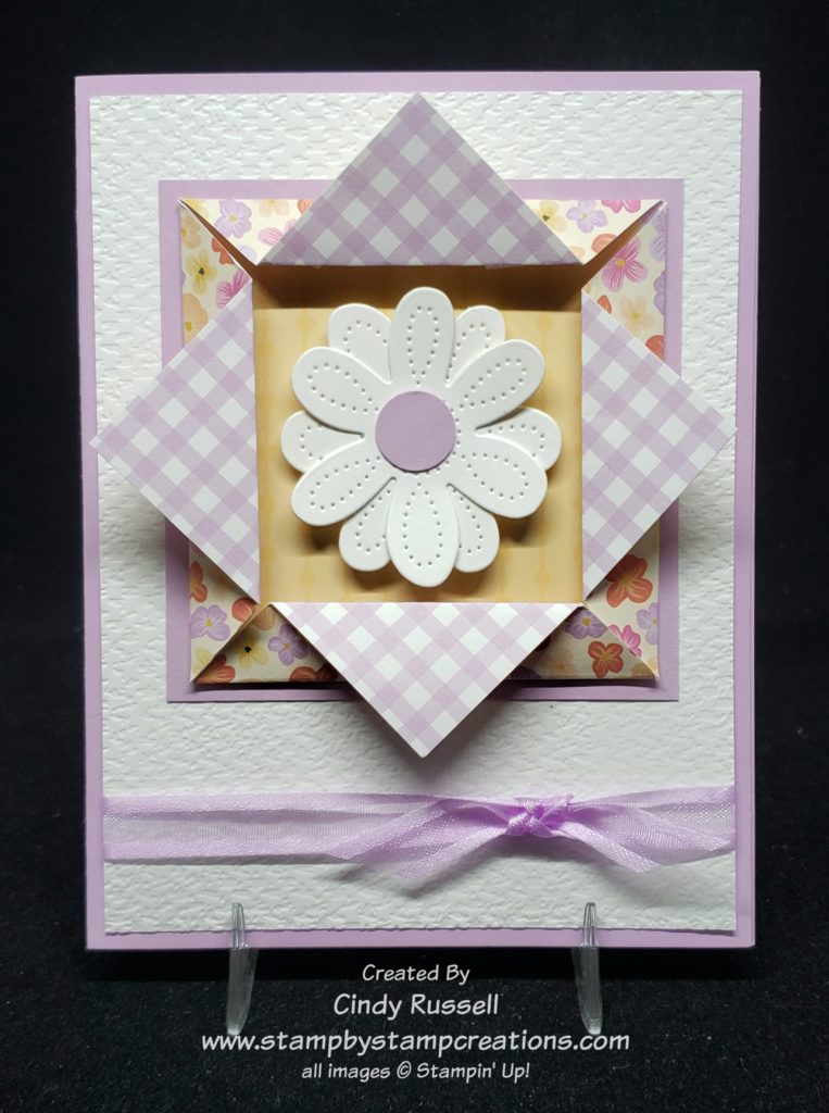
On Tuesday in my newsletter I shared a gorgeous origami frame with you that another talented demonstrator made. As I was searching around the web trying to find out how to make it (I’m still searching), I came across this fun and easy Origami Window Fold. The card itself isn’t a fun fold but you use this Origami Window Fold as the focal point of the card.
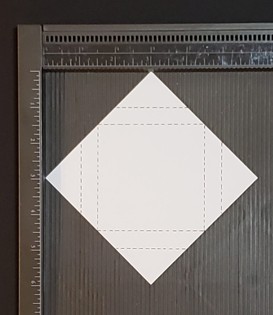
When you first look at this fold it’s a bit intimidating but once you have the measurements it’s quite easy. Start with a square piece of designer paper that is 4 ¼” x 4 ¼”. As with most origami folds you want the two sides of your paper to coordinate. I tried starting with a couple of squares that were a bit smaller but I couldn’t get the other measurements to quite work out. I’ll let you know if I get that figured out.
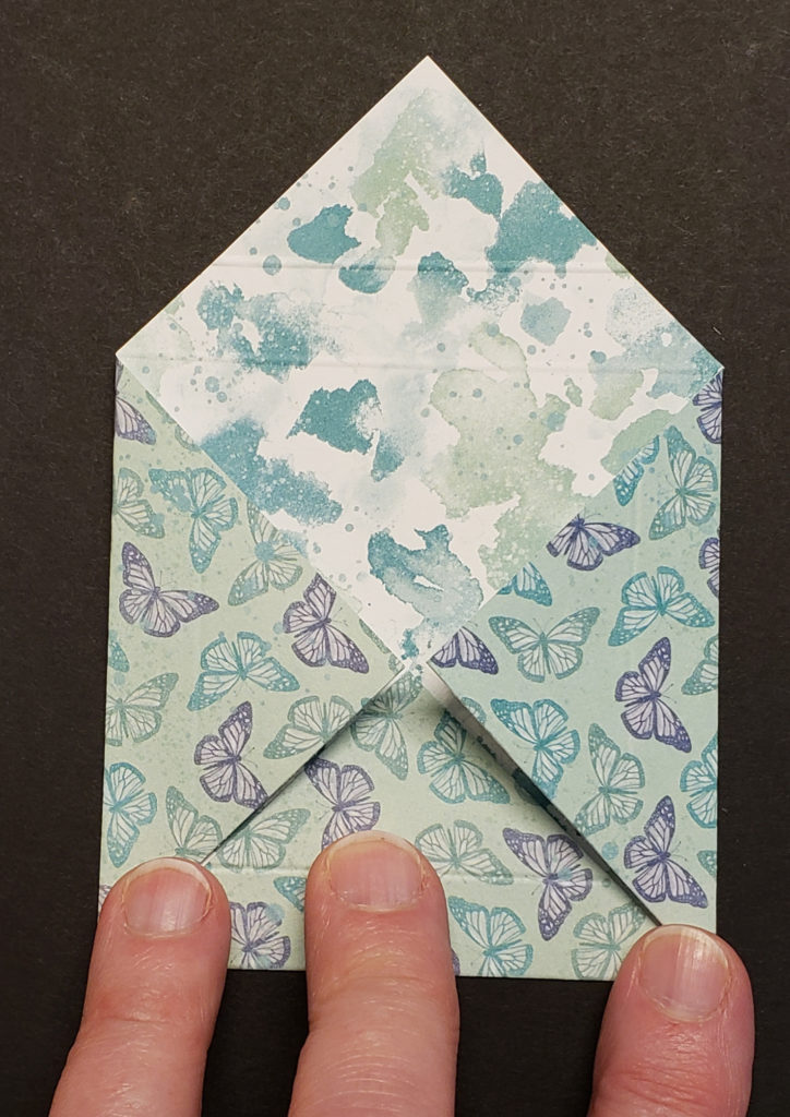
Lay your square of paper diagonally on the Simply Scored scoring board with the top and bottom points lined up on the 3” mark. Now score along the 1” and the 1 ½” marks. Turn the paper 90 degrees and repeat. Continue until you have four sets of score marks.
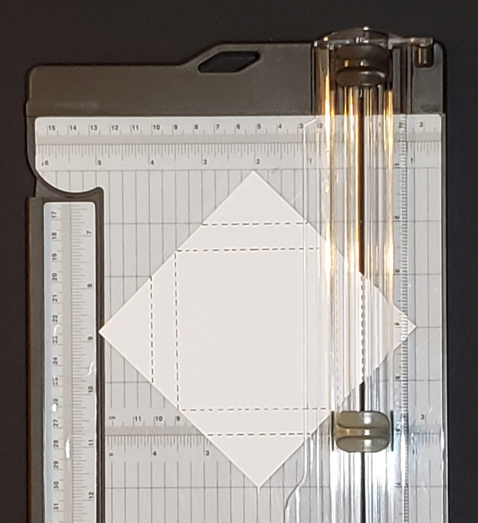
If you don’t have a Simply Scored to make your score lines and want to use your Paper Trimmer you line things up a bit differently. You still start by placing the paper diagonally on the Paper Trimmer. You will line up the top and bottom points at the 2” mark and score. Then slide the points over to line up on the 1 ½” mark and score. Turn paper and repeat three more times. Fold along the inside marks toward the center and them fold the other score marks to the outside.
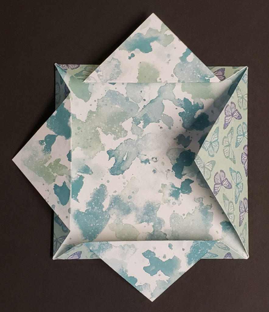
Fold along the inside score marks towards the center of the paper. They should all meet in the center. Then fold the other score marks back towards the outside.
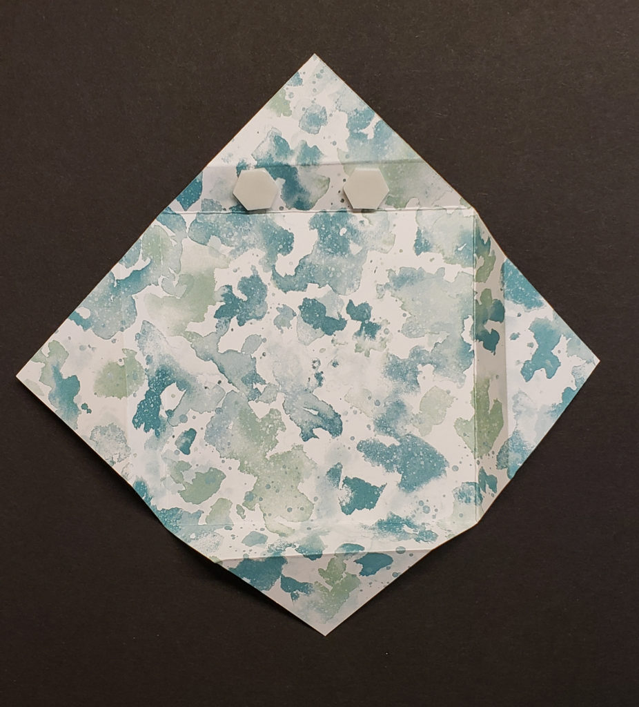
To complete the fold and give it a little dimension you want to add a couple of Stampin’ Dimensionals to the inside of each side of the frame. See the photo to the left to see where I placed them.
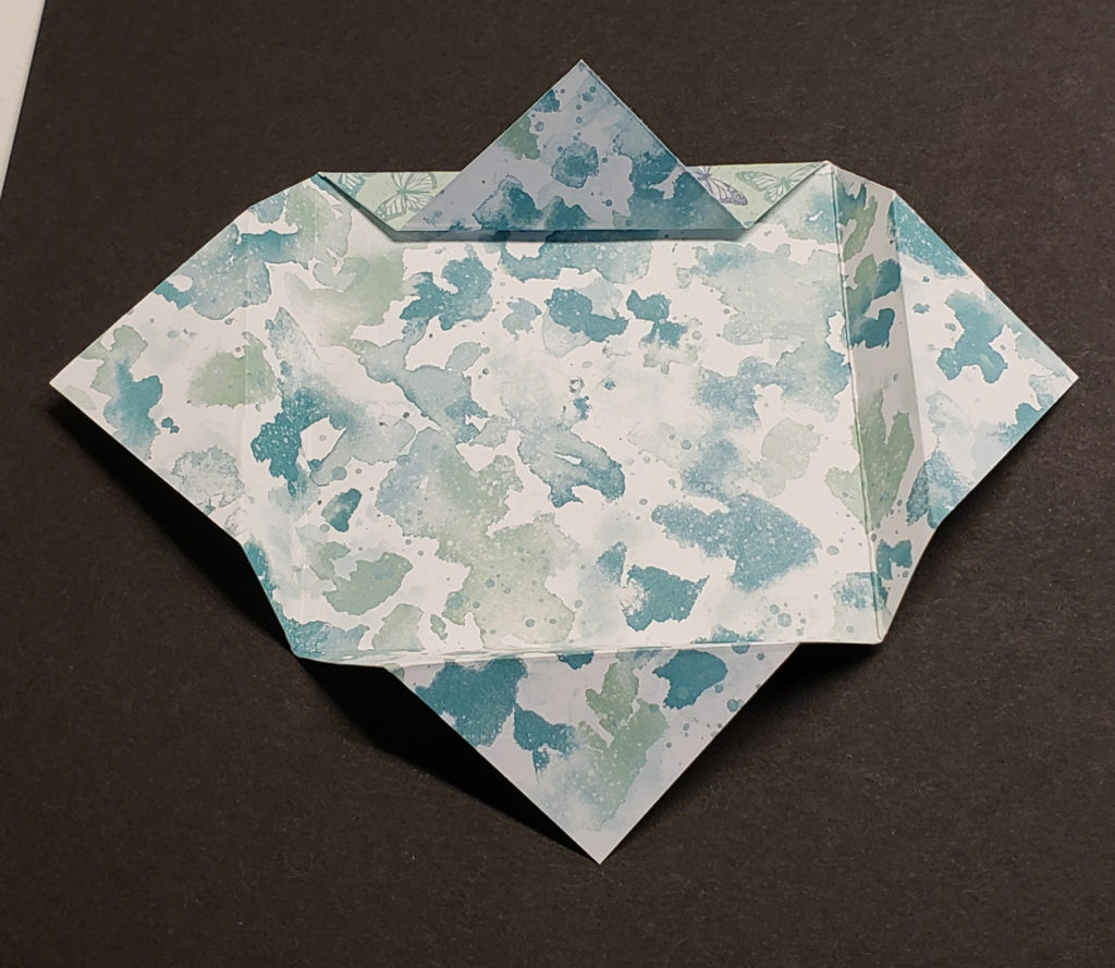
The Origami Window Fold is done. Now it’s time to decorate. I chose to mount my Origami Window Fold on another piece of cardstock (3 ¼” x 3 ¼”) before adhering it to the card. I also lined the inside of my frame with a coordinating piece of designer paper (2 7/8” x 2 7/8”) to make my flower pop. If I hadn’t, the inside of my frame would have been the gingham checked print like the folded out flaps.
This was a fun and easy fold to make that adds a lot of “wow” to my card. Give it a try. I think you’ll like the results! Have a great day! Take care and Happy Stamping!