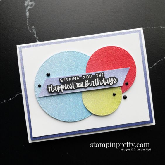
Day 6 of 30 Days of the New Catalog brings us a simple card using the amazing Charming Sentiments Bundle. You can find this bundle on page 38 of the catalog or click on the link above.
The Charming Sentiments Bundle was designed by a demonstrator, Million Sales Achiever Lisa Curcio. This stamp set has 17 sentiments and all of them can be die cut using the coordinating Sentiment Silhouettes Dies. How fun! The die set also cut out images such as candles, hearts and stars. This bundle is a must for any craft room! It’s sitting the shelf in my craft room just waiting for me to get home and play with it!
Thank you to Mary Fish for this fun and easy card that she made using this bundle. The circles on her card were die cut using the Stylish Shapes Dies found on page 175 of the new catalog. The Stylish Shapes Dies have six different stitched circles, five stitched squares and four stitched labels. Another definite must for any craft room! Do you have it on your wish list yet?
For Day 5 of the 30 Days of the New Catalog I have a fun and bright card for you. If this card doesn’t make you smile, I’m not sure what will.
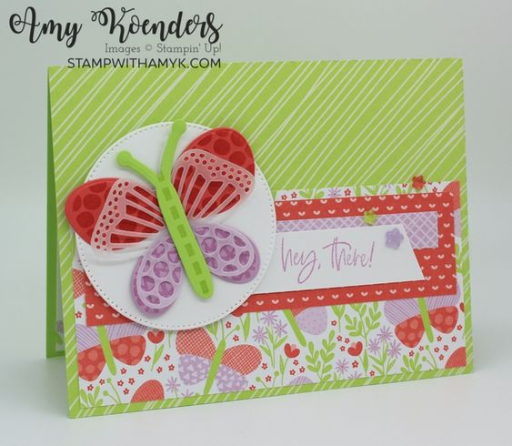
Thank you Amy Koenders for this cheerful card! I must like Amy’s style of cardmaking because yesterday’s card was made my Amy too!
Amy used theButterfly Kisses Suite of products on this card. Such a happy suite! Bright colors and fun images. How can you go wrong?
All of the designer papers used on the card are from the Butterfly Kisses Designer Series Paper and the little resin flowers match the papers perfectly. I LOVE coordination! This suite of products may end up on my wish list yet!
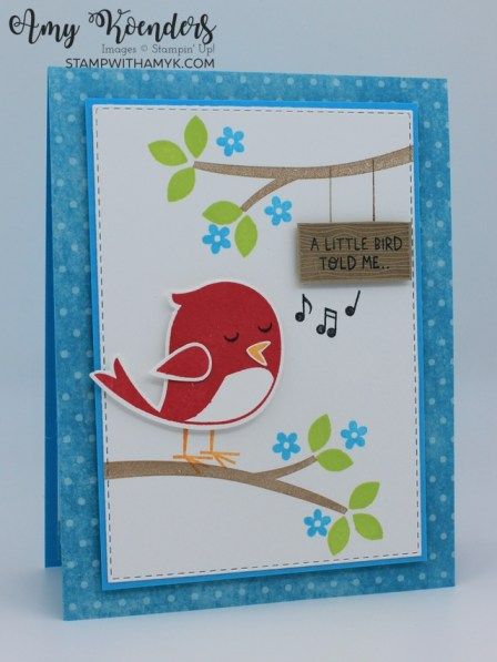
Here we go again. When I first saw this stamp set in the new catalog it didn’t catch my eye. I’m not into cutesy stamps, right? Ha! The jokes on me. The more I see these little birds singing away, the more I need to see them in my craft room!
The Sweet Songbirds Bundle can be found on page 31 of the new catalog. The stamp set includes two birds, seven sentiments in a fun font, along with some other images. The bird you see on this card was punched with the Songbird Builder Punch from the bundle. So cute!
Thank you to Amy Koenders for sharing this bright and fun card. I love that my fellow demonstrators are willing to share their creations.
This adorable bundle is on my wish list, how about you?
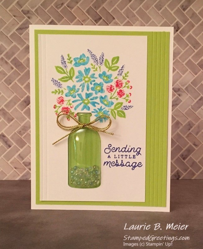
For Day 3 of my 30 Days of the Annual Catalog I want to share the Bottled Happiness Bundle which can be found on page 16 of the catalog.
I chose this card which Laurie Meier made because it showcases the Bottled Happiness stamp set, the Vintage Bottle Punch, the Vintage Bottle Shaker Domes and the new Effervescent Elements which are the little beads in the bottle. So many products that work together perfectly!
I’ve made a card or two using the stamp set and the punch but haven’t used the shaker dome or little beads yet.
Doesn’t this card make you smile? I love all of the bright colors. The flowers are on one stamp and the leaves are on another stamp. Laurie must have used her Stampin’ Write markers to color the flowers in the different colors. The Bottled Happiness stamp set is photopolymer so it’s a little harder to use the markers on, but as you can see, it does work.
Such a bright and cheerful card. I can’t wait to make something similar when I get back to my craft room. Have a great day! Take care and Happy Stamping!
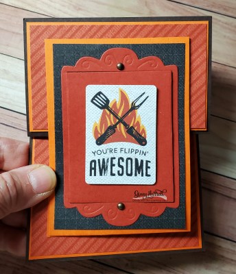
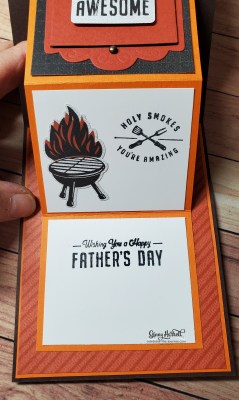
You can never have enough masculine cards on hand. Stampin’ Up!’s 2022-2023 Annual Catalog has a lot of options for making masculine cards.
Yesterday I shared the He’s The Man Suite of products with you and today I am sharing the Brewed For You Bundle of products. If you know someone who enjoys beer this is the perfect bundle. You could even make a wine glass with the stemmed glass if you’d like.
Thank you to Michelle Quinno for sharing this fun card. It highlights both the stamp set and the dies. I love how she used vellum for the glasses. Don’t you love the foam on the glasses? The foam on both glasses are die cuts.
Such a fun and easy card for Day 2 of 30 Days of the New Catalog. I wonder what’s in store for Day 3?
Hello! I’ve been away from my blog for a little bit and it’s time to get back to it. I’m actually away from craft room which is why you haven’t heard from lately. I’m in Minnesota with my parents as my mom has some health issues.
I want to share ideas with you using the products in Stampin’ Up!’s new annual catalog but since I’m away from my craft room, I’m going to share projects that other demonstrators/crafters have shared online.
I think it’s a great solution for both you and me. We both get to see these fabulous new products and how to use them.
The first product(s) I want to share with you is the He’s The Man Suite that can found on pages 78-79 of the catalog. Father’s Day is coming up fast so I thought this masculine suite would be perfect to share with you today.
One of the fun things included in this suite of products is the He’s The Man Specialty Designer Series Paper. It’s a specialty pack because it includes two sheets of die cuts that coordinate perfectly with the other products!
A big thank you to Ginny Harrell for designing this fun card and using so many items in the suite. The fun frame that Ginny used on the front of the card is die cut using the Fabulous Frames Dies found on page 171 of the catalog.
I hope you’ve enjoyed the first of my 30 Days of the New Annual Catalog! Come back tomorrow for Day #2!
Stampin’ Up!’s Sentimental Swirls stamp set is a fun and simple stamp set that can be found in the January – June Mini Catalog. It is a stamp set perfect for the beginner stamper.
The flowers that you see on this card are punched out with the Flowers & Leaves Punch. There are also smaller flowers in the stamp set that can be punched out with the Strawberry Builder Punch.
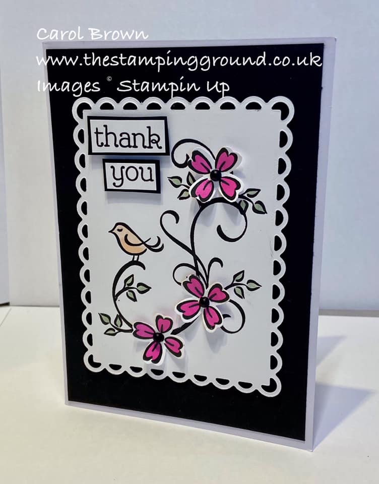
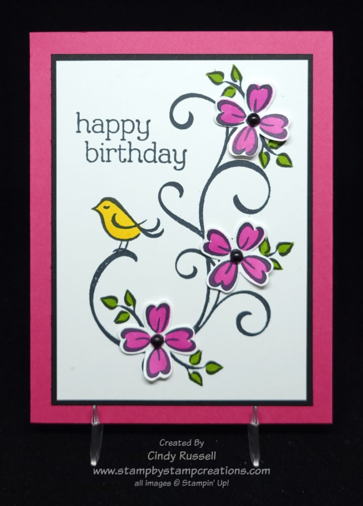
As I was scrolling through Pinterest I came across this card by Carol Brown that caught my eye. I knew I wanted to recreate it for Make It Mine Monday. Pink flowers with a touch of black. Of course it caught my eye!
As you can see on my card, I made pink the prominent color and black is just an accent. The card came together easily. I started with the black swirl and went from there. The flowers were stamped on a scrap of Basic White cardstock and then colored and punched out. I set them around the swirl where I was going to adhere them so I could figure out where to stamp the leaves.
The stamp set is photopolymer so it was quite easy to stamp the outlines of the flowers, leaves and bird and then use a second stamp to stamp the colored portion. Two step stamping at it’s best!
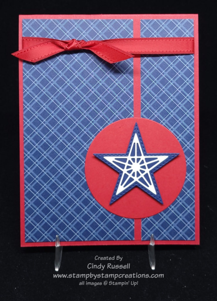
When I came across this card sketch I knew it was perfect for using my Stitched Stars Die Set one last time before it retires.
A star isn’t a shape that I use often when I make a card but it’s one of those basic ones that is nice to have on hand. The Stitched Stars Die Set will definitely stay as part of my “stash”.
The Tidings and Trimmings Bundle came to my mind first when I saw this sketch so I got out my bundle with the coordinating designer paper and ribbon and created a card. Then I happened to check out Stampin’ Up’s List of Last Products that are no longer available and this bundle was on the list. It was time to go back to the drawing board.
My next thought for using a star was “patriotic”. You know, red, white & blue and stars and stripes.
If you compare my card to the sketch you can see that I kind of flipped it. I also added the ribbon. If you’re wondering how I got my designer paper on the card front so straight, let me tell you my secret. I cut a piece of Real Red cardstock 5 1/4″ x 4″ and a piece of designer paper 5 1/4″ x 3 7/8″. I then adhered the designer paper to the cardstock. Easy Peasy! Sometimes I scare myself when I come up with these solutions. Ha!
I love the challenge of card sketches. The sketch gives you the basic starting point but then the sky is the limit! If you haven’t tried them yet, give them a shot. I think you’ll enjoy them!
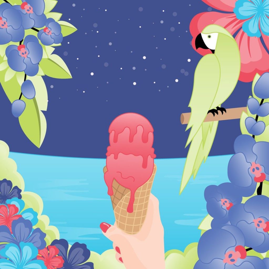
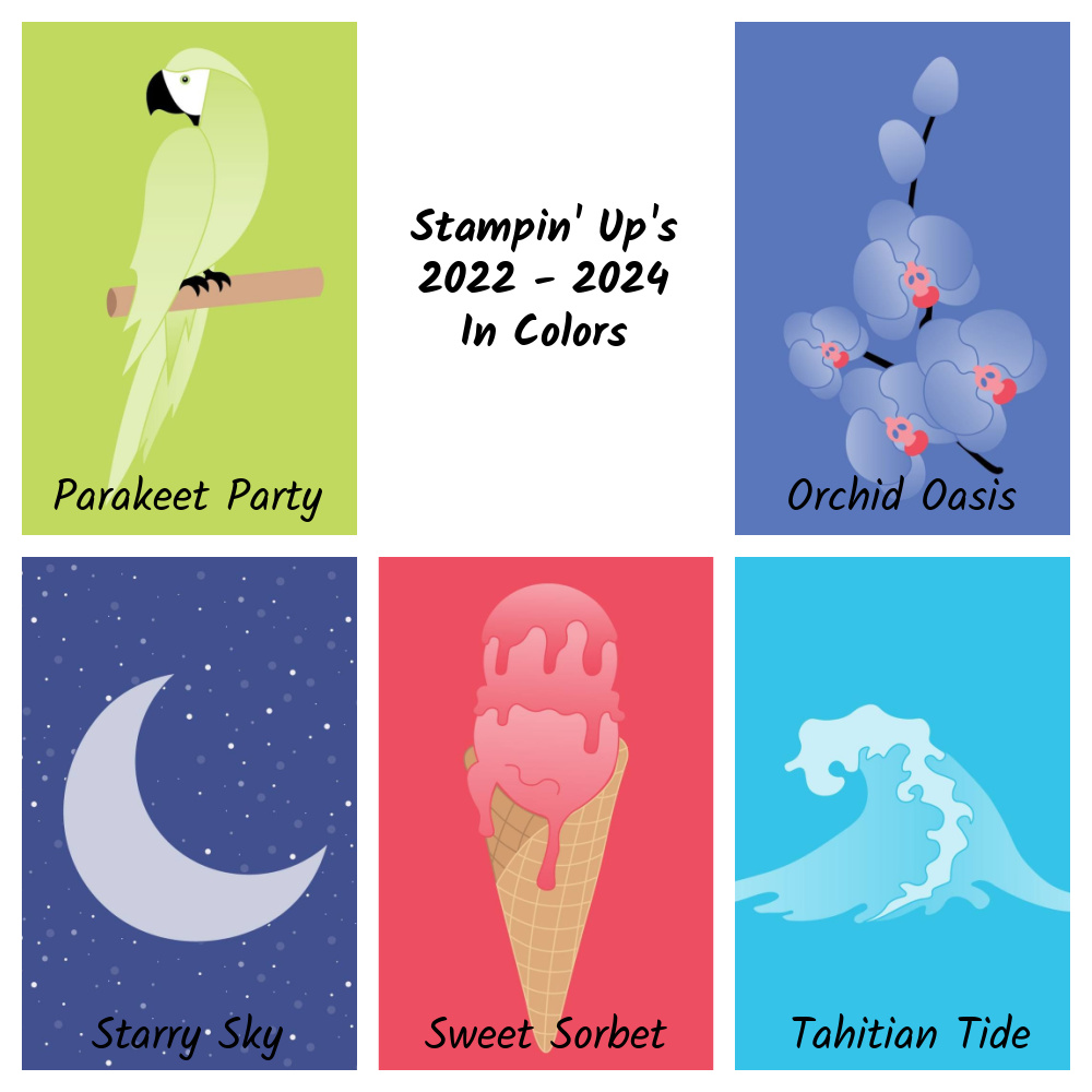
Stampin’ Up!’s new 2022-2024 In Colors are perfect for creating a Tropical Oasis! They are gorgeous and I love them all!
A little over a week ago, Stampin’ Up! created riddles for us to guess the names and the colors. Each morning for five days they posted a riddle and a photo in gray tones in our Demonstrator Planning Place on Facebook. In the evening of each day they then colored the picture like you see below and told us the name. It was fun to try to guess what color it was going to be as well as the name. I enjoyed seeing all the different guesses people came up with. Some of them were pretty funny.
Stampin’ Up!’s 2022-2024 In Colors
Parakeet Party “Don’t let my feathers fool you—I’m a social butterfly! Bright, bold, and beautiful is my motto. This is one bird who doesn’t have time for siestas, but that’s because me gusta la fiesta! Who am I?”
Isn’t this a pretty green?
Sweet Sorbet
“I’m a delicious treat on the tip of your tongue. Creamy yet dairy-free is the life for me. Strawberries, watermelon, raspberries, oh my! Just blend a little fruit juice, water, and sugar for a frozen surprise. What’s my name?”
Pink! Woo Hoo! I love my pinks!
Tahitian Tide
“I rise and fall with the sun and the moon. I’m a fun splash mid-afternoon. If you’re looking for a slice of paradise and that tropical aura, then I recommend a sweet escape to Bora Bora! Can you guess my name?”
Stampin’ Up! hasn’t had a turquoise color in a long time!
Starry Sky
“Like billions of fireflies shining so bright we work together to light up the night. Connect us together and we make up dazzling constellations. Shared with someone you love we’re quite the romantic destination. Who am I?”
Such a pretty blue!
Orchid Oasis
“I bloom in perfect symmetry. Elegant, fragrant, vibrant—I’m a flower fit for royalty. Together we can celebrate friendships, new beginnings, and affection. Think of me as your wellspring of tranquility and personal connection. What’s my name?”
This is almost a Periwinkle Blue. If you follow the Pantone colors of the year, this is spot on! This year’s color is called Very Peri and it’s pretty darn close to this!
So what do you think of Stampin’ Up!’s newest colors? I love the way these colors all coordinate together. Do you like them as much as I do? I can’t wait to get my hands on them! Then the fun will begin!
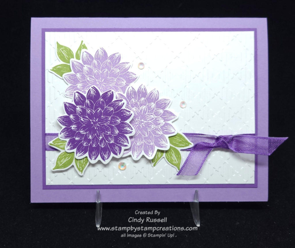
Dahlias are a favorite flower in my family. My mom used to grow them in her garden and her dad used to grow them and enter them in the Minnesota State Fair. He even won awards with them. So when I saw the new Dahlia Days stamp set in Stampin’ Up!’s January – June Mini catalog I knew that I had to get it. Then when I saw it on my stamp shelf it was time to create a card or two with it.
Not only do Dahlias come in different sizes and shapes but they can come in many different colors too.
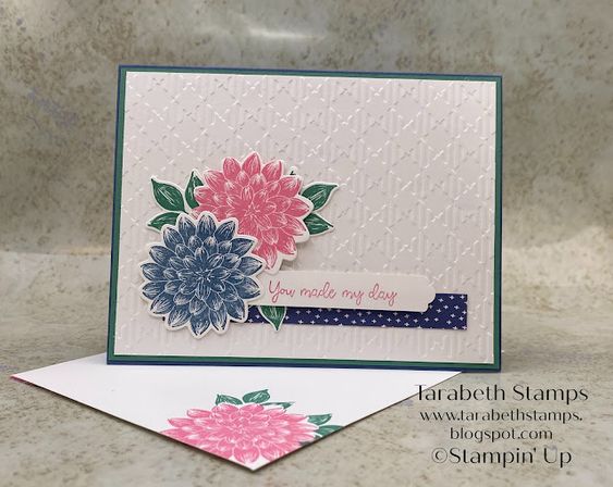
This is my inspiration card. I love Tarabeth’s card but it’s Make It Mine Monday and I had to change it up.
The basic layout of my card is the same as the inspiration card but I did add another layer (of course!). It’s hard to tell in the photo of my card but I used the Gingham Embossing Folder like Tarabeth did.
I added another flower to my card. You know, that Rule of 3 that I’ve talked about before. This rule says that elements in groups of 3, or at least odd numbers, are more pleasing to the eye.
Tarabeth’s card gave me the inspiration that I needed. That’s why I love checking out other people’s cards. I may not copy them exactly, but they give me the little boost I need to get started.
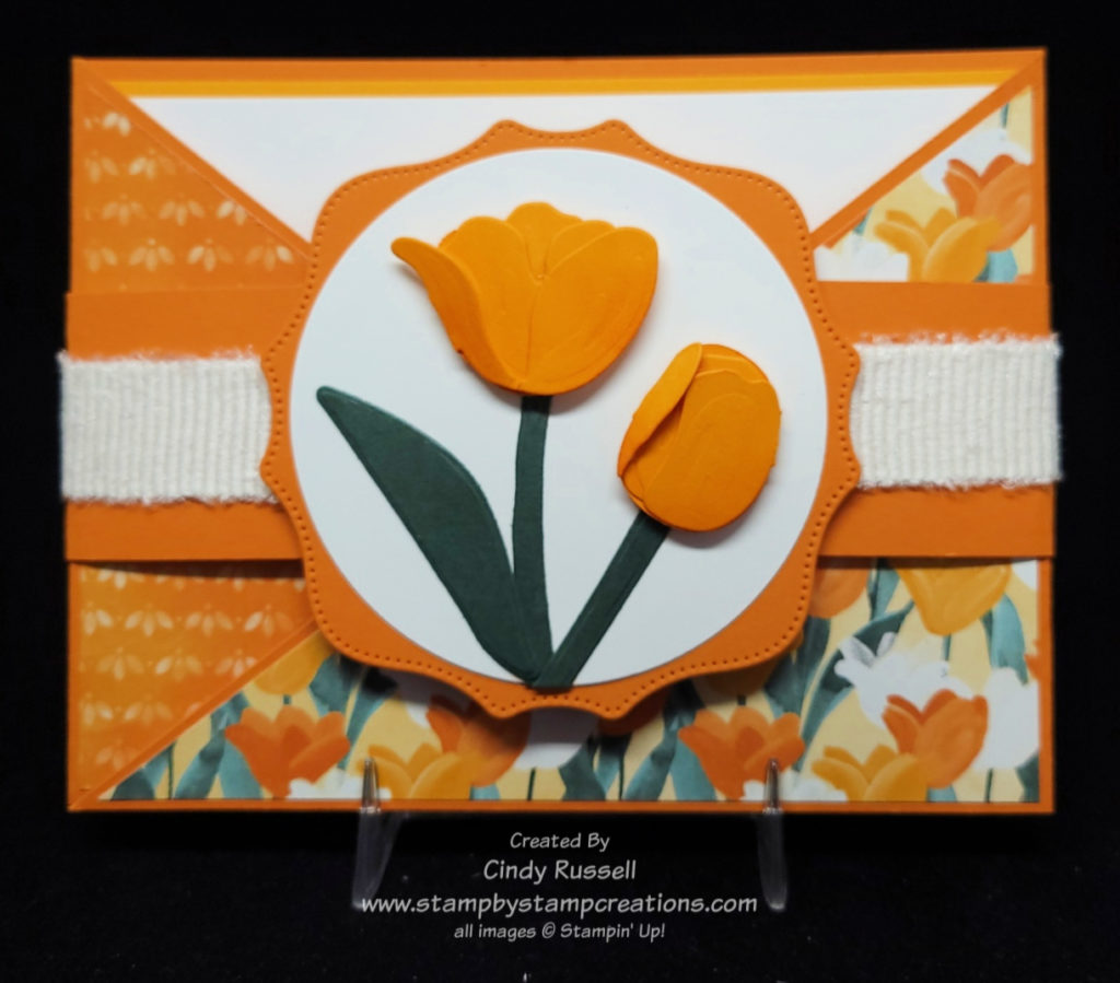
I’m calling today’s card a hybrid because it looks just like last week’s card but it doesn’t have a pocket and it’s a Gate Fold Card because the two sides fold in like a gate. Here’s the link to last week’s Angled Pocket Card and here’s the link to a Belly Band Gate Fold Card that I made. If we have to give this hybrid a name, let’s call it the Horizontal Angled Gate Fold. I like to name the fun folds so that I can tell them apart.
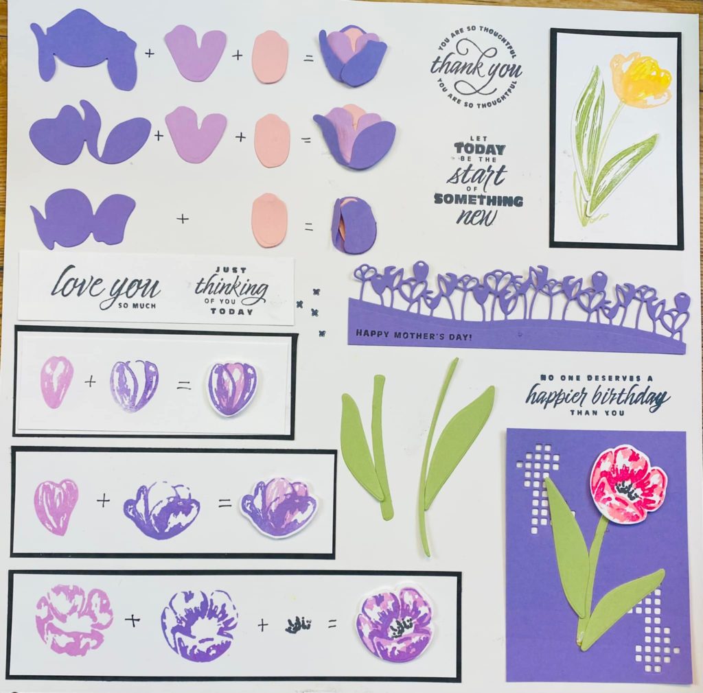
Tulips Dies Chart by Lisa Schmid
I love the way this card turned out. It screams “Spring!”. Just like on last week’s Angled Pocket Card (see link above), I wanted to find a piece of designer paper that I could use both sides. Flowering Fields Designer Paper to the rescue! Since I was using the tulip designer paper, I decided to try my hand with the Tulip Dies. Instead of trying to figure out what dies I needed to use to make the different tulips I did a little search online and found a chart. Thank you Lisa Schmid!
The base of the card is made just like last week’s Angled Pocket Card. The only difference is that you don’t make the pocket. Stop before you reach that point. Then you need to make a belly band and a focal point.
For the belly band I used 2 pieces of 6 ½” x 1 ½” pieces of Pumpkin Pie cardstock. I adhered the pieces together by overlapping the pieces by about 1/2” or so. With the card base closed and laying on top of the belly band (seam centered) I carefully wrapped the belly band around the card. It should be snug but not too tight. I then adhered the two ends together. You should use a strong adhesive like SEAL + or Tear & Tape to make the belly band.
The focal point of my card started with a die from the Hippo & Friends Dies (which is retiring). The tulips are added to the largest Layering Circles die. So fun!
To add a little texture to my die-cut tulips I used a Blending Brush to add a little Pumpkin Pie ink to the Mango Melody pieces before assembling them. I think this softened the Mango Melody cardstock a little.
The Flowering Tulips stamp set and the Tulips Dies are both continuing into the upcoming 2022-2023 Annual Catalog. However, the Flowering Fields Designer Paper is not.
I hope you enjoyed this lovely, springtime fun fold card! Have a great day. Take care and Happy Stamping!
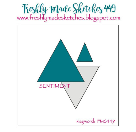
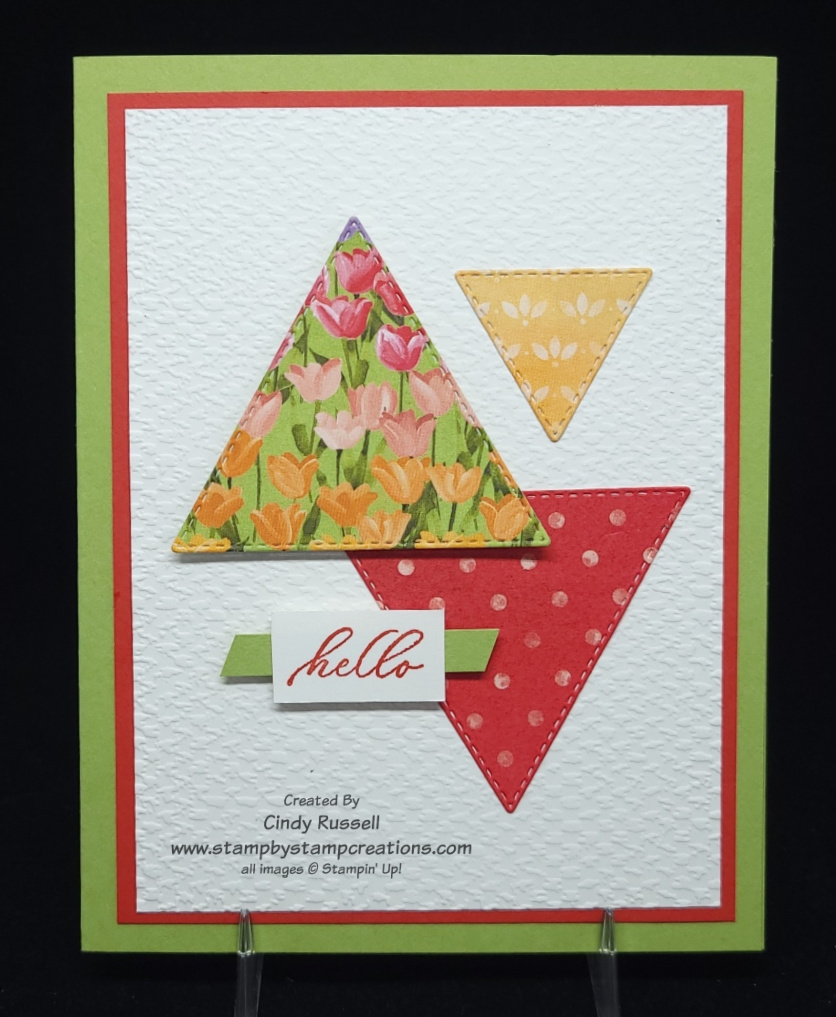
Today’s Card Sketch is all about the (Tri)Angle! I’ve had my Stitched Triangle Dies for a while now and they’ve never been used. (I know….I shouldn’t admit things like this!) Today’s sketch was the perfect chance to see how they worked.
There are 19 different dies in this set including four different sets of nesting triangles! That’s a lot of triangles!
I knew that I wanted to use designer paper for my triangles but the big question was which papers?
Small designs was what I needed for my triangles. Otherwise you wouldn’t be able to see the design. I finally decided on the Flowering Fields Designer Series Paper. All three designs are from this package of paper.
If you compare the card sketch to my card you can see that the first big change I made was to the size of the card. The sketch is for a square card and I made my card the usually 5 1/2″ x 4 1/4″ front.
The only other real change I made was to add a couple of layers, but then that is kind of what I do, right?
It was fun playing with those triangles. I may have to get them out again soon and play some more! Have a great day! Take care and Happy Stamping!
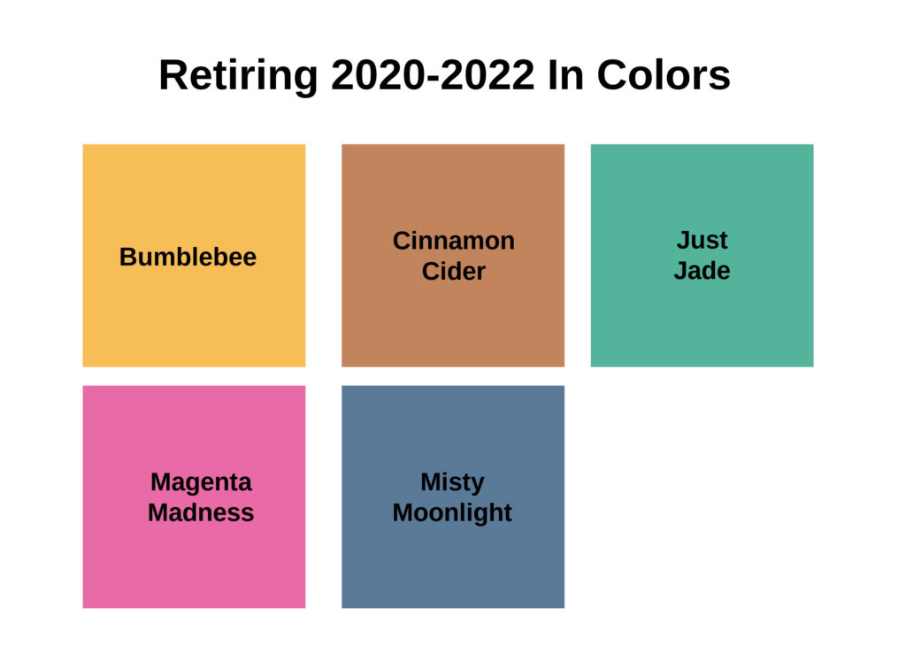
Tomorrow is a big day for us Stampin’ Up! Demonstrators. We will get to view a pdf of the Stampin’ Up!’s 2022-2023 Annual Catalog! Woo Hoo! I can’t wait! With each new catalog comes five new In Colors. Another Woo Hoo! Of course, this means that we’ll be losing the five 2020-2022 In Colors. Boo Hoo!
The five In Colors we’ll be losing this week are Bumblebee, Cinnamon Cider, Just Jade, Magenta Madness and Misty Moonlight. Which color do you really hate to see leave? I would have to say that Misty Moonlight is the color that I used the most over the past two years. I do like Just Jade but I haven’t used it that often and of course Magenta Madness is PINK!
If you like any of these colors and don’t have them yet, now is the time to purchase them. Stampin’ Up!’s Last Chance list comes out on April 1st and the retiring In Colors are some of the first products that are sold out. Buy the paper, buy the ink pads and don’t forget the ink refills!
One thing to think about while you’re deciding which of the retiring In Colors to purchase is that some of these colors are in the designer papers in the January – June Mini Catalog. That could mean that if there is a designer paper that you want to use on a project you may not be able to get the coordinating cardstock or ink.
Here’s a rundown of the Mini Catalog Designer Papers that include the retiring In Colors:
Hey Sports Fan – Bumblebee
Abstract Beauty – Magenta Madness
Heart & Home – Misty Moonlight and Cinnamon Cider
Artfully Composed – Just Jade
New Horizons – Misty Moonlight
If there are any of these soon-to-be-retired 2020-2022 In Colors that you want, I encourage you to purchase them prior to April 1st.
Here’s a little teaser for you: I’ve seen 4 of the 5 new 2022-2024 In Colors and they’re gorgeous! The last one will be revealed to all of us Demonstrators today. I think you’re going to love them! I know I do!
Ah, Springtime! It’s finally here! Ok…snow is actually forecast for here in the Denver area today but the calendar says Spring! Woo hoo!
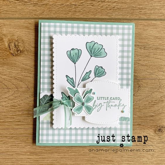
Flowers of Friendship is the stamp set I used on today’s card. It’s Make-It-Mine Monday so I did get my inspiration for today’s card elsewhere. You’ve got to love Pinterest. We Stampin’ Up! Demonstrators also have the Demonstrator Planning Place Facebook Page where we can share ideas with each other which is nice.
The fun gingham designer paper is from the Pansy Petals Designer Paper in the current Annual Catalog. I do love my gingham!
The stitched, scalloped rectangle was die cut using the Scalloped Contours Dies.
AnaMarie’s card definitely caught my eye and is so lovely, but I have to be honest, I couldn’t get over the Soft Succulent green flowers. That’s why I chose to change the main color to Fresh Fresh Freesia.
I kept most of the elements on the card the same but changed up the label and sentiment. It’s rare that I simplify a card instead of adding to it. Ha!
Happy Spring! Have a great day! Take care and Happy Stamping!
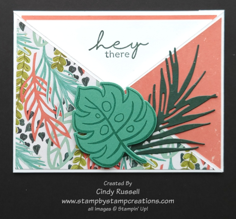
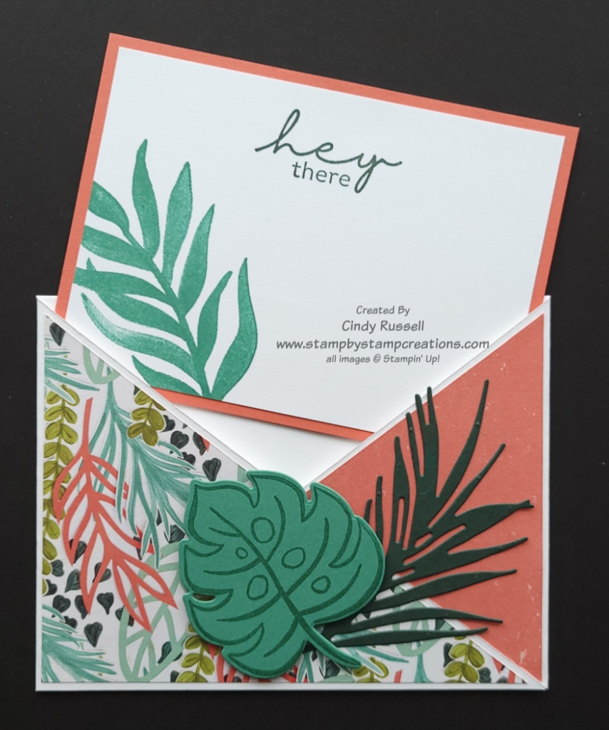
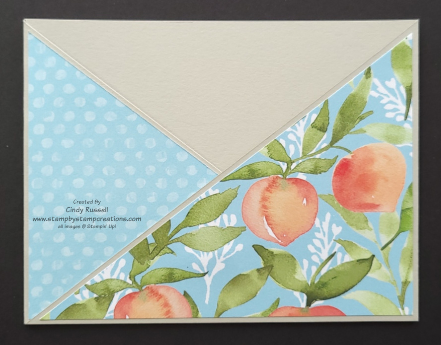
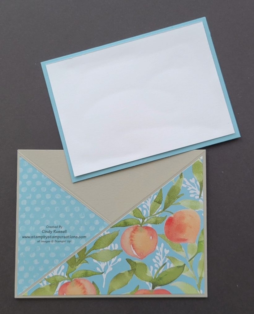
Today’s Fun Fold is an Angle Pocket Fun Fold. So fun and easy if you follow the instructions. Below you will find step-by-step instructions with photos on how to make it. I do have a disclaimer…on my samples in the instructions the card stock base doesn’t really match the rest of the parts of the card but I wanted to make sure you could see the different steps.
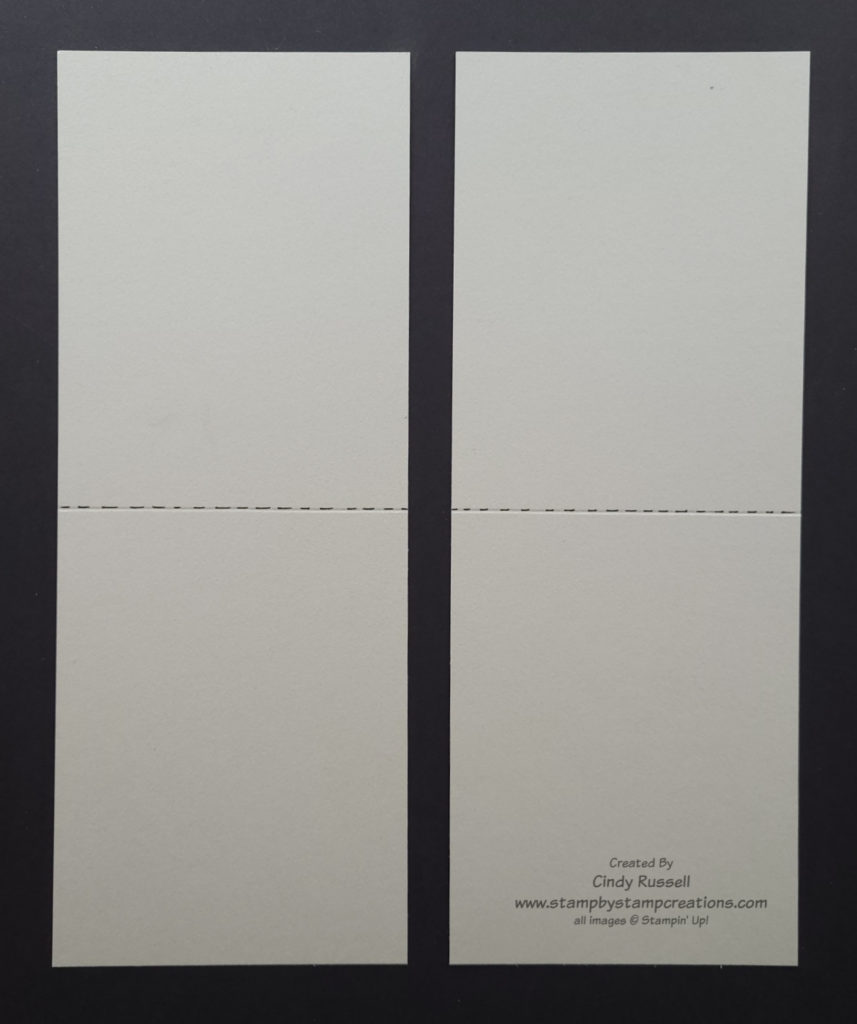
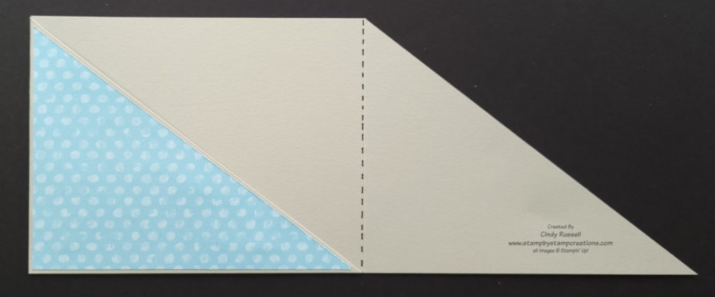
For the base of this card you need to start with a full sheet of cardstock. With the long side of the cardstock at the top of your score board, score at 5 ½”. The next step is to cut the card stock in half along the short side (at the 4 ¼” mark) so that you have two pieces of cardstock that are 4 ¼”x 11” and scored in half. At this point you want to make sure that both pieces are the exact same size because they will overlap.
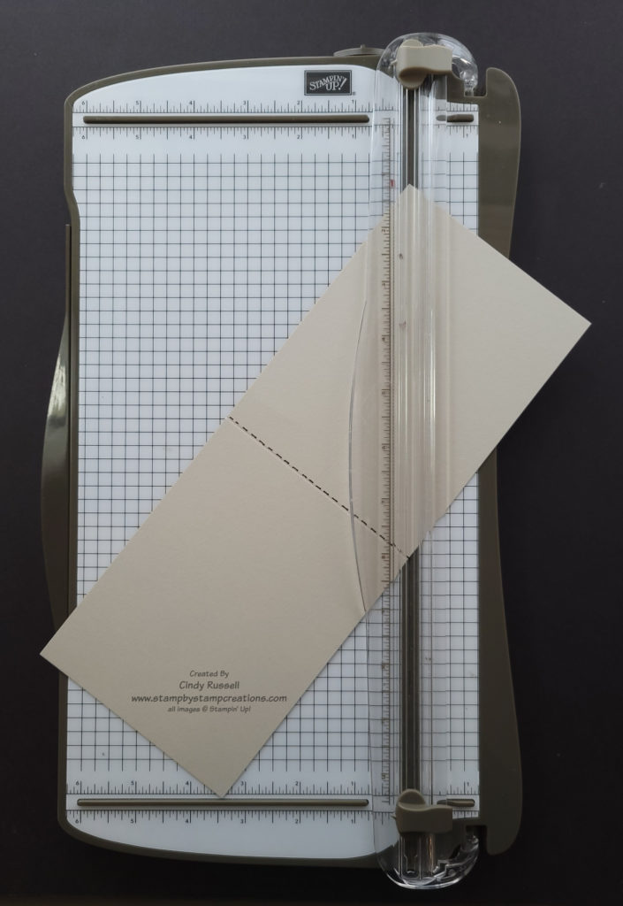
Place one of the 4 1/4″ x 11″ pieces of cardstock vertically on the Paper Trimmer (short side towards the top). Start at the top left corner and cut diagonally to the right side of the score line.
On the second piece of 4 1/4″ x 11″ cardstock start at the right side of the score mark and cut diagonally to the bottom left corner.
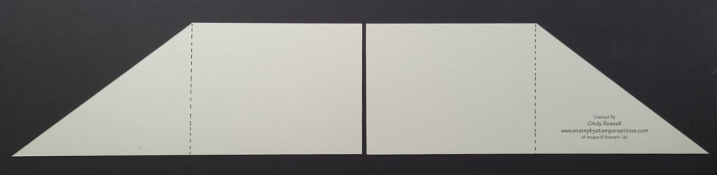
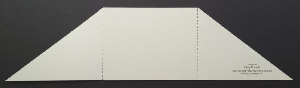
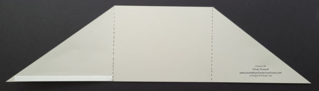
Fold both pieces along the score lines making sure that edges and points/corners line up straight. Lay the two pieces horizontally with the angled pieces to the outside. Adhere the two rectangular sections together, making sure all edges line up square.
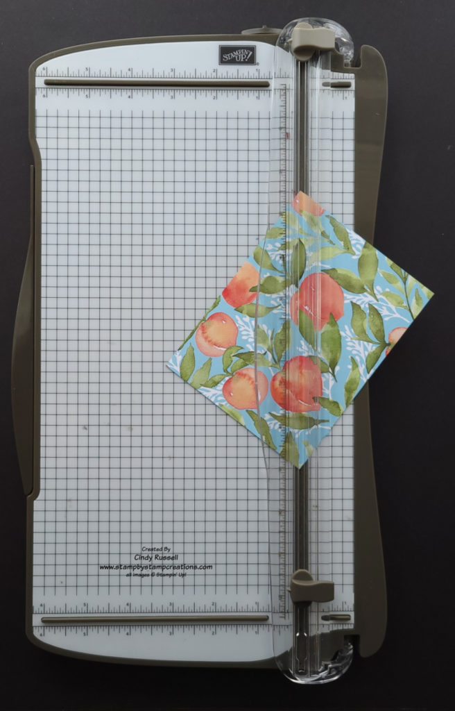
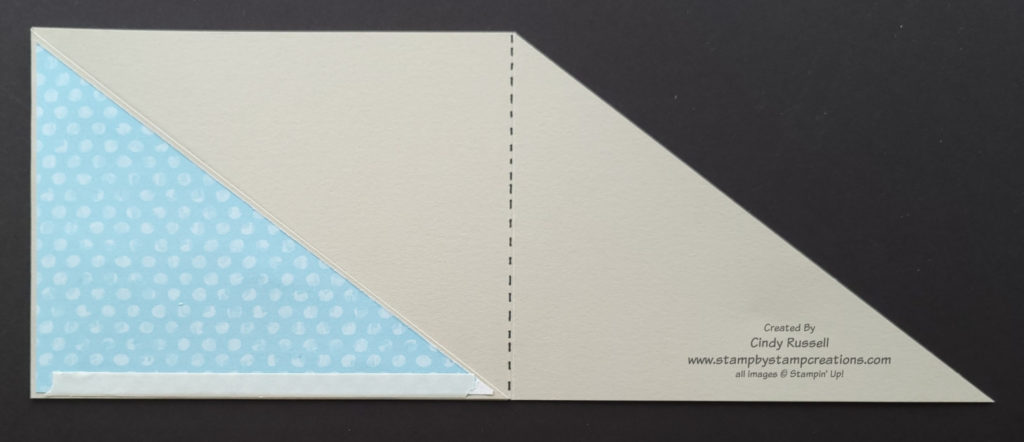
The angled sections of the card need to be decorated before you complete the pocket. It’s easiest if you start with a piece of designer paper that you want to use both sides of. Cut the designer paper to 5 ¼” x 4”. If the patterns you want to use aren’t on the same sheet of designer paper, you will need to cut two different 5 ¼” x 4” pieces. The side of the paper facing up will be adhered to the angled section on the right side of the card. Cut the designer paper diagonally from the upper left corner to the lower right corner. If the designer paper has a pattern where it matters if something is upside down, be sure to take this into consideration before cutting the paper. You will notice that on my card at the beginning of this post that the leaves are pointing down. Lucky for me this doesn’t really matter with leaves. (I forgot to take my own advice! Ha!). In the sample photo to the left you see that it will matter if the peaches are upside down so I had to take that into consideration.
Adhere the designer paper pieces to the angled sections of the card base. Make sure you have the sections in the “closed” position so you don’t adhere the paper to the wrong side of the section. I like to use liquid glue so that I have to a little room to slide the piece and make sure I get it in the correct position.
To make the pocket, place a strip of Tear & Tape adhesive as close to the bottom edge of one of the angle sections as possible . You will want to adhere the adhesive to the angled section that will be “underneath” and will be covered by a portion of the other angled section. In this example photo I placed my adhesive on the left angled section. Remove the backing from the Tear & Tape, fold the section over towards the center and adhere.
To adhere the second angle section over the first, place a piece of Tear & Tape adhesive close to the bottom edge of the first angle section (which is already adhered to the center of the card). Make sure not to get too close to the left side (in my example) so that the adhesive doesn’t show when the angled piece is adhered.
For the pocket insert cut the base piece 5 1/8” x 3 ¾”. The Basic White piece which you will decorate/write on should be cut 4 7/8” x 3 ½”.
Despite my lengthy instructions and all of the photos, this card is pretty easy to make. Have fun recreating it!