Journey With Color: A Tropical Oasis

Stampin’ Up!’s 2022-2024 In Colors

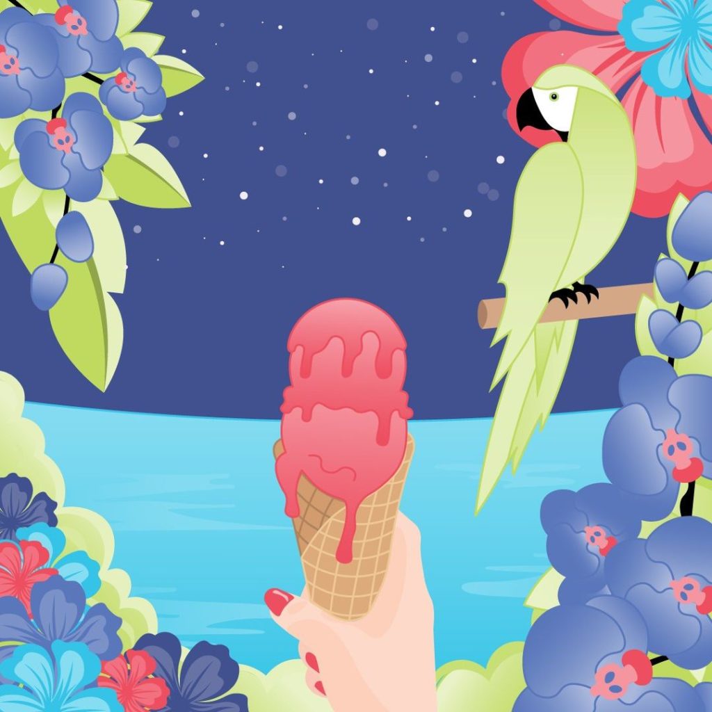
Stampin’ Up!’s new 2022-2024 In Colors are perfect for creating a Tropical Oasis!  They are gorgeous and I love them all! 

A little over a week ago, Stampin’ Up! created riddles for us to guess the names and the colors.  Each morning for five days they posted a riddle and a photo in gray tones in our Demonstrator Planning Place on Facebook. In the evening of each day they then colored the picture like you see below and told us the name.  It was fun to try to guess what color it was going to be as well as the name. I enjoyed seeing all the different guesses people came up with. Some of them were pretty funny.

Stampin’ Up!’s 2022-2024 In Colors

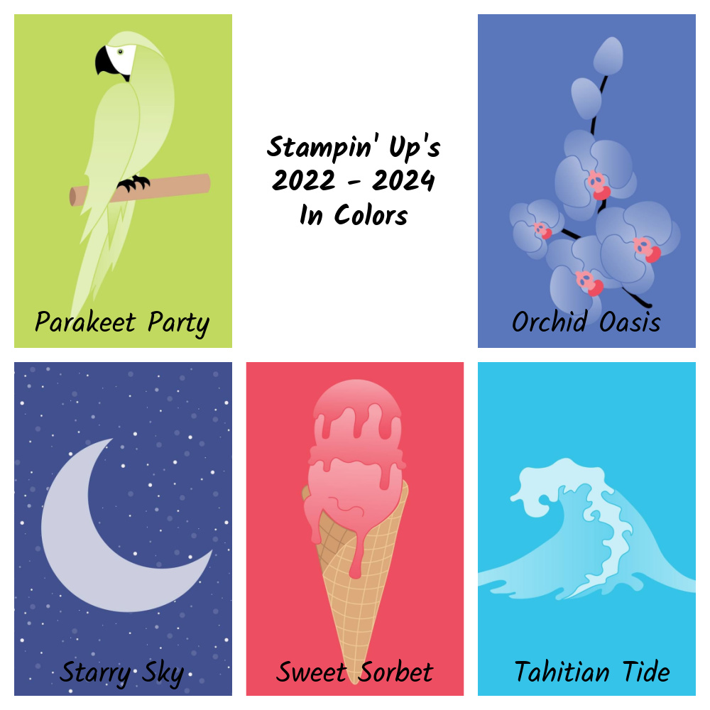
Parakeet Party “Don’t let my feathers fool you—I’m a social butterfly! Bright, bold, and beautiful is my motto. This is one bird who doesn’t have time for siestas, but that’s because me gusta la fiesta! Who am I?”

Isn’t this a pretty green?

Sweet Sorbet

“I’m a delicious treat on the tip of your tongue. Creamy yet dairy-free is the life for me. Strawberries, watermelon, raspberries, oh my! Just blend a little fruit juice, water, and sugar for a frozen surprise. What’s my name?”

Pink! Woo Hoo! I love my pinks!

Tahitian Tide

“I rise and fall with the sun and the moon. I’m a fun splash mid-afternoon. If you’re looking for a slice of paradise and that tropical aura, then I recommend a sweet escape to Bora Bora! Can you guess my name?”

Stampin’ Up! hasn’t had a turquoise color in a long time!

Starry Sky

“Like billions of fireflies shining so bright we work together to light up the night. Connect us together and we make up dazzling constellations. Shared with someone you love we’re quite the romantic destination. Who am I?”

Such a pretty blue!

Orchid Oasis

“I bloom in perfect symmetry. Elegant, fragrant, vibrant—I’m a flower fit for royalty. Together we can celebrate friendships, new beginnings, and affection. Think of me as your wellspring of tranquility and personal connection. What’s my name?”

This is almost a Periwinkle Blue. If you follow the Pantone colors of the year, this is spot on! This year’s color is called Very Peri and it’s pretty darn close to this!

So what do you think of Stampin’ Up!’s newest colors? I love the way these colors all coordinate together. Do you like them as much as I do? I can’t wait to get my hands on them! Then the fun will begin!

Which of these five colors is your favorite?

Have a great day! Take care and Happy Stamping!

Journey With Color: In Colors

In the 2006-2007 Annual Catalog, Stampin’ Up! first introduced us to In-Colors.  This is how In-Colors were described in that catalog:

               “This year, we’re delighted to introduce In Color ™, an exciting palette of six trend-savvy colors available only this year!  Use these exclusive colors to create unique hand-stamped cards and gifts.  These colors look terrific in a monochromatic color scheme, or in combination with many of our other colors!”

As it says in the above paragraph, when the In Colors were first introduced, they were only available for one year.  Lucky for us, In Colors are currently available for two years instead of just one.  This gives us more time to enjoy them. 

2006-2007 Stampin’ Up! In Colors

The first six In Colors were Vintage Violet, Buckaroo Blue, Cool Caribbean, Marigold Morning, True Thyme and Cranberry Crisp.  My favorite was Cool Caribbean.  It’s quite close to Coastal Cabana (both in name and color!)  I still get the two names mixed up.  Sheesh!

Do any of you remember these first In Colors?  Which was your favorite?

2007-2008 Stampin’ Up! In Colors

The second batch of In Colors came out in Stampin’ Up!’s Fall-Winter 2007 Annual Catalog.  (Yes, there were a couple of years that Stampin’ Up! tried going with two annual catalogs per year).  This group contained some softer colors.  Blue Bayou, Soft Sky, Wild Wasabi, River Rock, Groovy Guava and Purely Pomegranate.  Which of these six is your favorite?  In this group I’d have to go with Blue Bayou or Purely Pomegranate.  Also, in this catalog Basic Gray was added to the Neutrals Collection.  It’s a darker gray than Going Gray.

2008-2009 Stampin’ Up! In Colors

There were two more catalogs that contained the In Colors that lasted a year. In the 2008 Fall-Winter Catalog the In Colors were Kiwi Kiss, Baja Breeze, Tangerine Tango, Pink Pirouette, Pacific Point and Riding Hood Red. As you can probably guess, Pink Pirouette was my favorite color from this group.

2009-2010 Stampin’ Up! In Colors

The 2009-2010 Annual Catalog added Soft Suede, Dusty Durango, Crushed Curry, Melon Mambo, Rich Razzleberry and Bermuda Bay. You probably recognize some of these colors.

Take a look at these four sets of colors.  You can see that the colors in each group work well with each other.  I’m not sure I’d use all six of any set together on one project but you can definitely use at least 2-3 of them at one time.  When Stampin’ Up! develops a set of In Colors they make sure that the colors in the group not only work well together but will work well with the current group of 48 that they offer.

Coordination.  It’s one of my favorite things about Stampin’ Up!. 

A Journey With Color: The Beginning

Stampin’ Up! Colors

In my newsletter last week, I talked about the Journey With Color that we are going to be taking.  We’ll be talking about Stampin’ Up! colors, their history, working with them and coordinating them.  This journey will happen here on my blog, on my Facebook Page and in my newsletter.  If you don’t follow me on Facebook, you’ll want to click here and if you’re not on my email list click the link to the right to get on it.  You’re going to want to check out all three places to not miss any part of this journey.

Stampin’ Up! was founded back in 1988 but they didn’t have their own ink pads, paper or stamps.  They were selling products made by other companies.  Stampin’ Up! didn’t come out with their own colors, ink pads and paper until their 1997-1998 Catalog. (How many of you were stamping back then?) In this catalog they premiered 48 colors in four different color families:  Rich Regals, Bold Brights, Soft Subtles and Earth Elements.  These four families are very similar to the current families of colors:  Brights, Neutrals, Regals and Subtles.

Stampin’ Up!’s alliteration of color names began with these original colors.  Who remembers Chocolate Chip, YoYo Yellow and Marvelous Magenta?  Click here to view these original 48 colors.  The swatches of color will be a little off because I didn’t get this photo straight out of a catalog.  You can get a good idea of the variety of colors though as well as what colors were in each family.

In case you’re having trouble viewing the link, here’s a rundown by color collection:

Rich Regals:  Not Quite Navy, Eggplant Envy, Forest Foliage, Baroque Burgundy, Night of Navy, Bordering Blue, Rose Red, Brocade Blue, Rose Romance, Ballet Blue, Marvelous Magenta and Taken With Teal.

Bold Brights:  Glorious Green, Green Galore, Gable Green, YoYo Yellow, Only Orange, Rocket Red, Pink Passion, Positively Pink, Orchid Opulence, Lovely Lilac, Brilliant Blue and Tempting Turquoise.

Soft Subtles:  Perfect Plum, Pale Plum, Blush Blossom, Mellow Moss, Barely Banana, Sage Shadow, Lavender Lace, Mauve Mist, Almost Amethyst, Mint Melody, Bliss Blue and Pretty in Pink.

Earth Elements:  Chocolate Chip, Close To Cocoa, Really Rus, Cameo Coral, Ruby Red, More Mustard, Summer Sun, Luscious Lime, Old Olive, Garden Green, Going Grey and Basic Black.

How many current colors can you find in this original list of colors?  If you counted 4 (which includes Basic Black) then you are correct.  Night of Navy, Old Olive, Garden Green and Basic Black.  Four out of the 48 have survived 14 years of color changes!

It’s fun to look back at these original colors.  I hate to admit it but I remember these colors!  A few of the colors that I still kind of miss are More Mustard and Forest Foliage.  More Mustard was just the perfect deep yellow-gold for Fall cards.  Forest Foliage was a gorgeous Blue-Green (or Green-Blue).  The color swatch doesn’t do it justice.  It was a nice rich color like the current Shaded Spruce but with more blue in it.

How many of you remember these original colors?  Which colors do you miss?

The New Purple Posy!

The new In-Color Purple Posy is just so soft and lovely. It’s a very light purple and compliments the four other purples in the Stampin’ Up! Spectrum.

Purple Posy is soft enough of a color to compliment the deep and beautiful Blackberry Bliss and the fun and bright Rich Razzleberry. However, I think it really shines when you pair it with Highland Heather and Gorgeous Grape. Spot on! Now my question for you is which of the current purples will you be pairing Purple Posy with first?

I can’t wait to start creating projects with this soft and lovely color! Be sure to put the Purple Posy cardstock, ink pad and ink refill on your wish list for June…..or join my team of SASsy Stampers and order it in May! Yep! Ordering new products ahead of time is definitely one of the many perks of being a Stampin’ Up! Demonstrator!

Have a great day! Take care and Happy Stamping!

2019-2021 In-Colors

When I get a peek at the new, upcoming catalog one of the first things I check out are the new In-Colors. These are the 5 brand new colors that will be in the Stampin’ Up! spectrum of colors for the next two years. Here’s your peek at the 2019-2021 In-Colors:

2019-2021 In-Colors

What do you think? Pretty nice, huh? We have some nice new pastels as well as a couple of colors that I would probably place in the regals category. Which one is your favorite? Without really having worked with any of them I would have to say that at this point my favorite is the Pretty Peacock. It’s such a rich and deep color. I’m not really a pastels person but these three pastels are really pretty.

Do you remember a week or so ago when I was wondering about these new colors and what they’d be? I mentioned that Coral was the “color of the year” and wondered if Stampin’ Up! would come out with another coral color to stay current. Well, the Terracotta Tile is their choice of keeping in that Coral family. In the next few days I’ll be comparing these new colors with current Stampin’ Up! colors and show you where they fit in the Stampin’ Up! color spectrum. Stay tuned!

Have a great day! Take care and Happy Stamping!