Making-It-Mine Monday: Summer Splash and Spotlight on Nature

It’s been a while since I’ve done a Make-It-Mine Monday post, and I’ve missed it.  I love getting inspiration from other people’s projects and Make-It-Mine Monday is the perfect way to showcase that!
I try to write an email newsletter every week which I send out on Tuesdays or Wednesdays.  I try to share a project each week. 

(If you you’d like to be on my email list to receive my newsletter as well as other emails, please sign up in the box to the right of this post or in the pop up box when it appears.) 

In last week’s newsletter I shared this card that I made at Stampin’ Up!’s On Stage event in March.  I had explained how it was a very nice card, but it just wasn’t me.  The combination of colors isn’t me and the design itself isn’t really me.  The card did inspire me though.
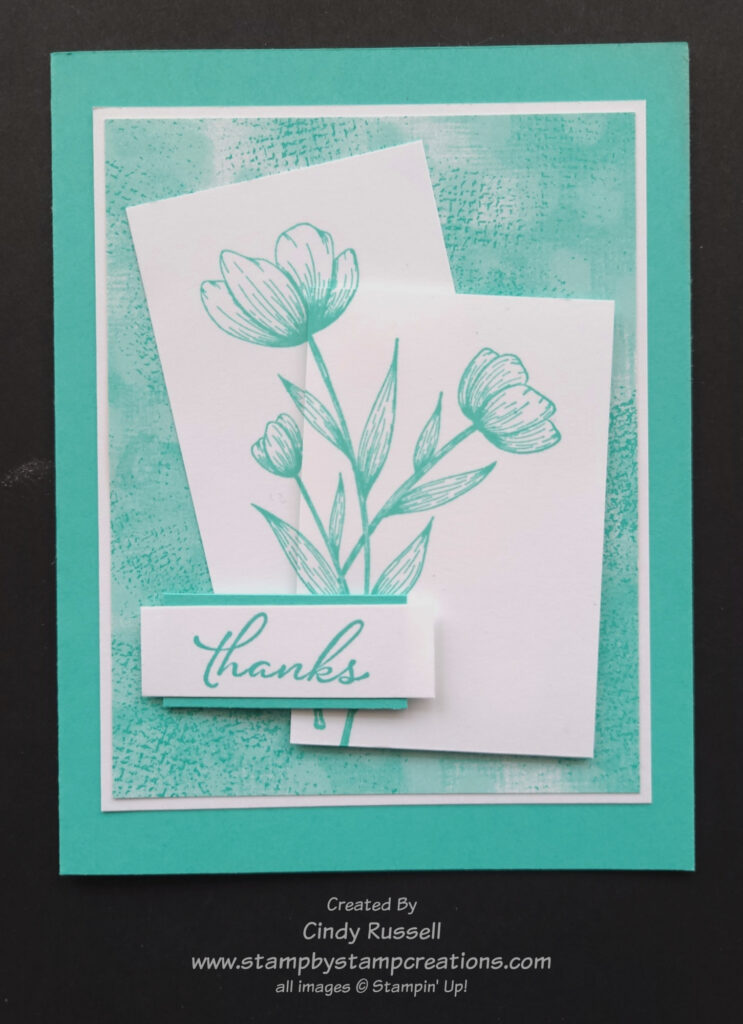
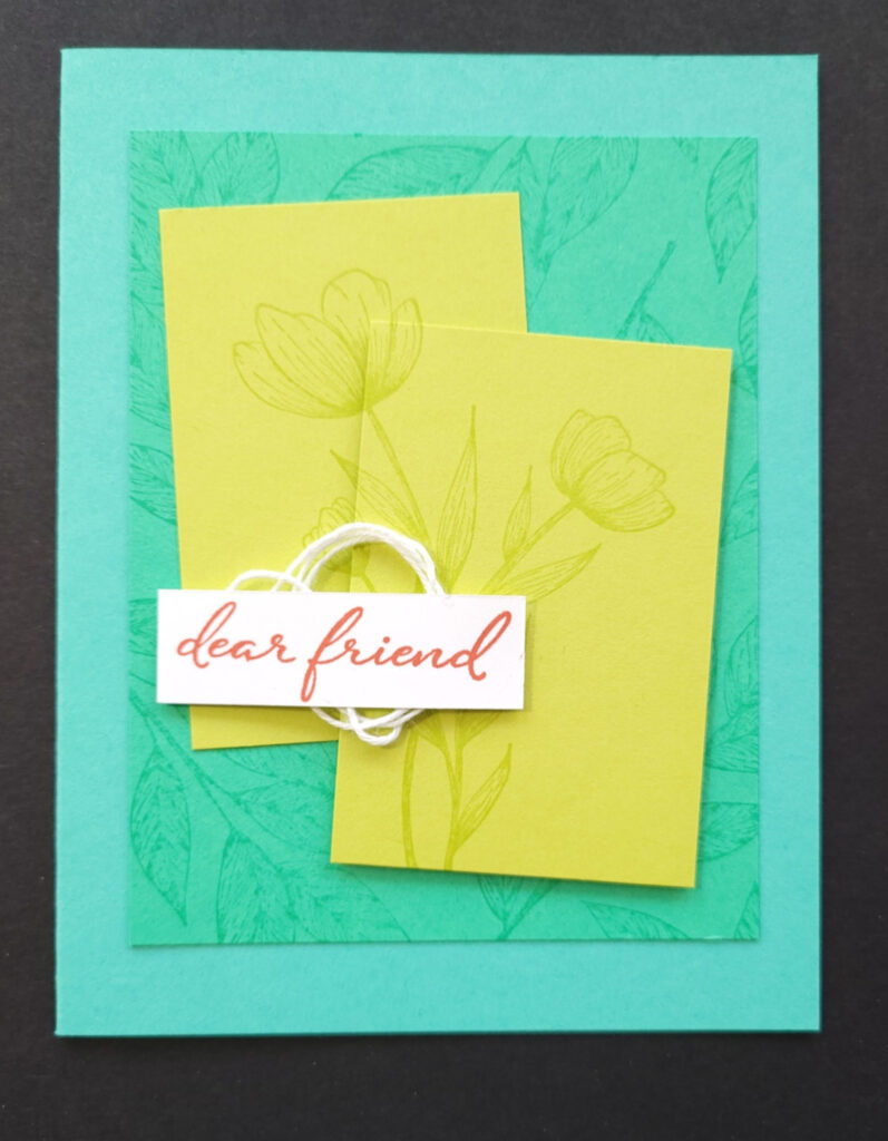
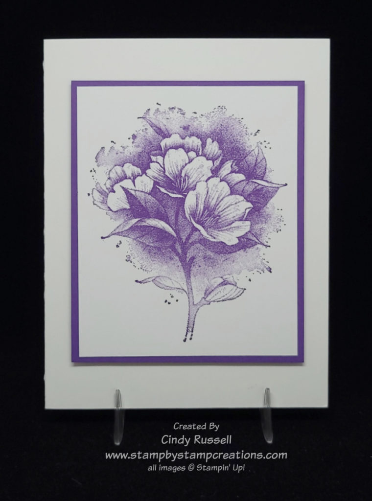
It inspired me so much that I had to make it mine!  Nothing against Stampin’ Up! designers, but I do like my card better.  Their card was way outside of my comfort zone.  The Stampin’ Up! designer used the new Spotlight in Nature (#163579 $23) which will be in the 2024-2025 Annual Catalog and since I had that stamp set I used it on my card too.  For my card I decided to stick with a single color and white.  To choose a color I started with the designer paper that I used on the layer behind the flowers.  I used the new Unbounded Bounty Beauty Designer Series Paper (#163372 $12.50) which you can find on page 55 of the new catalog or in my online store starting on Wednesday.  The color I used is the new 2024-2026 In-Color, Summer Splash.  So pretty!

The angled pieces that the flowers are on aren’t something that I would usually use on a card but I did find the technique intriguing, so I decided to give it another shot.  It’s not hard to line up the two images after stamping them, the hard part is stamping them and making sure that the two pieces will fit on the layer underneath them.

I could have heat embossed the sentiment in white on a piece Summer Splash cardstock but I think my layered sentiment works a little better on this card. 

As I mentioned above, I love being inspired by other people’s work.  It’s nice to have a starting point and go from there.  Give it a try!  Take my card and make it your own by changing a little something about the card or a lot.  The choice is yours!  Have a great day!  Take care and Happy Stamping!

Make It Mine Monday With Sentimental Swirls

Stampin’ Up!’s Sentimental Swirls stamp set is a fun and simple stamp set that can be found in the January – June Mini Catalog. It is a stamp set perfect for the beginner stamper.

The flowers that you see on this card are punched out with the Flowers & Leaves Punch. There are also smaller flowers in the stamp set that can be punched out with the Strawberry Builder Punch.

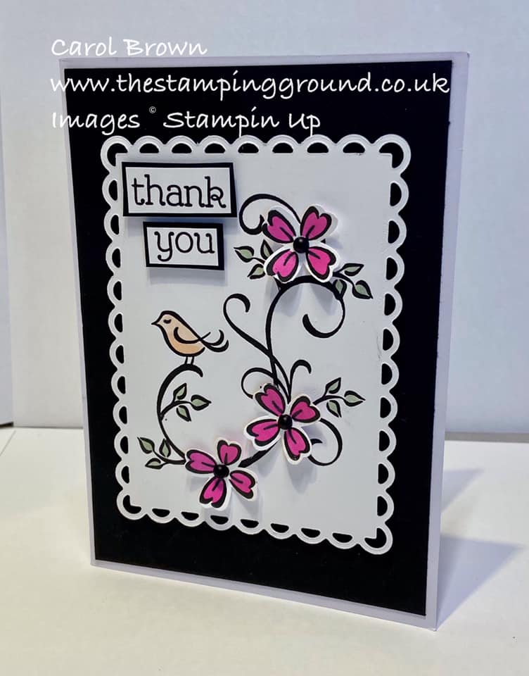
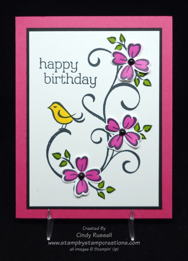
As I was scrolling through Pinterest I came across this card by Carol Brown that caught my eye. I knew I wanted to recreate it for Make It Mine Monday. Pink flowers with a touch of black. Of course it caught my eye! 🙂

As you can see on my card, I made pink the prominent color and black is just an accent. The card came together easily. I started with the black swirl and went from there. The flowers were stamped on a scrap of Basic White cardstock and then colored and punched out. I set them around the swirl where I was going to adhere them so I could figure out where to stamp the leaves.

The stamp set is photopolymer so it was quite easy to stamp the outlines of the flowers, leaves and bird and then use a second stamp to stamp the colored portion. Two step stamping at it’s best!

Have a great day! Take care and Happy Stamping!
Make It Mine With Dahlia Days

Dahlia Days

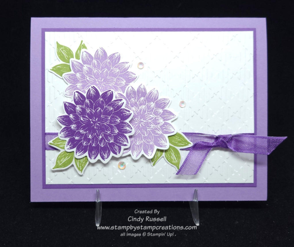
Dahlias are a favorite flower in my family. My mom used to grow them in her garden and her dad used to grow them and enter them in the Minnesota State Fair. He even won awards with them. So when I saw the new Dahlia Days stamp set in Stampin’ Up!’s January – June Mini catalog I knew that I had to get it. Then when I saw it on my stamp shelf it was time to create a card or two with it.

Not only do Dahlias come in different sizes and shapes but they can come in many different colors too.

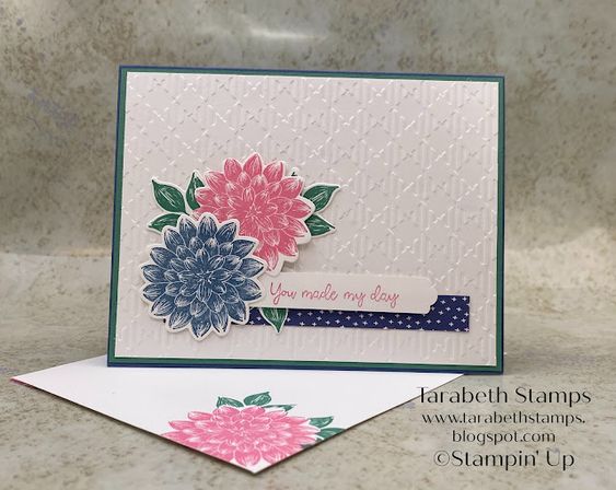
This is my inspiration card. I love Tarabeth’s card but it’s Make It Mine Monday and I had to change it up.

The basic layout of my card is the same as the inspiration card but I did add another layer (of course!). It’s hard to tell in the photo of my card but I used the Gingham Embossing Folder like Tarabeth did.

I added another flower to my card. You know, that Rule of 3 that I’ve talked about before. This rule says that elements in groups of 3, or at least odd numbers, are more pleasing to the eye.

Tarabeth’s card gave me the inspiration that I needed. That’s why I love checking out other people’s cards. I may not copy them exactly, but they give me the little boost I need to get started.

Have a great day! Take care and Happy Stamping!
A Masculine Card for Make It Mine Monday!

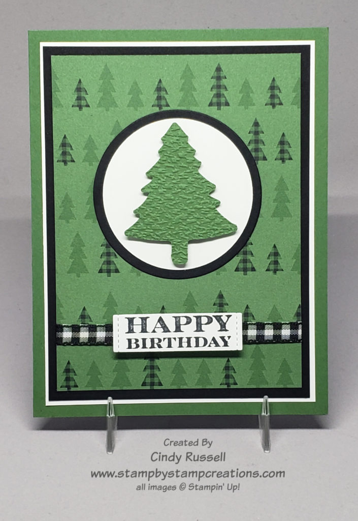
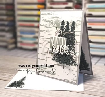
While I was scrolling through Pinterest looking for cards to make for my 40 Projects In 40 Days (find them on my Facebook page), This card caught my eye and knew I had to Make It Mine!  It seems that I have a thing for trees.  I seem to purchase any stamp set that has some type of tree in it.  😊

I love how Rose used the Birch background stamp on her card with the die-cut trees. I also love how she stamped and cut out the “happy birthday” from the Biggest Wish stamp set.

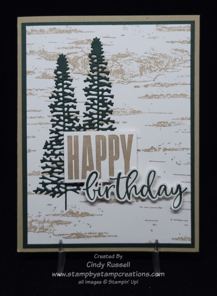
As you can see, I flipped the card and added a layer. It looks like Rose used grays on her card but I used Crumb Cake. The die-cut trees are from the Majestic Mountain dies. My card only has two tree on it to keep it a little more simple.

There’s a tip that I want to remind you of. I shared it with you last fall in my newsletter. What? You don’t get my newsletter? You may want to go to the sign-up box at the top of this page and get on that list today so you don’t miss anything!

Anyway, the tip that I want to remind you of is that when you are cutting around a stamped word like “birthday” here on my card you should lightly sketch around the word so that your scissors have a line to follow. It really makes a difference. The image here on my card was my second attempt. I forgot to trace around the word the first time and really messed it up. Another tip would be to remember to use Adhesive Sheets when die cutting the trees or other intricate images. It makes life a whole lot easier!

This turned out to be a perfect card for a guy. I’m going to have to make a few more of them to keep in my stash! Have a great day! Take care and Happy Stamping!
Make It Mine Monday: Hexagons

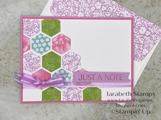
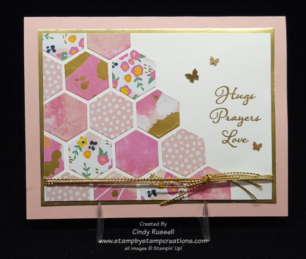
This card with all the hexagons is so cute! I just had to try it for myself. The hexagon die is from the new Beautiful Shapes die set which coordinates with the Hello Beautiful stamp set. The dies set has all sorts of fun shapes. Tarabeth used designer paper from a few different paper sets on her card. The main colors on her card are the new In Colors this year, Fresh Freesia and Polished Pink.

I was going to stick to the same color scheme as Larabeth but I didn’t seem to have all the designer papers so I had to start from scratch. After perusing my stash of design paper I finally went with the Abstract Beauty pack. This fun package of designer paper is a new size. It’s 4″ x 6″ and many of the sheets have accents of gold foil.

I’m pretty tickled with the way my card turned out. I may have to make a few more of them. The only part I would change would be the gold cord. I would rather have used a thin gold ribbon but Stampin’ Up! doesn’t have any right now.

If you compare the cards, you can see that I have a few more hexagons on my card than the one that inspired me. I just kept gluing them down! Ha!

You’ll notice that my focal point piece with the hexagons is also smaller than the card I copied. I did start with basically the same size as the original but when I had all of the hexagons adhered there was still a little space along the bottom. I was too lazy to die cut any more so I just trimmed down the Basic White card stock. I actually like the smaller focal point better than the larger one so it all worked out fine. 🙂

I used a gold foil layer and the gold cord on my card to pick up the gold on some of the pieces of designer paper. The sentiment, from the Positive Thoughts stamp set, is heat embossed with gold embossing powder.

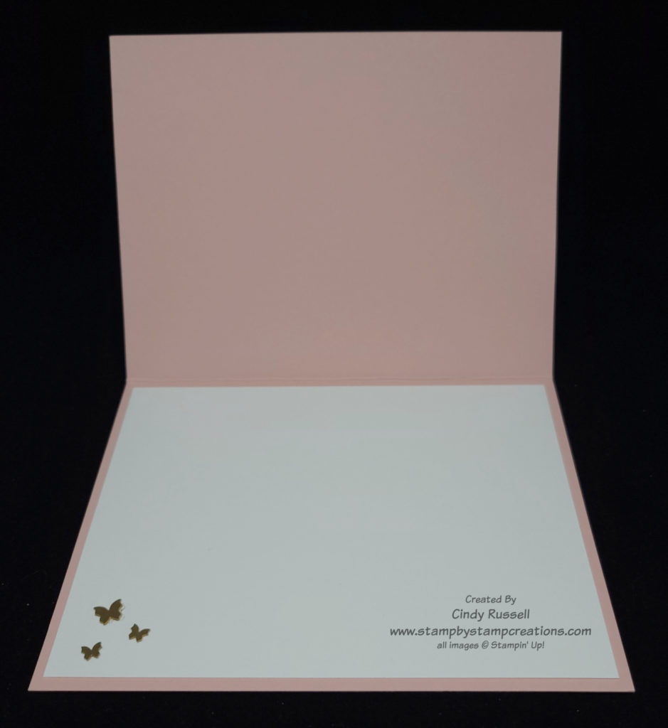
The finishing touches on my card are the adorable little butterflies. They are Brushed Brass Butterflies (#158136 $10) from Stampin’ Up!’s January – June Mini Catalog. I liked them so much on the outside of the card that I put them on the inside of the card too!

Have a great day! Take care and Happy Stamping!
Make It Mine Monday: Calming Camellia

Calming Camellia

It’s Make It Mine Monday! I’ve enjoyed sharing with you some of the swap cards that I’ve received. I hope you’ve enjoyed them too. I’m not done sharing swaps with you but it’s time to switch things up a bit again.

Isn’t the flower stamp on this card gorgeous? It’s from the Sale-a-bration Host Set Calming Camellia. You can choose this stamp set for free when you place a party order or personal order of $300 or more.

Calming Camellia is one of Stampin’ Up!’s DistINKtive stamp sets. Basically, this type of stamp is very realistic looking with lots of dimension and shading. I think they’re gorgeous! What do you think about DistINKtive stamps?

Calming Camellia

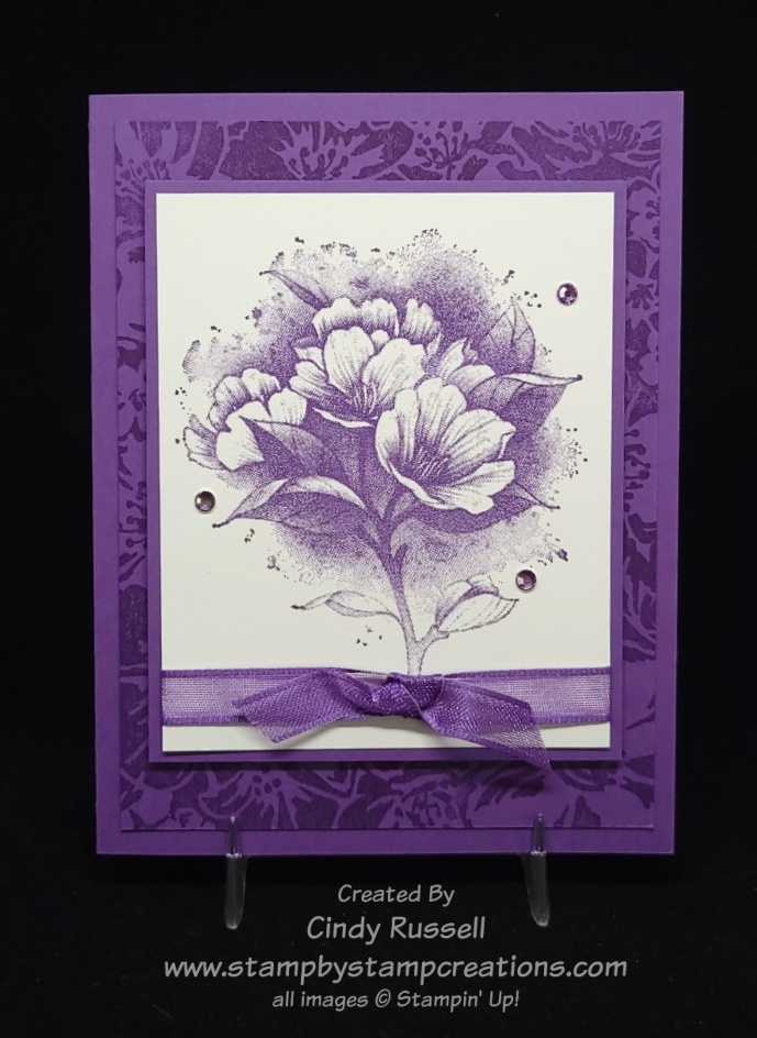
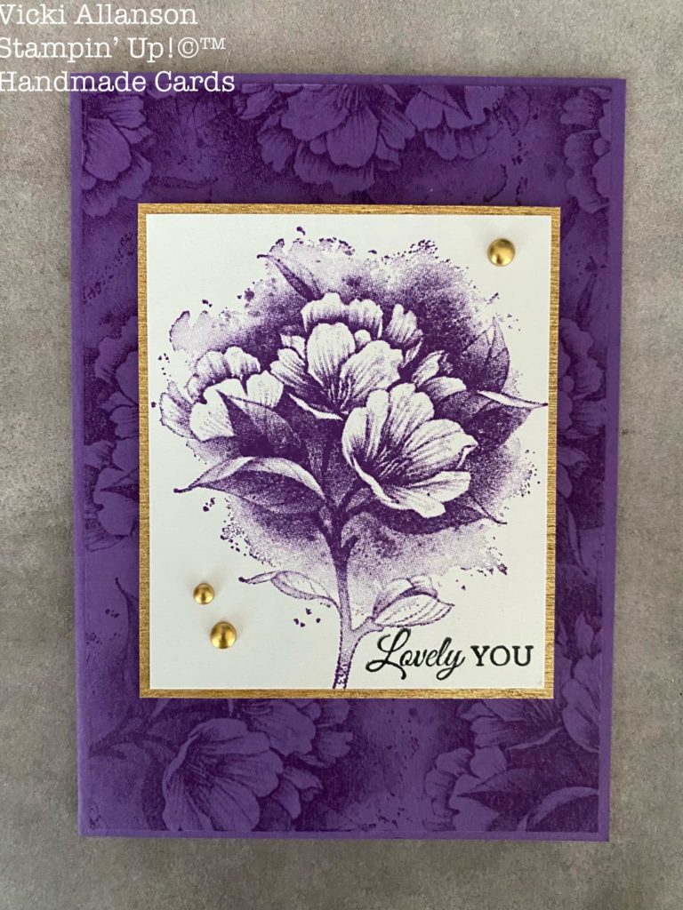
The second card here is the card that inspired me. I love how Vicki used the Wild Roses Background stamp on her card. It coordinates so well with the Calming Camellia stamp. Instead of using a gold layer and gold embellishments I only used Gorgeous Grape on my card.

The Basic Rhinestone Jewels on my card are colored with the Dark Highland Heather Stampin’ Blends marker and then of course I had to add ribbon.

Both my card and Vicki’s card are fairly simple. No dies or punches, no fussy cutting and not too many layers. While I had the stamp set out I wanted to try and make the card even more simple.

Calming Camellia

Check out the third photo. It’s just the stamped image and a coordinating layer adhered to the card with Stampin’ Dimensionals. Simple, yet stunning. It really shows off the floral image.

This simple card would be perfect for any occasion. Just add a sentiment to the inside.

Have a great day! Take care and Happy Stamping!
Grateful

Sparkle of the Season Fall Card

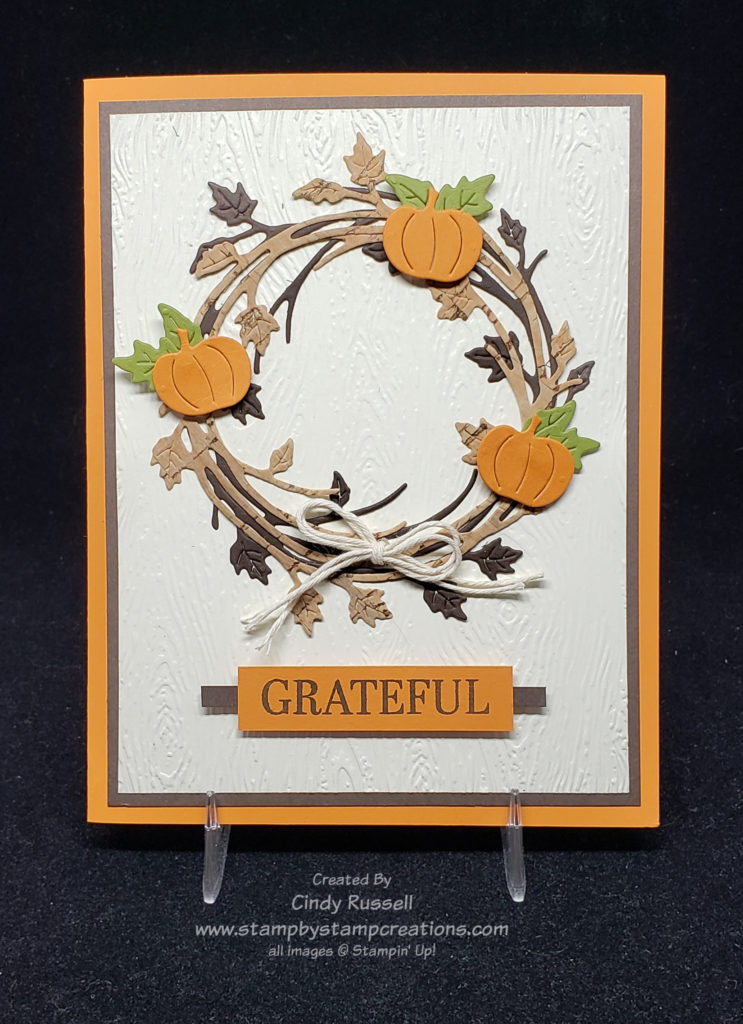
Grateful.  It’s something we should always be.  No matter how tough things can get there is always something, big or small, that we can be grateful for.  One thing I am grateful for is that I get to play with all of my crafting supplies and create things to share with you.

Today I wanted to share a Fall wreath with you using Stampin’ Up!’s Sparkle of the Season Bundle.  I’ve seen lots of cards made with this versatile bundle but the card that inspired me had pumpkins on it so that’s the direction I went this week.

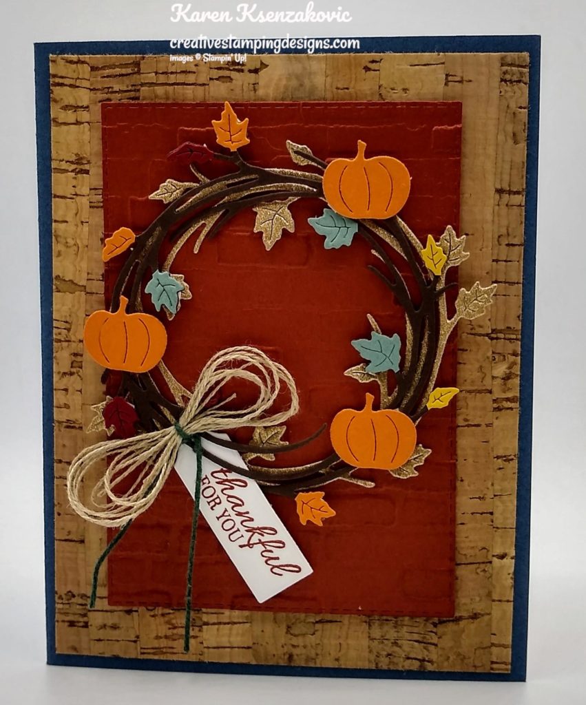
When you view the card that inspired me you will notice that there aren’t a lot of similarities between the two cards. I took a lot of creative license with this Make-It-Mine project.

The first thing that I saw on this card by Karen that I wanted to use was the Cork Specialty Paper. It adds that special little touch to a project. The second thing I wanted to incorporate on my card was the double wreath. The second wreath adds another level of dimension to the card.

Instead of copying what Karen did, I combined those two points of inspiration into one. I die cut one of the wreaths on my card from the Cork Specialty Paper. I love how it turned out! When I set it against a Early Espresso colored wreath the cork really popped.

The only other thing that I really took from the inspiration card to my own was to include the three pumpkins on my wreath. Other than those few things there aren’t a lot of other similarities between the cards. That’s ok though. The whole point of Make-It-Mine Monday is to get inspired and find a starting point for my project.

Give it a try. Go get inspired! Maybe start with my card and move on from there. I’d love to see what you come up with! Have a great day. Take care and Happy Stamping!

Make It Mine: Pretty In Pink

It’s time to step away from Fall, Halloween, and Christmas for a bit.  I love making cards and projects for those occasions but today I felt like switching it up.  With the days becoming shorter and cooler it’s time for a little pretty in pink to brighten things up.

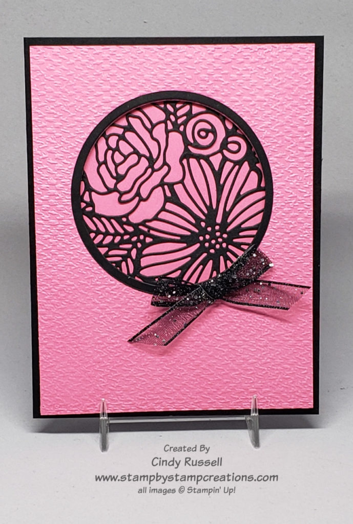
This color combination is one of my favorites and I love the contrast between the two colors.  The little window with a peek at the outline of the flower bouquet is gorgeous.  The flower bouquet outline is from Stampin’ Up!’s Artistic Dies.  Of course you can’t go wrong adding a little sparkle with a bow made with the Black Glittered Organdy Ribbon.  This card makes me smile!

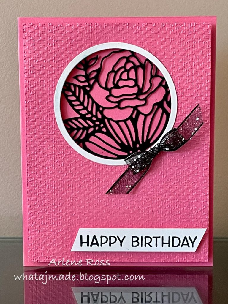
I had seen the card that inspired me (thank you Arlene!) months ago and had saved it on my computer in a special place so I could Make It Mine at some point in time. Lucky you that today is that day!

When I saw Arlene’s card I knew I had to recreate it.  But being me, I had to change some things up.  I really only changed a few things.  I changed the color of the card base from pink to black for a little more contrast on the card.  I did the same with “frame” for the window changing from white to black.  The last thing I changed was leaving the sentiment off the front of the card. 

I hope this card brightens your day as much as it did mine.  Have a great day!  Take care and Happy Stamping!
Make It Mine: Inspired Thoughts

Wow!  Are you in for a treat today.  You’re getting the combo post.  What?  It’s Make It Mine Monday but the card I made also uses last week’s card sketch.  It’s a twofer…two for one!  Ha!

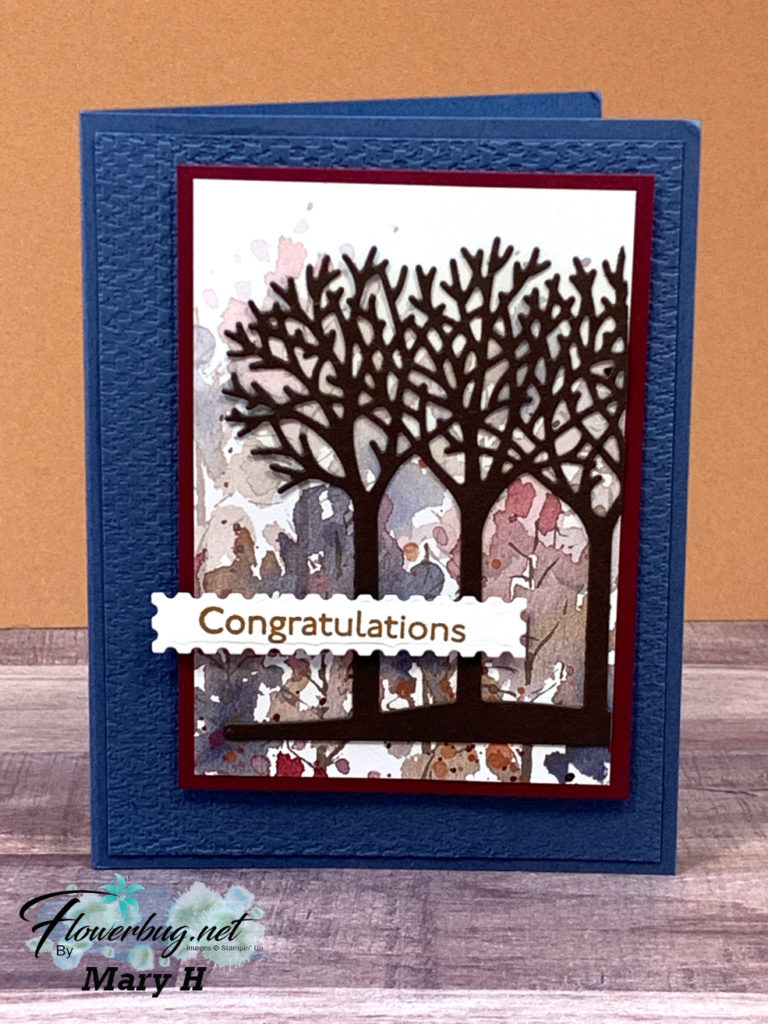
Enough silliness (although I do that fairly well…)! Let’s get to the card!  Isn’t it lovely?  The colors are beautiful and the design is simple.  Thank you to Mary H. for the inspiration.

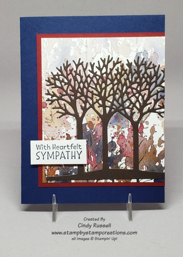
Mary used the Beauty of the Earth Designer Series Paper as the background for the die-cut trees. Some of the designs from this package of paper are absolutely gorgeous! This is one of my favorite designs. The die-cut trees are from the Inspiring Canopy Die Set.  The sentiment is from the Inspired Thoughts stamp set which can be bundled with the Inspiring Canopy dies. If you haven’t checked out this bundle of products (pg. 52 of Stampin’ Up’s Annual Catalog) please do. The stamp set is all lovely sentiments for various occasions.

Here’s my take on Mary’s card combined with last week’s card sketch. As you can see, I switched things up a bit from both cards that inspired me, but not too much.

It’s so fun and easy to create when you’re inspired by others (and/or yourself…). Give it a try! Take care and Happy Stamping!
Make It Mine: Halloween Tombstone

Halloween Tombstone

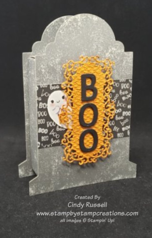
Boo! It’s October and that means it’s time to celebrate Halloween. These tombstone boxes from Stampin’ Up! are adorable and perfect for your Halloween treats. The box portion of the tombstone is 3 3/8″ x 2 1/2″ so it’s a good size. It’s also food safe! The boxes are quick and easy to put together.

I decorated my tombstone box with Stampin’ Up!’s Cute Halloween Designer Series Paper. Yes, I cut out the little ghost right from the paper! I didn’t have the Cutest Halloween stamp set or the coordinating Halloween Punch but my Paper Snips worked out perfectly for my project.

The label is die cut from the Ornate Frames Dies. After die-cutting the label I ran it through my Stampin’ Cut & Emboss Machine with the Tasteful Textile 3D Embossing Folder. The letters are die cut using the Playful Alphabet Dies.

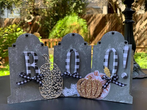
This fabulous little project was my inspiration for Make It Mine Monday. Isn’t it fun? I would have loved to use large letters on my project but unfortunately they are a retired product (although I do still have them…).

Not only did the large letters catch my eye but so did the use of the gingham ribbon and the gingham paper. I love my plaid!

This trio of tombstones is so dang cute you may just see another take on this project from me later this month so stay tuned!

Have a great day! Take care and Happy Stamping!
It’s Time For Gingerbread!

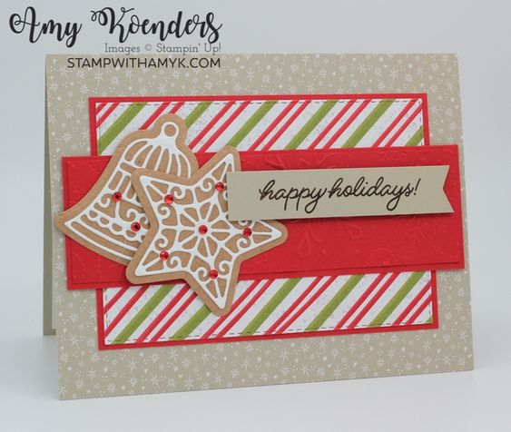
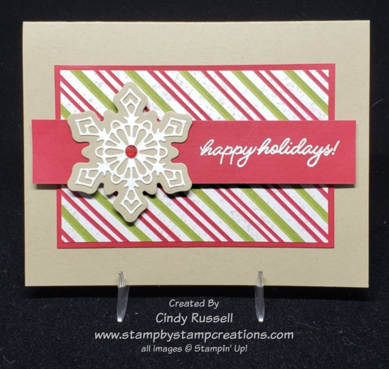
Have you checked out the Gingerbread & Peppermint Suite of products in Stampin’ Up!’s July-December Mini Catalog? So cute! So fun!

One of my favorite parts of the suite are the gingerbread cookies that you can die cut with the Gingerbread Dies. Not only can you cut out four different shapes of cookies but you can die cut the intricate frosting patterns too! So fun! Of course, one of the best features of these dies is that they will cut out designs from the Gingerbread & Peppermint Designer Series Paper too! Love that coordination!

I saw Amy’s card above and loved the way it featured the cookies as well as some of the fun patterns of the designer paper so naturally I had to see what I’d come up with from her design.

I actually kept pretty close to Amy’s design on my card. My card is a little simpler. Say what? My card is simpler? How did that happen! I’m always adding more! Ha!

This suite of products is perfect for all of your holiday projects. Did you notice that I used the Gingerbread Dies on my fun fold card last Friday? I told you I liked them!

The Red Rhinestone Basic Jewels from Stampin’ Up!’s Annual Catalog or the Wonderful Gems embellishments in the Mini Catalog make the perfect addition to your Gingerbread “cookies”. The cinnamon candies are the first decorations I like to put on Christmas cookies.

Have a great day! Take care and Happy Stamping!
Make It With Vellum!

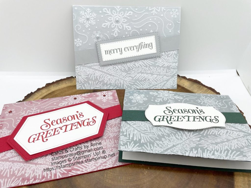
Vellum always adds a little something-something to a project. I wish I would remember to use it more often on my projects!

These projects by Anne were just the nudge I needed. They’re very simple but the embossed vellum makes the cards pop! I couldn’t wait to get my supplies out and start creating!

Anne used the Wintery 3D Embossing Folders from Stampin’ Up!’s Annual Catalog to make her cards. Both the snowflake folder and the pine bough folder come in a set together. These are smaller folders that fit perfectly in the Mini Stampin’ Cut & Emboss Machine. Of course they work just fine in the full size model too.

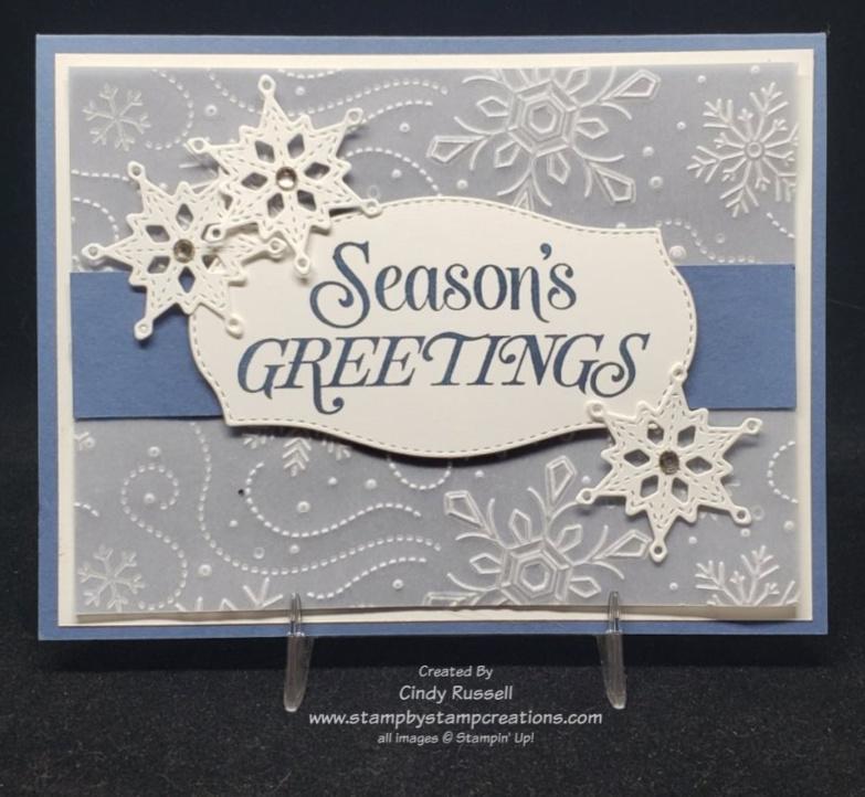
Here’s my take on Anne’s projects. I decided to only use the snowflake folder on my card and kept the snowflake theme by adding a few Stitched Snowflakes to the card. Naturally I had to add a few layers to my card too. Ha!

The issue when using vellum is adhering it so that the adhesive doesn’t show through. To adhere the vellum on my card I added a strip of adhesive to the edge of the vellum that would stick under the Misty Moonlight strip of cardstock.

The “Season’s Greeting” sentiment is from the Merry Everything stamp set. I also used one of the other sentiments from this stamp set on the inside of the card. I die-cut the sentiment using one of the labels from the Tasteful Labels Dies. This is definitely one of my go-to sets of dies. I love all the different sizes and shapes of labels it has.

This is a fun and easy card! I hope you like it. Have a great day. Take care and Happy Stamping!
It’s All About the Paper!

It’s all about the paper (ok…and the adorable little fish….) with this card.  How can you go wrong with fun designer paper that has little pine trees all over it….and plaid pine trees at that?!  Two of my favorite things!  When I think of pine trees I think of the Minnesota Homeland and our family property in Canada.  I can’t wait to get back there.  Oh….as you read this I AM in the Minnesota Homeland hanging with my mom and dad.  I’ll be here for a week before hubby joins me and we head up to the cabin.  Woo Hoo! I’m excited to hopefully spend some time in the upper midwest!

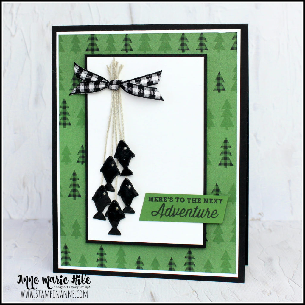
This card really came together once I was inspired Anne Marie’s card. She hit the trifecta on her card. Plaid trees on the paper, plaid ribbon and the little fishies! The fish were what first caught my eye! They’re so cute!

I wanted to incorporate the fish on my card without completely copying Anne Marie’s card but I just couldn’t make it work so I decided to go with the Pine Tree Punch. Did you notice that I ran the punched tree through the Stampin’ Cut & Emboss Machine with the Tasteful Textile Embossing Folder? This really gave it a nice texture.

This color combination of black, white and Garden Green is very striking. I’m not sure I’ve used it before. Hope about you? Have you checked out the Peaceful Prints Designer Series Paper in the Sale-a-bration Brochure yet? So many fun designs! If you like it, you need to get it soon! Sale-a-bration is almost over! Only a few weeks left! With a $50 purchase you can choose this package of designer paper for FREE!!! Don’t miss out!

I’m pleased with the way my card turned out. Guess what? You could use it for lots of occasions including Christmas! Hmm….

Have a great day! Take care and Happy Stamping!
Nothing’s Better Than Cocktails!

Nothing’s Better Than

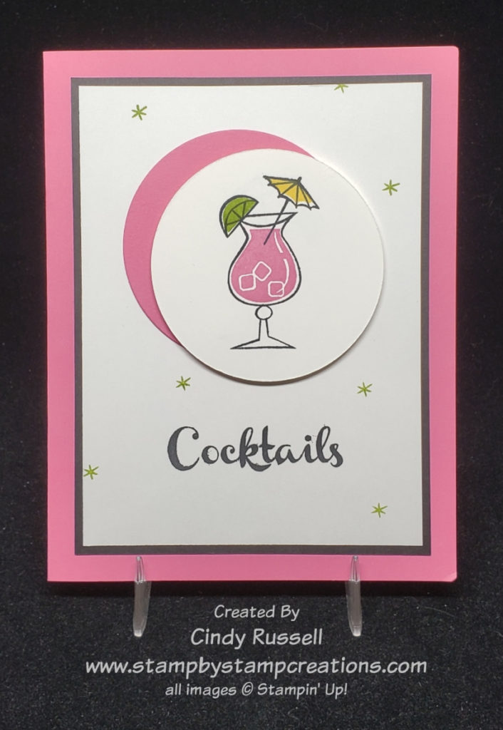
Nothing’s better than cocktails, right?  Ok…not everyone drinks alcohol but Stampin’ Up!’s Nothings’ Better Than stamp set not only has cocktails, but it has chocolate, cookies and coffee too!  You could easily switch this focal point and the corresponding sentiment on this card. This stamp set even has a coordinating die set called Love You More Than. So fun! When I’m crafting there is nothing better than a stamp set and dies that coordinate! This stamp set has some really fun sentiments in it and you can cut out the words cocktails, chocolate, cookies and coffe with the dies. Be sure to click the links above (name of stamp set or dies) and check them out. Too fun!

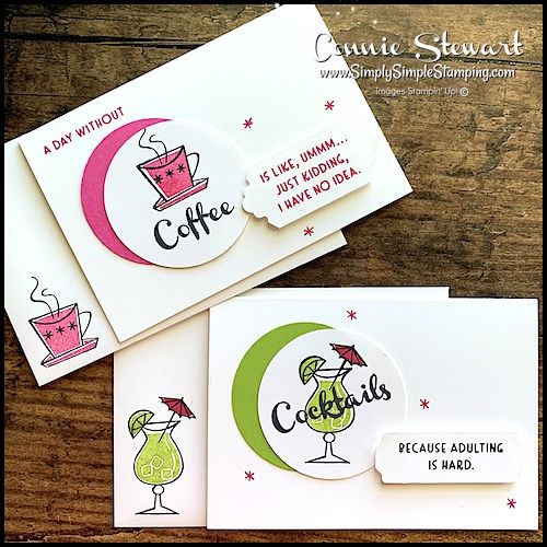
Connie Stewart, who designed these samples that inspired my card, helped design this stamp set!  When a Stampin’ Up! Demonstrator reaches the $1,000,000 milestone in career sales they get to help design a stamp set!  How fun is that?!  And no….I’m not even close.  Ha!

You can see Connie’s samples to the left.  Her projects were made using the Basic White Notecards & Envelopes.  I needed more layers and more PINK on my card so I went with a full size card.  The double circles (and the cocktail glass!) are what initially caught my eye on Connie’s cards.  So cute, fun and retro!  I love the little stars.  They just say “1960’s” to me.

On Connie’s cards you can see how easy it is to use the same template or card sketch and just change the images and sentiments.

Here you can that I added my sentiment to the inside of the card instead of having it on the front. Just another one of those changes I made.

I was definitely inspired by these fun little samples but I didn’t stick very close to the original when making my card. That’s the fun of Make It Mine Mondays (or any other day)….you’re inspired and have that starting point for your project.

I hope you’re inspired. Have a great day! Take care and Happy Stamping!
A Non-Traditional Halloween Card for Make It Mine Monday

Nontraditional Halloween Card with Sparkle of the Season

Today I really changed things up with Make It Mine Monday!  Both cards are made using the fun and versatile Sparkle of the Season Bundle but after that…..well, you decide!  Ha!

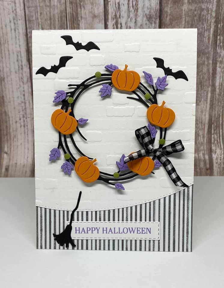
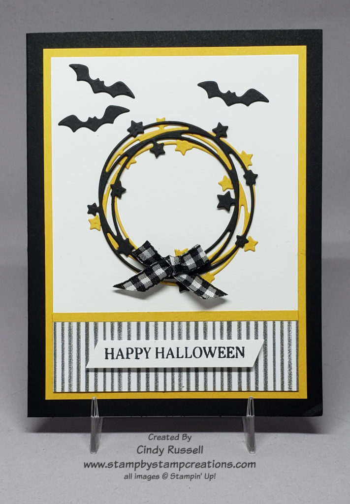
There were two things on the original card that caught my eye and made me want to make it mine.  The first was my favorite checked ribbon and the second was the little bats on the card.  I love stamped, punched or die-cut bats but I’m pretty sure I’d be totally freaked out if I encountered a real bat.  After including the those two items on my card all bets were off and the card was my own.  I guess I did use the same pattern of the Cute Halloween designer paper.

The bundle used to create both the original card and my card is the Sparkle of the Season Bundle (page 58 in Stampin’ Up!’s Mini Catalog).  In the Seasonal Swirls dies that coordinate with the Sparkle of the Season stamp set there are three different swirled wreath dies.  One has Christmas greenery, one has leaves and the last one has stars.  On the card that inspired me the creator used the wreath with leaves and added pumpkins.  For a Halloween card I wanted to use the wreath with the stars and I wanted my stars to be yellow which is why my Halloween card is black and yellow instead of black and orange.  Now that I’m writing this I guess I could have used the traditional Halloween colors but…I didn’t.

Have a great day!  Take care and Happy Stamping!