
In my newsletter last week, I talked about the Journey With Color that we are going to be taking. We’ll be talking about Stampin’ Up! colors, their history, working with them and coordinating them. This journey will happen here on my blog, on my Facebook Page and in my newsletter. If you don’t follow me on Facebook, you’ll want to click here and if you’re not on my email list click the link to the right to get on it. You’re going to want to check out all three places to not miss any part of this journey.
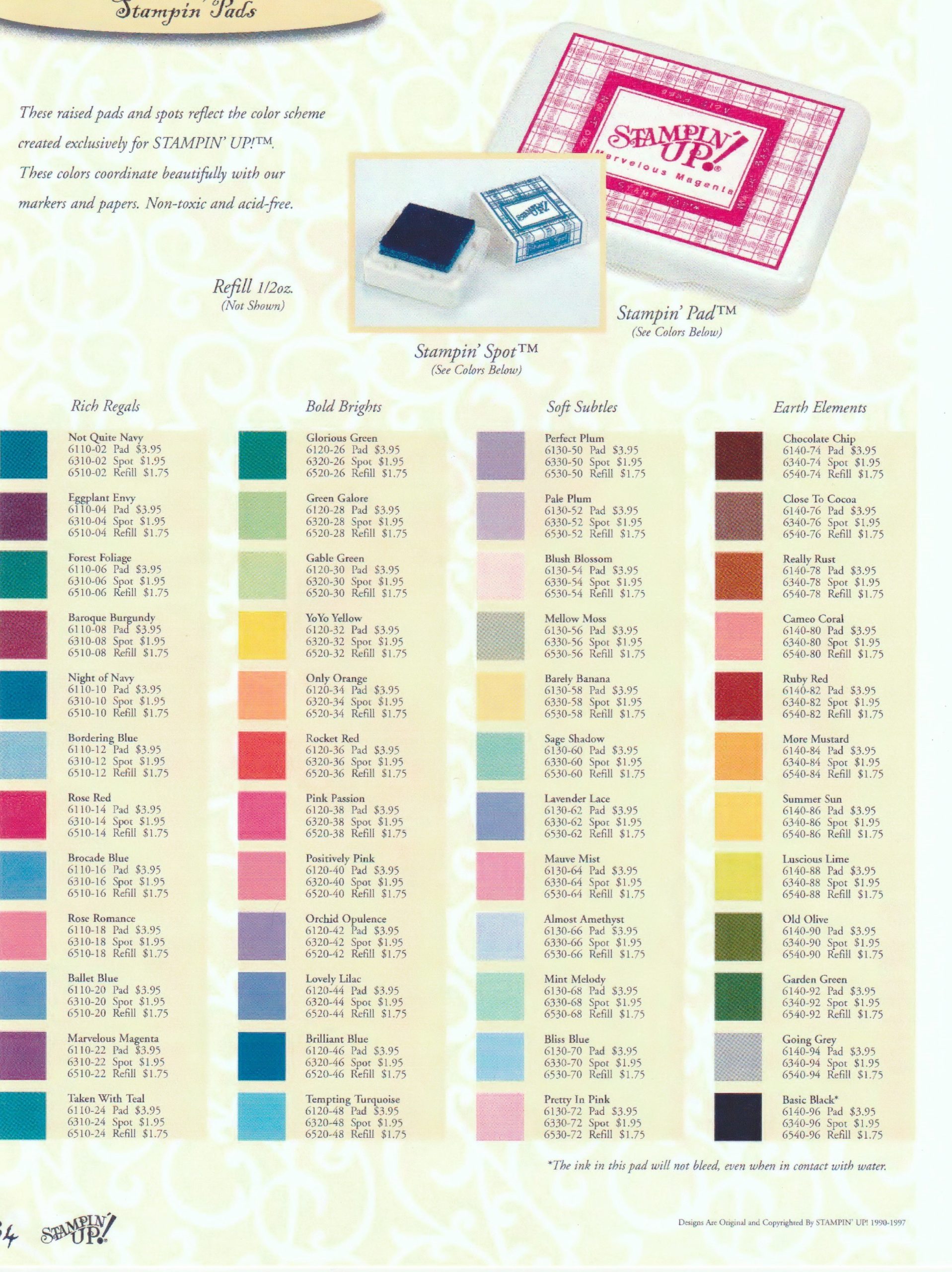
Stampin’ Up! was founded back in 1988 but they didn’t have their own ink pads, paper or stamps. They were selling products made by other companies. Stampin’ Up! didn’t come out with their own colors, ink pads and paper until their 1997-1998 Catalog. (How many of you were stamping back then?) In this catalog they premiered 48 colors in four different color families: Rich Regals, Bold Brights, Soft Subtles and Earth Elements. These four families are very similar to the current families of colors: Brights, Neutrals, Regals and Subtles.
Stampin’ Up!’s alliteration of color names began with these original colors. Who remembers Chocolate Chip, YoYo Yellow and Marvelous Magenta? Click here to view these original 48 colors. The swatches of color will be a little off because I didn’t get this photo straight out of a catalog. You can get a good idea of the variety of colors though as well as what colors were in each family.
In case you’re having trouble viewing the link, here’s a rundown by color collection:
Rich Regals: Not Quite Navy, Eggplant Envy, Forest Foliage, Baroque Burgundy, Night of Navy, Bordering Blue, Rose Red, Brocade Blue, Rose Romance, Ballet Blue, Marvelous Magenta and Taken With Teal.
Bold Brights: Glorious Green, Green Galore, Gable Green, YoYo Yellow, Only Orange, Rocket Red, Pink Passion, Positively Pink, Orchid Opulence, Lovely Lilac, Brilliant Blue and Tempting Turquoise.
Soft Subtles: Perfect Plum, Pale Plum, Blush Blossom, Mellow Moss, Barely Banana, Sage Shadow, Lavender Lace, Mauve Mist, Almost Amethyst, Mint Melody, Bliss Blue and Pretty in Pink.
Earth Elements: Chocolate Chip, Close To Cocoa, Really Rus, Cameo Coral, Ruby Red, More Mustard, Summer Sun, Luscious Lime, Old Olive, Garden Green, Going Grey and Basic Black.
How many current colors can you find in this original list of colors? If you counted 4 (which includes Basic Black) then you are correct. Night of Navy, Old Olive, Garden Green and Basic Black. Four out of the 48 have survived 14 years of color changes!
It’s fun to look back at these original colors. I hate to admit it but I remember these colors! A few of the colors that I still kind of miss are More Mustard and Forest Foliage. More Mustard was just the perfect deep yellow-gold for Fall cards. Forest Foliage was a gorgeous Blue-Green (or Green-Blue). The color swatch doesn’t do it justice. It was a nice rich color like the current Shaded Spruce but with more blue in it.
How many of you remember these original colors? Which colors do you miss?