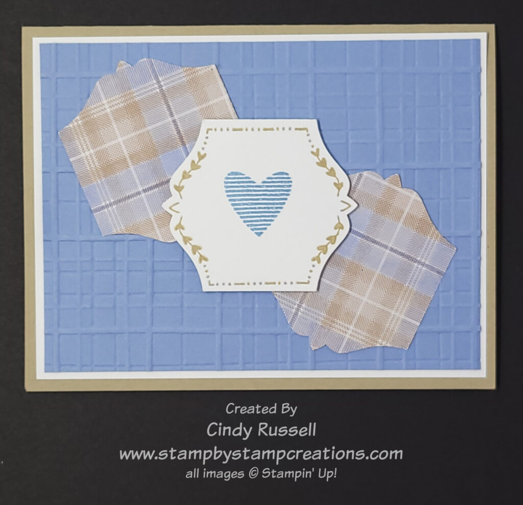
It’s Day 10 of my 40 Cards in 40 Days Challenge and I have another card from Stamp Camp to share with you. Janet Muse created this card using the Botanical Textures Suite. Just looking at this card makes me want to order this suite of products right now! Simple, yet elegant.
This suite of products contains a stamp set, a die set, two different packages of designer paper, an embossing folder, an embossing folder, ribbon and embellishments that coordinate with both sets of paper. My favorite part of the suite is the Woven Textures Designer Series Paper. The designs look like photographs!
The dies in the Textured Notes Dies are all rectangles and each has their own design around the edge. In the card photo you can see that the stamped image rectangle and the sentiment rectangle as well as the embossed rectangle all have a border on them. Yep, I feel a purchase coming on. Ha!
This amazing suite of products is one of the newest Online Exclusives. If you haven’t checked it out yet, you really should. You’re not going to have to ask me to give it a second look!
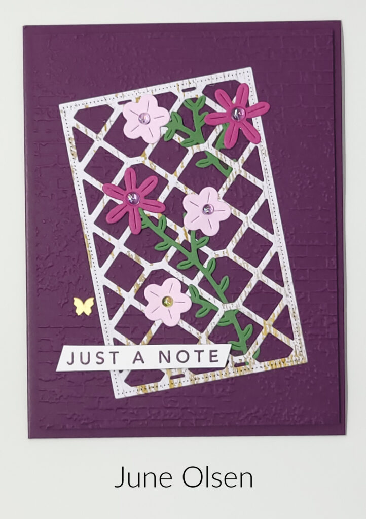
I want to share this beautiful card with you for Day 9 of my 40 Cards in 40 Days Challenge. This card was designed by fellow demonstrator June Olsen using the Linked Together Bundle. The bundle comes with a stamp set, dies and decorative masks. I have to admit that I have not used decorative masks yet, but they are on my wish list, and I do know that you can use them with ink, or embossing paste. June used only the stamp set and dies on her card.
The trellis, flowers and leaves are all die cut. One of the nice things about the die set is that you can die cut multiple flowers with one die. The 6 petal flower die cuts out two flowers and the 5 petal die cuts out four flowers. That definitely simplifies cardmaking when you’re making multiples!
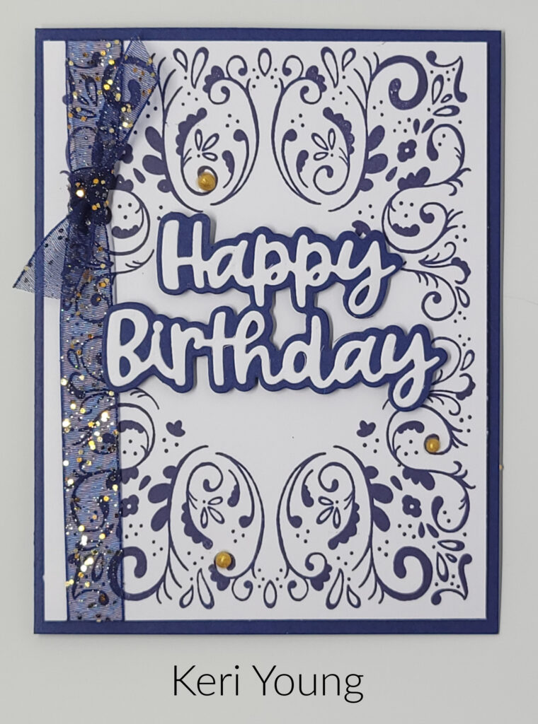
I have another birthday card for Day 8 of my 40 Cards in 40 Days Challenge. This fun birthday card was also designed for our Sassy Stampers & Friends Stamp Camp earlier this month. Keri Young is the designer of this card. Keri used the Tiled Techniques Stamp Set on this card along with the Wanted to Say Dies. I love how combing these two products makes such a lovely card.
When I first looked at the card, I was amazed at how perfectly the stamp lined up on the card if you had to stamp it in each corner, but the stamp used on the front is the largest stamp in the stamp set and only had to be stamped twice. Once at the top and once at the bottom. This makes the perfect frame for the “happy birthday”.
The Wanted to Say Dies should be a staple in every craft room. I haven’t used mine in a while, but I need to get them out. They make it so easy to add a sentiment to the card and they really give your project a wow factor. The die set has four different layered sentiments as well as some smaller dies you can add to your project.
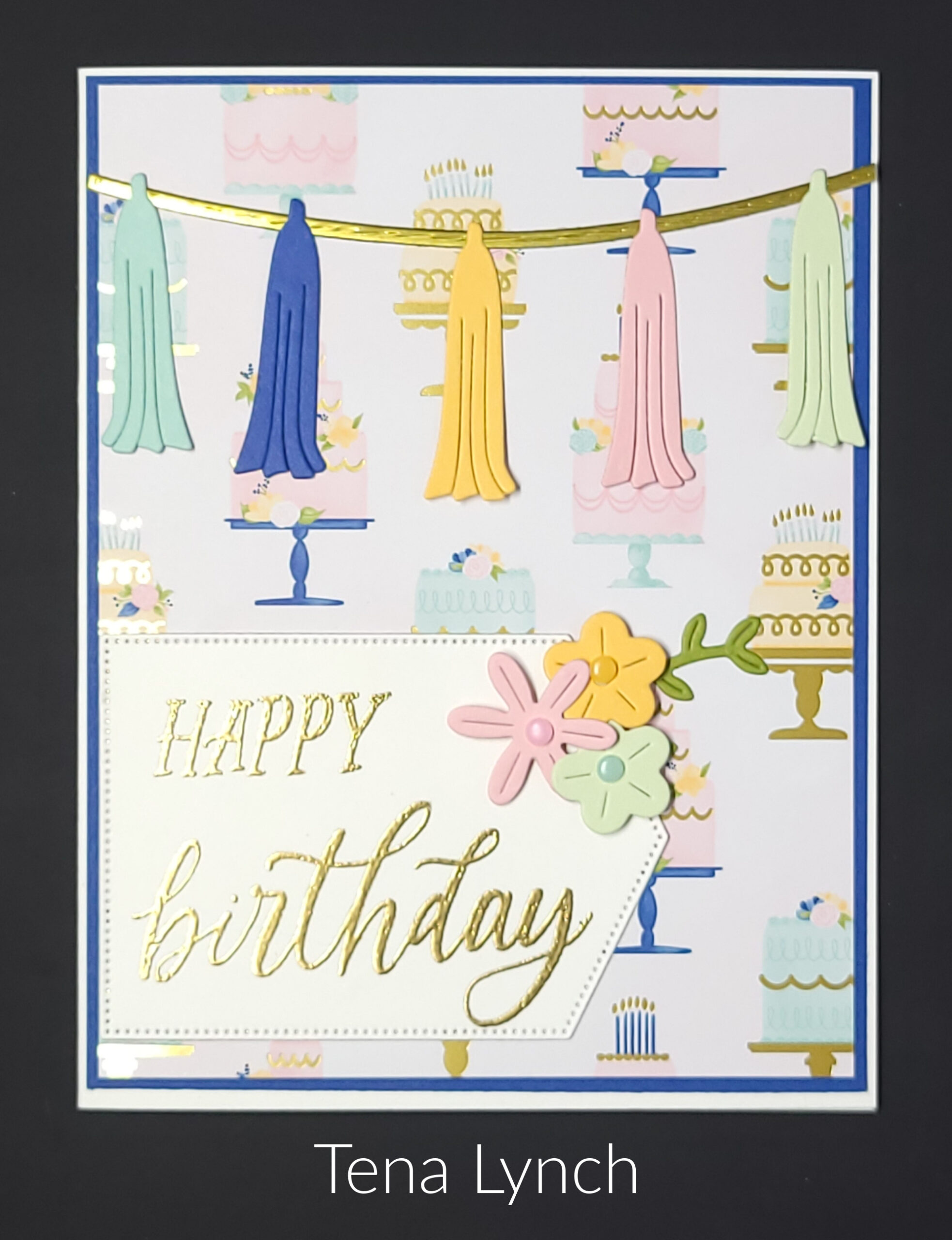
For Day 7 of my 40 Cards in 40 Days Challenge I have a lovely birthday card to share with you. This card was designed by fellow demonstrator Tena Lynch for our group’s recent Stamp Camp. Tena used most of the items found in the Wildflower Birthday Suite. Thissuite of products is perfect for birthdays and other celebrations.
The Wildflower Birthday Specialty Designer Series Paper has gold foil accents on many of the sheets which really make the images pop. It also has two full sheets of die cuts that make it easy-peasy to make cards. The colors in this designer paper are Pretty in Pink, Peach Pie, Old Olive, Soft Seafoam, Pool Party. Such soft and springy colors.
Tena embossed the sentiment with gold embossing powder so it would pop along with the gold foil accents on the designer paper. Cute card!
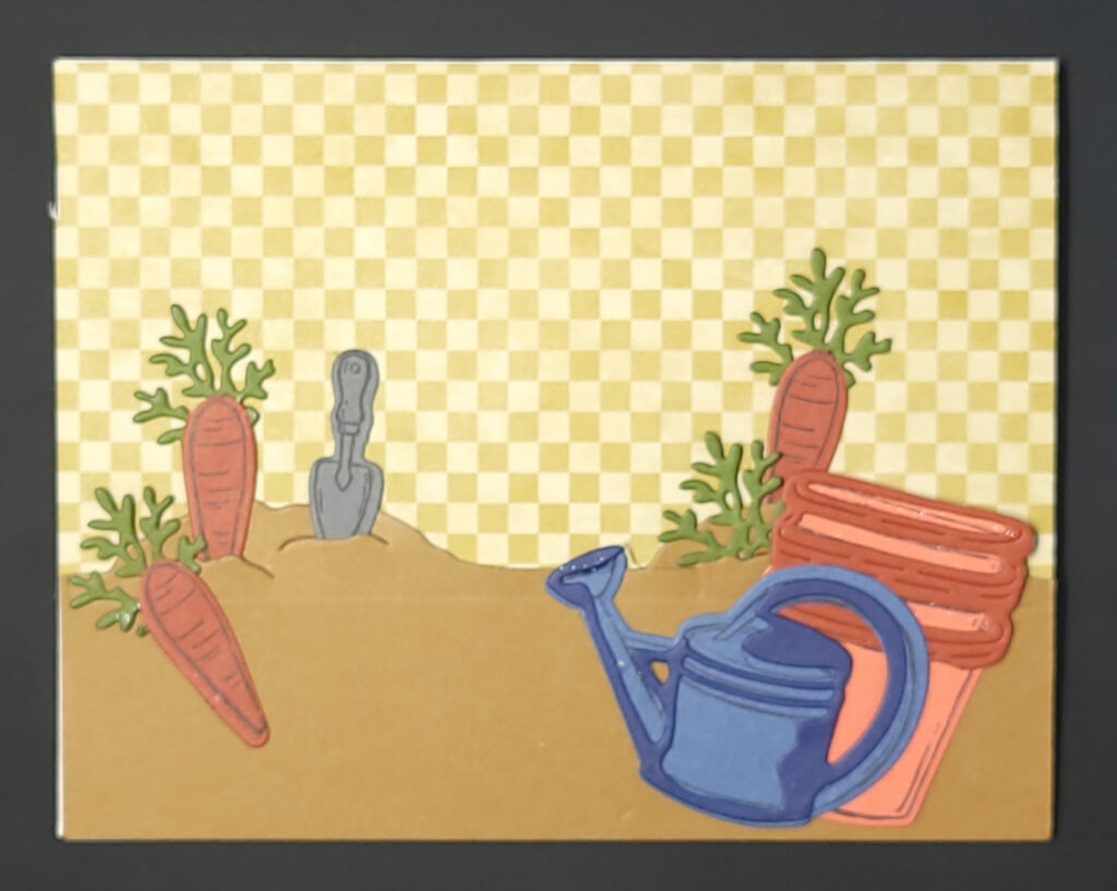
It’s time to think of Spring with Day 6 of my 40 Cards in 40 Days Challenge. The Storybook Garden Patch Bundle is all about Spring and that is what was used on this card. A fellow demonstrator made this card, but unfortunately, I don’t know who to give the credit to.
If you’re a gardener, this is the bundle for you. It’s all about planting and gardening. Aren’t the die-cut images fun? I love the carrots! Did you notice that the watering can and the pots are made with two different dies? One to cut out the image and one to so a little shading for dimension.
The checked background is from the Timeless Plaid Designer Series Paper. It’s got some great designs which is probably why you’ve seen them on more than one card I’ve shared with you so far.
The Garden Patch Bundle is part of the Storybook Moments Suite. This suite contains both the Storybook Garden Patch Bundle and the Timeless Plaid Designer Series Paper. It also contains a second bundle, a second pack of designer series paper, a roll of ribbon and some pearl embellishments.
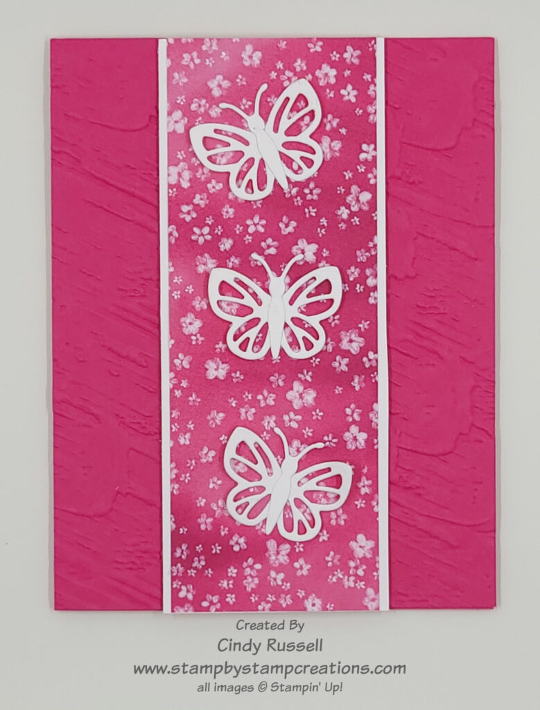
Day 5! 40 Cards in 40 Days is coming right along. Today’s card was created with the Beautiful Butterflies Bundle by me! This bundle is gorgeous! It’s one of those bundles that comes with a Hybrid Embossing Folder which means the dies coordinate with the embossing folder! I have a card that I will share with you in the future and show you how a Hybrid Embossing Folder works.
This card is easy. The background is made using the Plaster Painting 3D Embossing Folder. This is one of the new larger embossing folders that is 6” x 8 ½”. These large folders are nice because it makes it easier to have your paper sit in them in either direction.
The designer paper I used on this card was from Sale-a-bration, but we made the same card using the Beautiful Bokeh Designer Series Paper at Stamp Camp last week. When I adhered the butterflies to the designer paper, I only put glue on the center of the wings. That way I could pull the wings up a little and give them a little dimension. Doesn’t this card shout “Spring”?
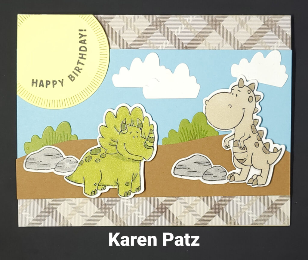
It’s Day 4 of 40 Cards in 40 Days and I have another birthday card to share. This card is perfect for the littles in your life. It’s made with the Darling Dinos Bundle. Cute dinos and cute sentiments. What more do you need?
Last week my group of Sassy Stampers and Friends held our Spring Stamp Camp. This card was one of the cards that was made. It was created by my friend and fellow demonstrator Karen Patz. The little dinos are easy to color and coordinate so well with the Timeless Plaid Designer Series Paper. This designer paper has sure been popular this week on the cards I’ve shared with you during my challenge. It’s been used on three of the four cards! I didn’t even plan that. Ha!
If you look closely, you can see that the clouds and the shrubbery are cut out using the same die! How convenient is that? I can’t wait to play with this bundle again. I made my grandson a cute card for Valentines Day using it and am anxious to use the bundle again. Hmmm…Do dinosaurs celebrate St. Patrick’s Day? I might have to create a St. Paddy’s Day card using them. I’ll keep you posted!
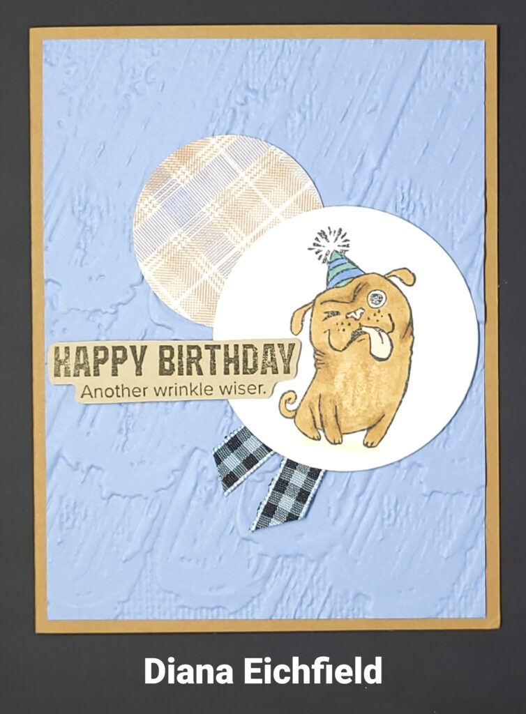
40 Cards in 40 Days – Day 3! Today’s card was created by fellow demonstrator Diana Eichfield. I participated in a swap around Christmas and this was Diana’s card. She used the fun One More Year stamp set which can be found in Stampin’ Up!’s January – April 2025 Mini Catalog and of course the online store. This stamp set has some fun images as well as fun and snarky birthday sentiments. I don’t own it yet, but it’s on my list for my next order.
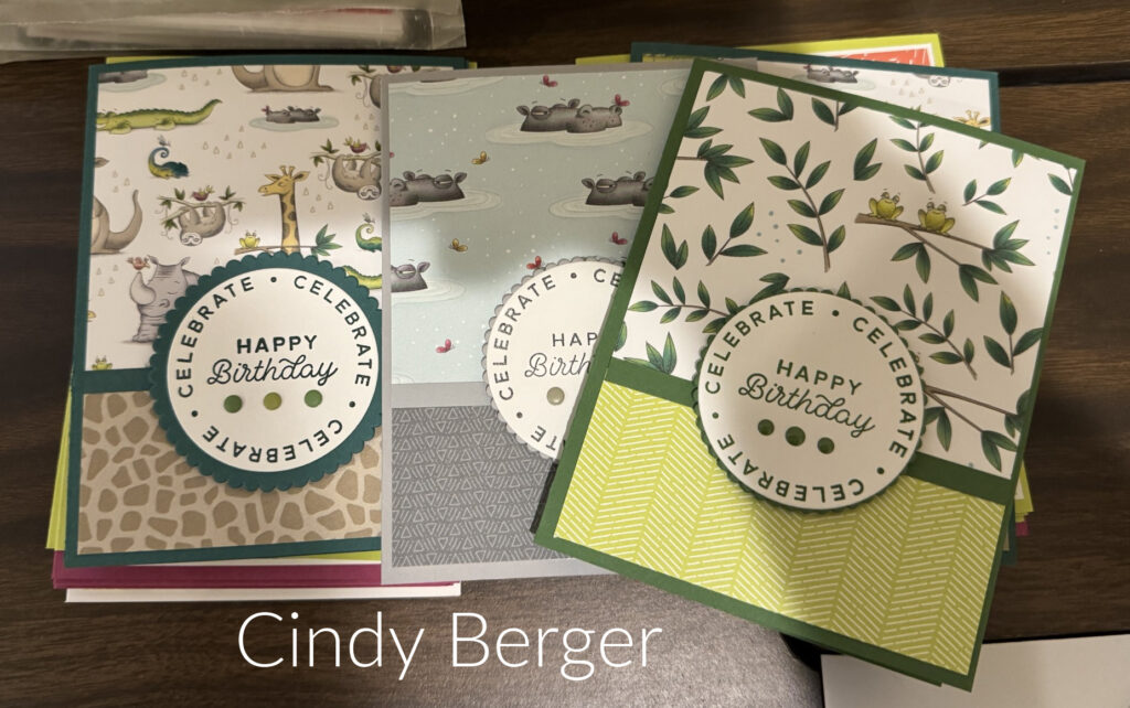
It’s Day 2 of my 40 Cards in 40 Days. In my newsletter this past Tuesday I was talking about this challenge and I invited my readers to send me photos of their creations so I could share them with you. Cindy Berger from Erie, CO sent me 5 different photos! Thank you Cindy!
Cindy has been creating cards using all of the designer papers she has been collecting (Isn’t that what you do with designer papers? ). This group of cards is a fun and easy way to use patterned paper on a card. She chose two coordinating designs for each card and added a sentiment. I like the way Cindy used a strip of cardstock to separate the two patterned papers.
Recently Cindy made over 200 cards for charities so easy was definitely the way to go. Designer Paper was the focus of her cards and then she added a stamped sentiment. Easy Peasy. Thank you Cindy for sharing your design! It makes me want to get started using my rather large stash of designer papers!
I’d like to invite you to share your favorite creation with me too. Email me a photo and I will share it as part of my 40 Cards in 40 Days Challenge.
Welcome to Day 1 of 40 Cards in 40 Days 2025! The first card of our 40 Day journey is one I had designed for my January Card Buffet. When I created this card I put a Valentine sentiment on the inside, but this card could be used for any occasion. It’s a simple card design that I copied (and tweaked) straight from page 54 in Stampin’ Up!’s January – April Mini Catalog.
I try not to copy someone else’s card exactly. I like to give their ideas my own twist. I kept the same color combination of Boho Blue, Crumb Cake and Basic White for my card but I added a few layers (naturally) and the Forever Plaid 3D Embossing Folder. (I do like plaid! )
I hope you’ve enjoyed the first card in my 40 Cards in 40 Days Challenge! Leave a comment and let me know what you think. Have a great day! Take care and Happy Stamping!
The 40 days of Lent starts tomorrow. Some people give things up for Lent and I know others (myself included) have participated in different sorts of challenges for the 40 days. In the past I have done a cleaning/get rid of stuff challenge of “a bag a day” where you try to fill a box or bag a day with things you don’t want/need anymore. I have also done a 40 Cards in 40 Days challenge, and I am going to give that a try again this year.
So, what is my 40 Cards in 40 Days Challenge? I am going to do my best to post a card for you each day during Lent on my Facebook page and/or blog. I know, you’re asking yourself “does she have a blog?”. Well, I do. I just have not posted to it for a really long time. It’s time to get back to it and this is the perfect way. I may not create every card I post but I hope to create many of them.
You are welcome to help me out with my challenge. Maybe you have created a card you love and would like to share. Email me a photo of it and I can include it as one of my challenge cards. The point is for me to share inspiration with you! I’m doing this challenge for you so please check my blog or Facebook page sometime during the 40 days of Lent and let me know what you think!
Are you a Halloween fan? Then you’re going to want this fun new kit from Stampin’ Up!. Yep, everything you need to make this house, along with the tree and fence are included in the kit. The only things you will need to supply will be a hot glue gun and some battery-operated candles to make the windows glow.
You can view the details about the Haunted Home Kit as well as order it in my online store .
Be sure to check out the video below to see how easy this kit is to put together. Stampin’ Up! kits are only available while supplies last so order yours today!
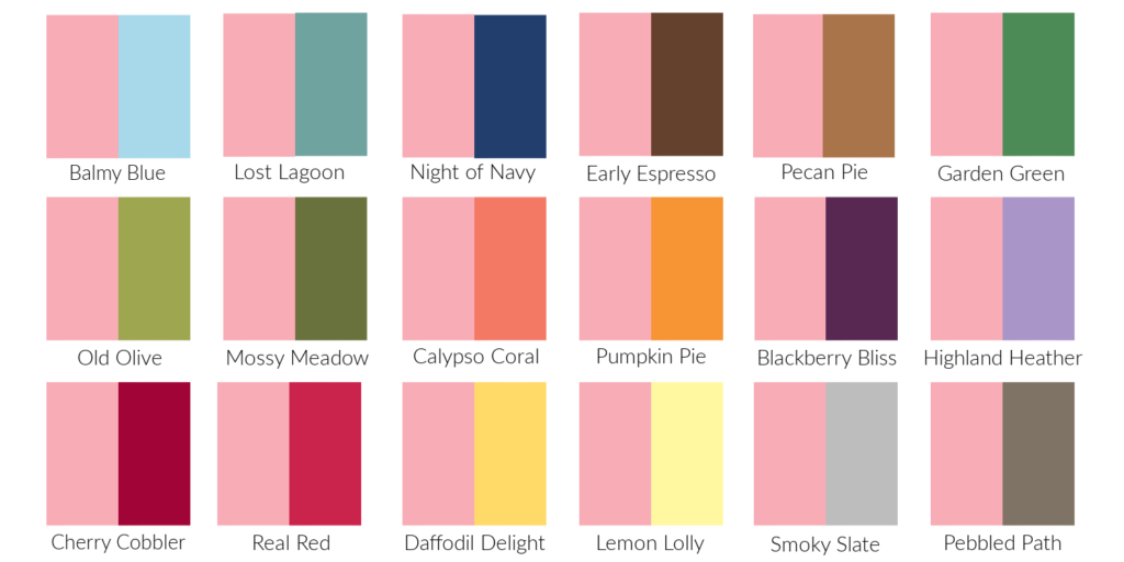
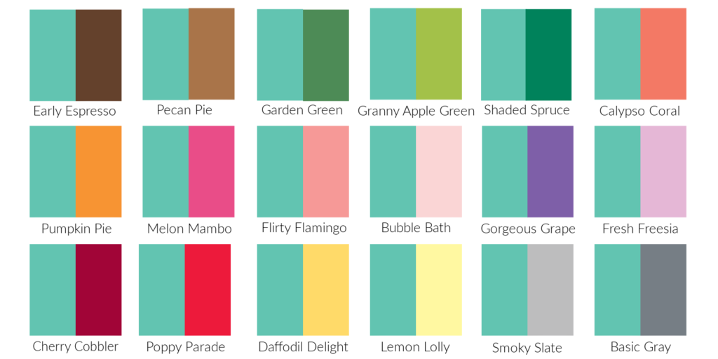
Pink. I love the color pink. When I first heard the names of the new In-Colors the name Pretty In Pink sounded quite familiar. Since I’ve been a demonstrator for 20 years it should. Pretty in Pink used to be a regular Stampin’ Up! color! No wonder it sounded familiar. I believe this is the first time that Stampin’ Up! has brought back a retired color (other than In-Colors).
Pretty In Pink is the exact same color now as it was way back when. It’s a lovely soft pink. In this first photo you can see how it compares to some of the other Stampin’ Up! pinks.
In this second photo it’s compared with some of the other Stampin’ Up! colors. I like it with most of the other colors except Calypso Coral and Pumpkin Pie. What do you think?
The last photo shows the color combinations from Stampin’ Up!’s Color Coach. My least favorite combination is the middle one with Lemon Lolly and Petal Pink. My favorite combination is the last one with Coastal Cabana and Lost Lagoon.
Are you excited that Stampin’ Up! has brought back Pretty in Pink? I am! It’s the perfect addition to their color family…and it’s PINK! Have a great day. Take care and Happy Stamping!
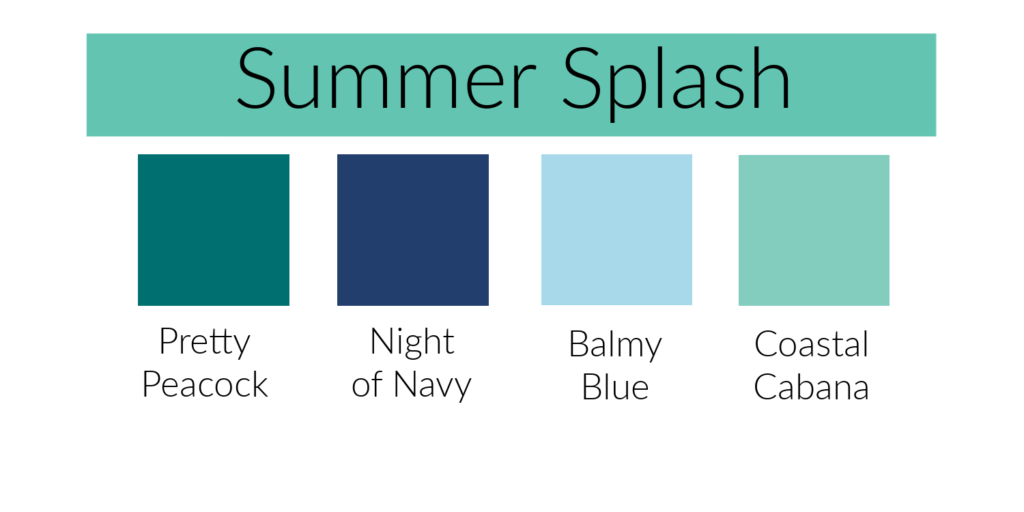
This week in our Journey With Color I will be talking about Summer Splash. The name says it all. When I look at this color, or even just say the name, I can picture myself sitting by a pool or on the beach in the tropics with an umbrella drink. (Why would I be in the tropics without an umbrella drink! Ha!) There’s also a soft warm breeze and plenty of shade. What do you imagine when you see this color or say the name?
Summer Splash is a beautiful soft blue green just a little deeper than Stampin’ Up!’s current Coastal Cabana. In the photo above you can see how it compares with some of the other blues in Stampin’ Up!’s color collection. I like it best with the blues that have a little green in them.
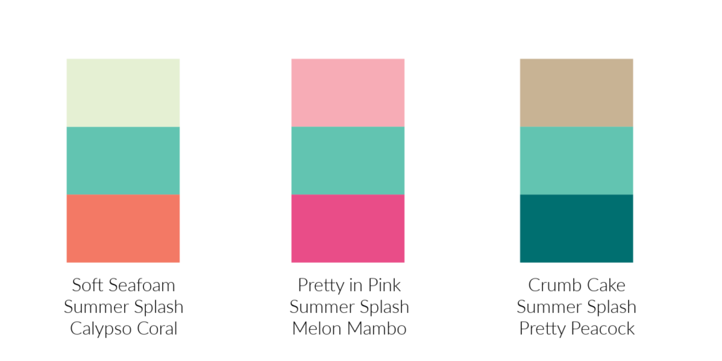
This second photo compares Summer Splash with other Stampin’ Up! colors. It looks pretty good with most of them. I’m not sure which colors I like it with best. How about you?
This last photo is the color combinations that Stampin’ Up! artists came up with. What do you think of them? The middle combination caught my eye first but that’s probably because it has my favorite color, Melon Mambo, in it. When I took another look, I really liked the last combination with Crumb Cake and Pretty Peacock. It’s so striking! Which combination is your favorite?
I hope you’re enjoying our Journey With Color. Have a great day. Take care and Happy Stamping!
It’s been a while since I’ve done a Make-It-Mine Monday post, and I’ve missed it. I love getting inspiration from other people’s projects and Make-It-Mine Monday is the perfect way to showcase that!
I try to write an email newsletter every week which I send out on Tuesdays or Wednesdays. I try to share a project each week.
(If you you’d like to be on my email list to receive my newsletter as well as other emails, please sign up in the box to the right of this post or in the pop up box when it appears.)
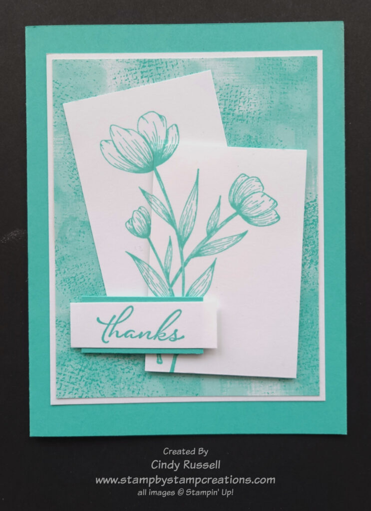
In last week’s newsletter I shared this card that I made at Stampin’ Up!’s On Stage event in March. I had explained how it was a very nice card, but it just wasn’t me. The combination of colors isn’t me and the design itself isn’t really me. The card did inspire me though.
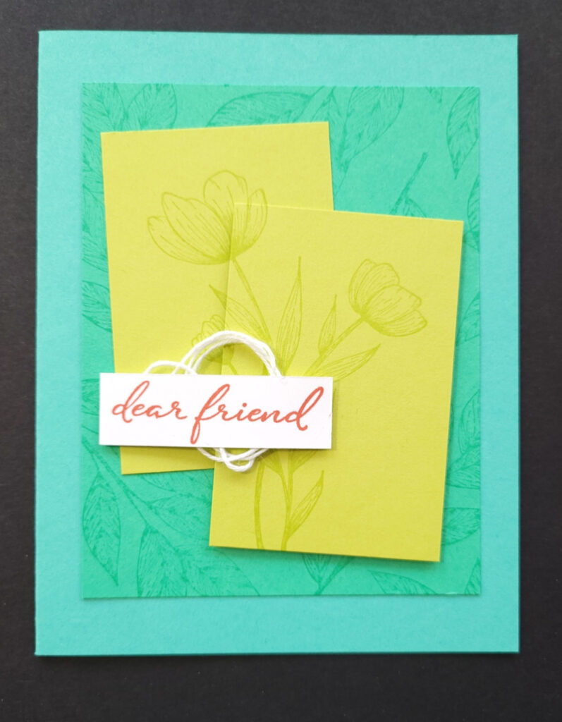
It inspired me so much that I had to make it mine! Nothing against Stampin’ Up! designers, but I do like my card better. Their card was way outside of my comfort zone. The Stampin’ Up! designer used the new Spotlight in Nature (#163579 $23) which will be in the 2024-2025 Annual Catalog and since I had that stamp set I used it on my card too. For my card I decided to stick with a single color and white. To choose a color I started with the designer paper that I used on the layer behind the flowers. I used the new Unbounded Bounty Beauty Designer Series Paper (#163372 $12.50) which you can find on page 55 of the new catalog or in my online store starting on Wednesday. The color I used is the new 2024-2026 In-Color, Summer Splash. So pretty!
The angled pieces that the flowers are on aren’t something that I would usually use on a card but I did find the technique intriguing, so I decided to give it another shot. It’s not hard to line up the two images after stamping them, the hard part is stamping them and making sure that the two pieces will fit on the layer underneath them.
I could have heat embossed the sentiment in white on a piece Summer Splash cardstock but I think my layered sentiment works a little better on this card.
As I mentioned above, I love being inspired by other people’s work. It’s nice to have a starting point and go from there. Give it a try! Take my card and make it your own by changing a little something about the card or a lot. The choice is yours! Have a great day! Take care and Happy Stamping!