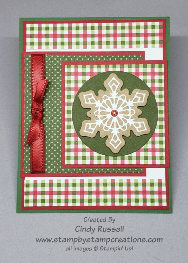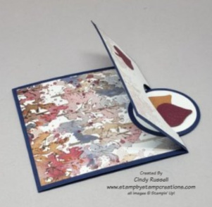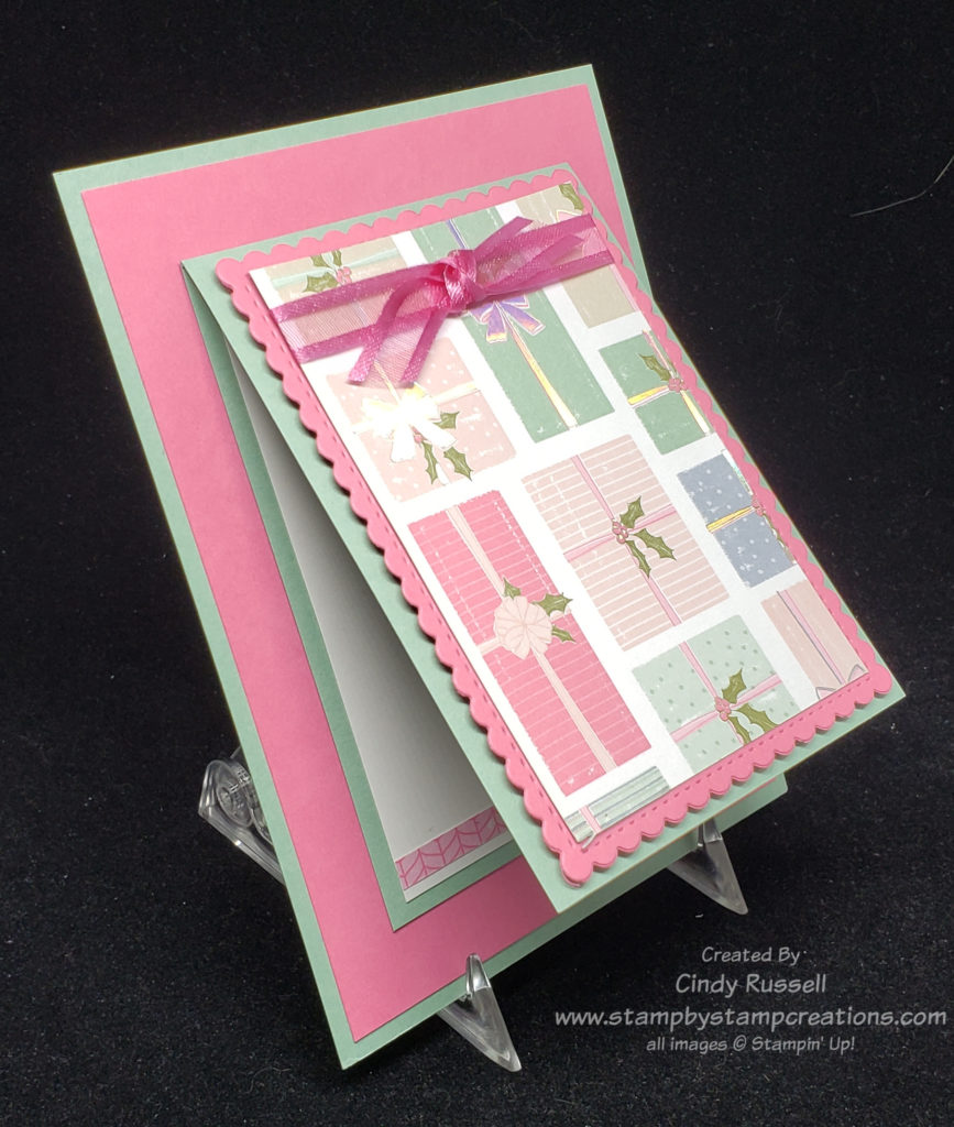
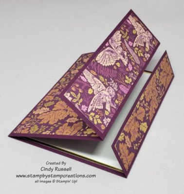
Another descriptive name for a fun fold card….the Overlapping Panel Fun Fold or if you prefer you can call it the Overlapping Tri-Panel Fun Fold. Three score marks make three front panels that show off your favorite designer series paper.
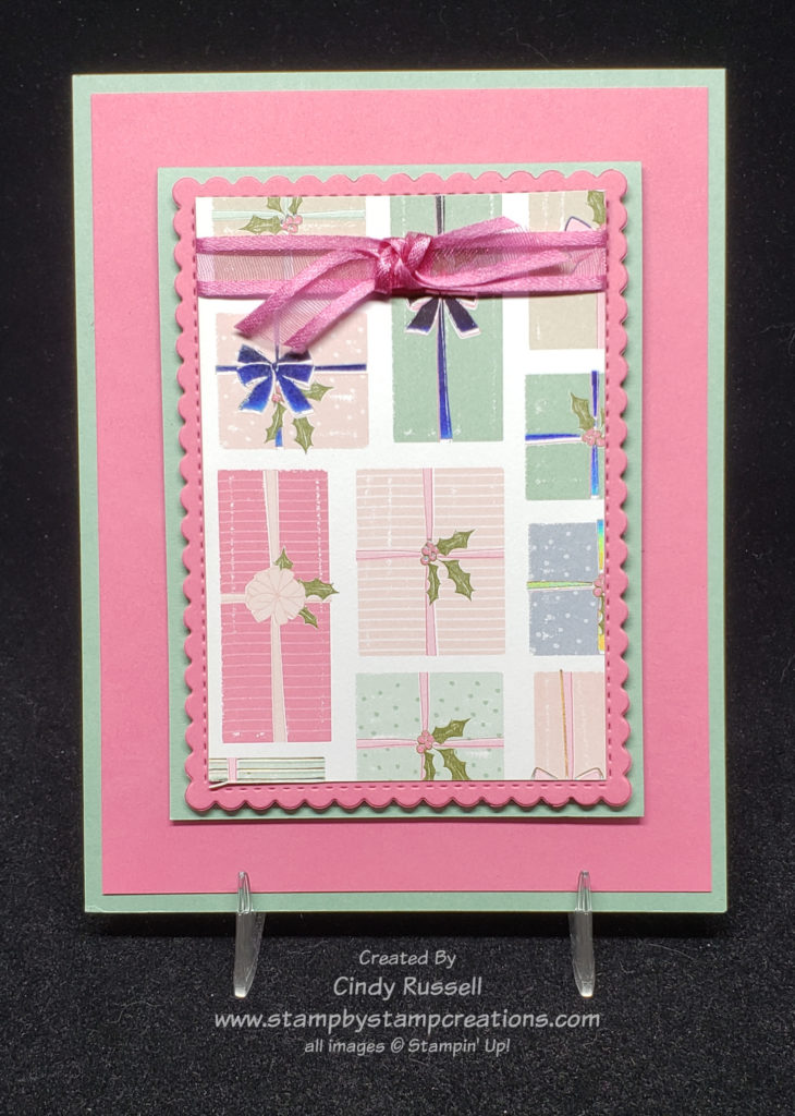
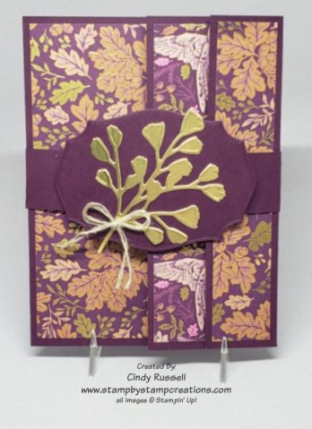
When I saw the Blackberry Beauty Designer Series Paper in Stampin’ Up!’s July – December Mini Catalog I wasn’t overly impressed. I thought it was a little busy and the I didn’t like the birds on it. Fast forward to actually seeing the paper in person and using it. I still don’t really like the birds on it but the paper is gorgeous! Deep purples and gold foil. A lovely combination. Have you seen this paper in person? What do you think of it?
I die cut the foliage on my belly band from Gold Foil using the Forever Flourishing Dies and adhered it to a label die cut using one of the Tasteful Label Dies. The purple cardstock used on my card is Blackberry Bliss.
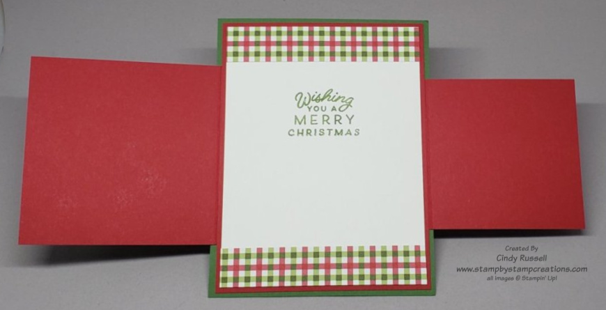
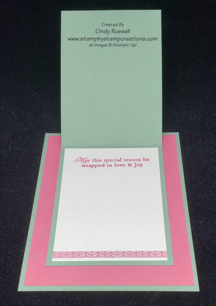
In this photo you can get a better idea of how the card is folded and how the three different sections will overlap. I added a layer of gold foil to the inside white piece of my card to really set it off.
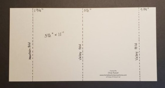
Here’s the template to show you where to score and in which direction to fold your score marks.
Start with a piece of cardstock that is 5 1/2″ x 11″. Score at 1 3/4″, 5 1/2″ and 9 3/4″. The designer paper measurements for the panels are 5 1/4″ x 1″, 5 1/4″ x 1 1/2″ and 5 1/4″ x 3 1/2″.
Above is a quick video showing you how make this fun fold card. It shows you in which direction your folds should go and where to apply the designer paper. Enjoy!
Have a great day! Take care and Happy Stamping!