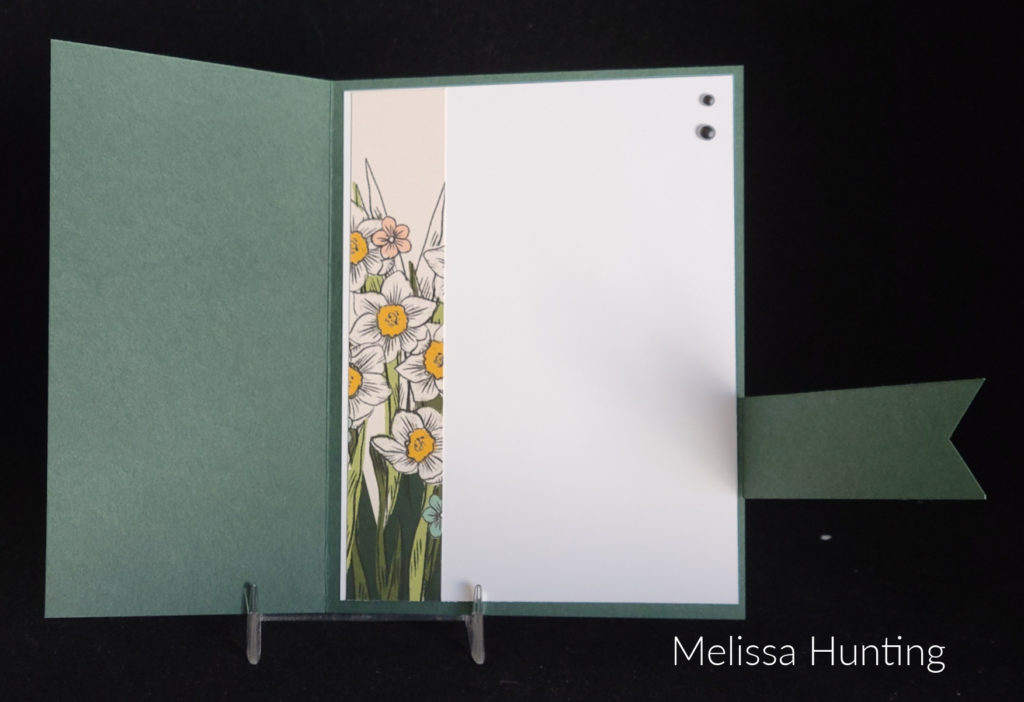
My mother-in-law’s birthday is today and I chose the Translucent Florals stamp set and the coordinating Delightful Florals Designer Series Paper to make her card. There is also a set of dies that coordinates with them. These three items are Online Exclusives found only in my online store. My favorite item of these coordinating products is the designer paper so that is what I chose for the focal point of my card. I fussy cut this floral image from the paper. So pretty!
I knew that I was going to mount the fussy-cut image on white so I wasn’t too worried that there may have been a little white around the edges. I did have to get my X-acto knife out to cut out the small area by the stem of the small flower
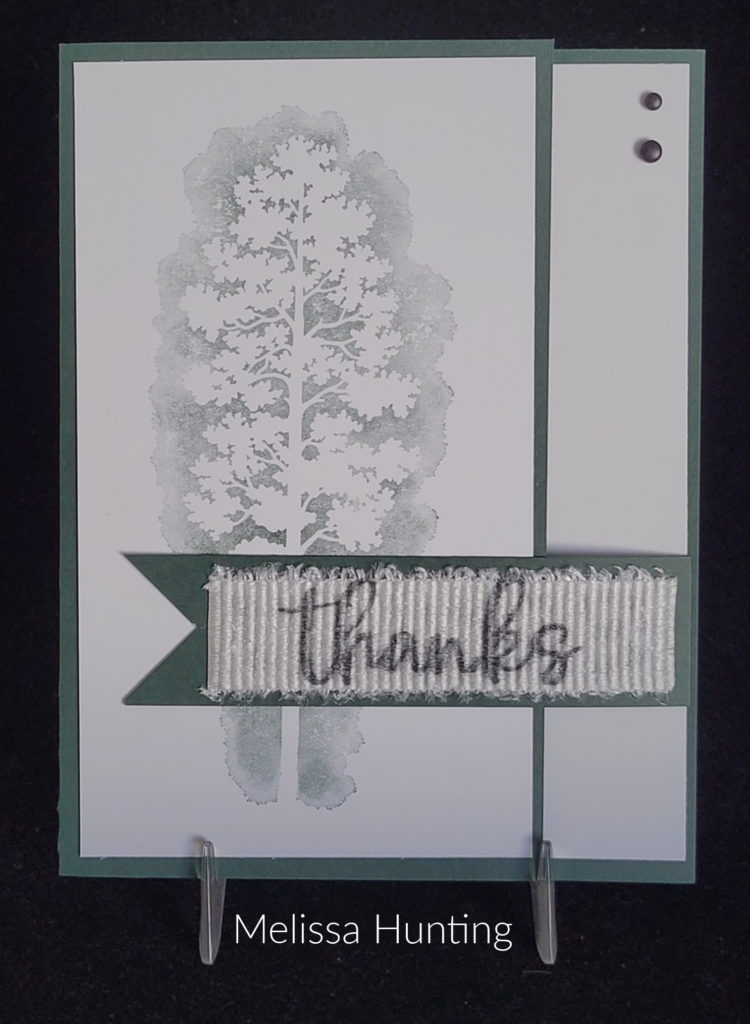
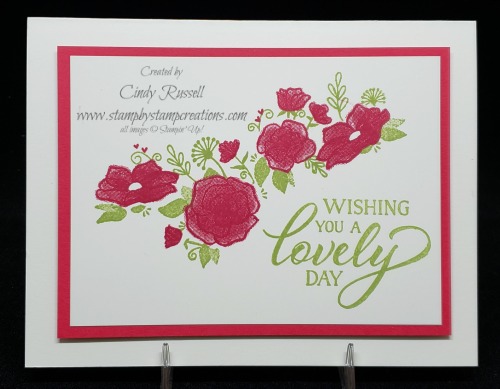
The Berry Burst card front is stamped with the larger floral image from the stamp set with the same color ink and the strip of Pretty Peacock cardstock is stamped with the foliage image in the Pretty Peacock ink. Stamping cardstock with the same color image gives a nice subtle background design.
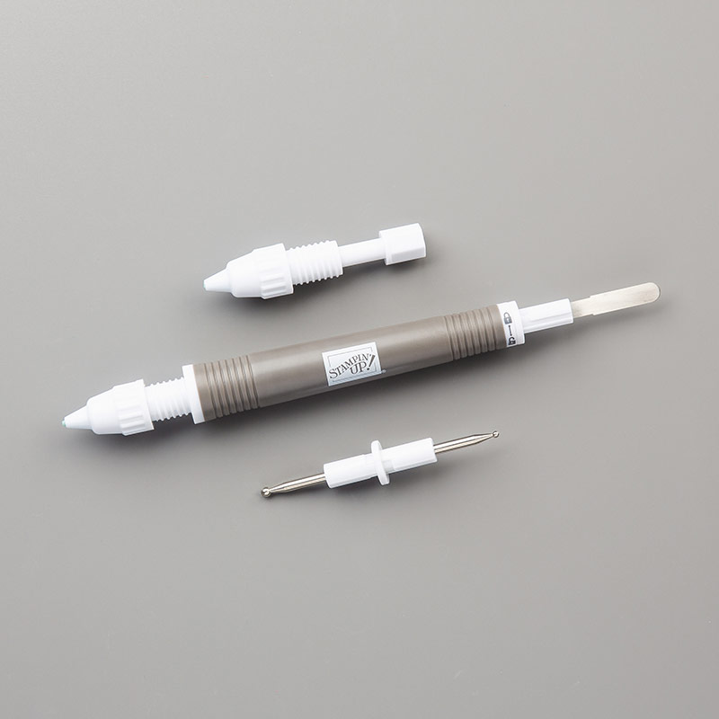
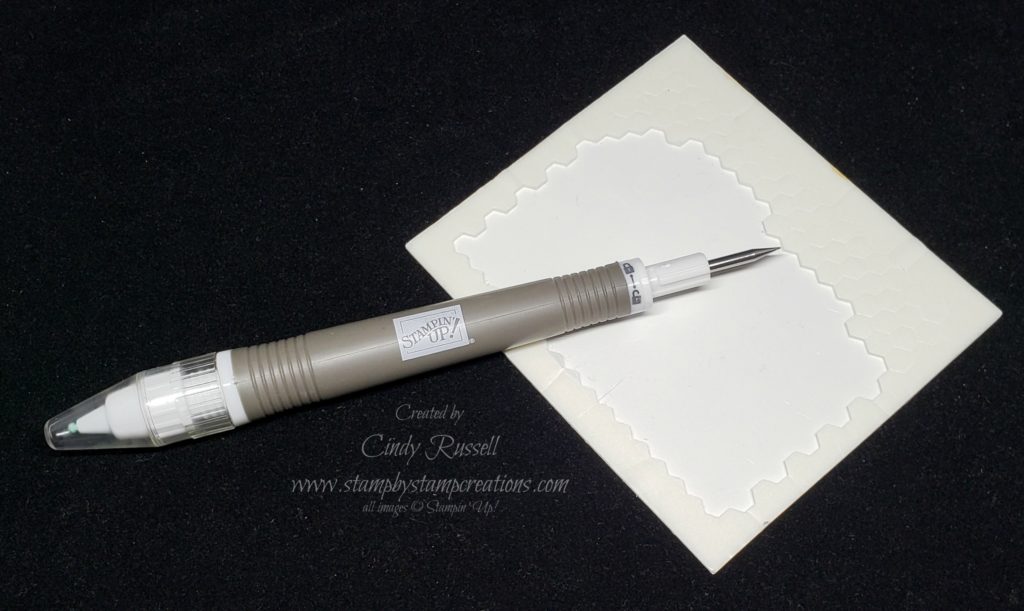
One of the dies (the sixth largest) from the Deckled Circles die set was the perfect size for the floral image and the card. After die-cutting it, it seemed a bit boring, so I needed to figure out how to add a little something to it. I tried drawing a dotted circle just inside the die-cut edge, but my drawing skills were a bit lacking. I tried to find something circular that I could draw around but came up empty. Then I had an epiphany. I could simply draw around the inside of the Deckled Circle die! I placed the die on my cardstock and using sticky notes, I was able to keep the die in place. The sticky notes need to be moved as you draw around the circle. You can either draw the circle before you die-cut it or draw it after as long as you keep the sticky notes in place. I will definitely be trying this technique with other dies.
The Berry Burst card front is stamped with the larger floral image from the stamp set with the same color ink and the strip of Pretty Peacock cardstock is stamped with the foliage image in the Pretty Peacock ink. Stamping cardstock with the same color image gives a nice subtle background design.
Sentiments used on both the inside and the outside of the card are from the Sentimental Park stamp set. There is a birthday sentiment in the Translucent Florals stamp set but it was a little too large. Sometimes you need to look through your stash for just the right item.
Happy Birthday to my MIL! I hope you all have a great day! Take care and Happy Stamping!