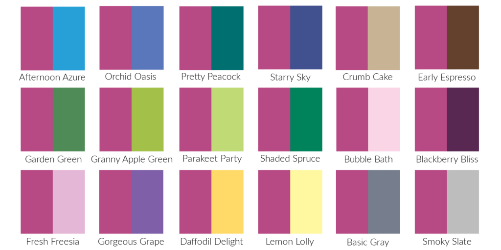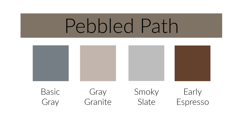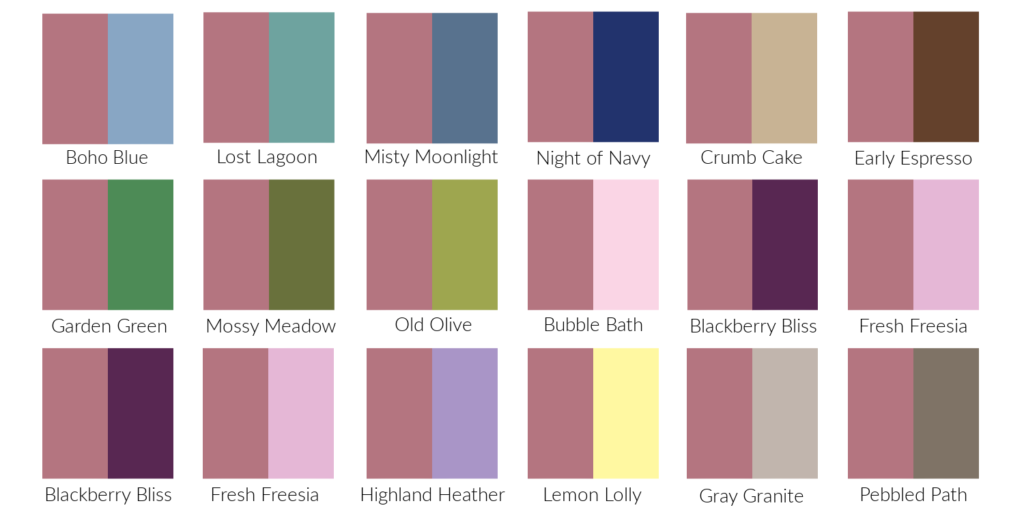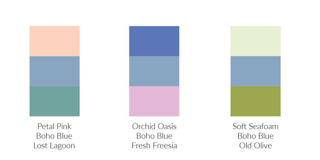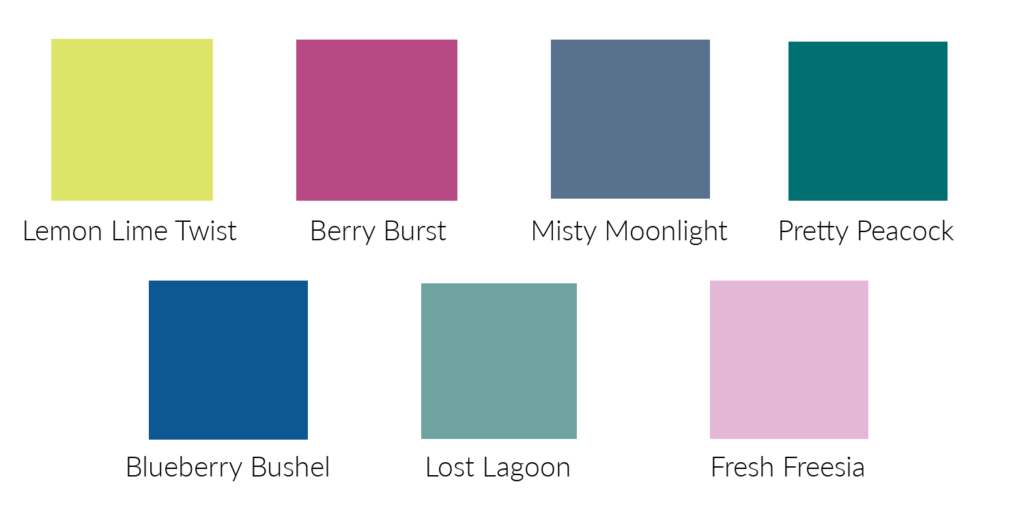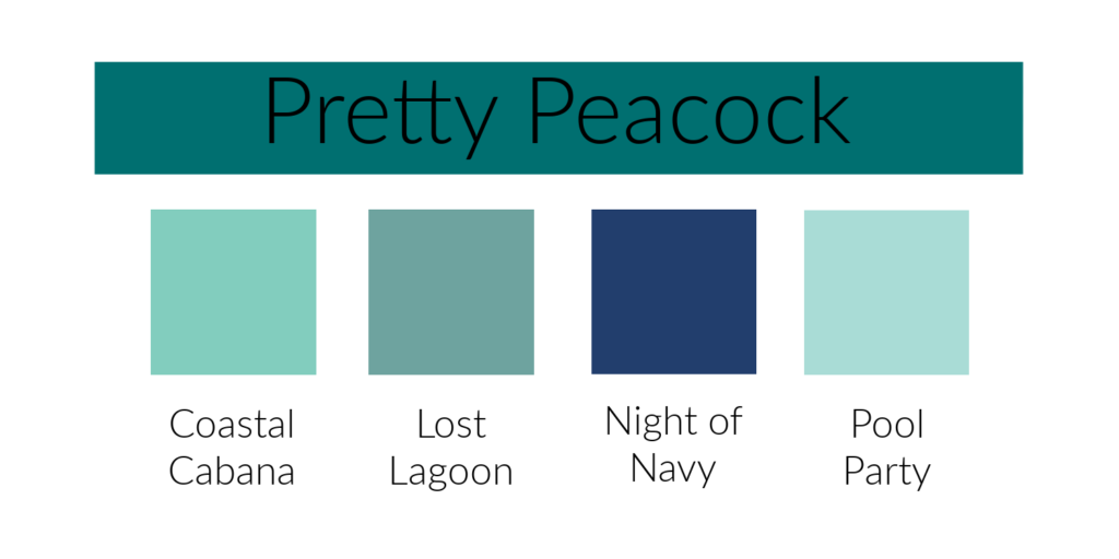
Pretty Peacock! This is the returning color that people were most excited about. It’s such a pretty blue/green and perfect for so many projects. In this first picture you can see how it compares to the other blues in Stampin’ Up!’s color collection.
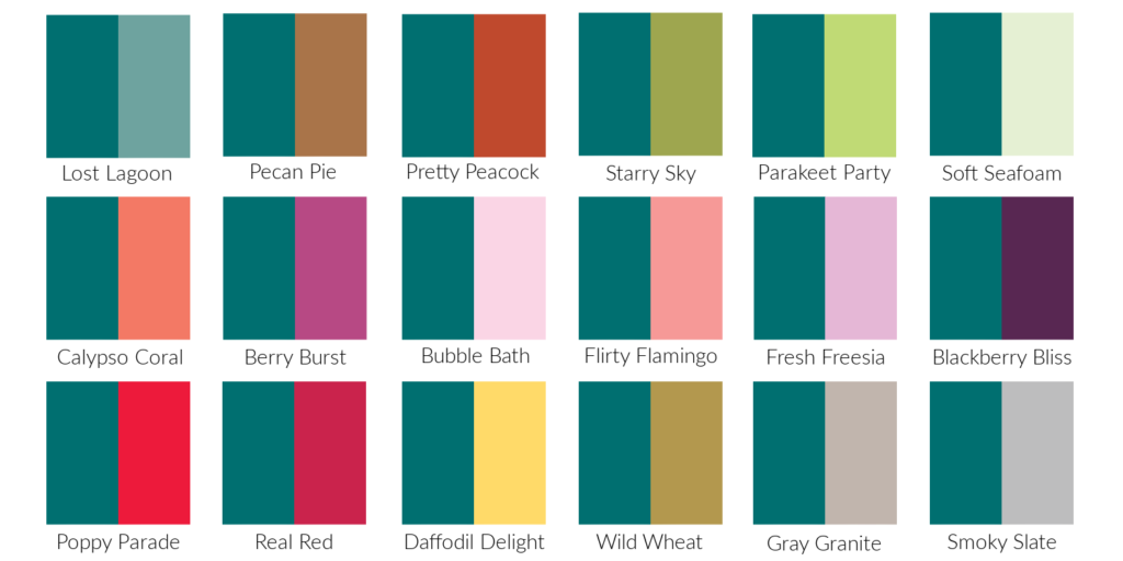
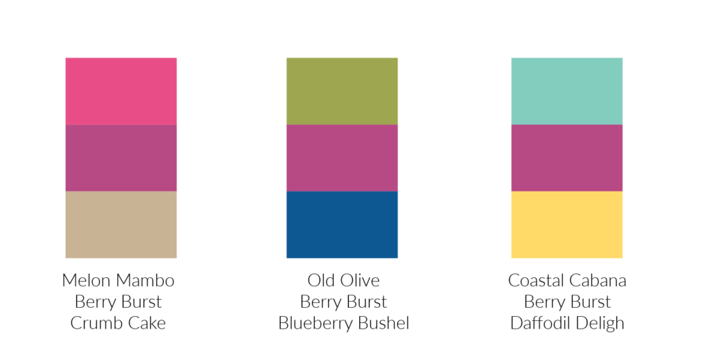
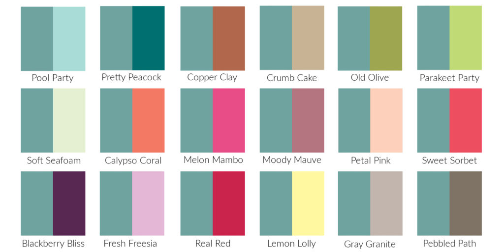
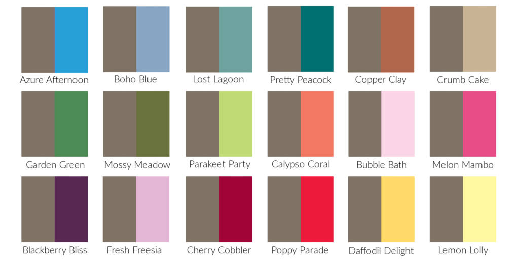
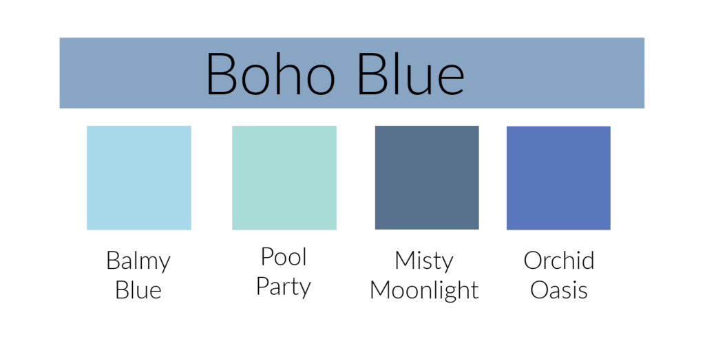
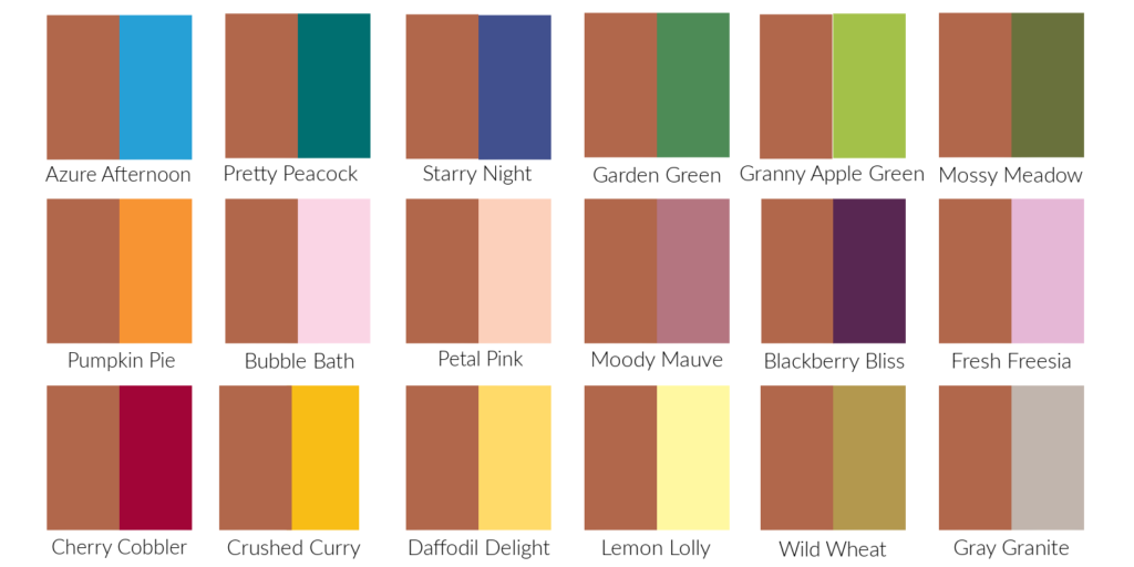
This second photo shows Pretty Peacock with other Stampin’ Up! colors. I was going to comment on which colors I like it best with but after studying the chart I had a hard time deciding. If I had to choose I would go with Lost Lagoon. They almost look like different shades of the same color
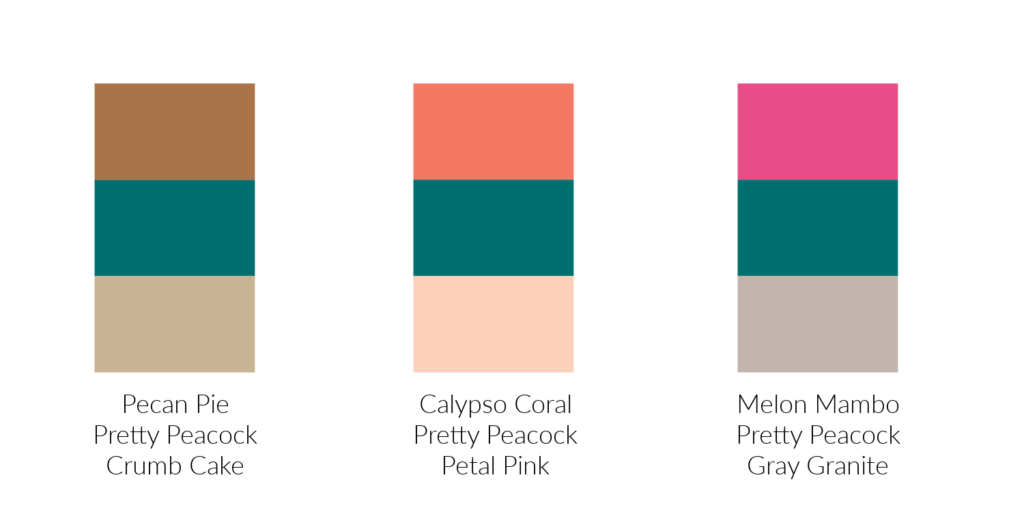
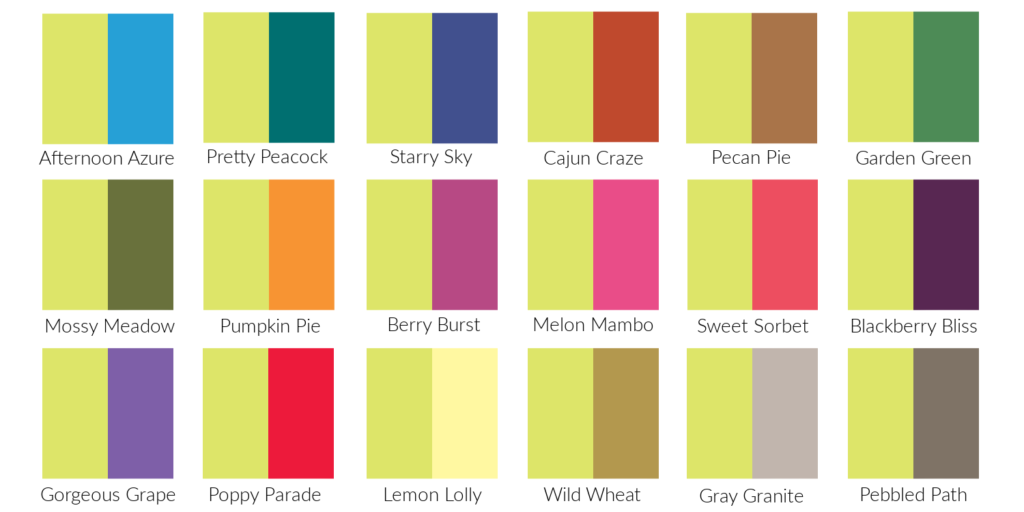
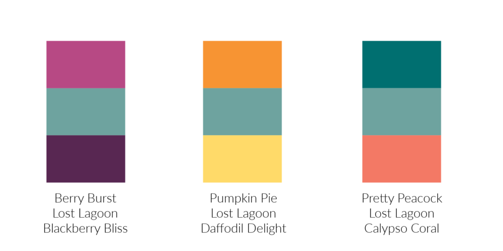
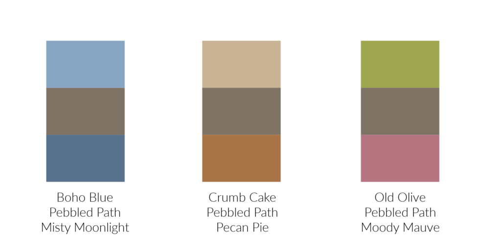
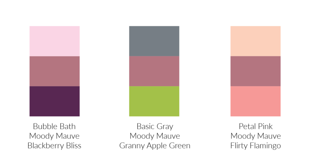
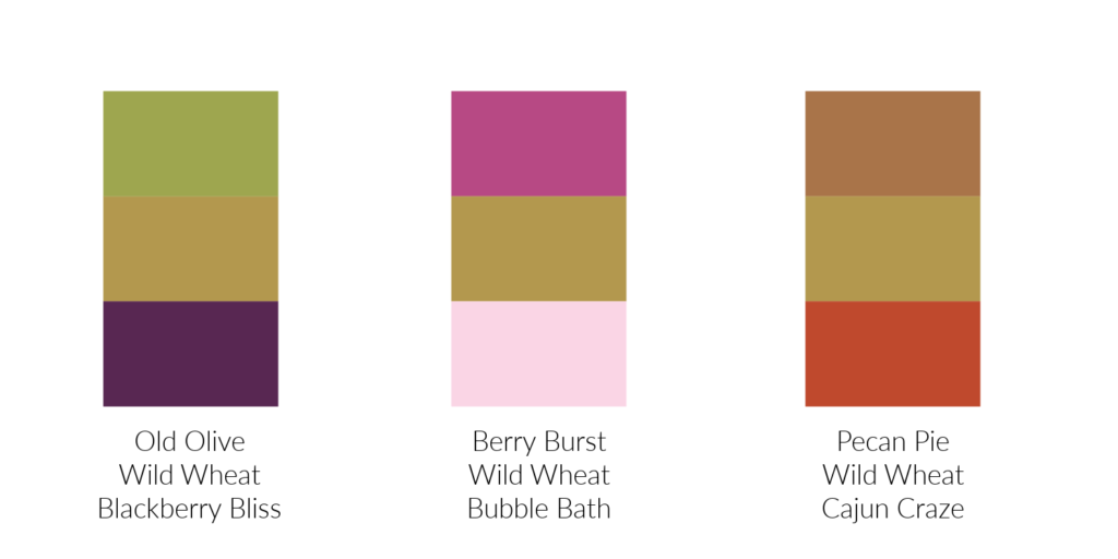
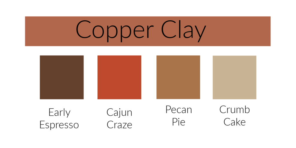
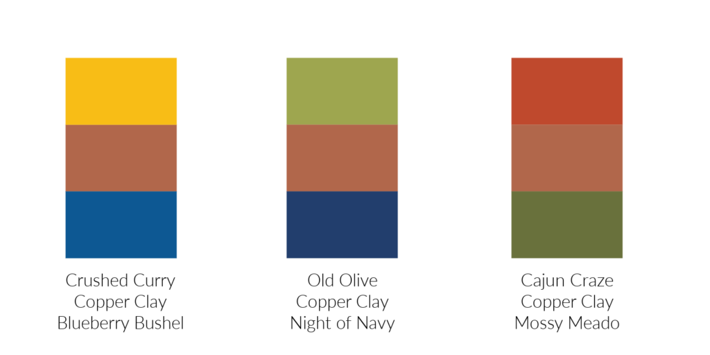
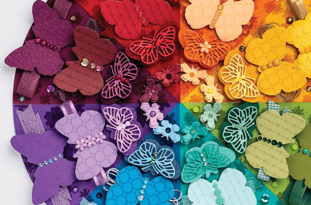
The last photo shows color combinations from Stampin’ Up!’s Color Coach. It’s a tough decision again on my favorite. My eye is first drawn to the last combination (PINK!) but I really like the first one with Pecan Pie and Crumb Cake. Do you have a favorite?