With so many colors and so many shades of colors sometimes it’s hard to know where to begin. Most of the time you have an idea of the basic color(s) you want to use on a card but how do you choose a shade of that color?

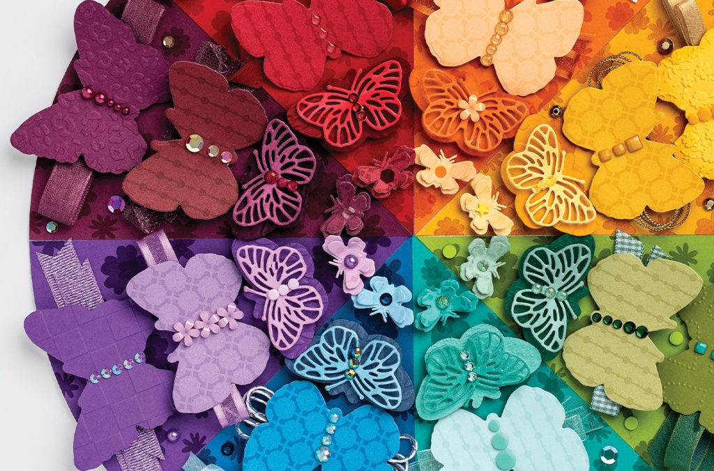
Currently, Stampin’ Up! has 11 different greens for us to choose from! Green wins the prize for the most shades. Check out the chart I made. You can see how the greens go from a very soft and light Soft Seafoam to the deep and rich Evening Evergreen. We all have our favorites. The greens that I probably use most often are Pear Pizzazz and Old Olive, although it depends on the project. If I was going to pick a favorite green it would have to be Evening Evergreen. A chart like this make it easy to see all of the greens together so you could maybe try a new shade.
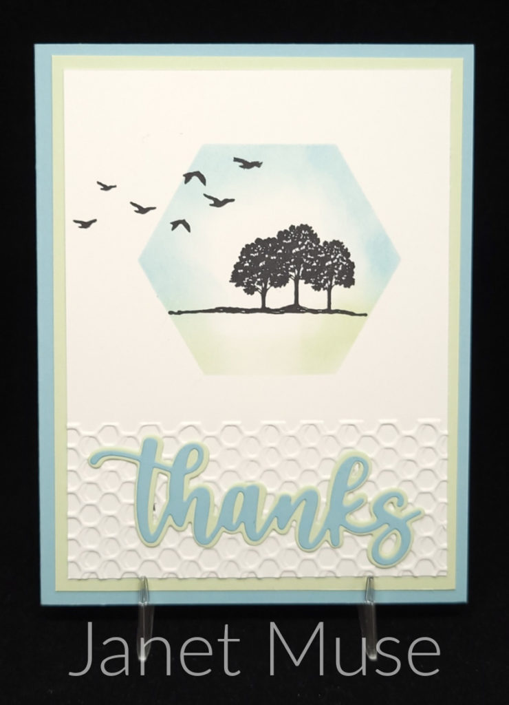
Check out the lovely card that my friend Janet made. She used Soft Sea Foam along with Balmy Blue. Personally, I don’t care for Soft Seafoam, but it really works on this card. I get a nice, relaxed feeling when I look at it which is probably what Janet was going for when she chose these two colors to go with her stamped images. If I recreated this card and went with my go-to green of Pear Pizzazz it wouldn’t have worked nearly as well. You just wouldn’t have that same relaxed feeling.

Different colors and different shades of colors are going to give you different feelings. As I mentioned, the soft colors of Janet’s card make me feel relaxed and peaceful. If I tried making this card with Granny Apple Green which is a fun, bright, in-your-face color it definitely wouldn’t make you feel relaxed. Bright colors give you more of a happy and excited feeling. They would be better suited for a birthday card or something like that.
When you’re choosing a color or shade of color you also want to think about how it’s being used on your project. Are you using a certain ink color to stamp an image or are you using a blending brush to apply the ink color on cardstock? Are you just using the colored cardstock for layers? These questions are important to think about when choosing the right color/shade for your project.
In a previous paragraph I mentioned that my go-to light green, Pear Pizzazz, probably wouldn’t have worked on Janet’s card. I’d like to change that thought up a bit. If I recreated Janet’s card as is, Pear Pizzaz wouldn’t have worked. If I changed up the card so that I didn’t use any Pear Pizzazz cardstock on the card and just used it on the focal point it might work. I’d be able to blend the Pear Pizzazz lightly enough with my Blending Brush to get that same soft look. Sometimes you have to experiment and see what’s actually going to work for your project.
Stampin’ Up! has so many choices of greens for our projects. Don’t always head for your favorites. You may even see me using Soft Seafoam on one of my upcoming projects! Give those other shades a try. Think about the feeling you’re trying to project. Stampin’ Up! already does this for us with their Designer Papers. Check out some of the papers and see what kind of feelings you get.
Color and combinations of color are powerful. Think about the feeling you want your card to project before choosing your colors.
Have a great day! Take care and Happy Stamping!
