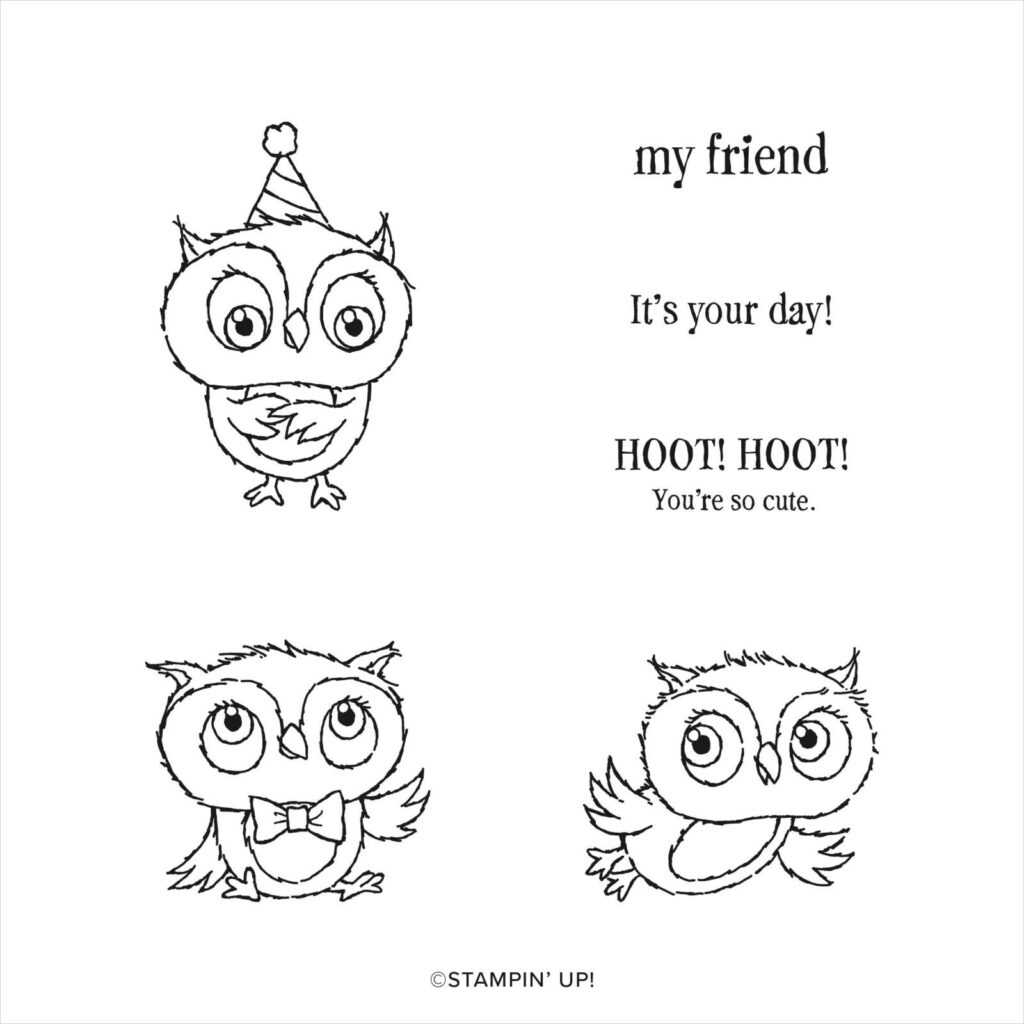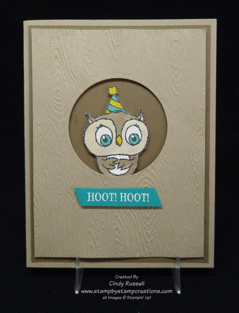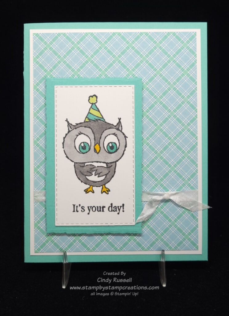
The third day of my 40 Cards in 40 days features Stampin’ Up!’s Adorable Owls stamp set. These owls are so stinkin’ cute! Today you get a two-for-one because I couldn’t decide which owl to use on my card. 😊
Adorable Owls is a Sale-a-bration item which means you can choose it for FREE with a $50 purchase! Sweet! If you like these little owls as much as I do, don’t wait! Sale-a-bration ends on Tuesday, February 28th and that is the last day you will see these cuties.
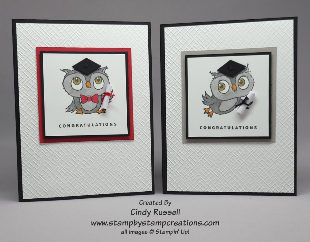
I came up with the idea for these cards after working with the stamp set and then seeing a graduation sentiment in the Sentimental Park stamp set (which I didn’t use on the card). Both of these owls have a little wing sticking out which can “hold” something in so I thought a little diploma would look adorable. The diplomas are simple a piece of computer paper cut 1 ¾” x ¾”, rolled up, and tied with a piece of baker’s twine (black) or embroidery floss (red). They are attached to the card with Mini Glue Dots. The “congratulations” stamp is from the Something Fancy stamp set. You can purchase this stamp set in a bundle with the Something Fancy Dies. The die set has tags and labels that fit the sentiments perfectly .
Once I had the diplomas on the owls I felt that they needed a graduation cap so I had to do some thinking. Aha! I remembered that the Beautiful Shapes Dies had many different shaped dies and wouldn’t you know, it had the perfect shape and sized die that I needed! It’s hard to see in the photos but there is a small 1/8” circle attached to the top of the caps.
You may have noticed that I used my new favorite embossing folder on the background of both cards. It’s one of three in the Basics 3D Embossing Folders pack which will be part of Stampin’ Up!’s Online Exclusives starting on March 1st.
I hope you enjoyed these fun graduation cards. Please leave a comment and let me know what you think of them. Have a great day! Take care and Happy Stamping!