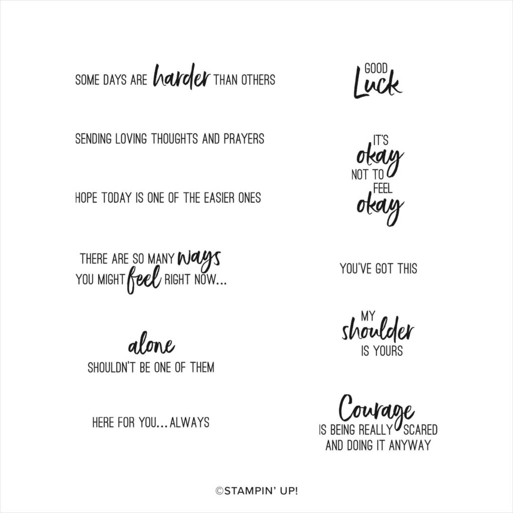
Today’s Sale-a-bration celebration is about Stampin’ Up!’s Sending Support stamp set. This stamp set has 11 different sentiments about encouragement and support. It may not be a stamp set that you use often but it’s one you will want in your craft room for those cards that need a sentiment that’s just right.
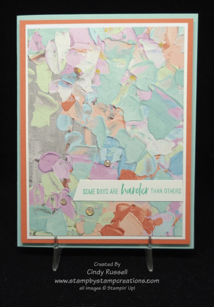
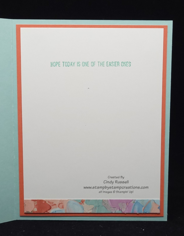
Pair these sentiments with a lovely floral or subdued designer paper for a simple card. Here is a simple card that I made. A bit of designer paper on the inside as well as the outside can really tie things together.
Be sure to put this stamp set on your Sale-a-bration wish list. It has sentiments that you don’t usually find in other stamp sets.
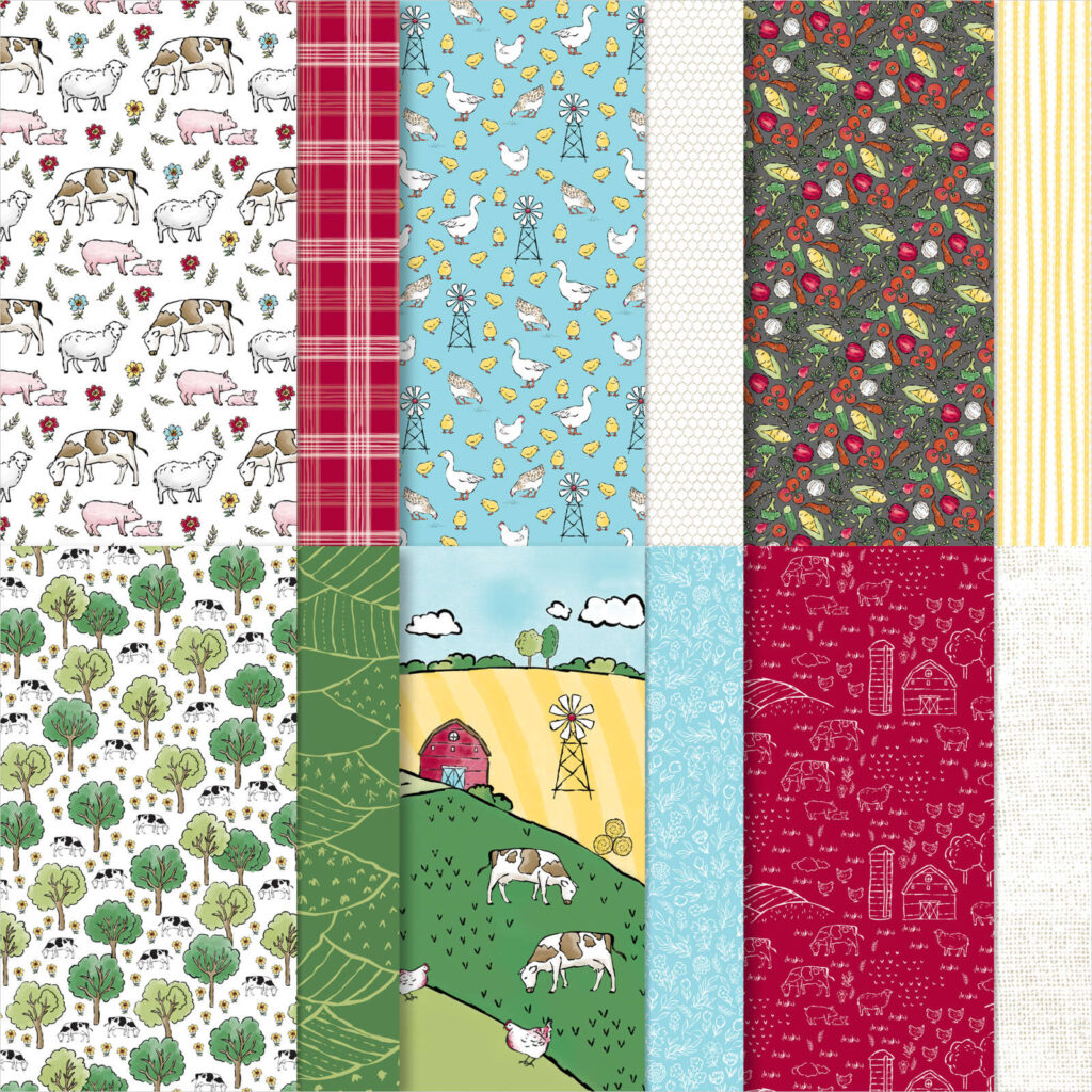
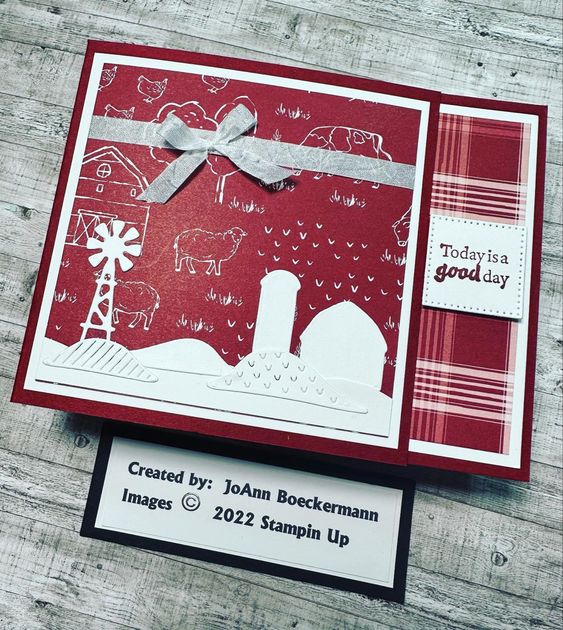
Do you love farms and everything to do with them? Did you grow up on a farm or know someone who did? If you can answer yes to either of these questions you are going to love Stampin’ Up!’s Day at the Farm Designer Series Paper. This designer paper is one of the items in the Sale-a-bration Brochure that you can choose for free with a qualifying purchase!
This cute farm paper coordinates perfectly with the On the Farm Bundle (stamp set and dies) found on page 34 of the January – April Mini Catalog. In this photo you can see how the farm silhouette coordinates with the paper. So fun!
If you love farms or know someone who does, be sure to check out this Sale-a-bration item. Have a great day! Take care and Happy Stamping!
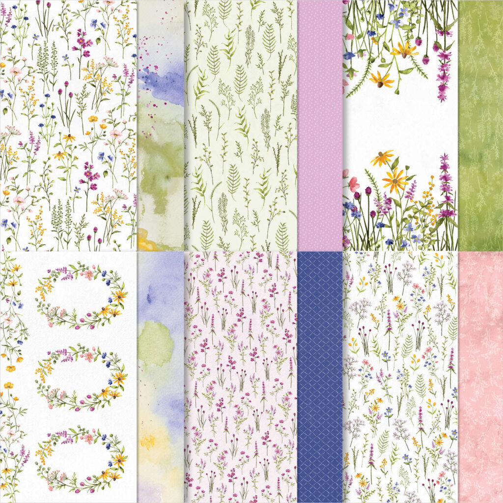
Dainty Flowers Designer Series Paper by Stampin’ Up!
Stampin’ Up!’s Dainty Flowers designer paper is definitely worth celebrating! This designer paper is beautiful! It was the first Sale-a-bration item I chose. The flowers are on these papers are gorgeous!
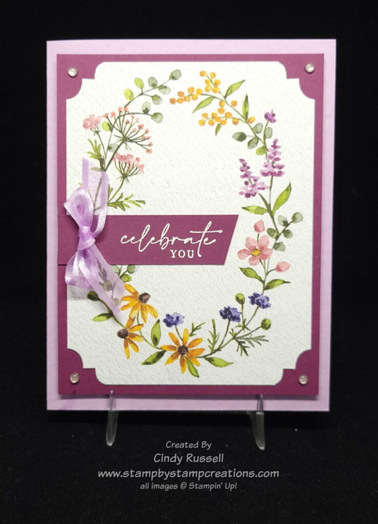
The first card shown here is a card I made using the sheet of paper that has six of the floral wreaths on it as well as two floral vine images. The images look like they were watercolored. So pretty!
I punched the edges of the desginer paper with the Very Best Trio Punch which is an item carried over from the previous mini catalog. A tip to remember when using this punch is that you need to turn your paper over when punching the next corner. For the first corner you punch (upper left) put the paper in the punch with the floral wreath facing up. When you move the paper to punch the upper right corner, you need to turn the paper over with the floral wreath facing down to get the fancy corner design to look the same. For the lower right corner have the wreath facing up and for the lower left corner have the wreath facing down.
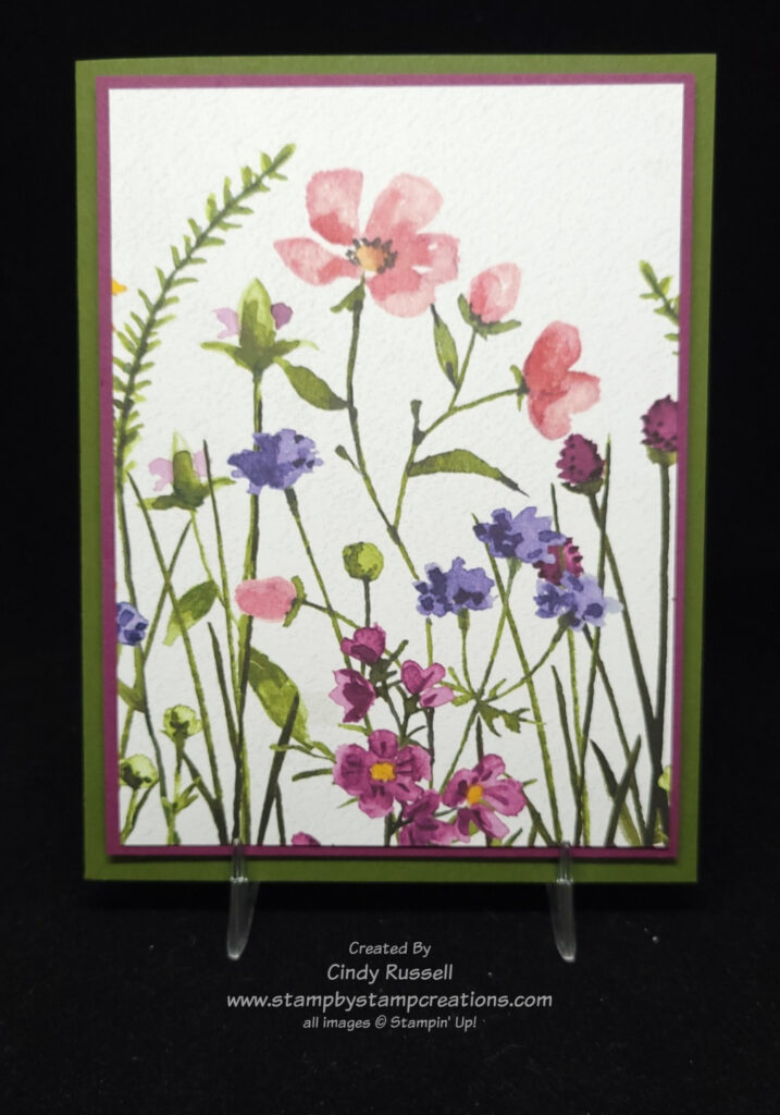
As you can see on this second card, the designer paper is so beautiful you can make it the focal point of your card!
Did you know that this designer paper coordinates perfectly with the Dainty Delight Bundle (stamp set & dies) that you can find on page 55 of the new January – April Mini Catalog? I LOVE coordination! 😊
As I mentioned before, I love the watercolor look of these papers. I think you will too!
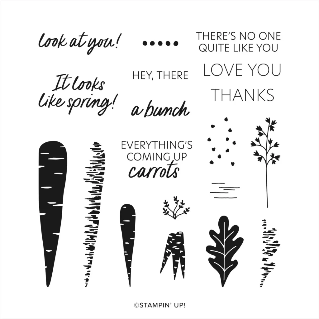
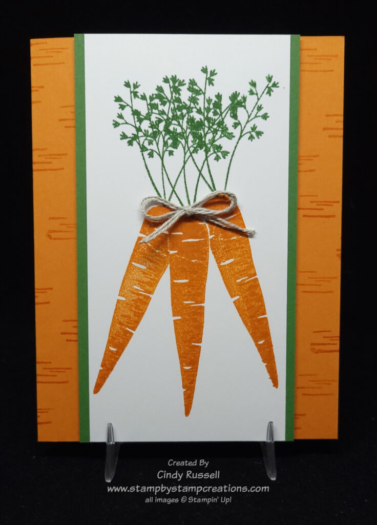
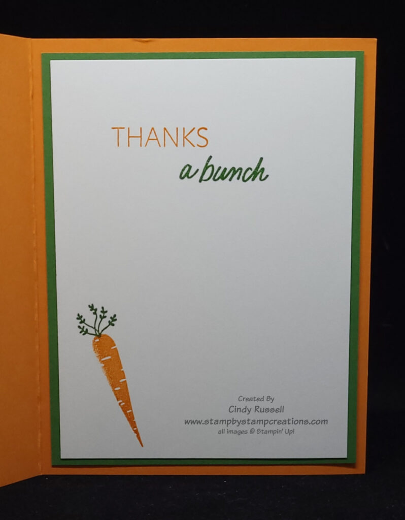
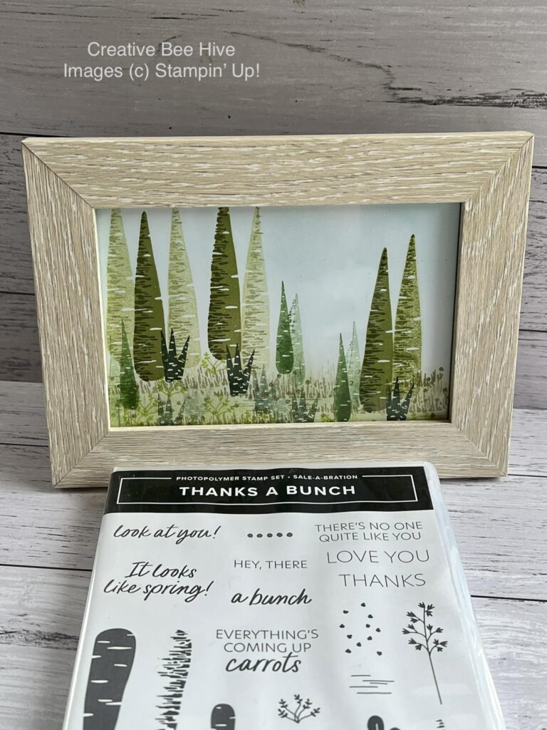
The next product on our Celebrate Sale-a-bration 2023 tour is the Thanks A Bunch stamp set. Ok, if you’re like me when I first saw this stamp set you said “why do I need a stamp set about carrots?”. Carrots. Really?
Well….let me tell you….this stamp set is stinkin’ cute! The more I played around with it, the more it grew on me. Simple and fun! Add the sentiments “thanks a bunch” to the three carrots and you’ve got an adorable thank you card!
To make my bunch of carrots I first stamped the middle carrot. I then made a mask by stamping a carrot on a sticky note and cutting it out. I masked my stamped carrot and then stamped the other two carrots. As you can see on the card it looks like the two outside carrots are behind the center one.
If you’re still thinking that you can stamp only so many carrot cards, check out this 3D project made by fellow demonstrator Barbara Ruby. So clever! Turn the carrots upside down and stamp them with a green ink to make a tree!
See, this stamp set is versatile! You may want to add it to your Sale-a-bration wish list! Have a great day! Take care and Happy Stamping!
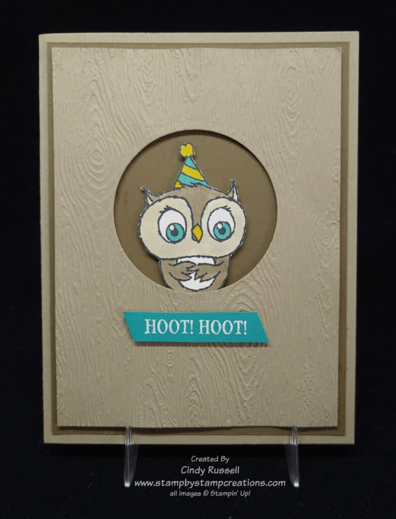
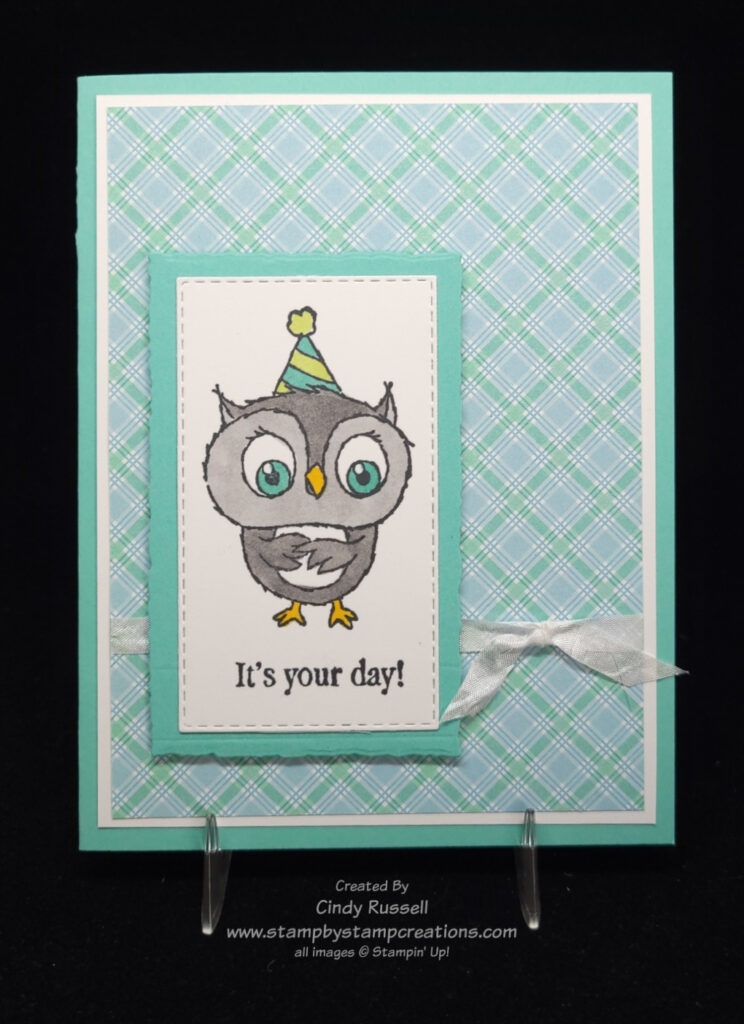
There is so much to celebrate during 2023’s Sale-a-bration and it starts with the Adorable Owls stamp set. So fun! So cute! This stamp set includes three cute owls and three sentiments. I’ve had a lot of fun playing with it. The images are easy to color with Stampin’ Blend markers. I’ve used both the Crumb Cake Blends and the Smoky Slate blends to color my owls.
I love this birthday card with the owl peeking out of the tree. It was fun to make. I did have to fussy-cut the owl but it was worth it for the finished look. A quick tip I have for you on this card is that you should die cut the circle before running the Crumb Cake cardstock through the Stampin’ Cut & Emboss Machine with the Timber 3D Embossing Folder.
If you look at the images in the stamp set, you will see that the “Hoot! Hoot!” that I used on my card is actually part of a longer phrase. I masked the other portion of the sentiment with a sticky note while I inked the stamp and then removed the sticky note before stamping the “Hoot! Hoot!” on the Bermuda Bay cardstock.
This is a fun and easy birthday card made with the Adorable Owls stamp set. The designer paper I used on the card is from the Dandy Designs Designer Series Paper which is also a Sale-a-bration item. The owl and sentiment are die cut with one of the Stitched Rectangle Dies and the Coastal Cabana layer is die cut with one of the Deckled Rectangle Dies.
The Adorable Owls stamp set can be your Sale-a-bration choice with a $50 order. Get working on that wish list and order. Sale-a-bration only runs through February 28th! Have a great day. Take care and Happy Stamping!
Hello friends! I’m back! Yes, it’s been awhile. For those of you who don’t receive my weekly (or mostly weekly) newsletter, 2022 was a terrible year in the Russell household. One that we’d prefer not to repeat. 2023 has been good so far so we’re optimistic for this new year.
Stampin’ Up!’s 2023 January – April Mini Catalog
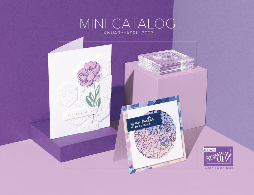
Stampin’ Up!’s new January – April 2023 Mini Catalog is here! From the title, you can see that the selling period for this Mini Catalog is slightly shorter than in the past.
This catalog is gorgeous and you’re not going to want to miss out. You can view the catalog here or you can view the products from the catalog here in my online store.
Stampin’ Up!’s 2023 Sale-a-bration Brochure
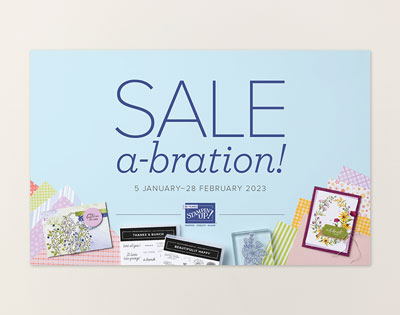
Sale-a-bration 2023 is here! Woo Hoo! Stampin’ Up! has gone back to only one Sale-a-bration event per year so this is it. You don’t want to miss it! This time of year is the only time for you to earn FREE products in so many different ways.
SHOP. Choose a FREE Sale-a-bration item with every $50 or $100 you spend on Stampin’ Up! products (before tax and shipping). Are you wondering what the Sale-a-bration items are? You can view the Sale-a-bration Brochure here! Or you can see the Sale-a-bration producs here in my online store.
HOST. Host a qualifying stamping party and receive the exclusive Scenic Garden stamp set for FREE! You can find this stamp set on page 17 of the Sale-a-bration Brochure or here in my online store.
JOIN. You are not going to want to miss this part. If you have every considered becoming part of the Stampin’ Up! family and my team of Sassy Stampers, this is the time. During Sale-a-bration you can choose from 3 different Starter Kit Options! Whether you want to be a Happy Shopper with 20% discount on Stampin’ Up! products or work a business like I do, there is an option for you! Check out the details of these 3 options as well as how to sign up here. In all of the three options you will get to choose $175 of Stampin’ Up! merchandise! That is a lot of merchandise.
Option #1 – Receive the exclusive Boho Blue (an upcoming new In-Color) Limited Edition Mini Stampin’ Cut & Emboss Machine and choose $175 of Stampin’ Up! merchandise for only $129.
Option #2 – Receive the original White Stampin’ Cut & Emboss Machine and choose $175 of Stampin’ Up! merchandise for only $129.
Option #3 – Choose $175 of Stampin’ Up! merchandise for only $99. Any of these three options are amazing deals. Don’t miss out! If you’d like more details on being a Stampin’ Up! demonstrator, please contact me. I’d love to chat!
Have fun checking out these publications! I know you’ll enjoy them! Have a great day! Take care and Happy Stamping!
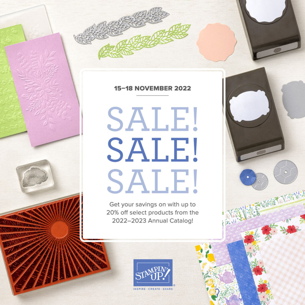
It’s time for Stampin’ Up!’s Seasonal Sale! Now is the time to get that wish list out or at least get it started. This sale will run from Tuesday, November 15th through Friday, November 18th.
You will want to shop early as sale items are only available while supplies last. What’s on sale? All products on sale can be found in Stampin’ Up!’s 2022-2023 Annual Catalog. No items from the current Mini Catalog are included in the sale. You can view a list of the items on sale here. You’ll be able to view the items on sale in my online store on Tuesday.
Products included in the sale:
10% off all punches
15% off all stamps (hostess sets not included)
20% off all dies
20% off all embossing folders
20% off all non-specialty Designer Series Paper
Don’t miss out on these great deals! Happy Shopping!
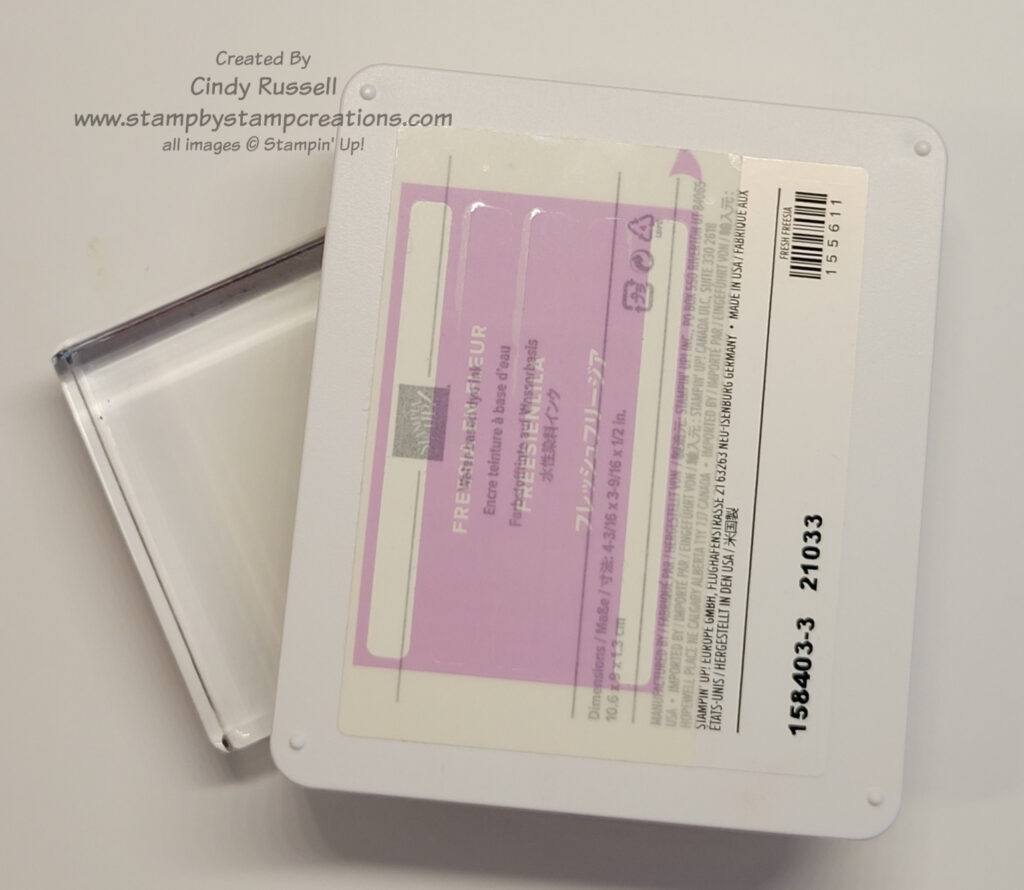
There are so many different ways to watercolor. One of the easiest ways to get started with water coloring is a Watercolor Wash. This technique is easy because there isn’t any detail work. You are simply adding color to the paper to make a background. This technique gets you started on how to apply the paint (ink) to the paper with the brush.
Tools
Besides the three basics tools of water coloring (paper, brush and ink), you will also need:
a Stampin’ Spritzer or small squirt bottle for water
a small dish for water
some type of waterproof work surface
painter’s tape or washi tape
the flat tip brush Water Painter
paper towels
clear stamping block (optional)
For my waterproof work surface I took one of Stampin’ Up!’s 6” x 8” Cello Bags and inserted a small piece of cardboard inside. This gave me a sturdy work surface that could get wet.
Tips
Have all of your tools and supplies set out and ready before you begin.
Cut the cardstock larger than you need for your finished project.
Use the painter’s tape/washi tape (or some type of adhesive that is easy to remove) to adhere the paper to your waterproof work surface. This keeps the paper flat as it gets wet and holds it in place.
Before applying the ink to the paper be sure to thoroughly wet the paper with the Stampin’ Spritzer/spray bottle of water.
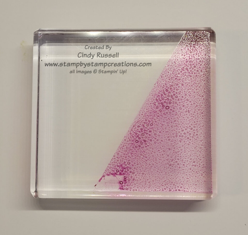
Open the ink pad(s) you will be using. Don’t slide the lid back. Put a drop of the ink refill in the lid. This is your “paint” palette. (you can also use any of the other ideas for the ink that I mentioned in my previous post)
Clean out the lid of the ink pad when you’re done.
Technique
Adhere the paper to the work surface with painter’s tape or washi tape
Spritz the paper with water
Gently squeeze the reservoir of the Water Painter to wet the tip or simply dip it in the container of water.
Pick up the ink in the ink pad lid with the brush.
Sweep the inked brush across the paper going back and forth.
Keep the brush wet and inked
Continue adding color until you get the look you want.
Clean brush thoroughly before switching colors by getting brush wet and dabbing color on paper towel until brush is clean.
As you can see in the card above, I covered the entire area of my paper with the watercolor wash. I used two colors, Parakeet Party and Tahitian Tide, to get the look on the card. On this second card, I wet the watercolor paper and then got my brush really wet, picked up the color and kind of tapped my brush on different areas of the wet paper. The water on the paper made the ink spread. Then I played with it until I got the look I wanted.
After you have done a watercolor wash you need to let the paper dry thoroughly before adding it to a project. Watercolor Paper is thick so use Stampin’ Seal +, Liquid Glue or some other strong adhesive when adhering it to your project.
I hope you like this watercolor technique and give it a try soon. Have a great day! Take care and Happy Stamping!
There are many ways to watercolor and to get that watercolor look on your projects. Stampin’ Up! has shared a video that highlights 7 different techniques that you can try at home. You can view it here:
What did you think? Did you come up with a favorite technique or method?
It’s fun to see all of these different methods. They all have a different look but how do the finished products compare?
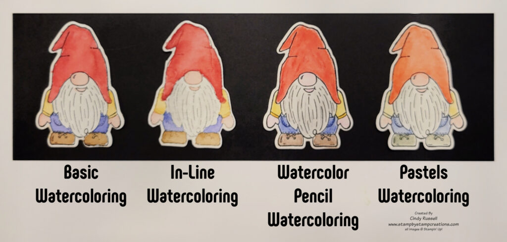
In this photo you can see four adorable gnomes from the Kindest Gnomes stamp set. I have watercolored all four of them with different techniques/methods. You can see how they all have a slightly different look.
The first gnome was done with what I’ll call Basic Watercoloring. The gnome was first stamped with StazOn Jet Black Ink which is alcohol-based. You need to use this type of ink so that it doesn’t smear when water is added. When watercoloring this image I did one part/color at a time. I first wet the section with my Water Painter and went then went over it with the brush. Then I picked up the color I wanted and added it to the paper. I then moved on to a different part of image, trying to do a section not next to the one I just did so the colors wouldn’t run together.
The second gnome was done with the No-Line Watercoloring Technique. This was the first technique described in the video above. This method is very similar to Basic Watercoloring except you use a light-colored ink when stamping the image. With this technique you want a water-based ink like Stampin’ Up!’s inks because you want the lines of the image to blend in with the coloring. Once again, you want to do one section/color at a time, moving to a section that is not next to the one you just did.
The third gnome was colored using Stampin’ Up!’s Water Color Pencils. This techniqe was also described in the video. The gnome was stamped with StazOn Jet Black. Then I colored the image with the Water Color Pencils. Finally, I went over each section with a Water Painter to blend and smooth the colored image.
The final gnome in the photo was watercolored using Stampin’ Up!’s Soft Pastels which are chalk. This method gave the softest look to the finished gnome. Stamp the image with StazOn Jet Black ink. On a piece of watercolor paper or Shimmery White cardstock color a line of chalk pastel with each of the colors you want to use on your stamped image. With a wet brush, pick up the color from the line of chalk pastel and then color your image.
There are so many different ways to watercolor with your stamping supplies. I hope you try some of them soon. Have a great day! Take care and Happy Stamping!
When watercoloring, we know that we need to get the ink on the brush and on to the paper. But how do we do that? The ink is on the ink pad or in the ink refill bottle.
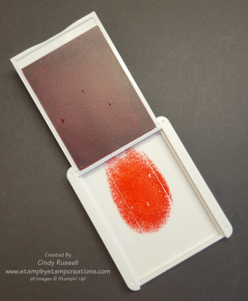
There are a few different options for this that I’ve seen. The first option, which is the one I most often use, is putting the ink in the lid of the open ink pad and picking up the ink from the lid. There are two different ways to do this:
You can squish the ink pad so that the ink transfers from the foam pad to the lid. This is a little hard to do with Stampin’ Up!’s new ink pads but if you place the closed ink pad with the lid down on your work surface and apply firm pressure to the back of the ink pad you should be able to get some ink transferred to the lid.
Or you can put a drop or two of the ink refill in the lid of the ink pad.
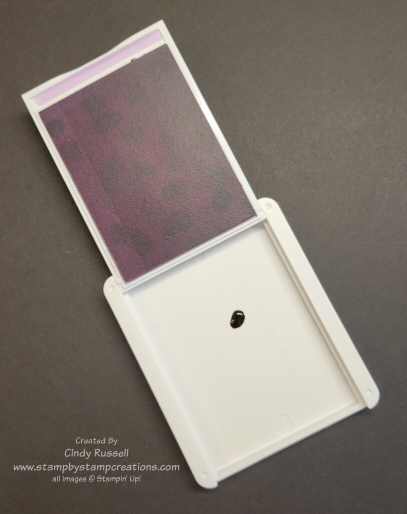
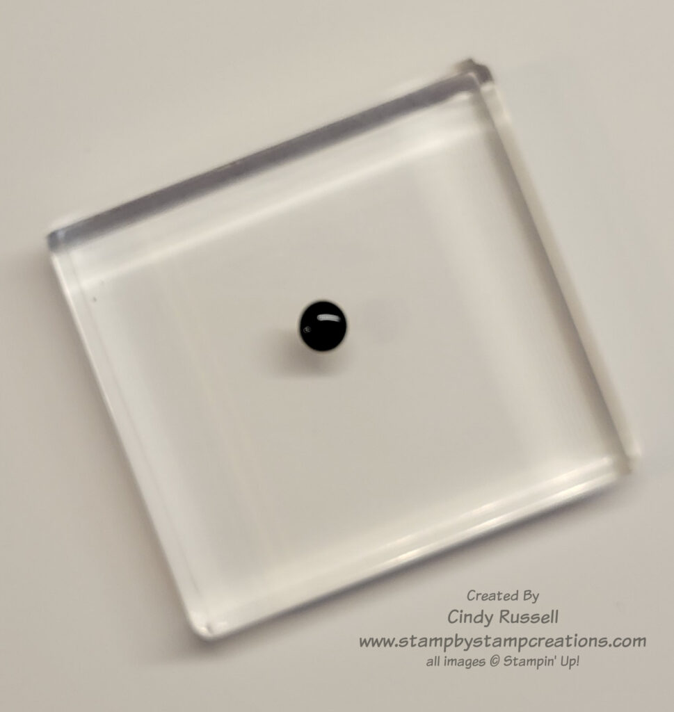
The other two methods that I know of use a clear stamping block.
In the first block method you put a drop of the ink on a clear block and pick up the ink from there.
The second block method is to take your ink pad and apply it to the block (or apply the block to the ink pad).
In all of these methods you get the ink in/on a place where it is easy to pick up with the brush. Now that you have the basics it’s we can move on to some techniques. Stay tuned! Have a great day! Take care and Happy Stamping!
July is National Watercolor Month! I love the look of water coloring, don’t you? I’m definitely not an expert with water coloring but I can give it my best shot. If you don’t practice, you don’t improve. Am I right?
Today I’d like to introduce you to the basic tools that you will need to watercolor. To get started you will need paper, brush, paint and of course, water! Stampin’ Up! has these basics covered for us.
Paper: Stampin’ Up! carries Watercolor Paper (#149612 $9) as well as Shimmery White cardstock (#101910 $10). Both of these papers work well to watercolor with. Watercolor Paper is a thick, textured, absorbent paper which is made specifically for water coloring. Shimmery White cardstock is slightly thicker than Stampin’ Up!’s Basic White cardstock with a little shimmer to it.
Brushes: Stampin’ Up! doesn’t carry basic paint brushes but they do carry Water Painters (#151298 $13). Water Painters are a set of 3 brushes, each containing a small reservoir for water. To fill the Water Painter, hold the tip end and gently unscrew the reservoir. (It may twist in the opposite direction that you think it should twist). Fill with water (not completely full) and screw the reservoir back on to the tip. A light squeeze of the reservoir wets the brush tip. The set comes with a large flat brush tip, a small brush tip and a medium brush tip.
Paint: Stampin’ Up! doesn’t carry paint but they do carry 50 colors of ink which work perfectly to watercolor with. You will need an ink pad and/or an ink refill of that color to watercolor with. With these basic tools you can start watercoloring! I hope you have them in your craft room! Have a great day. Take care and Happy Stamping!
It’s here! Stampin’ Up!’s July – December (Holiday) Mini Catalog is here! I know you’re going to love it! You can check out the catalog right here or you can view all of the fabulous products in my online store here.
This fantastic catalog has something for everyone! There are products for Fall, Halloween and of course Christmas along with some fun all-occasion itmes. You are definitely going to want to check it out! If you would like a copy of the catalog please let me know. You can email me at cindy@stampbystampcreations.com
Sale-a-bration Brochure
It’s Sale-a-bration time again! I like to call it Sale-a-bration 2.0 since it’s totally different from the Sale-a-bration that was held in January and February of this year. New brochure. New products!
Sale-a-bration is the time of the year where you can choose a FREE product from this brochure with each $50 or $100 you spend on Stampin’ Up! products! Woo Hoo! Free products! There are also special Sale-a-bration benefits for hosting a qualifying event or joining the Stampin’ Up! family of demonstrators. You can check these benefits out in the back of the Sale-a-bration Brochure or contact me (cindy@stampbystampcreations.com) for more information.
You can view the Sale-a-bration 2.0 Brochure here or you can view the products in my online store here.
Have fun browsing these two publications! Enjoy! Have a great day. Take care and Happy Stamping!
We made it! 30 Days of Stampin’ Up!’s new Annual Catalog. Have you enjoyed our 30 Days of the New Catalog? I know I have. I’ve loved looking for all of the samples and getting inspired by fellow crafters.
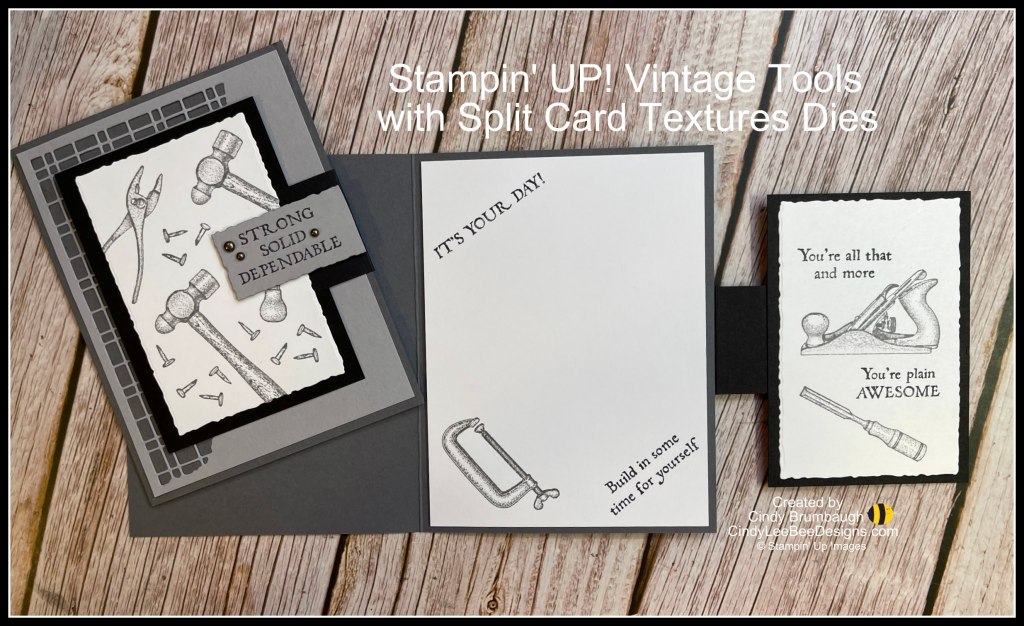
For our final day I am going to share two products with you that were shared on the same card. Thank you Cindy Brumbaugh for this fun masculine card!
The stamp set used on this card is the Vintage Tools stamp setfound on page 87 of Stampin’ Up!’s Annual Catalog. The this stamp set includes 5 sentiments and 7 tools. This is another item that is already on the shelf in my craft room. My husband is quite handy and he loves to build things so this set is perfect!
The other product used is the Split Card Textures Dies found on page 174 of the catalog. I will admit that these dies didn’t do anything for me when I first saw them. Of course, now that I’ve seen so many fabulous cards made with them I’m going to have to add them to my wish list.
There are two dies in this set. The first one is the grid-like pattern you can see on this card. The second one is more of a floral pattern. If you look at Cindy’s card in the photo above, the entire Smoky Slate piece of cardstock was die cut with the Split Texture die. These dies will add a lot of interest to any project!
That’s it for our 30 Days of the New Catalog! Leave me a comment below if you’ve enjoyed the projects. Have a great day! Take care and Happy Stamping.
Stampin’ Up!’s Deckled Rectangled Dies are featured here for Day 29 of 30 Days of the New Catalog. This set of dies can be found on page 170 of the annual catalog.
This is a beautiful card made with the Bottled Happiness stamp set. Check out the layers though. This is where you can see the Deckled Rectangle Dies. There 8 dies in the set. Two sets of layering dies. One set is long and thinner rectangles and the other set contains the ones shown on this card that are designed for a card front.
Thank you Allison Davini for sharing this lovely card.
Once again I have an addition for my wish list. Do you? Have a great day! Take care and Happy Stamping!
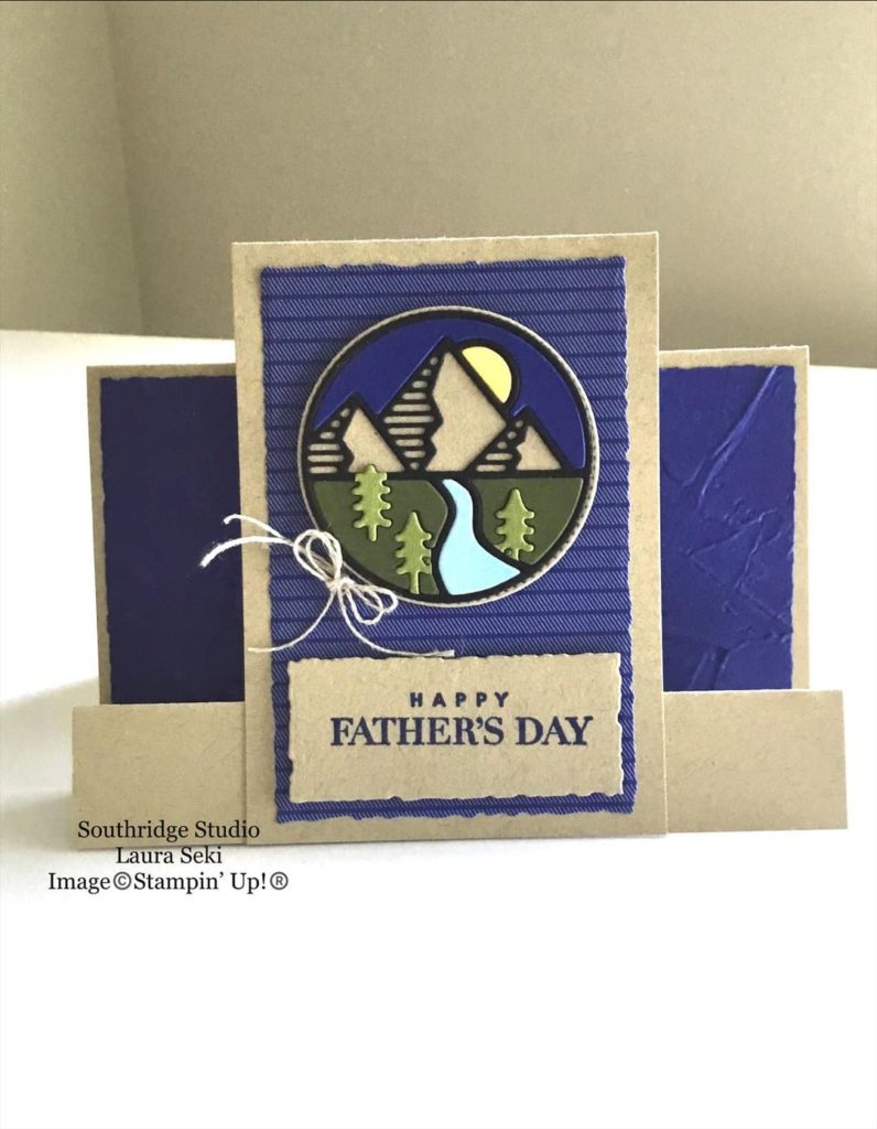
For Day 28 of our 30 Days of the New Catalog I am sharing the product that was one of the very first things I had to have from this catalog. The Rugged Icon Dies.
There are 5 dies in this set and I love them all! My favorite is the mountain scene that you see here. I do live in Colorado! 🙂
Thank you to Laurie Seki for sharing this card. Laurie die-cut this mountain scene several times in different colors so she could insert the colored pieces in the negative space of the scene die-cut from black.
The other images that you can find in the die set is a guitar outline, an outline of a beard (too fun!), a drill outline and a fishing rod outline.
The fishing rod is another favorite of mine since we do have the family cabin and do a lot of fishing while we are there. I know I’ll be making a lot of cards using this die.
This die set is already in my craft room waiting for me so it doesn’t need to go on my wish list. Will it be on your wish list? Have a great day! Take care and Happy Stamping.