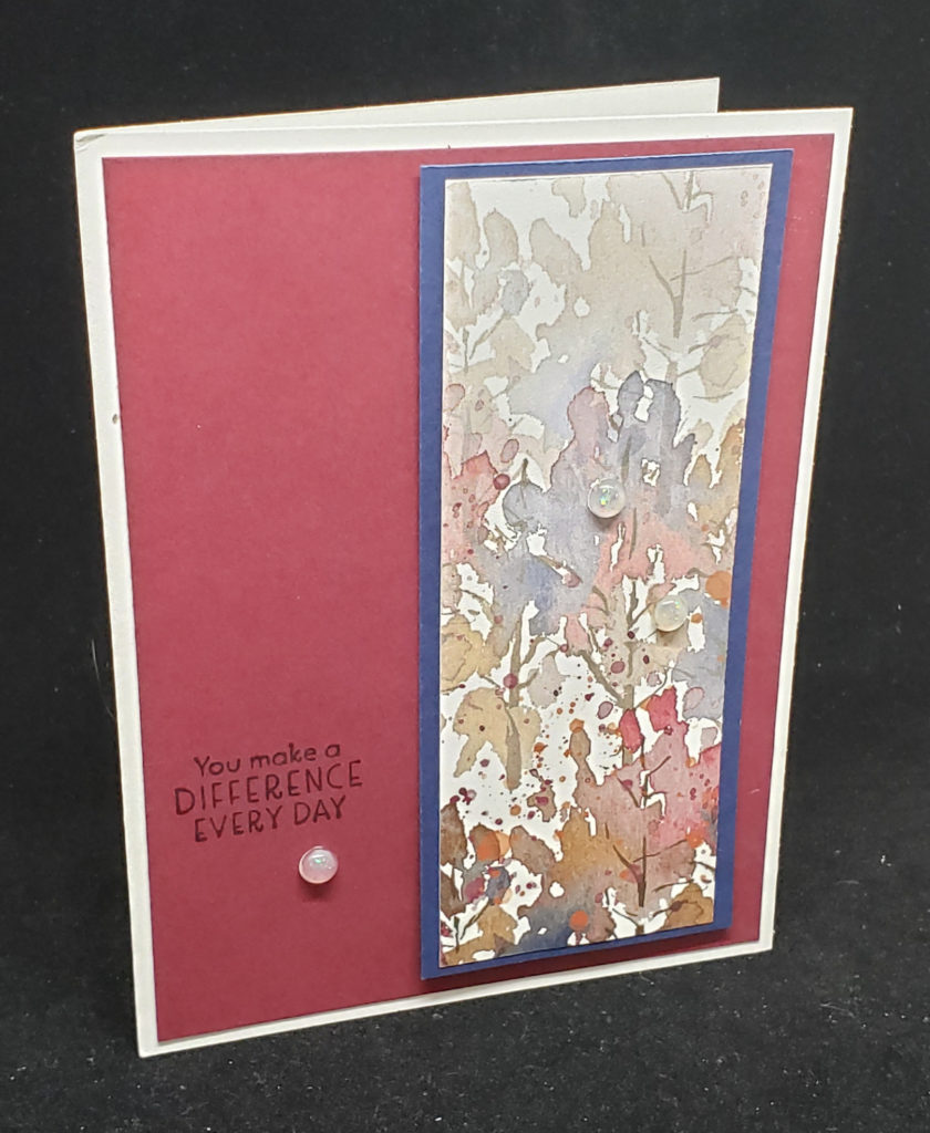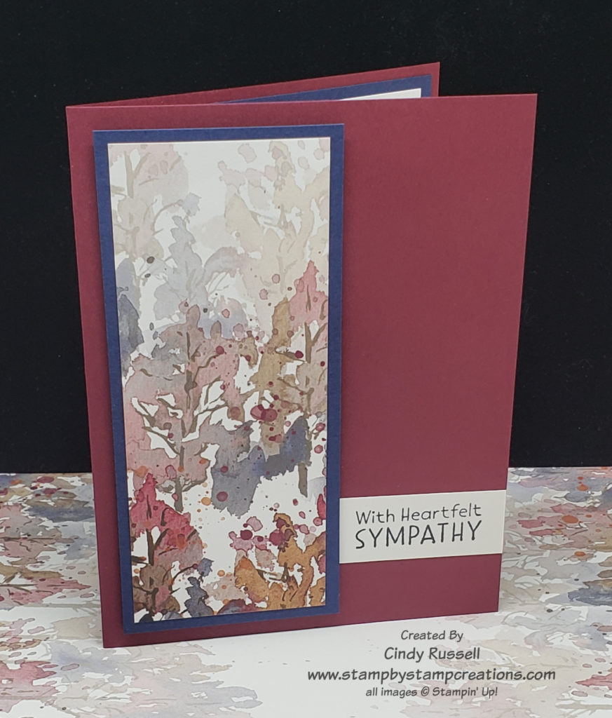
Stampin’ Up! makes such beautiful paper that sometimes you just need to make it the focal point of your card. The first card that I’m sharing here is the card that inspired me. Simple, yet elegant. I received this card in a swap and unfortunately there was no name on it so I don’t know who to credit.
The piece of designer paper used on this card is from the Beauty of the Earth package. It is beautiful and layering it on Night of Navy cardstock makes it pop. Those of you who have been around me for a while know that I have a hard time with “simple”. I usually have to add layers and embellishments to my cards. However it was the simplicity of this card that caught my eye and I knew I had to give it a try.

If you look closely at my version of the card you will notice that this time I actually used one less layer! What? I know, it’s pretty different for me. I tried layering my version like the original but I felt that by just layering the designer paper and popping it up on the card base with Stampin’ Dimensionals kept the focus on the designer paper better.
On the original card the sentiment is stamped directly on to the Merry Merlot cardstock with Night of Navy ink. I felt this was a little hard to read. I didn’t want to stamp my sentiment on a label because I thought that that would fight with my designer paper focal point. I thought I’d just try a strip of Basic White cardstock and tuck it under the focal point. Guess what? I LOVE it! What do you think? I am definitely going to have to try this little trick again. It’s just enough to add a little something-something to the front of the card but not enough to detract from the focal point.
Do you love designer paper as much as I do? Don’t forget that Stampin’ Up! has 9 different packages of designer paper on sale this month. Don’t miss out! Check out what’s on sale right here!
