A Colorado Card Sketch

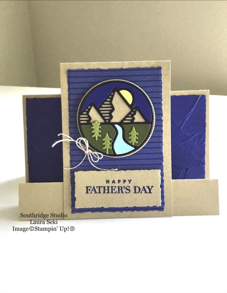
This card definitely reminds me of my home state of Colorado. Gotta love those mountains!

I’ve had the Mountain Air stamp set and the Majestic Mountain Dies for a while and haven’t used them much. My 40 Projects In 40 Days challenge has got me looking at, and trying to use, all of those unloved stamp sets on my shelves.

It may be hard to tell from the photo but I used the dies on my card. I stamped each row of mountains separately, die cut them and layered them on a piece of Basic White cardstock that I had added a little color to with a Blending Brush and Balmy Blue ink.

The water is stamped on a separate piece of Basic White cardstock with Balmy Blue ink and the “water” stamp from the Oceanfront set. The trees are stamped over the water with Mossy Meadow ink. I then used a circle die from the Layering Circles die set to die cut the area of lake and trees that I wanted to use on the card. I did this because I knew that my die wouldn’t go through more than a few pieces of cardstock.

Once the I had my die-cut lake and trees I adhered them to the mountains. I lined up the same circle die around the edge of the water/trees and ran the cardstock and die through my Stampin’ Cut & Emboss Machine. Most of the circle was die cut but I did have to use paper snips on a few areas that had more than a couple layers.

Here is the card sketch that inspired me today. I stayed pretty true to the sketch. The only changes I made were flipping the design and adding one more layer. Not bad for me! Ha!

Have you tried using sketches yet? I hope so! They are a great way to get those creative juices flowing!

Have a great day! Take care and Happy stamping!

Make It Mine With A Hello

A simple hello for you on Make It Mine Monday. Once again, the simplicity of a card caught my eye. I have trouble recreating simplicity, but I like it. As the banner above the photo says, this card was created using Stampin’ Up!’s Dressed To Impress stamp set. This fun stamp set is quite “girly”. The coordinating All Dressed Up dies die cut some of the images and also has dies that you can create a 3D purse with.

I love the white on white that Kim did on this card with her layers with just the subtle pink dots to set them apart. That is what made me want to recreate her card.

Of course when I started my creative process things didn’t turn out quite as simple as I wanted.

Stampin’ Up!’s All Dressed Up!

To start with, I didn’t want to use the “fabulous” portion of the “hello fabulous” stamp so I masked that portion of the stamp before inking it up. I also wanted to use a die that fit around my images a little closer so as not to leave quite as much white space. The Hippo & Friends dies fit worked perfectly and I was able to layer my stamped images.

The flowers on my card are colored with the Polished Pink and Just Jade Stampin’ Blend Markers so those are the colors I used on the rest of the card. The larger label is embossed with the Tasteful Texture 3D Embossing Folder. To really change up my card from Kim’s I used a Just Jade card base instead of Basic White.

Even though I changed quite a bit about Kim’s card, I do love hers. One of these days I will figure out simple stamping. How do you do with simple stamping? If you’ve got the hang of it I’d love to see some of your projects.

Have a great day! Take care and Happy Stamping!

Best Wishes Swing Arm Fun Fold Card

Swing Arm Fun Fold Card – front

I love fun fold cards.  This fun fold card is called the Swing Arm Fun Fold and is quite easy to make.  The base of the card is the basic 5 ½” x 8 ½” piece of cardstock folded in half at 4 ¼”.  To make it a fun fold you just need to add a label (or focal piece) and the swing arm.

On my card I used Stampin’ Up!’s beautiful Symbols of Fortune Specialty Designer Series Paper from the January – June Mini Catalog. One side of each sheet of this paper has a gold foil design on it. So pretty!

Both the “best wishes” on the front of the card and the “happy birthday” on the inside of the card are from the Artistically Inked stamp set in the Annual Catalog.

The circles are die cut using the Layering Circles dies and the decorative label is die cut using the Hippo & Friends dies. I have to admit that I purchased this die set because of all the layering dies in it. One of these days I may purchase the coordinating Hippo Happiness stamp set. 🙂

Swing Arm Fun Fold Card – inside

The swing arm on my card measures 1″ x 4 3/4″. It’s scored at 3″. The smaller section is adhered to the inside of the back section of the card. The long section is what folds over to the front of the card. When attach the swing arm to the label you want to make sure that you adhere the swing arm to the top of the label. The arm will be sandwiched between two layers so that you can’t see the end of it.

Swing Arm Fun Fold. So easy. So fun! Have a great day! Take care and Happy Stamping!
Cocktails & Card Sketches

Cocktails and Card Sketches! How can you go wrong? The Nothing’s Better Than stamp set is so fun! It’s definitely going on my keeper shelf. The great thing about this stamp set is that it encompasses four different favorite items (well, only three of mine as I don’t care for coffee…). Cocktails, Chocolate, Cookies and Coffee! Such a fun stamp set and it has coordinating dies too! The Love You More Than dies. The sentiments in this stamp set are fun too.

When I saw this card sketch I thought it would be a fun one to work with. I didn’t realize how difficult it would be to find just the right image for the focal point. I could have used a butterfly just like in the sketch but I wanted to be a little original! 🙂

When I saw the Nothing’s Better Than stamp set on my shelf and knew it had coordinating dies I knew I had the winner. I changed up the sketch a little bit since I wanted to use the die for the work “cocktails”. I also added a few layers (naturally!).

It was a fun sketch to work with and I was able to use a bright and cheerful color palette with Polished Pink, Bermuda Bay and Basic Black.

Have a great day! Take care and Happy Stamping!

(Don’t forget to decorate the inside of your cards!)

A Beachy Make It Mine Card

Oceanfront Seaside Card

This beachy card is so easy and so fun to make with the Oceanfront stamp set.  This was one of those stamp sets that I didn’t think I needed.  I live in land-locked Colorado so I don’t get to the ocean much. I’m more of a lake girl (my Minnesota roots). Ha!

But I fell in love with the New Horizons designer paper and saw all sort of cards online that used both this gorgeous paper and the Oceanfront stamp set.  It was time to make the purchase. 

The Oceanfront stamp set makes it so easy to create a beach scene.  There is one stamp for the sky, one stamp for the ocean and one stamp for the sand.  On my card I stamped the “sand” three times to give it a little more texture and depth.  I used Balmy Blue for the sky, Coastal Cabana for the water and Crumb Cake for the sand.  Easy Peasy!

This stamp set is one of Stampin’ Up!’s DistINKtive stamp sets which is why there is so much texture and shading in the water and the sky. Stampin’ Up! sure does make it easy for us to create a lovely scene like this.

Thank you Tracy for the inspiration. The simpleness of this card is what first caught my attention and I knew I wanted to recreate it.

When you compare the two cards you can see that I added a some more of the grasses and left off the sentiment. I also added the birds from the On The Horizon stamp set as I felt the upper portion of the card needed some type of black element on it. I also made my layers slightly smaller. You know me, I don’t handle white space very well. 🙂

Of course looking at this card while writing this in frigid Minnesota (although the weather is actually very mild right now) makes me want to head to the ocean. How about you?

Have a great day! Take care and happy stamping!

Black & White Half Front Fun Fold Card

It’s a Fun Fold Card that highlights the fun All Together Designer Series Paper! This Half-Front Fun Fold is easy peasy!

I cut my cardstock 4 1/4″ x 11″ and scored it at 5 1/2″. Then I trimmed 3″ off of one of the sections which left the “front” of the card 2 1/2″. The large piece of designer paper is 2 1/4″ x 4″. I added a strip of 4″ x 1/4″ designer paper to the bottom of the inside piece (5 1/4″ x 4″) to add a little interest.

The sentiment focal point piece of Basic White cardstock is 2 3/4″ x 3 1/2″. The sentiment is from the Happiest of Birthdays stamp set. I love that it is so large and can be used as a focal point on a card.

This black & white birthday card would be perfect any guy in your life. Guy cards are so hard to design but you can’t go wrong with black & white!

It’s been a fun week playing with black & white cards but next week I think we’ll move back to some color!

Have a great day! Take care and Happy Stamping!
A Black & White Card Sketch

It’s black and white week here on my blog.  All of the projects I’m sharing with you this week are black and white.  As I mentioned on Monday, there is something about a black and white card that always catches my eye.  They’re so striking.

Once again I was able to stick pretty close to the card sketch. I only added one layer around the focal point. The designer paper I used was the fun All Together 6″ x 6″ Designer Series Paper. As I mentioned in my newsletter earlier this week, all of the designs are black and white. So fun!

The die I used as the focal point is from the Meadow Dies which coordinates with the Quiet Meadow stamp set. This set of dies is filled with silhouette dies. So many different ones to choose from for any type of card.

What would you use as your focal point on this card sketch? Would you use a die like I did or would you prefer to stamp an image. Maybe a combination of the two! There are really so many options when you use a card sketch.

Have a great day! Take care and Happy Stamping!
Make It Mine In Black & White

This week’s Make-It-Mine card is black and white with a little bit of gray on it.  Monochromatic is the technical term.  Monochromatic means: “of, relating to, or having tones of one color in addition to the ground hue”.

There’s something about a black and white card that always catches my eye.  Black and white together is simple and it’s stunning.  I like these types of cards so much that I’m sharing them all week on my blog, Facebook and even in my newsletter.  Be sure to check them all out!  (If you don’t get my newsletter yet, just fill out the info in the box to the right.)

I used Stampin’ Up!’s Artfully Layered stamp set on today’s card.  I was inspired by Tess Rollin’s card.  As you can see, I stuck pretty close to Tess’s card and only added a few extra leaves. 

This card is quite simple.  All stamping except the sentiment is done directly on the card base.  The two leaves on the upper portion of the card were stamped first.  Then I used a piece of scrap paper to cover them so I could stamp just a portion of the leaves on the lower section of the card.  The sentiment is layered on black cardstock and adhered to the card front with Stampin’ Dimensionals. Easy Peasy!

I tried using embellishments of some sort on my card like Tess did but they seemed to distract from the simplicity of the card.  I like Tess’s use of embellishments but I just couldn’t make them work.  Sometimes simple is better.

Somewhere Over the Rainbow Bridge Fun Fold Card

Bridge Fun Fold Card

How can you not sing Somewhere Over the Rainbow while looking at this fun fold card?  So many rainbows!  I’m going to be sad when Sale-a-bration is over on February 28th and I won’t be able to get any more of the fun Sunshine & Rainbows Designer Series Paper. The paper coordinates perfectly with the Rainbow of Happiness Bundle of products from Stampin’ Up!’s January – June Mini Catalog. I’ve used the Rainbow of Happiness stamp set, the Brilliant Rainbow dies and the Cloud Punch on my card.

Bridge Fun Fold Card

This second picture gives you a top view so you can see all of the panels a little better.

This fun fold is pretty easy. Start with a card base that is 4 1/4″ x 8″. Make sure the length is 8″, not 8-1/2″. I made that error the first time around and couldn’t figure out why my “bridge” piece wouldn’t fit! Sheesh!

With the long edge of the card base at the top of your Simply Scored scoring board score the cardstock at 1 1/4″, 2 1/2″, 5 1/2″ and 6 3/4″. Fold the two outside score lines into mountain folds and the two inside score lines into valley folds. The “bridge” piece of cardstock is 5 1/2″ x 1″. The width of the “bridge” piece of cardstock can be any dimension that works for your design. The key is to make sure the length is 5 1/2″.

The four designer paper panels measure 4″ x 1″. The designer paper piece on the “bridge” measures 5 1/4″ x 3/4″. The Basic White piece of cardstock in the center of the card measures 4″ x 2 3/4″.

To adhere the “bridge” to the card you want to fold the card like in this picture. The sections on one side of the center piece of the card base should be “open” and the sections on the other side should be folded closed.

Make sure to put adhesive only on the areas of the “bridge” that will be adhered to the two outside panels.

The way the card is folded in this last photo is also the way you will fold it to slide it into an envelope.

Let me know if you have any questions on this fun fold. Have a great day! Take care and Happy Stamping!
Purple Marble Sketch Card

Pretty in Purple (Marble).  Stampin’ Up!’s  Simply Marbelous designer paper is gorgeous and I love it more each time I use it.  It’s the perfect background paper with the soft designs on both sides.  Best of all, you can get it for FREE during Sale-a-bration with a purchase of $50 or more.  Don’t wait!  Sale-a-bration is ending soon on February 28th!

Back to this lovely card.  Besides the Simply Marbelous Designer Series Paper I used the Meadow Dies for the flowers.  I am loving these silhouette-type dies!  The Meadow Dies can be found in the Annual Catalog or here in my online store.  The dies coordinate with the Quite Meadow stamp setThese items can be purchased separately or together as a bundle saving 10%. 

Any of the colors of designer paper would have worked well with this design.  Blues, pinks, grays, yellows, greens or purples.  I can’t remember why I chose purple but it may have been because I had ribbon that matched the card.  That’s how I make design decisions sometimes.  😊

The sketch to the left here is the one that I used today. As you can see, I stayed pretty true to the sketch again. I have both the horizontal and the vertical piece even though my vertical piece doesn’t go all the way to the bottom of the card. I did add a piece of ribbon to my card for a little added interest.

This card was quite simple yet can be used for almost any occasion. Have a great day! Take care and Happy Stamping!

Make It Mine Monday: Hexagons

This card with all the hexagons is so cute! I just had to try it for myself. The hexagon die is from the new Beautiful Shapes die set which coordinates with the Hello Beautiful stamp set. The dies set has all sorts of fun shapes. Tarabeth used designer paper from a few different paper sets on her card. The main colors on her card are the new In Colors this year, Fresh Freesia and Polished Pink.

I was going to stick to the same color scheme as Larabeth but I didn’t seem to have all the designer papers so I had to start from scratch. After perusing my stash of design paper I finally went with the Abstract Beauty pack. This fun package of designer paper is a new size. It’s 4″ x 6″ and many of the sheets have accents of gold foil.

I’m pretty tickled with the way my card turned out. I may have to make a few more of them. The only part I would change would be the gold cord. I would rather have used a thin gold ribbon but Stampin’ Up! doesn’t have any right now.

If you compare the cards, you can see that I have a few more hexagons on my card than the one that inspired me. I just kept gluing them down! Ha!

You’ll notice that my focal point piece with the hexagons is also smaller than the card I copied. I did start with basically the same size as the original but when I had all of the hexagons adhered there was still a little space along the bottom. I was too lazy to die cut any more so I just trimmed down the Basic White card stock. I actually like the smaller focal point better than the larger one so it all worked out fine. 🙂

I used a gold foil layer and the gold cord on my card to pick up the gold on some of the pieces of designer paper. The sentiment, from the Positive Thoughts stamp set, is heat embossed with gold embossing powder.

The finishing touches on my card are the adorable little butterflies. They are Brushed Brass Butterflies (#158136 $10) from Stampin’ Up!’s January – June Mini Catalog. I liked them so much on the outside of the card that I put them on the inside of the card too!

Have a great day! Take care and Happy Stamping!

A Fun Fold and Stamped Ribbon

It’s Fun Fold Friday!  Not only do I have a fun fold card for you but it’s a swap card as well.  This fun fold is very similar to one I showed you back in October.  You can view that post here.  I called that fun fold in October the Side Flap Fun Fold.  This card is the same idea but the flap is a different size and in a different location on the card.

The image on the front of the card is from the Amazing Silhouettes stamp set in Stampin’ Up!’s January – June Mini catalog. The “thanks” is from the Biggest Wish stamp set in the Annual Catalog.

I have to tell you that my favorite part of Melissa’s card is that she stamped the sentiment directly on the ribbon! I have never done that. Have you? I’m especially impressed because this ribbon is very textured.

I was going to tell you that you should probably use StazOn ink when stamping on ribbon but then I thought I’d give it a try with regular Stampin’ Up! ink. Guess what? It worked just fine! Check out the second photo.

Stamping On Ribbon

I didn’t expect it to turn out so well! When I placed the inked stamp on the ribbon I held it in place for a few seconds and then lifted the stamp straight up. No problems at all! Hmm…I may have to try this on one of my own cards!

If you’re wondering, this ribbon is the White Frayed Ribbon (#158138 $7.50) found on page 33 of Stampin’ Up!’s January – June Mini Catalog.

Here’s a photo of the inside of Melissa’s card. I like the way she used the Sale-a-bration paper, Daffodil Afternoon, to add a little something extra to the inside of the card.

No naked envelopes and no naked insides of your cards! If you’re going to the trouble of making a special card, make the envelope and the inside of the card special too.

Have a great day! Take care and Happy Stamping!

A Leafy Card Sketch

After you’ve chosen a card sketch what’s the next step? Do you first choose colors, stamp set or embellishments? For me, it depends on what first comes to mind.

With this card sketch I knew it needed designer paper for at least one of the layers. Of course I then had to decide which package of designer paper and from there which pattern.

Luckily I happened to have the new All Together package of designer paper right next to me so I started flipping through all of the patterns. The fun part of this package of paper is that it’s all in black and white and there are tons of patterns to choose from. I came a cross a leafy pattern and thought that was a good place to start.

The next step was finding a single stamp for the stamped image. I didn’t want anything too large or too busy. A branch of leaves would be perfect. Then it was off to my stamp shelf!

This image from the Forever Fern stamp was perfect! Not only is it a beautiful image but it was similar to the branches on the designer paper!

I thought about using another piece of designer paper to layer my leaf on but it got too busy. Maybe if the leaf stamp wasn’t so detailed that might have worked. The plain black layer works perfectly!

Did you notice how well I did following the card sketch? I only added one additional layer! Ha!

Be sure to check out the fun All Together designer series paper. You can find it and the other items in the All Together Collection here.

Have a great day! Take care and Happy Stamping!

Make It Mine Monday: Calming Camellia

Calming Camellia

It’s Make It Mine Monday! I’ve enjoyed sharing with you some of the swap cards that I’ve received. I hope you’ve enjoyed them too. I’m not done sharing swaps with you but it’s time to switch things up a bit again.

Isn’t the flower stamp on this card gorgeous? It’s from the Sale-a-bration Host Set Calming Camellia. You can choose this stamp set for free when you place a party order or personal order of $300 or more.

Calming Camellia is one of Stampin’ Up!’s DistINKtive stamp sets. Basically, this type of stamp is very realistic looking with lots of dimension and shading. I think they’re gorgeous! What do you think about DistINKtive stamps?

Calming Camellia

The second card here is the card that inspired me. I love how Vicki used the Wild Roses Background stamp on her card. It coordinates so well with the Calming Camellia stamp. Instead of using a gold layer and gold embellishments I only used Gorgeous Grape on my card.

The Basic Rhinestone Jewels on my card are colored with the Dark Highland Heather Stampin’ Blends marker and then of course I had to add ribbon.

Both my card and Vicki’s card are fairly simple. No dies or punches, no fussy cutting and not too many layers. While I had the stamp set out I wanted to try and make the card even more simple.

Calming Camellia

Check out the third photo. It’s just the stamped image and a coordinating layer adhered to the card with Stampin’ Dimensionals. Simple, yet stunning. It really shows off the floral image.

This simple card would be perfect for any occasion. Just add a sentiment to the inside.

Have a great day! Take care and Happy Stamping!

Artfully Layered Tropics

Artfully Layered Fun Fold

Tropics are definitely on the brain this week.  With two days of snow this week I’m ready for a tropical vacation.  Since I don’t have one scheduled, I’ll just look at this lovely tropical card and imagine a Mai Tai in my hand and the sandy beach under my toes!

It’s Friday today and I usually do Fun Folds on Friday.  This swap is perfect to share today.  My downline Karen created this card for our Mini Catalog Swap.  Didn’t she do a nice job?  The Fun Fold may look familiar.  I shared it with back in September.  It’s funny how different the fold can look when you use different products.  You can view the original post on this Overlapping Flap Fun Fold card here.  The original post will give you dimensions as well as a quick video on how the fun fold was made.

Artfully Layered Fun Fold

One fun feature that Karen added to her fun fold was the Velcro-type fastener to hold the top flap closed.  Sometimes with a lot of layers things don’t stay closed like you want.  Another option that would have worked would be tiny, thin magnets to hold things closed.  The nice thing about magnets is that you can hide them under cardstock.  I like the fasteners that Karen used because they’re almost clear.  You can hardly tell that they’re there.

Karen used some of the products from the Artfully Composed Suite in Stampin’ Up!’s new Mini Catalog on her card. So much fun to be had with Artfully Layered stamp set, the Tropical Layers dies and the gorgeous and fun Artfully Composed Designer Series Paper! I love the soft colors and bold designs of the paper and can’t wait to play with it.

Are you itching for a tropical vacation after seeing Karen’s card? I sure am! Have a great day. Take care and Happy Stamping!