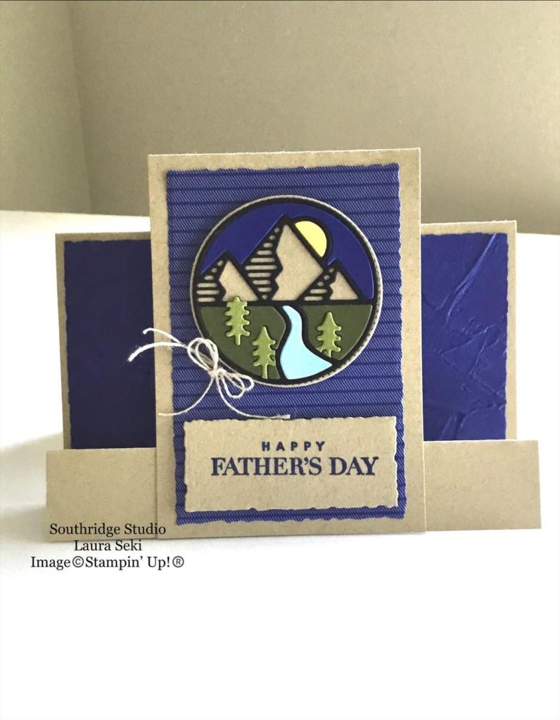
We made it! 30 Days of Stampin’ Up!’s new Annual Catalog. Have you enjoyed our 30 Days of the New Catalog? I know I have. I’ve loved looking for all of the samples and getting inspired by fellow crafters.
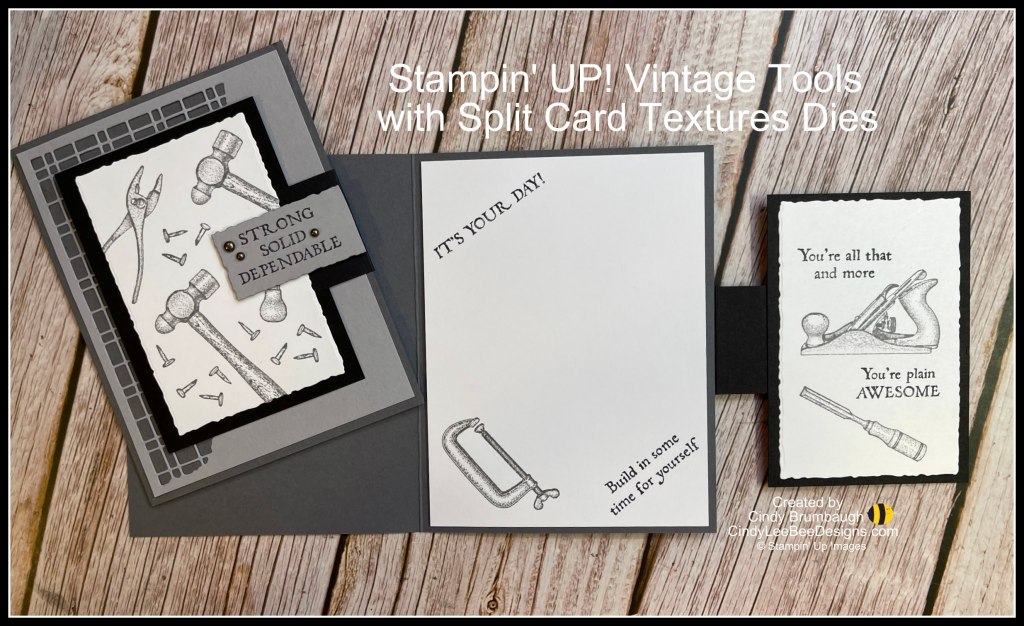
For our final day I am going to share two products with you that were shared on the same card. Thank you Cindy Brumbaugh for this fun masculine card!
The stamp set used on this card is the Vintage Tools stamp set found on page 87 of Stampin’ Up!’s Annual Catalog. The this stamp set includes 5 sentiments and 7 tools. This is another item that is already on the shelf in my craft room. My husband is quite handy and he loves to build things so this set is perfect!
The other product used is the Split Card Textures Dies found on page 174 of the catalog. I will admit that these dies didn’t do anything for me when I first saw them. Of course, now that I’ve seen so many fabulous cards made with them I’m going to have to add them to my wish list.
There are two dies in this set. The first one is the grid-like pattern you can see on this card. The second one is more of a floral pattern. If you look at Cindy’s card in the photo above, the entire Smoky Slate piece of cardstock was die cut with the Split Texture die. These dies will add a lot of interest to any project!
That’s it for our 30 Days of the New Catalog! Leave me a comment below if you’ve enjoyed the projects. Have a great day! Take care and Happy Stamping.