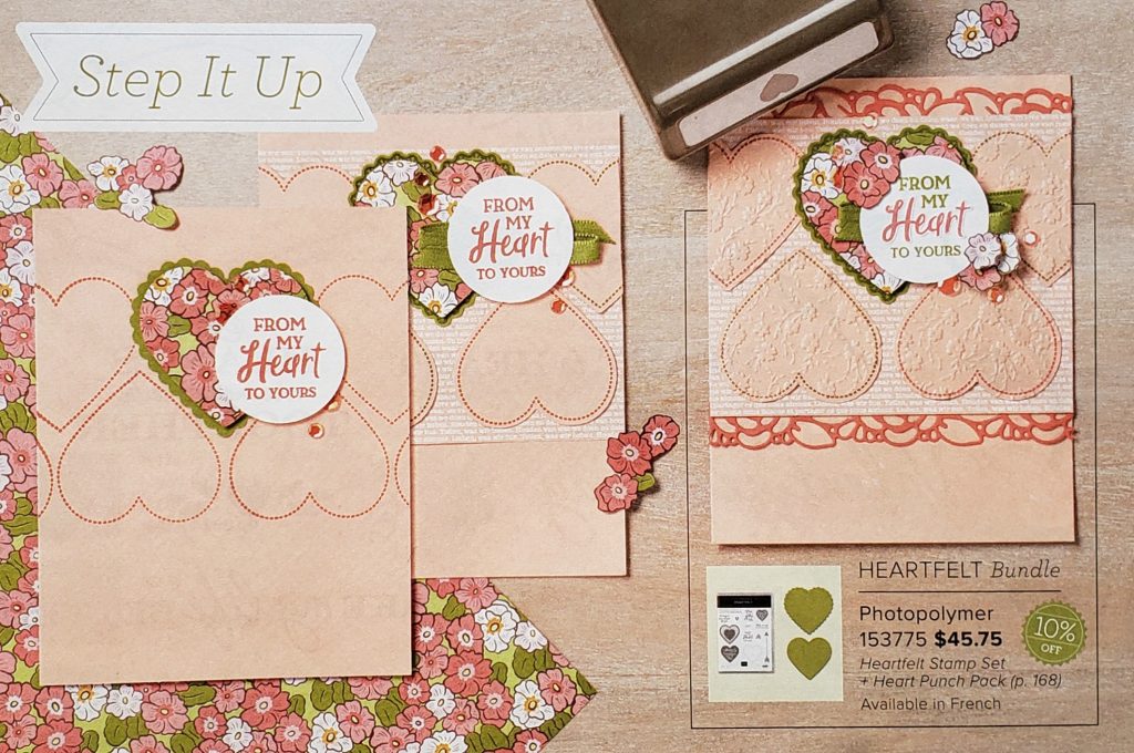
It’s time for another Cruise the Catalog tip! With the “Step It Up” features in Stampin’ Up!’s new annual catalog you can see how to “step up” your projects. You will find a number of these features throughout the catalog showing you how to make a lovely basic card. Add a little more detail on the second card and go for the WOW factor on the third card.

As you can see in the photo above, all three cards have the same design. Different elements were just added to the second and third cards to take them to the next level.
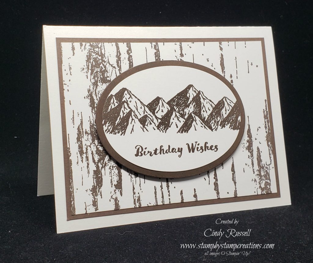
This is a great feature to help you step outside your box and maybe try a little something different on your next card. I do this a lot when I’m designing. I will make a perfectly lovely card but want to add just a little something-something to it as it’s not quite what I envisioned originally. In the first card below you can see the first card I had designed for my dad’s birthday. Nice card and it would have worked fine. It just wasn’t quite what I was going for.

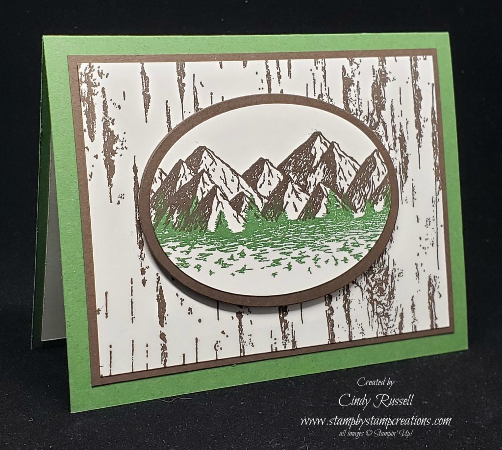
I liked the basic layout of the card with the Birch background and the oval of mountains. I guess I was looking for a little more color so I switched a few things around a came up with this second card.

As you can see, the second card isn’t all that much different from the first card. I kept the exact same layout with the Birch background and the oval of mountains. I just switched the card base color and added the same green to the oval of mountains. I then moved the sentiment to the inside of the card. Same card…just a little stepped up with a little more pop.
Give this a try next time you’re making a card….unless of course that first card is exactly what you envisioned. 🙂
Check out the Step It Up features in Stampin’ Up!’s catalog and see how just a few little additions can change up the card. The Step It Up feature that I showed you at the beginning of this post can be found on page 75 in the catalog. Leave a comment and let me know how many others you find.
