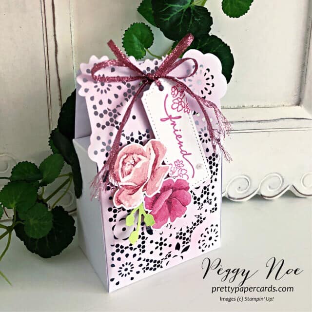
Journey With Color: The Next Step

It’s time for a new step in our Journey of Color.  We’ve talked about the history of Stampin’ Up! colors but now we need to figure out how best to use the colors that we have.  Stampin’ Up! has 40 colors in their color palette not including the 10 current In Colors, Basic Black, Basic White and Very Vanilla.

Here’s the breakdown:

Reds:  4

Yellows:  4

Pinks:  4

Greens:  8

Purples:  4

Oranges:  2

Blues:  6

Grays:  3

Browns:  5

If you include the current In Colors you add 1 Yellow, 2 Pink, 3 Green, 1 Purple, 1 Orange, 1 Blue and 1 Brown.  Green is definitely the most popular color in Stampin’ Up!’s color palette.

Now what?  We need to figure out how to use the colors together.  We all have our favorite color palettes and our go-to colors.  How do we get out of that rut?  How do we come up with fresh color combinations? 

In their catalogs, Stampin’ Up! provides us with a quick and easy tool for combining colors:  their designer paper!  In their designer papers they come up with color combinations I would never think of and they’re gorgeous!  Check out pages 130 through 134 in the Annual Catalog.  This is where you can view all the papers and below each picture Stampin’ Up! lists the colors included in that package of paper!  You can also see the colors included on the package of paper itself.  I like creating cards with Stampin’ Up!’s designer papers because most of them coordinate with a stamp set or bundle.  You know me, I love coordination!

Maybe you don’t like to use designer paper.  Maybe you are more of a paper, ink and stamps type of person.  You can still get your color combinations from designer paper but how can you come up with your own combinations?

When I am creating, I use color swatches a lot.  If I’m using designer paper on my project, I will check out the list of colors used on the papers and pull out a full sheet or scrap of those colors of cardstock.  This way I can put the different colors together and see what combinations I like best.  If I’m starting from scratch, I look at the stamp set or dies/punches that I’m working with.  Let’s say I want to create a card with a pink flower on it.  I would pull out some pink and green swatches of cardstock to see which combinations I like the best.  Then, if I want to add a third or fourth color to my project I would pull out additional swatches.

Starting with designer paper and color swatches are the easiest methods of determining color combinations.  When you use color swatches you will probably still start with your favorite combinations but if you have other colors to look at you may try something new. Give one of these methods a try next time you’re creating!

Have a great day! Take care and Happy Stamping!

Make It Mine With A Hello

A simple hello for you on Make It Mine Monday. Once again, the simplicity of a card caught my eye. I have trouble recreating simplicity, but I like it. As the banner above the photo says, this card was created using Stampin’ Up!’s Dressed To Impress stamp set. This fun stamp set is quite “girly”. The coordinating All Dressed Up dies die cut some of the images and also has dies that you can create a 3D purse with.

I love the white on white that Kim did on this card with her layers with just the subtle pink dots to set them apart. That is what made me want to recreate her card.

Of course when I started my creative process things didn’t turn out quite as simple as I wanted.

Stampin’ Up!’s All Dressed Up!

To start with, I didn’t want to use the “fabulous” portion of the “hello fabulous” stamp so I masked that portion of the stamp before inking it up. I also wanted to use a die that fit around my images a little closer so as not to leave quite as much white space. The Hippo & Friends dies fit worked perfectly and I was able to layer my stamped images.

The flowers on my card are colored with the Polished Pink and Just Jade Stampin’ Blend Markers so those are the colors I used on the rest of the card. The larger label is embossed with the Tasteful Texture 3D Embossing Folder. To really change up my card from Kim’s I used a Just Jade card base instead of Basic White.

Even though I changed quite a bit about Kim’s card, I do love hers. One of these days I will figure out simple stamping. How do you do with simple stamping? If you’ve got the hang of it I’d love to see some of your projects.

Have a great day! Take care and Happy Stamping!

Best Wishes Swing Arm Fun Fold Card

Swing Arm Fun Fold Card – front

I love fun fold cards.  This fun fold card is called the Swing Arm Fun Fold and is quite easy to make.  The base of the card is the basic 5 ½” x 8 ½” piece of cardstock folded in half at 4 ¼”.  To make it a fun fold you just need to add a label (or focal piece) and the swing arm.

On my card I used Stampin’ Up!’s beautiful Symbols of Fortune Specialty Designer Series Paper from the January – June Mini Catalog. One side of each sheet of this paper has a gold foil design on it. So pretty!

Both the “best wishes” on the front of the card and the “happy birthday” on the inside of the card are from the Artistically Inked stamp set in the Annual Catalog.

The circles are die cut using the Layering Circles dies and the decorative label is die cut using the Hippo & Friends dies. I have to admit that I purchased this die set because of all the layering dies in it. One of these days I may purchase the coordinating Hippo Happiness stamp set. 🙂

Swing Arm Fun Fold Card – inside

The swing arm on my card measures 1″ x 4 3/4″. It’s scored at 3″. The smaller section is adhered to the inside of the back section of the card. The long section is what folds over to the front of the card. When attach the swing arm to the label you want to make sure that you adhere the swing arm to the top of the label. The arm will be sandwiched between two layers so that you can’t see the end of it.

Swing Arm Fun Fold. So easy. So fun! Have a great day! Take care and Happy Stamping!

Cocktails & Card Sketches

Cocktails and Card Sketches! How can you go wrong? The Nothing’s Better Than stamp set is so fun! It’s definitely going on my keeper shelf. The great thing about this stamp set is that it encompasses four different favorite items (well, only three of mine as I don’t care for coffee…). Cocktails, Chocolate, Cookies and Coffee! Such a fun stamp set and it has coordinating dies too! The Love You More Than dies. The sentiments in this stamp set are fun too.

When I saw this card sketch I thought it would be a fun one to work with. I didn’t realize how difficult it would be to find just the right image for the focal point. I could have used a butterfly just like in the sketch but I wanted to be a little original! 🙂

When I saw the Nothing’s Better Than stamp set on my shelf and knew it had coordinating dies I knew I had the winner. I changed up the sketch a little bit since I wanted to use the die for the work “cocktails”. I also added a few layers (naturally!).

It was a fun sketch to work with and I was able to use a bright and cheerful color palette with Polished Pink, Bermuda Bay and Basic Black.

Have a great day! Take care and Happy Stamping!

(Don’t forget to decorate the inside of your cards!)

40 Days

Today is the beginning of Lent for Christians around the world.  The season of Lent is the 40 days before Easter (not including Sundays).  Some people give things up for the season of Lent while others may do something special for themselves or others.

A few years ago, I tried doing something called 40 Bags in 40 Days which was a way of decluttering your home.  You are suppose to clean/go through your home and each day of Lent get rid of a bag/box of items by either tossing or donating.  I’m not sure I got all 40 bags but I did make a dent in all of the clutter in my home.  Of course, that was a few years ago and I really should start the process again!

You may remember that last year I tried 40 Cards in 40 Days.  My goal was to send out 40 cards during Lent.  I can’t remember if I got all 40 out but I think I came close.

I may try both of these ideas this year as my home needs decluttering again, but I also want to try to post 40 cards/projects.  Each day during Lent I want to share a card/project with you on my Facebook page.  I hope to make most of them but will also share cards/projects I’ve received in swaps or just a lovely project that I’ve seen online.  Be sure to check out my Facebook page every day (except Sundays) this Lenten season to see what projects I’ll be sharing!

What are you going to do during Lent?  Declutter?  Send cards?  Or maybe commit to trying to make a project a day?  Whatever you choose, give it your best shot!  You’ve got this!

Journey With Color: Most Recent Color Change

Today in our Journey With Color we finish up Stampin’ Up!’s history of color. Hasn’t it been fun seeing where the color collections began and how they got to where they are today?

The last and most recent color change that Stampin’ Up! had was in their 2018-2019 Annual Catalog.  If you know your Stampin’ Up! colors, you can see in the photo Stampin’ Up!’s current colors.  The only thing that this photo doesn’t show is that Stampin’ Up! added a new group called Basics.  This group consists of Whisper White (now Basic White), Very Vanilla and Basic Black.

Stampin’ Up!’s 2018-2019 Color Change

I’ve summarized the changes to each of the four color groups below.  You can compare it to the previous color groups here.

Neutrals:  Whisper White, Very Vanilla and Basic Black moved to Basics Group.  Chocolate Chip was retired.  Night of Navy was moved from the Regals group.  Merry Merlot and Mossy Meadow were added. 

Brights:  Real Red, Pumpkin Pie, Rich Razzleberry and Old Olive were moved to the Regals group.  Tangerine Tango and Tempting Turquoise were retired, and Poppy Parade, Flirty Flamingo, Mango Melody, Granny Apple Green, Coastal Cabana and Gorgeous Grape were added.

Regals:  Rose Red, Always Artichoke, Island Indigo, Elegant Eggplant and Perfect Plum were retired.  Night of Navy moved to the Neutrals group.  Real Red, Pumpkin Pie, Rich Razzleberry and Old Olive were added from the Brights Group.  Shade Spruce and Blackberry Bliss were added.

Subtles:  Pink Pirouette, Wild Wasabi, Soft Sky, Marina Mist and Wisteria Wonder were retired.  Petal Pink, Soft Seafoam, Mint Macaron, Balmy Blue and Highland Heather were added.

If you’ve been following this Journey With Color since the beginning, you will notice that many of the new colors that were added to Stampin’ Up!’s color collection were former In Colors.  It’s nice when some of your favorites make the cut!  😊

Color changes can be fun even though some of us don’t always do well with it.  I wonder when the next one will be?

Have a great day! Take care and Happy Stamping!

A Beachy Make It Mine Card

Oceanfront Seaside Card

This beachy card is so easy and so fun to make with the Oceanfront stamp set.  This was one of those stamp sets that I didn’t think I needed.  I live in land-locked Colorado so I don’t get to the ocean much. I’m more of a lake girl (my Minnesota roots). Ha!

But I fell in love with the New Horizons designer paper and saw all sort of cards online that used both this gorgeous paper and the Oceanfront stamp set.  It was time to make the purchase. 

The Oceanfront stamp set makes it so easy to create a beach scene.  There is one stamp for the sky, one stamp for the ocean and one stamp for the sand.  On my card I stamped the “sand” three times to give it a little more texture and depth.  I used Balmy Blue for the sky, Coastal Cabana for the water and Crumb Cake for the sand.  Easy Peasy!

This stamp set is one of Stampin’ Up!’s DistINKtive stamp sets which is why there is so much texture and shading in the water and the sky. Stampin’ Up! sure does make it easy for us to create a lovely scene like this.

Thank you Tracy for the inspiration. The simpleness of this card is what first caught my attention and I knew I wanted to recreate it.

When you compare the two cards you can see that I added a some more of the grasses and left off the sentiment. I also added the birds from the On The Horizon stamp set as I felt the upper portion of the card needed some type of black element on it. I also made my layers slightly smaller. You know me, I don’t handle white space very well. 🙂

Of course looking at this card while writing this in frigid Minnesota (although the weather is actually very mild right now) makes me want to head to the ocean. How about you?

Have a great day! Take care and happy stamping!

Black & White Half Front Fun Fold Card

It’s a Fun Fold Card that highlights the fun All Together Designer Series Paper! This Half-Front Fun Fold is easy peasy!

I cut my cardstock 4 1/4″ x 11″ and scored it at 5 1/2″. Then I trimmed 3″ off of one of the sections which left the “front” of the card 2 1/2″. The large piece of designer paper is 2 1/4″ x 4″. I added a strip of 4″ x 1/4″ designer paper to the bottom of the inside piece (5 1/4″ x 4″) to add a little interest.

The sentiment focal point piece of Basic White cardstock is 2 3/4″ x 3 1/2″. The sentiment is from the Happiest of Birthdays stamp set. I love that it is so large and can be used as a focal point on a card.

This black & white birthday card would be perfect any guy in your life. Guy cards are so hard to design but you can’t go wrong with black & white!

It’s been a fun week playing with black & white cards but next week I think we’ll move back to some color!

Have a great day! Take care and Happy Stamping!

A Black & White Card Sketch

It’s black and white week here on my blog.  All of the projects I’m sharing with you this week are black and white.  As I mentioned on Monday, there is something about a black and white card that always catches my eye.  They’re so striking.

Once again I was able to stick pretty close to the card sketch. I only added one layer around the focal point. The designer paper I used was the fun All Together 6″ x 6″ Designer Series Paper. As I mentioned in my newsletter earlier this week, all of the designs are black and white. So fun!

The die I used as the focal point is from the Meadow Dies which coordinates with the Quiet Meadow stamp set. This set of dies is filled with silhouette dies. So many different ones to choose from for any type of card.

What would you use as your focal point on this card sketch? Would you use a die like I did or would you prefer to stamp an image. Maybe a combination of the two! There are really so many options when you use a card sketch.

Have a great day! Take care and Happy Stamping!

Journey With Color: Lots of In Colors

This week in our Journey With Color, we’re going to finish up with the history of Stampin’ Up! In Colors.  Next week I’ll share the most recent change to Stampin’ Up!’s line of colors and then we’ll move on.

When In Colors were first introduced, they only had a life span of 1 year.  Starting with the major color overhaul in the 2010-2011 catalog In Colors now have a life span of 2 years.

Below you can see photos of the In Colors from 2014-2016 to the current ones.

In Colors 2021-2023

Wow! So many colors! Which group is your favorite? Which is your least favorite?

Of these groups, I have to admit that I didn’t care for the 2015-2017 collection. The only color I really liked in this group was Watermelon Wonder.

When talking favorites the current 2021-2023 In Colors and the 2017-2019 colors are pretty darn close with the win going to 2021-2023.

Now, if you want to get into individual favorites, I can’t narrow it down to just a few so I’ll give you a list: Berry Burst, Tranquil Tide, Pretty Peacock, Evening Evergreen and Polished Pink!

I do love that Stampin’ Up! gives us fresh new colors each year and that they stick around for two years so that we can have time to play with them. What is your opinion of In Colors?

Make It Mine In Black & White

This week’s Make-It-Mine card is black and white with a little bit of gray on it.  Monochromatic is the technical term.  Monochromatic means: “of, relating to, or having tones of one color in addition to the ground hue”.

There’s something about a black and white card that always catches my eye.  Black and white together is simple and it’s stunning.  I like these types of cards so much that I’m sharing them all week on my blog, Facebook and even in my newsletter.  Be sure to check them all out!  (If you don’t get my newsletter yet, just fill out the info in the box to the right.)

I used Stampin’ Up!’s Artfully Layered stamp set on today’s card.  I was inspired by Tess Rollin’s card.  As you can see, I stuck pretty close to Tess’s card and only added a few extra leaves. 

This card is quite simple.  All stamping except the sentiment is done directly on the card base.  The two leaves on the upper portion of the card were stamped first.  Then I used a piece of scrap paper to cover them so I could stamp just a portion of the leaves on the lower section of the card.  The sentiment is layered on black cardstock and adhered to the card front with Stampin’ Dimensionals. Easy Peasy!

I tried using embellishments of some sort on my card like Tess did but they seemed to distract from the simplicity of the card.  I like Tess’s use of embellishments but I just couldn’t make them work.  Sometimes simple is better.

Somewhere Over the Rainbow Bridge Fun Fold Card

Bridge Fun Fold Card

How can you not sing Somewhere Over the Rainbow while looking at this fun fold card?  So many rainbows!  I’m going to be sad when Sale-a-bration is over on February 28th and I won’t be able to get any more of the fun Sunshine & Rainbows Designer Series Paper. The paper coordinates perfectly with the Rainbow of Happiness Bundle of products from Stampin’ Up!’s January – June Mini Catalog. I’ve used the Rainbow of Happiness stamp set, the Brilliant Rainbow dies and the Cloud Punch on my card.

Bridge Fun Fold Card

This second picture gives you a top view so you can see all of the panels a little better.

This fun fold is pretty easy. Start with a card base that is 4 1/4″ x 8″. Make sure the length is 8″, not 8-1/2″. I made that error the first time around and couldn’t figure out why my “bridge” piece wouldn’t fit! Sheesh!

With the long edge of the card base at the top of your Simply Scored scoring board score the cardstock at 1 1/4″, 2 1/2″, 5 1/2″ and 6 3/4″. Fold the two outside score lines into mountain folds and the two inside score lines into valley folds. The “bridge” piece of cardstock is 5 1/2″ x 1″. The width of the “bridge” piece of cardstock can be any dimension that works for your design. The key is to make sure the length is 5 1/2″.

The four designer paper panels measure 4″ x 1″. The designer paper piece on the “bridge” measures 5 1/4″ x 3/4″. The Basic White piece of cardstock in the center of the card measures 4″ x 2 3/4″.

To adhere the “bridge” to the card you want to fold the card like in this picture. The sections on one side of the center piece of the card base should be “open” and the sections on the other side should be folded closed.

Make sure to put adhesive only on the areas of the “bridge” that will be adhered to the two outside panels.

The way the card is folded in this last photo is also the way you will fold it to slide it into an envelope.

Let me know if you have any questions on this fun fold. Have a great day! Take care and Happy Stamping!

Purple Marble Sketch Card

Pretty in Purple (Marble).  Stampin’ Up!’s  Simply Marbelous designer paper is gorgeous and I love it more each time I use it.  It’s the perfect background paper with the soft designs on both sides.  Best of all, you can get it for FREE during Sale-a-bration with a purchase of $50 or more.  Don’t wait!  Sale-a-bration is ending soon on February 28th!

Back to this lovely card.  Besides the Simply Marbelous Designer Series Paper I used the Meadow Dies for the flowers.  I am loving these silhouette-type dies!  The Meadow Dies can be found in the Annual Catalog or here in my online store.  The dies coordinate with the Quite Meadow stamp setThese items can be purchased separately or together as a bundle saving 10%. 

Any of the colors of designer paper would have worked well with this design.  Blues, pinks, grays, yellows, greens or purples.  I can’t remember why I chose purple but it may have been because I had ribbon that matched the card.  That’s how I make design decisions sometimes.  😊

The sketch to the left here is the one that I used today. As you can see, I stayed pretty true to the sketch again. I have both the horizontal and the vertical piece even though my vertical piece doesn’t go all the way to the bottom of the card. I did add a piece of ribbon to my card for a little added interest.

This card was quite simple yet can be used for almost any occasion. Have a great day! Take care and Happy Stamping!

Journey With Colors: A Few Changes

After the major overhaul to Stampin’ Up!’s colors that I shared with you last week, there were a few years that only included changes to In Colors.  Starting during the major overhaul, In Colors would now have a lifespan of 2 years and only 5 would be introduced each year.

The 2011-2012 catalog introduced the 2011-2013 In Colors which were Pool Party, Calypso Coral, Lucky Limeade, Wisteria Wonder and Island Indigo.  By adding these five colors and including the five In Colors that were introduced the previous year, there were now a total of 10 In Colors in the 2011-2012 Catalog bring the total number of Stampin’ Up! colors to 50.  My favorites in this group of In colors were Pool Party and Island Indigo.

In the 2012-2013 Annual Catalog the 2010-2012 In Colors were retired and the 2012-2014 In Colors were introduced.  They were Gumball Green, Midnight Muse, Primrose Petals, Raspberry Ripple and Summer Starfruit.  My favorite colors in this group of In Colors were Midnight Muse and Raspberry Ripple.

Stampin’ Up! Colors 2013-2014

It was time for a small color change with the 2013-2014 Annual Catalog.  Some colors switched color families, some colors were added and some were retired.  Many of the names of the new colors may sound familiar as they were former In Colors. Below you can find the changes by color family.

Neutrals:  River Rock was retired and Smoky Slate was added

Brights:  Regal Rose was retired and Bermuda Bay was added.

Regals:  More Mustard, Bravo Burgundy, Riding Hood Red and Not Quite Navy left.  Perfect Plum and Rose Red moved over from the Subtles color family.

Subtles:  Pretty in Pink, Certainly Celery, Baja Breeze and Bashful Blue were retired.  Perfect Plum and Rose Red moved to the Regals family.  Pear Pizzazz, Soft Sky, Pool Party, Wisteria Wonder, Calypso Coral and Blushing Bride were added.

The new In Colors for 2013-2015 were Baked Brown Sugar, Coastal Cabana, Crisp Cantaloupe, Pistachio Pudding, Strawberry Slush.  You’ve probably already guess that one of my favorite In Colors of this bunch was Strawberry Slush since it was PINK!  The other color I liked best of this group was Coastal Cabana. 

I hope you’re enjoying this history of Stampin’ Up! color. It’s kind of fun to see how the colors and the color families have evolved.

Have a great day! Take care and Happy Stamping!

Make It Mine Monday: Hexagons

This card with all the hexagons is so cute! I just had to try it for myself. The hexagon die is from the new Beautiful Shapes die set which coordinates with the Hello Beautiful stamp set. The dies set has all sorts of fun shapes. Tarabeth used designer paper from a few different paper sets on her card. The main colors on her card are the new In Colors this year, Fresh Freesia and Polished Pink.

I was going to stick to the same color scheme as Larabeth but I didn’t seem to have all the designer papers so I had to start from scratch. After perusing my stash of design paper I finally went with the Abstract Beauty pack. This fun package of designer paper is a new size. It’s 4″ x 6″ and many of the sheets have accents of gold foil.

I’m pretty tickled with the way my card turned out. I may have to make a few more of them. The only part I would change would be the gold cord. I would rather have used a thin gold ribbon but Stampin’ Up! doesn’t have any right now.

If you compare the cards, you can see that I have a few more hexagons on my card than the one that inspired me. I just kept gluing them down! Ha!

You’ll notice that my focal point piece with the hexagons is also smaller than the card I copied. I did start with basically the same size as the original but when I had all of the hexagons adhered there was still a little space along the bottom. I was too lazy to die cut any more so I just trimmed down the Basic White card stock. I actually like the smaller focal point better than the larger one so it all worked out fine. 🙂

I used a gold foil layer and the gold cord on my card to pick up the gold on some of the pieces of designer paper. The sentiment, from the Positive Thoughts stamp set, is heat embossed with gold embossing powder.

The finishing touches on my card are the adorable little butterflies. They are Brushed Brass Butterflies (#158136 $10) from Stampin’ Up!’s January – June Mini Catalog. I liked them so much on the outside of the card that I put them on the inside of the card too!

Have a great day! Take care and Happy Stamping!