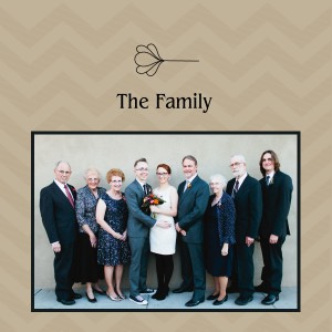
 Welcome back to MDS (My Digital Studio) Monday! Here is one of the pages from the albums I’ve been working on. As I’ve mentioned before, I like to stick to simple for my layouts and embellishments.
All of the pages in the book started with the Crumb Cake background overlaid with the slightly darker Crumb Cake chevron design. That part was so simple to make. I simply lighted the opacity of the background so that the chevron design would show up darker. I love that little trick. If you’re wondering why I chose the chevron design for the background go back to this post. We used the chevron design on the programs for the wedding. I thought those turned out so cute I just had to use that design again! 🙂
All of the pictures in the book have a black frame around them and if the page needed a little something to fill in the blank space I used this little flower outline. Like I said, my scrapbooking style is very simple….especially when you’re trying to get things done quickly! 🙂
Have a great day! Take care and Happy Stamping!
