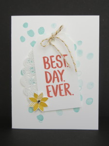
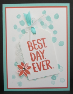
 CASE. Copy and Share Everything!
That’s what I did here. I started with the first card you see here. If you check out the sample on page 3 of the Sale-a-bration Brochure you’ll see that my card is pretty darn close to Stampin’ Up!’s sample. It’s a nice card but I like layers and ribbon so I came up with the second card you see here. Close, but not quite the same.
 I made these cards for my Opportunity Event because I wanted to show how you don’t have to come up with original designs. You can either just borrow someone’s design directly or use it as a starting point for your own design like I did. Some people might like the cleaner look of the first card and some might like the layered look on the second card. There’s so many choices and options in creating. I love it!
Which card is more your style? Leave me a comment and let me know! 🙂
Have a great day! Take care and Happy Stamping!
