 Here’s a new weekly post for you. Join me on Mondays to find out how a take someone else’s card and make it my own.
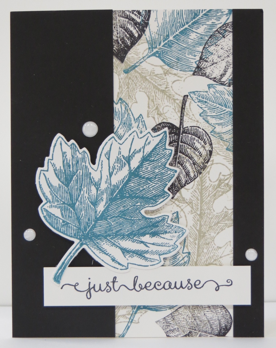
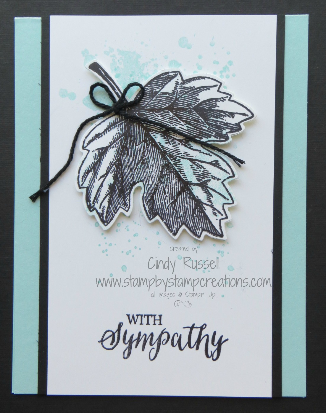
Today’s card is one we’ll be making in classes this week. I usually don’t like to use the Big Shot in a Card Buffet but I couldn’t resist with this card. I’m not sure what it is about this card but I really, really like it. It could be the color combination, the bold leaf or maybe just the overall design. Whatever the reason, this is the card I came up with after seeing the second card here in this post.
Looking at this second card you can see where I got 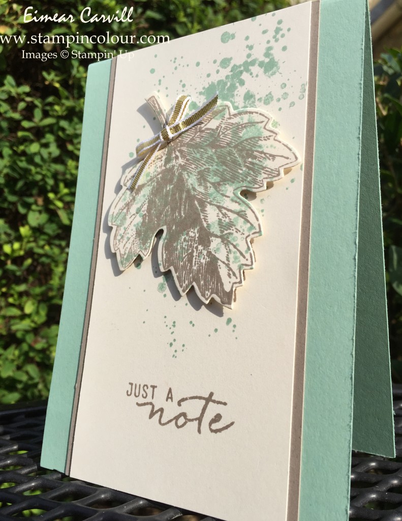 started. I took the design and pretty much and left it as is. It looks like I widened the focal piece but other than that the card design is the same.
The next thing I did was change the color. I’m weird but when I’m designing and know I want to use ribbon that’s where I start. I look at all of my ribbons and pick something that will work with the design in my head. On the original card I didn’t want to use the gold ribbon with the Tip Top Taupe ink so I used the Basic Black Baker’s Twine and Archival Basic Black Ink. I also changed the color of the card itself from Mint Macaron to Pool Party. Once I did that my card was born! 🙂
Can you see how easy it is to start with someone else’s card and make it your own? With this card I basically just changed the colors and you can see what a difference that can make. Join me again next Monday for another installment of Make it Mine!
Have a great day! Take care and Happy Stamping!