Journey With Color:  Blueberry Bushel

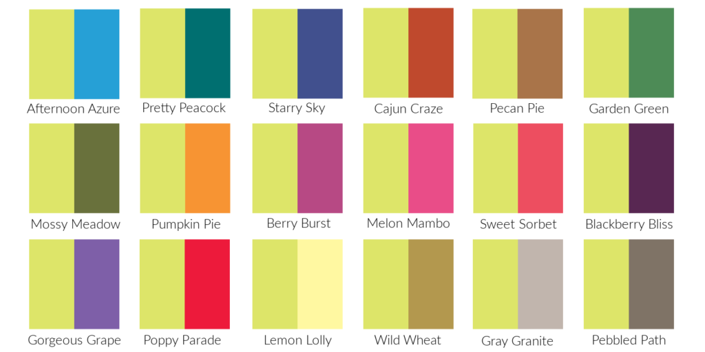
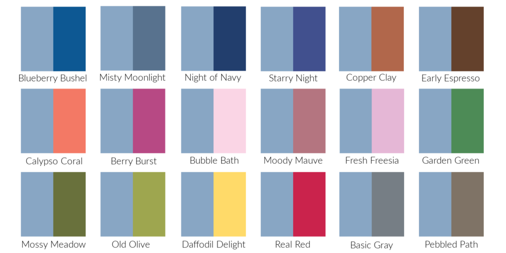
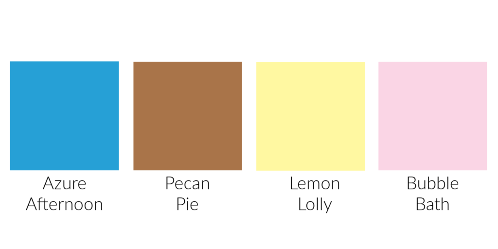
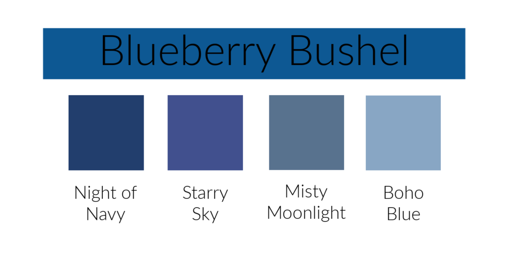
Today we will look at Blueberry Bushel in our Journey With Color.  Blueberry Bushel is a returning In Color from 2018-2020.  It’s a deep, bright blue.  In this first picture you can see how it compares to some of Stampin’ Up!’s other blues.

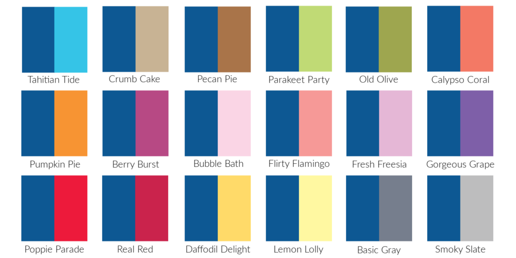
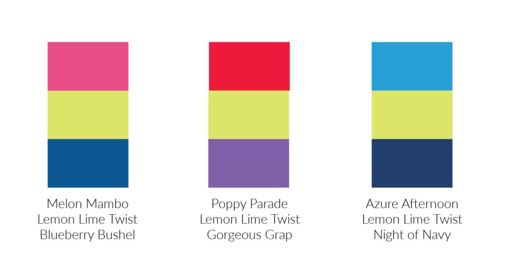
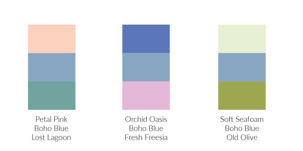
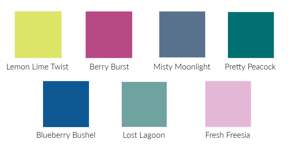
The second photo show Blueberry Bushel with other Stampin’ Up! colors.  I like it best with the lighter and brighter colors. Of these colors, I like Blueberry Bushel best with Parakeet Party.

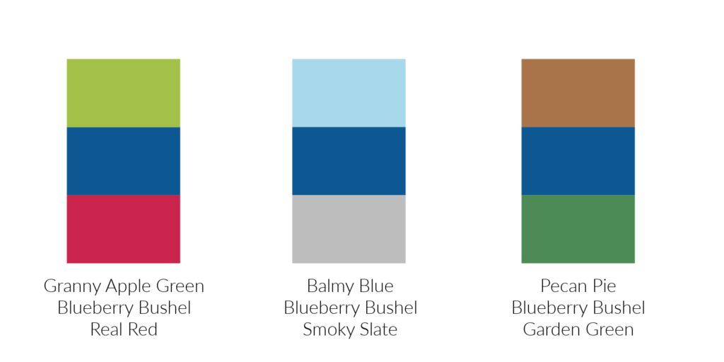
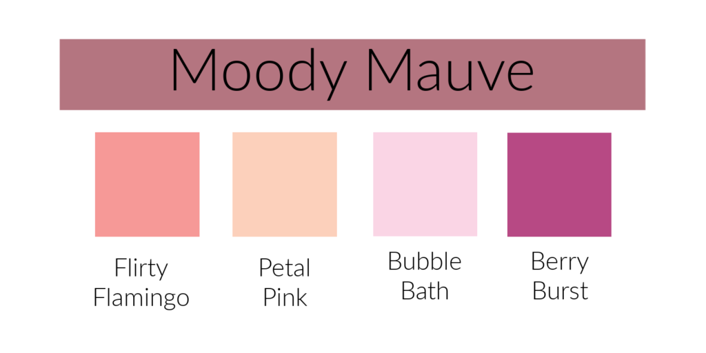
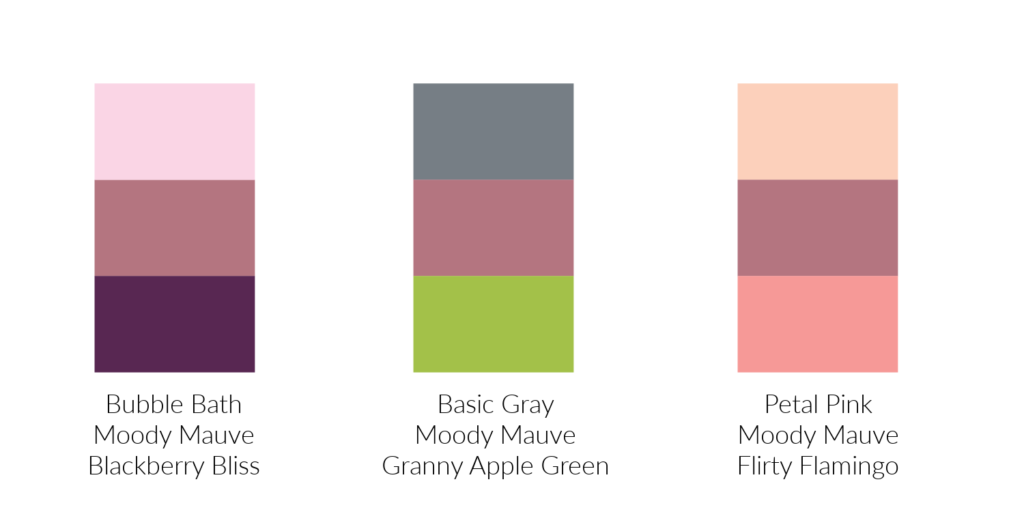
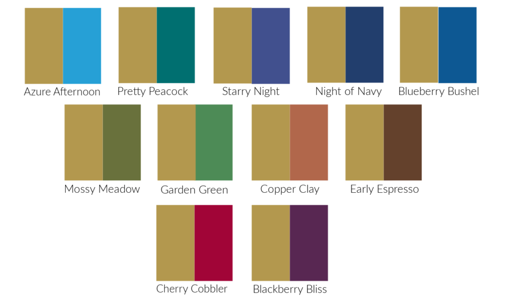
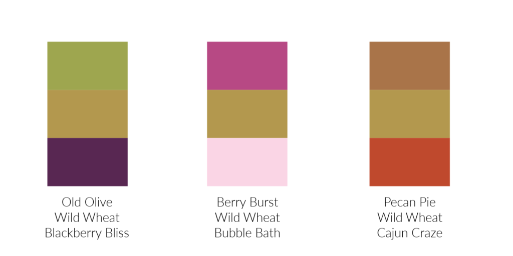
This last photo has color combinations from Stampin’ Up!’s Color Coach.  To me, all three of these combinations look nice but I like the middle one with Smoky Slate and Balmy Blue the best.  It’s a combination I may have come up with.  Which combination is your favorite? Next week I will talk about another favorite of mine, Pretty Peacock.

Have a great day! Take care and Happy Stamping!

Journey With Color:  Berry Burst

Berry Burst is today’s color in our Journey With Color.  It is my favorite color that is returning to Stampin’ Up!’s color spectrum.  It’s so bright and cheerful!  Like Lemon Lime Twist, Berry Burst is a returning In Color from 2017-2019.  The first photo here gives you an idea of where Berry Burst falls in with other similar colors.  It’s very close to Melon Mambo but has more purple to it.  In my craft room I classify Berry Burst with my other pinks.

The second photo compares Berry Burst to many of the other Stampin’ Up! colors.  I like it best with the purples, the grays and the blues.  I really like it with Fresh Freesia. Which color or color families do you like it best with?

In this last photo I am sharing the color combinations from Stampin’ Up!’s Color Coach.  I had a hard time choosing a favorite combination from these three.  I was very intrigued with the first combination that had Crumb Cake in it.  I don’t think I would have thought of combining Crumb Cake with Berry Burst on my own.  How about you?

Journey With Color:  Lemon Lime Twist

Today’s color in our Journey With Color is Lemon Lime Twist.  This is a past In Color from 2017-2019.  It’s a yellowy green and in this first picture you can see how it compares to Stampin’ Up!’s other greens that have a lot of yellow in them as well as Daffodil Delight.  Lemon Lime Twist has the most yellow in it of any of the greens.  It’s very close in color to Parakeet Party.

In the second picture you can see how I compared Lemon Lime Twist to other Stampin’ Up! colors.  It’s a lighter color so it looks well with most of the colors in the Stampin’ Up! spectrum. Of all the colors I’ve shown it with, I like it best with Pretty Peacock or Starry Sky.

The last picture here shows the color combinations from Stampin’ Up!’s Color Coach.  My favorite combination is the last ones with Azure Afternoon and Night of Navy althought I do like the first one a lot too.  Which combination is your favorite?  Leave a comment and let me know.  Next week I will share Berry Burst with you.

Journey With Color: Lost Lagoon

In our Journey With Color, we’ve finished with the new 2023-2025 In Colors and it’s time to move on to the past In Colors that have returned to the Stampin’ Up! color palette.  This week we’ll be talking about Lost Lagoon. 

Lost Lagoon is a soft blueish green (or maybe greenish blue).  I keep it with my blues which is why I’ve showed it with blues in this first photo.  If you look at Lost Lagoon, Coastal Cabana and Pool Party, you can definitely see the green in them.

In this second photo you can see how Lost Lagoon looks with other Stampin’ Up! colors.  It goes well with most of the colors I’ve shown.  I can’t choose a favorite.  Check out the photo below to see how Stampin’ Up! paired Lost Lagoon in their Color Coach.  My favorite combination is the last one where it is paired with Pretty Peacock and Calypso Coral.  Which combination is your favorite? 

Have you put Lost Lagoon on your Wish List?  Or do you still have it from when it was an In Color?  😊

Have a great day!  Take care and Happy Stamping!

Journey With Color: Pebbled Path

Last week in our Journey With Color I talked about Moody Mauve.  I like the color but had a hard time finding colors that I thought worked well with it.  Today I am going to share Pebbled Path with you.  Pebbled Path is a gray color with a little bit of brown in it.  Very pretty.  In this first photo you can see how it compares to other Stampin’ Up! grays.  I also put Early Espresso in the photo so you see that it does have that little bit of brown to it.

The second photo shows you how Pebbled Path compares to some of the other Stampin’ Up! colors.  It’s a neutral color so it really goes with most of the colors.  I’m having trouble deciding which colors I like it best with.  How about you?

What do you think of these color combinations that Stampin’ Up! has in their Color Coach?  I like them all. I may have come up with the first two on my own, but probably not the last one. I am looking forward to playing with this color.  Are you?  Have a great day.  Take care and Happy Stamping!

Journey With Color: Moody Mauve

In today’s Journey With Color we’ll be looking at Moody Mauve.  If you look up the word “Mauve” in the dictionary it is described as a pale bluish purple.  Interesting.  I think of it as being in the pink family.  Although if you compare it to some of Stampin’ Up!’s pinks you can see that it does look better with the pinks that have a blue tone to them.

This next photo shows you how Moody Mauve looks with other Stampin’ Up! colors.  I can’t say that I love all these combinations, but I want you to be able to see them.  Colors with too much red or yellow didn’t work well with Moody Mauve, but that’s my opinion. 

The last photo shows you color combinations from Stampin’ Up!’s Color Coach.  Once again, they’ve shown you combinations that I would never have tried.  I really need to step outside of my box.  How about you?  Are you stuck inside of your box like I am when it comes to color combinations, or do you like to step outside of it sometimes? 

Next week we will look at Pebbled Path.  Have a great day!  Take care and Happy Stamping!

Journey With Color: Boho Blue

In this first photo you can see how it compares to some of Stampin’ Up!’s other blues.  It has that same gray tone as Misty Moonlight.  It is one of the lighter blues that Stampin’ Up! offers.

Here I’ve paired Boho Blue with some of Stampin’ Up!’s other colors.  I like it best with the blues, pinks and grays.  How about you?

This last photo shows color combinations that Stampin’ Up! has come up with in their Color Coach.  Such interesting combinations.  Definitely ones I wouldn’t have come up with on my own.  I am very middle of the road…something I should try to work on.  😊

Do you like Boho Blue?  I do.  It should be fun to work with.  Have a great day!  Take care and Happy Stamping!

Journey With Color: Wild Wheat

After introducing all the colors that have joined Stampin’ Up!’s color family this year I am now going into more details about each one.  I am starting with the new 2023-2025 In Colors.  Last week I talked about Copper Clay.  This week is all about Wild Wheat.

Wild Wheat is a hard color to describe.  Is it yellow?  Is it brown?  I guess I would describe it as a golden brown with a little bit of a greenish hue to it.  If you look at the photo above, you can see how I came up with this description.  I will admit it’s not my favorite color, but I haven’t actually used it on a project yet.  Once I do, I’m sure I will like it a bit better.

This next photo compares Wild Wheat to many of Stampin’ Up!’s other colors.  These are the combinations that I liked the best.  As you can see, I don’t have it paired with a lot of colors.  It did not look good with any of the greens that had a lot of yellow in them and I didn’t like it with any of the pinks either.  I like it with the deeper, richer colors. 

Bringing a third color into a combination makes a big difference.  Check out these 3-color combinations that Stampin’ Up! uses in their Color Coach.  Most of the colors in these combinations are ones that I didn’t care for with Wild Wheat but I do like these combinations.  I love seeing the color combinations that Stampin’ Up! shares with us on samples, in their designer paper or the Color Coach because most of them are combinations I would never come up with on my own

What do you think of Wild Wheat?  Is it a must have favorite?  Leave me a comment below and let me know!  Have a great day!  Take care and Happy Stamping!

Journey With Color: Copper Clay

Copper Clay is one of Stampin’ Up!’s 2023-2025 In Colors.  Copper Clay is a rusty, coppery brown.  In the photo here you can see how it compares to Stampin’ Up!’s other browns.  I think it falls right between Cajun Craze and Pecan Pie.

We all have a different view on how colors coordinate with each other.  I compared all of Stampin’ Up!’s colors with Copper Clay and in the photo below you can some combinations.  I tried to choose at least one color from each color family (reds, blues, etc.)  I haven’t had a chance to play much with Cooper Clay but just by comparing colors I think my favorite three that I like with Copper Clay are Mossy Meadow, Starry Night, and Pretty Peacock. Many of the colors that didn’t make my chart also look nice with Copper Clay, but these are the ones I liked best.


Each time that Stampin’ Up! changes their colors, whether it’s adding/taking away In Colors or a whole Color Refresh, they come out with a Color Coach.  For each color that they offer they give you three color combinations of three colors.  Below you can see the combinations they chose for Copper Clay.

Adding that third color really makes a big difference doesn’t it? Crushed Curry alone with Copper Clay isn’t a favorite of mine but when you add a blue I really like it!

What do you think of Copper Clay?  Is it a color that you have to have in your craft room?  Leave a comment and let me know!  Have a great day!  Take care and Happy Stamping!

Journey With Color:  Fresh New Colors – The New Colors

During the past few weeks I’ve shared with you Stampin’ Up!’s new 2023-2025 In-Colors as well as old In-Colors that have returned.  This week I get to introduce you to the four brand new colors!

The first new color is Azure Afternoon which is part of the Brights Collection of colors.  This is a bright medium blue that I think takes the place of Pacific Point.  It falls between Tahitian Tide and Blueberry Bushel.

The second new color is Pecan Pie in the Neutrals Collection.  It’s lighter and brighter than Soft Suede and is a good addition to the browns that Stampin’ Up! has.

Next is Lemon Lolly.  A gorgeous light yellow in the Subtles Collection.  This color is much needed.  In my opinion So Saffron was just too dull and muddy.  I’m excited to play with Lemon Lolly.

Last, but not least, is Bubble Bath which is also in the Subtles Collection. For some reason I’m always calling it Bubble Gum.  Ha! I’ll get it right sooner or later.  This is the light, soft pink we’ve been waiting for!  Blushing Bride and Petal Pink were/are nice colors but they weren’t a true pink to me. 

Can you guess which of these new colors is my favorite?  Of course, you can!  It’s Bubble Bath!  It’s PINK!  Which of these four colors is your favorite new color?  Leave a comment and let me know.  😊

Have a great day!  Take care and Happy Stamping!

Journey With Color: Returning Colors

The first thing we have to do in this week’s Journey With Color is to change our main photo.  I love the photo with all of the colored butterflies that we’ve been using, however we need to make a change.  Not only are some of the colors gone that are in that photo, but so are the butterflies!  This will be our Journey With Color Photo for this coming year.

Last week I introduced you to the new 2023-2025 In-Colors.  What did you think of them?  This week I’d like to re-introduce you to the 7 past In-Colors that are returning to Stampin’ Up!’s color palette.

Lost Lagoon (2014-2016 In-Color)

Lemon Lime Twist (2017-2019 In-Color)

Berry Burst (2017-2019 In-Color)

Blueberry Bushel (2018-2020 In-Color)

Pretty Peacock (2019-2021 In-Color)

Misty Moonlight (2020-2022 In-Color)

Fresh Freesia (2021-2023 In-Color)

My favorite two colors that are returning are Berry Burst and Pretty Peacock.  Which of these colors are you glad to see back in the line-up?  I would have liked to see Evening Evergreen and Soft Succulent return but maybe they’ll make the next Color Refresh.  😊

Journey With Color: Stampin’ Up!’s 2023-2025 In-Colors

Journey With Color

Hello!  Our Journey With Color is back!  With new In-Colors and Fresh New Colors on the horizon it’s time to get back to the business of talking colors!  Today we’re going to talk about the new 2023-2025 In-Colors. When a new Annual Catalog comes along (May 2nd this year!) we lose 5 In-Colors and gain 5 new In-Colors.  I’m a little sad to see the 2021-2023 In-Colors.  I love Evening Evergreen, Soft Succulent and Polished Pink.  Which of the 2021-2023 In-Colors are you sad to see leave?

Stampin’ Up!’s 2023 – 2024 In-Colors

The new 2023-2025 In-Colors aren’t nearly as vibrant as last year’s bright and tropical colors (Sweet Sorbet, Parakeet Party, Tahitian Tide, Starry Sky and Orchid Oasis).  They are a little more muted, but I think they’re going to be fun to work with. Below is how I would describe the colors.

Copper Clay.  Copper Clay is a nice light reddish brown copper color.  It’s not nearly as red or bright as Cajun Craze

Wild Wheat.  Wild Wheat is an interesting color I’d have to describe it as a greenish yellow with a touch of brown to it.

Boho Blue.  Boho Blue a lighter almost dusty blue. 

Moody Mauve.  Moody Mauve is a dusty rose color with just a hint of purple.

Pebbled Path.  A deeper gray color with almost a hint of green to it.

This post is your introduction to the new 2023-2024 In-Colors. We’ll look at them more closely and compare them to other colors in a future post. Which is your favorite new In-Color? Leave me comment on this post and let me know! Have a great day! Take care and Happy Stamping!

40 Card in 40 Days: Nothing’s Better Than Chocolate Card

Last but not least!  Day 40 of my 40 Cards in 40 Days.  The Nothing’s Better Than stamp set and the coordinating Love You More Than dies are my choice for this final day.  So fun!  If you love chocolate, cookies, coffee or cocktails you may need to grab these products before they retire.  I’ve only made cards using the cocktails stamps so for it’s last hurrah I decided to go with chocolate.  You can’t go wrong with chocolate!  To make the chocolates and the “chocolate” pop on my card I die cut the images three times and glued them together.  I did this because I knew I’d never get Stampin’ Dimensionals on the back of the word.  This was a fun card to make but it makes me sad to know it’s retiring.  At least I can keep it in my stash!  😊

40 Cards in 40 Days: A Fishy Card

The A Fish and a Wish stamp set was one of the first items I purchased from Stampin’ Up!’s 2022-2023 Annual Catalog and is perfect for Day 39 of my 40 Cards in 40 Days.  The Fish Builder Punch coordinates perfectly with the stamp set although I didn’t use it on my card.  The colors I used on my card are Old Olive and Granite Gray.  I used a Blending Brush and Pool Party ink to give a more watery look to the Basic White cardstock that I stamped on.  To stamp the fish I first inked it in Granite Gray ink and then lightly added some Old Olive ink to the stamp with a Sponge Dauber.  The background on the card was made using the Splatters Embossing Folder from the Stripes & Splatters 3D Embossing Folders pack. 

40 Card in 40 Days: Sweet Full of Love Card

Only three days left of my 40 Cards in 40 Days!  For Day 38 I used Stampin’ Up!’s Full of Love stamp set.  This stamp set has some sweet images and sentiments.  It was snowing when I created this card the other day so I made sure I chose some nice Spring colors and designer paper.  The designer paper I used is from the Awash in Beauty Designer Series Paper pack.  The colors of Stampin’ Blend Markers that I used were Polished Pink, Daffodil Delight and Granny Apple Green.  The Radiating Stitches Dies from the Online Exclusives were the perfect choice to highlight my focal point.  Have a great day!  Take care and Happy Stamping!  Think Spring!