Journey With Color:  Peach Pie and Petunia Pop Color Combos

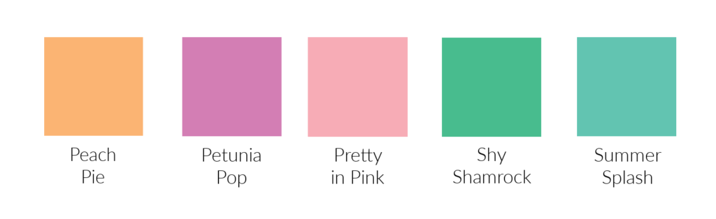
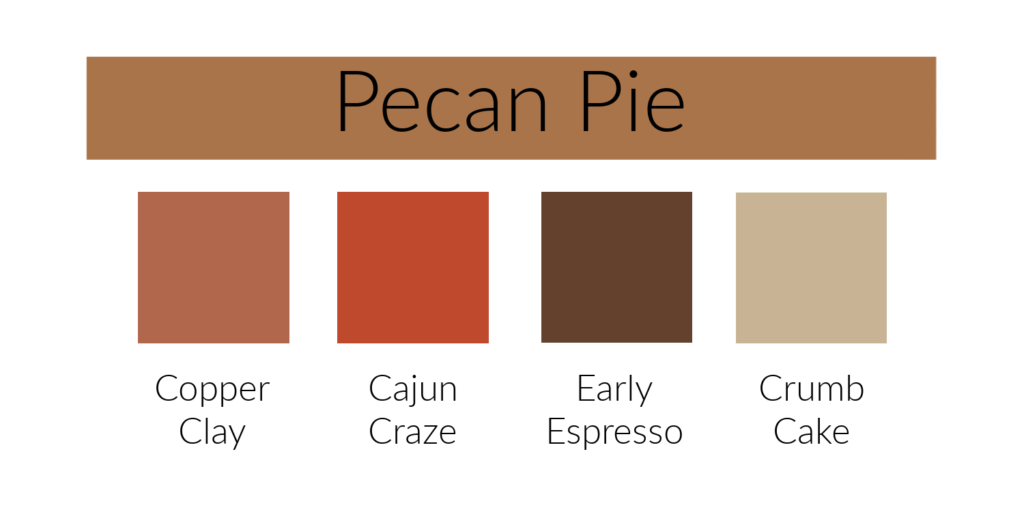
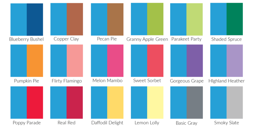
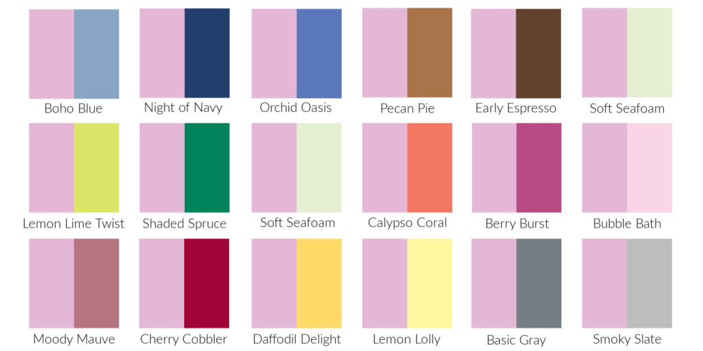
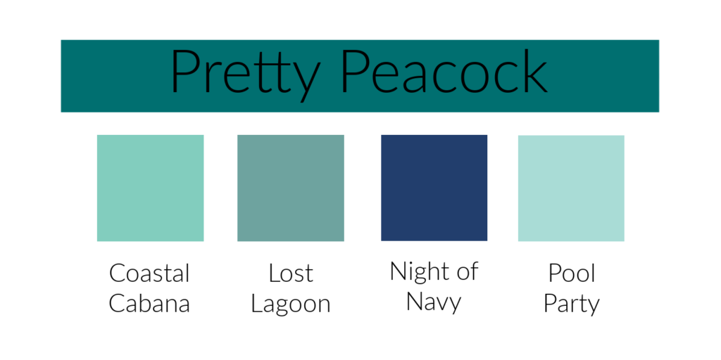
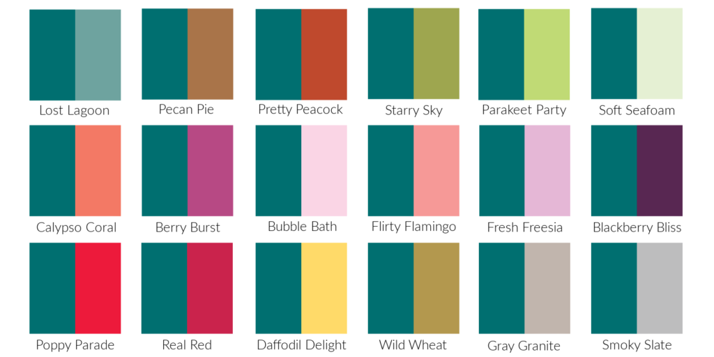
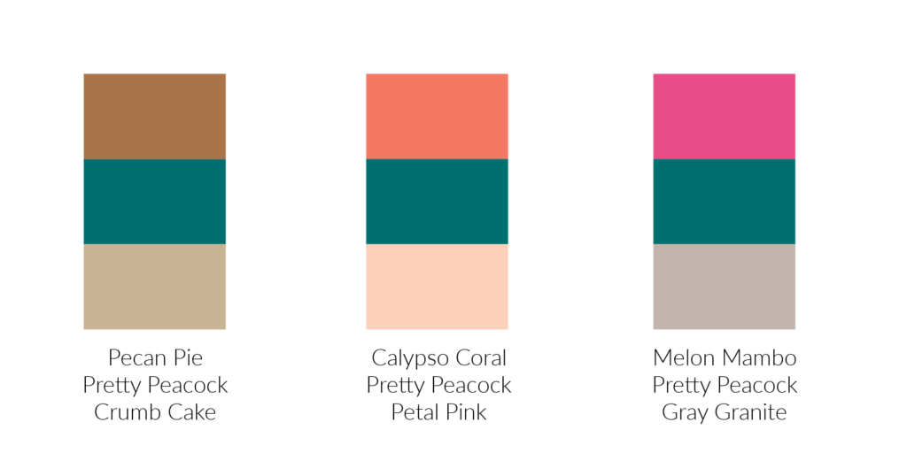
Last year in my Journey With Color when I shared new colors with you I included color combinations from Stampin’ Up!’s Color Coach.  I completely missed those color combinations with the new In-Colors Peach Fuzz and Petunia Pop that I shared with you the past two weeks.  Now I need to catch up! 

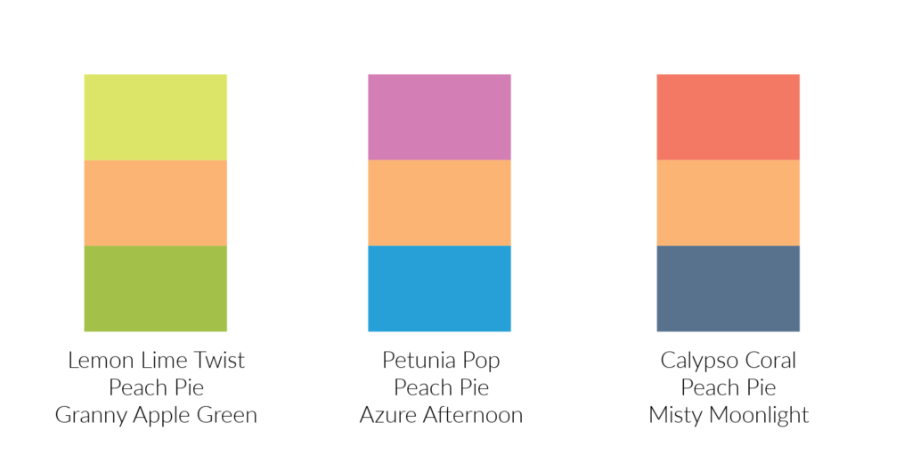
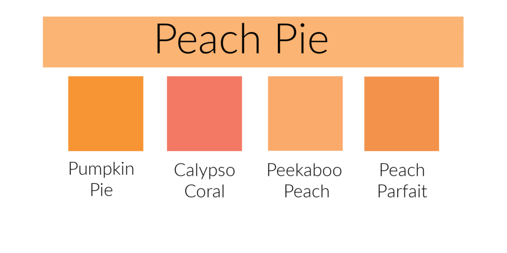
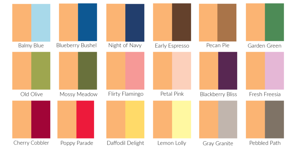
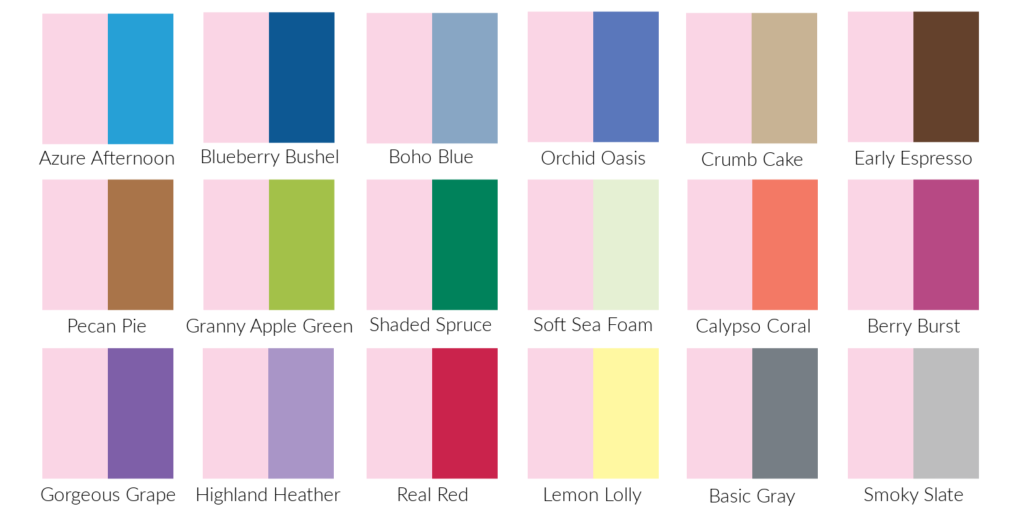
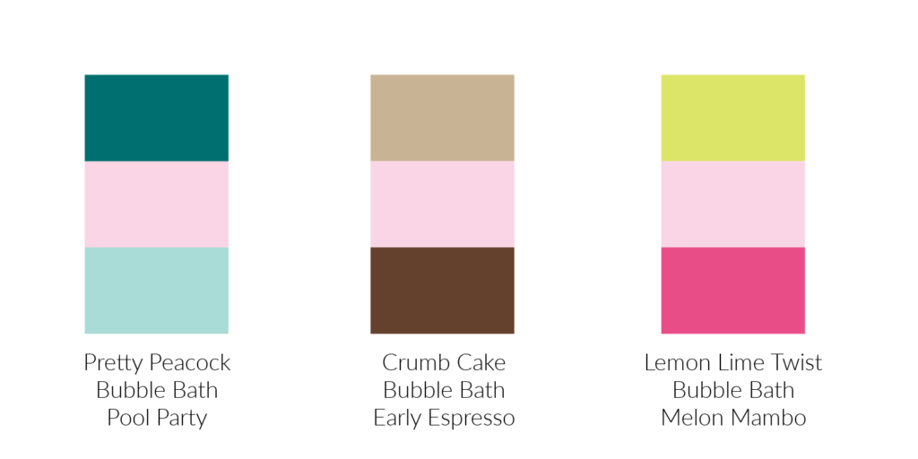
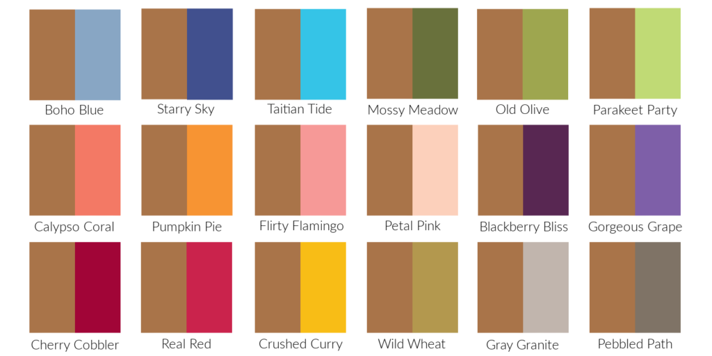
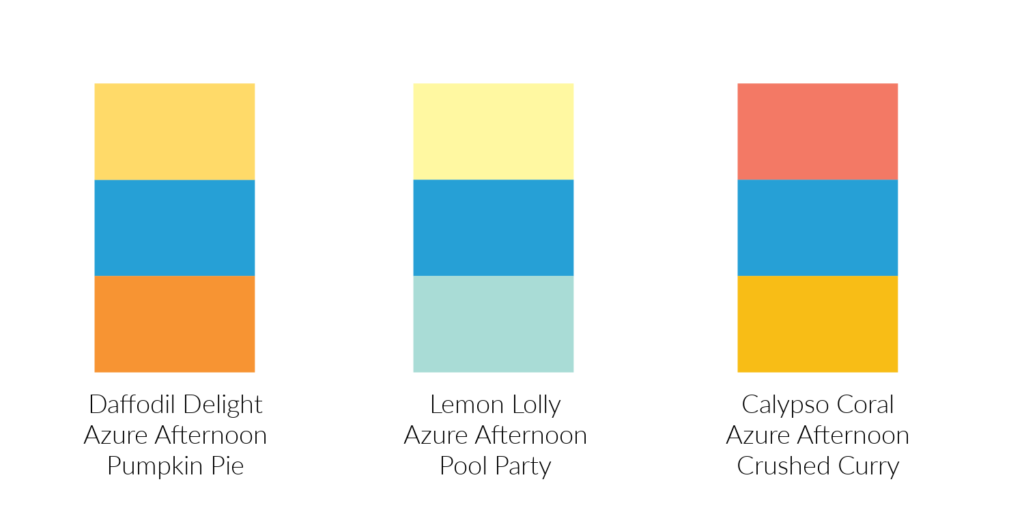
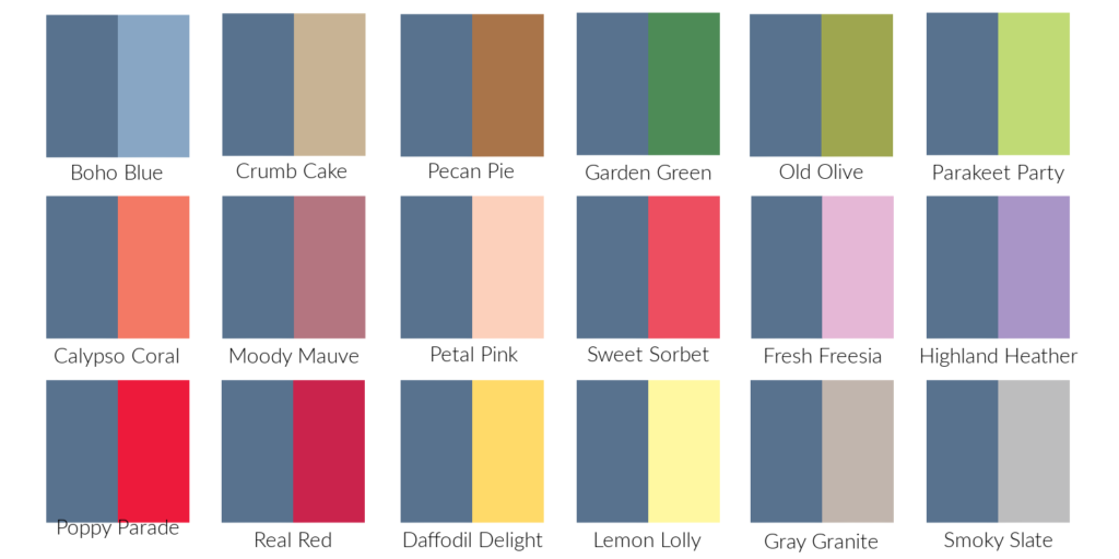
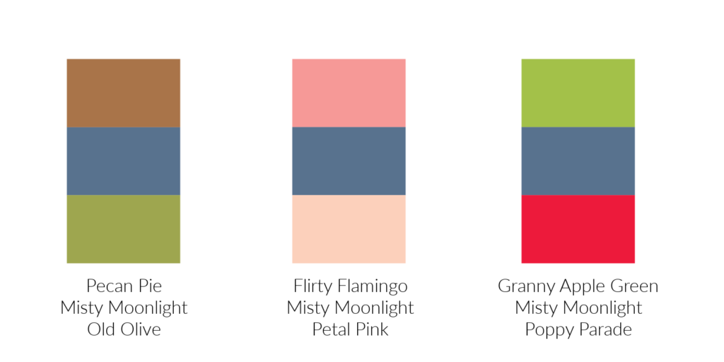
Check out these fun combinations with Peach Fuzz.  I can’t decide which one is my favorite.  The first combination with the two bright greens catches my eye, but if I were designing a project, I think I would go for the third combination with Calypso Coral and Misty Moonlight.  I would call it the “safe” combination for people like me who are a bit “color shy”.

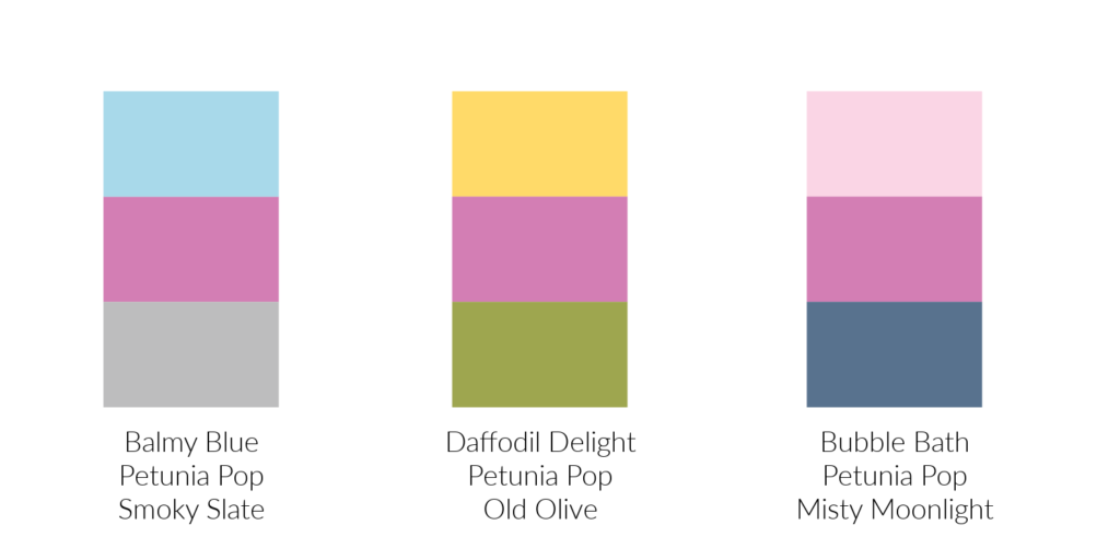
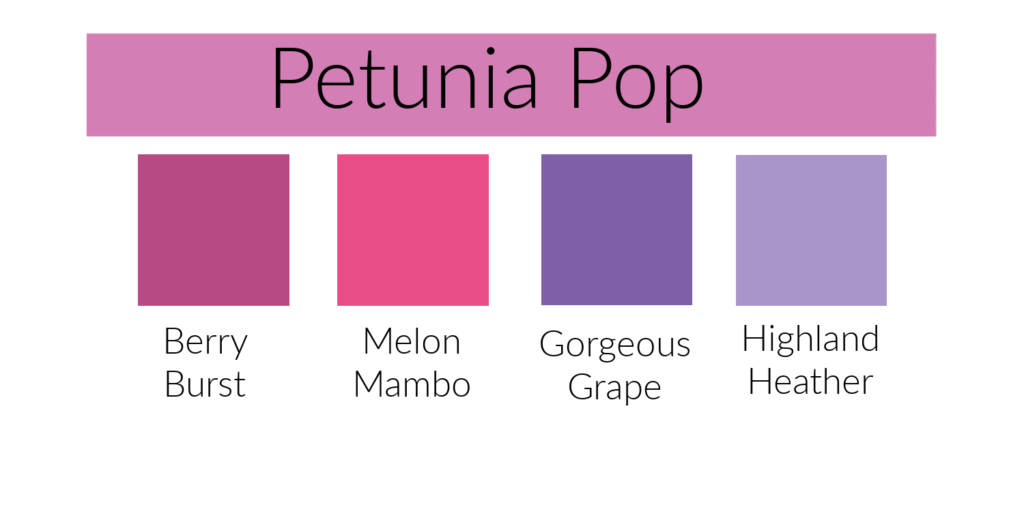
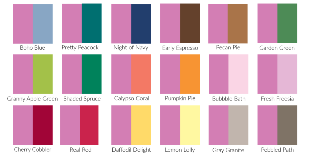
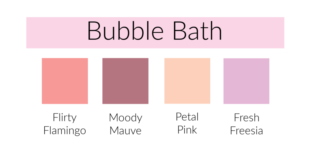
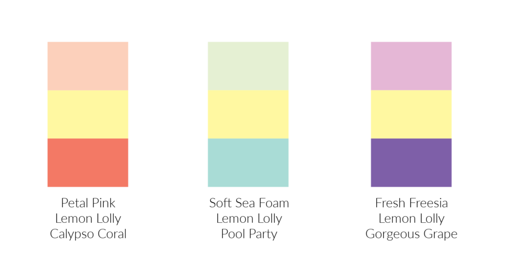
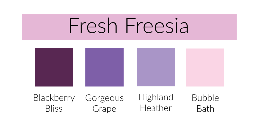
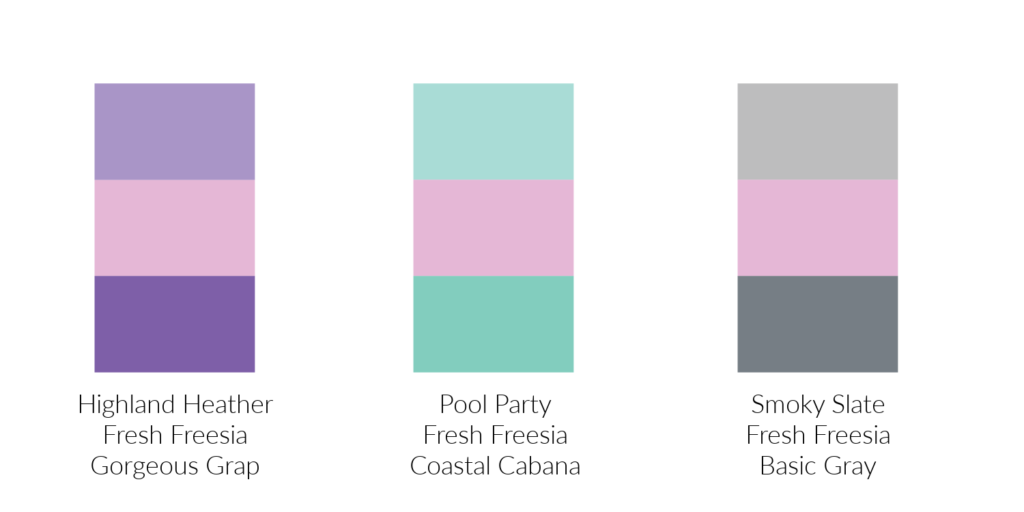
What do you think about these combinations for Petunia Pop?  Once again I am going to go with choice #3.  Not only does the combination catch my eye but it’s the one I’d most likely use on a card.  Although, option #1 is nice too.  The more I look at them though, the middle one says “flowers” to me.  You have the pink petals, the yellow center and the green leaves.  I guess with these combinations it all comes down to what you are stamping with the colors. 

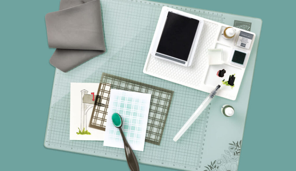
I love seeing the different color combinations that Stampin’ Up! comes up with.  They definitely help me see “outside the box”. 

Have a great day!  Take care and Happy Stamping!

Journey With Color: Petunia Pop

Yesterday in my newsletter, I shared a card with you, and I used this new color, Petunia Pop.  All the new 2024-2026 In-Colors are pretty, but Petunia Pop is definitely my favorite.  Is it pink?  Is it purple?  I had a hard time deciding so I compared it to both color families here in this first photo. 

I store my ink pads and cardstock by color group (pinks, reds, blues, etc.).  It was a difficult decision, but I finally decided that Petunia Pop belonged in the purple family.  Do you agree?

In the photo below you can see how Petunia Pop looks with some of Stampin’ Up!’s other colors.  Of the combinations I’ve shared, I think my favorites are when Petunia Pop is paired with Pretty Peacock, Navy Blue, Bubble Bath and Fresh Freesia.  From this comparison chart you can see that it has a lot of blue in it as it works well with other colors with a lot of blue.

Journey With Color: Peach Pie

When Stampin’ Up! comes up with their new In-Colors each year they not only look for colors that will coordinate with current Stampin’ Up! colors, they also try to choose relevant colors that will be popular in today’s world.  Did you know that the 2024 Pantone Color of the Year is called Peach Fuzz?  Stampin’ Up! got it right when they added Peach Pie to this year’s In-Colors.

Stampin’ Up! has had a number of peach colors in past line-ups include Peach Parfait and Peekaboo Peach, as well as similar colors like Grapefruit Grove and Crisp Canteloupe.  As you can see from the attached color comparison, Peach Pie is very similar to Peekaboo Peach, just a bit lighter.  It works really well with the current Stampin’ Up! colors.  A lighter orange color was definitely needed.  Peach Pie will be fun to work with.

In the photo below you can see how Peach Pie works with other Stampin’ Up! colors.  I think it will go well with most any of the blues and greens, although I like it best with the darker shades.  Personally, I don’t like it with any of the yellows or reds but I sure someone else with use it with some of those colors and it will be gorgeous.  Which colors do you like Peach Pie best with?

Journey With Color: The 2024-2026 In-Colors

I’m so excited to get back to our Journey With Color.  This week I want to introduce you to Stampin’ Up!’s new 2024-2026 In-Colors!  These five colors are all soft and pastel-like.  They would fit perfectly in Stampin’ Up!’s Subtle family of colors.  They are beautiful! 

Below you will find a brief description of each color.  I will go into more details about these colors in the upcoming weeks.

Peach Pie is a nice soft orange/peach color.

Petunia Pop is a beautiful pinkish purple.

Pretty in Pink is a lovely “baby pink” color.

Shy Shamrock is a soft, lighter green.

Summer Splash is a light blue in the turquoise family.

These are all great additions to Stampin’ Up!’s color spectrum.  I can’t wait to play with them!

Five Cards, One Design: Working Smarter, Not Harder

We all should really work smarter, not harder in whatever we do.  Life is too short to do otherwise.  Why “reinvent the wheel” when you can just change things up a little.  In today’s blog post I want to show you how I made 5 similar, yet different cards with one design.

Bee My Valentine Card #1

This is the card I started with.  It’s one we’re making in class this week. (Actually, I got the idea from a friend, but we won’t go into that. 😊)  It’s an easy Valentine card made using the Bee My Valentine Bundle and the coordinating Bee Mine Designer Series Paper.  Such fun products!  These little bees are adorable!

In the second photo, you can see all five of the cards I made.  Once I got started, I could barely stop.  I wanted to see how many different designs I could come up with.  Alas, life got in the way, and I had to move on to other things that needed to get done.

The two cards in the first column look the same, but if you look closely, you can see that the bottom one is a gate fold card that opens in the middle.  The two cards in the middle column are similar.  They look alike, but the bottom one is a gate fold card. 

I have five cards from one main design.  I’ve worked smarter, not harder!  What a great idea!  I need to do this more often!  How about you?  Have a great day!  Take care and Happy Stamping!

Bee My Valentine 5 Cards

A Die Tip With Translucent Florals

My mother-in-law’s birthday is today and I chose the Translucent Florals stamp set and the coordinating Delightful Florals Designer Series Paper to make her card.  There is also a set of dies that coordinates with them.  These three items are Online Exclusives found only in my online store.  My favorite item of these coordinating products is the designer paper so that is what I chose for the focal point of my card.  I fussy cut this floral image from the paper.  So pretty! 

I knew that I was going to mount the fussy-cut image on white so I wasn’t too worried that there may have been a little white around the edges.  I did have to get my X-acto knife out to cut out the small area by the stem of the small flower

The Berry Burst card front is stamped with the larger floral image from the stamp set with the same color ink and the strip of Pretty Peacock cardstock is stamped with the foliage image in the Pretty Peacock ink.  Stamping cardstock with the same color image gives a nice subtle background design.

One of the dies (the sixth largest) from the Deckled Circles die set was the perfect size for the floral image and the card.  After die-cutting it, it seemed a bit boring, so I needed to figure out how to add a little something to it.  I tried drawing a dotted circle just inside the die-cut edge, but my drawing skills were a bit lacking.  I tried to find something circular that I could draw around but came up empty.  Then I had an epiphany.  I could simply draw around the inside of the Deckled Circle die!  I placed the die on my cardstock and using sticky notes, I was able to keep the die in place.  The sticky notes need to be moved as you draw around the circle.  You can either draw the circle before you die-cut it or draw it after as long as you keep the sticky notes in place.  I will definitely be trying this technique with other dies.

The Berry Burst card front is stamped with the larger floral image from the stamp set with the same color ink and the strip of Pretty Peacock cardstock is stamped with the foliage image in the Pretty Peacock ink.  Stamping cardstock with the same color image gives a nice subtle background design.

Sentiments used on both the inside and the outside of the card are from the Sentimental Park stamp set.  There is a birthday sentiment in the Translucent Florals stamp set but it was a little too large.  Sometimes you need to look through your stash for just the right item.

Happy Birthday to my MIL!  I hope you all have a great day!  Take care and Happy Stamping!

Today is the Day!

Today is a big day! It’s Sale-a-bration Time at Stampin’ Up! What a wonderful time of the year for a paper crafter!  Sale-a-bration is a way to earn FREE products from Stampin’ Up!!  There are three different ways to earn FREE products.

#1.  SHOP!  Choose a FREE Sale-A-Bration product from the Sale-a-bration brochure (p. 4–15) with every $50 or $100 you spend (before tax and shipping).   You can place your order from me directly or shop in my online storeThere are items at the $50 level and there are a few items at the $100 level.  You can view the Sale-a-bration Brochure here.

#2.  HOST!  Host a qualifying party and select an additional $30 in FREE products (p. 18)!  Host a party with sales of at least $300 to earn this benefit.  A personal order of at least $300 also qualifies for this benefit.

#3.  JOIN!  I’m really excited about this benefit.  Once again, you have a couple of different options when you decide to join my team of SASsy Stampers and the Stampin’ Up! family. 

“Join Stampin’ Up! as an independent demonstrator and help others discover the joy that comes with creativity! When you join during Sale-A-Bration, you can build your Starter Kit  by choosing $125 of products for only $99 (includes shipping). Plus, you’ll get to choose one of the two FREE bonus options shown on p. 17.”

Option 1 – STAMPIN’ GLASS MAT STUDIO (RETAIL VALUE: $60) free! (See Photo Below) GLASS MAT 17″ x 14″ (43.2 x 35.6 cm). 5 mm thick. Heavy-duty,  safety-tempered glass crafting mat with raised nonslip rubber feet. Features a white background printed with a gray grid. Heat and scratch resistant. Wipes clean with water or alcohol.  SILICONE MAT 8-3/8″ x 6″ (21.3 x 15.2 cm). Nonslip, multiuse mat.  Waterproof and heat resistant. Features 4 palette squares for custom color mixing. White.   CLEANING CLOTH 8-1/4″ x 8-1/4″ (21 x 21 cm). Reusable cleaning cloth makes chemical-free cleaning easy: just add water and wipe.  Durable, thick, lint-free. Dark gray.

Glass Mat Studio

Option 2 – Your choice of an additional $30 in FREE products to add to  your Starter Kit.

Sale-a-bration is such an exciting time!  I hope you take advantage of these opportunities to earn free products from Stampin’ Up!.  Please contact me with any questions you may have!

Stampin' Up! January - April 2024 Mini Catalog

Today is also the day that Stampin’ Up!’s new January – April 2024 Mini Catalog goes live! Woo Hoo! More new products!

Click here to view this amazing new mini catalog!

I hope you enjoy these two new publications! Have a great day! Take care and Happy Stamping!

Happy New Year

Happy 2024! It’s been a long time since I’ve posted here on my blog. Sorry I’ve been away so long. It’s a new year now and the perfect time to get back to posting. I hope you’ll continue to check back and read my posts.

I wish you all a new year filled with peace, happiness and joy!

Journey With Color: Bubble Bath

I saved the best for last!  At least in my opinion.  😊

Bubble Bath.  It’s pink!  Last but not least, I am going to share the final new color that Stampin’ Up! added to their color spectrum this year.  Bubble Bath is that soft, light pink that we have been waiting for. 

In the first photo, you can see how it compares to the other softer pinks in the Stampin’ Up! spectrum.  You can also see how perfectly it goes with Fresh Freesia.  These two colors work perfectly together.

The second photo shows Bubble Bath with other Stampin’ Up! colors.  It’s a soft, muted color like Lemon Lolly so it works well with most of the colors.

I like all of the color combinations that Stampin’ Up! has come up with in their Color Coach.  It’s hard to choose a favorite.  If I did have to choose, I think I would go with the first combination with Pretty Peacock and Pool Party.  So pretty!

I hope you’ve enjoyed the past few months of our Journey With Color as I’ve introduced you to the colors that Stampin’ Up! has added to their color spectrum this year.  Have a great day!  Take care and Happy Stamping!

Journey With Color: Lemon Lolly

Lemon Lolly is the color we’re going to talk about in today’s Journey With Color.  What a beautiful soft yellow color!  I hate to say it, but in my opinion, I’m glad Stampin’ Up! retired So Saffron and replaced it with this lovely yellow. 

The first photo here shows Lemon Lolly with the other two Stampin’ Up! yellows as well as with So Saffron which it replaced.  It’s a good addition.  This lighter, softer yellow was needed

In this second photo you can see how Lemon Lolly works with other Stampin’ Up! colors.  I think I like it best with the blues but it does look nice with most of the other colors.

Lastly you can see the color combinations that Stampin’ Up! has come up with in their Color Coach.  All three of these combinations are nice but my eye is first drawn to the last combination with the purples.

I’m excited to start using this lovely new color.  How about you?  Have a great day.  Take care and Happy Stamping!

Journey With Color: Pecan Pie

In today’s Journey with color, I want to talk about Pecan Pie.  At any one time, Stampin’ Up! doesn’t have a lot of browns in their spectrum of colors.  You don’t necessarily need a lot of browns to choose from, but you do need a variety of them.  This year Stampin’ Up! introduced Pecan Pie into their color spectrum and it was just what was needed. 

As you can see in this first photo where I compare Pecan Pie with some of the other browns that Stampin’ Up! offers, it’s the perfect fit between the dark Early Espresso and the light Crumb Cake.   It replaced Soft Suede as a mid-tone brown.

In this second photo you can see how Pecan Pie works with some of Stampin’ Up!’s other colors.  It works well with many of the colors.  In this photo, I like it best with the greens and the purples.

The last photo here shows you the color combinations that you can find in Stampin’ Up!’s Color Coach.  My eye is first drawn to the “Christmas” combination with Shaded Spruce and Cherry Cobbler, but I think I like the second combination with Pumpkin Pie and Pretty Peacock as well.  What are your thoughts about Pecan Pie?  Leave a comment below and let me know.  H

Have a great day!  Take care and Happy Stamping.

Journey With Color: Azure Afternoon

It’s time to start talking about brand new colors by Stampin’ Up! in our Journey With Color.  We’ll start with Azure Afternoon.  Afternoon Azure is a lovely brighter light/medium blue.  It’s the color of the sky on a beautiful day.  As I was writing this post I happened to look out the window and guess what color the sky was….yep, Azure Afternoon.  I looked up the definition of Azure and it’s definition is:  “the blue of a clear or unclouded sky”.  😊

In this first photo you can see how Azure Afternoon compares to some of Stampin’ Up!’s other blues.

This second photo shows Azure Afternoon with other Stampin’ Up! colors.  I like it best with some of the brighter colors.

The last photo shows some of the color combinations that Stampin’ Up! has in their Color Coach.  My favorite combination is the last one with Calypso Coral and Crushed Curry.  As I mentioned above, I like it best with the bright colors.  What is your favorite combination?

Journey With Color: Fresh Freesia

Fresh Freesia.  The color that has missing from Stampin’ Up!’s color spectrum.  This gorgeous light purple compliments the other purples in the Stampin’ Up! family perfectly.  Fresh Freesia was an In-Color in 2021-2023.  In this first photo you can see how it is very close in color to the new Bubble Bath pink. 

In this second photo you can see how it works with some of the other Stampin’ Up! colors.  I have to admit that the colors I don’t like it with I really don’t like.  You won’t see me using Fresh Freesia with Shaded Spruce or Calypso Coral.  Isn’t is interesting how we all see things differently? Some of you may love those combinations.

This last photo are the color combinations from Stampin’ Up!’s Color Coach.  I like all three of these combinations and would use any of them on a project.  I can’t even choose a favorite of the three.  How about you?

Fresh Freesia is the last returning In-Color that we will be talking about in our Journey With Color.  Next week we will start talking about the four brand new colors Stampin’ Up! has added.

Journey With Color: Misty Moonlight

In today’s Journey With Color, I am going to share Misty Moonlight with you.  This is a returning In-Color from 2018-2020.  It’s a medium, soft blue.  In this first picture you can see how it coordinates with some of the other blues in Stampin’ Up!’s collection.

The second photo compares Misty Moonlight to other Stampin’ Up! colors.  Isn’t it a great complement to Boho Blue?  I can see using these two colors together a lot.  It pairs nicely with so many of the other colors too. 

This last photo shows color combinations from Stampin’ Up!’s Color Coach.  My favorite combination is the first one where Misty Moonlight is paired with Old Olive and Pecan Pie.  It reminds me of Fall.  Which combination is your favorite?

Journey With Color: Pretty Peacock

Pretty Peacock!  This is the returning color that people were most excited about.  It’s such a pretty blue/green and perfect for so many projects.  In this first picture you can see how it compares to the other blues in Stampin’ Up!’s color collection.

This second photo shows Pretty Peacock with other Stampin’ Up! colors.  I was going to comment on which colors I like it best with but after studying the chart I had a hard time deciding.  If I had to choose I would go with Lost Lagoon.  They almost look like different shades of the same color

The last photo shows color combinations from Stampin’ Up!’s Color Coach.  It’s a tough decision again on my favorite.  My eye is first drawn to the last combination (PINK!) but I really like the first one with Pecan Pie and Crumb Cake.  Do you have a favorite?